There are many ways to approach character design. Mine is one of many other possibilities, but doing things this way has always worked for me, and hopefully some of these processes can be applied to your work (see our ZBrush 4R8 review)
The basics are simple: start by getting inspired! We all know about the stress of seeing a blank page in front of us that needs to be filled. However, from my experience, as long as you keep an open mind and continue to be curious, you don't need to worry about this.
The best way to get inspired is to fill up your head with other designs. Don’t worry, you won’t become overloaded. Look around you – on forums, movies and books – for what attracts you. Maybe you are in the mood for sci-fi spaceship design, or a fantasy creature? It has occurred to me that you don’t really dictate your artistic taste, it is more the other way around.
If you’re working on a commissioned project or have been given a very specific task, then looking at how other artists have approached similar subjects and projects is even more important.
Once you’ve gathered together some good references (I like to use Pinterest), take your time to study them – look for interesting shapes, colours and patterns. Try to concentrate on the areas that grab your attention and begin looking for more references that follow that same direction.
Soon you’ll start to recognise what you like, but also – and this is very important – what you don’t like. This is where your creation process begins and you can start to fill that blank canvas with something that is your own.
Start setting a theme
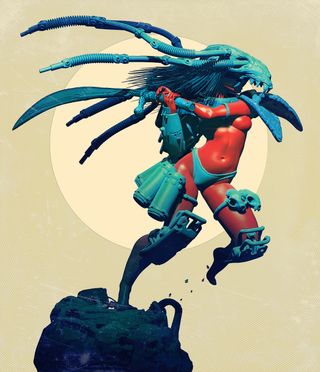
With a reference set and ideas sparking, it’s time to pick up a thematic direction. My inspiration for the project illustrated on this post was the old Psygnosis game Shadow of the Beast. I always loved the tone, the cover art by Roger Dean, and the music of that game. The remake was good, but my artistic side was kind of frustrated to not have had the chance to work on it. So I used this project to create my own vision of it.
Get the Creative Bloq Newsletter
Daily design news, reviews, how-tos and more, as picked by the editors.
I started to gather pictures by using references from Roger Dean, and then expanded into what I felt was the inspiration for that universe – this included art by 1990s comic book artist Simon Bisley and by some other artists inspired by heavy metal. The Shadow of The Beast game was brutal but also had this very airy alien aesthetic, and I wanted to get back to that feeling.
When creating characters, I like to think of them as part of a whole universe. For example, I consider my character in a group of similar characters and plot their role in this new world – what dangers would they be facing? This helps a lot when creating a design with more story-related elements, and I think the final design really benefits from the process.
Gathering elements
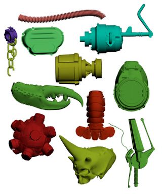
With my backstory set, my references gathered and my research done, it’s time to put together some concepts.
A great way to approach this is to use the kitbashing technique. Kitbashing was originally created at Industrial Light & Magic as an efficient way to create spaceship shapes and details for the Star Wars films, and has since evolved within the hobbyist community to create alternate versions of existing kits.
This technique allows you to be creative using a limited number of set 3D pieces – a bit like playing with Lego blocks to come up with new designs.
Over the years I have gathered a library of kitbash elements, and I’d suggest you do the same. Every time you create a new sculpt, save all your elements into a library. I use these saved elements to come up with a few interesting shapes to use as a base from which to create my character’s armour.
Pose and composition
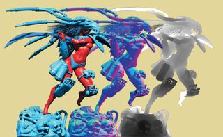
Posing is also a very important part of the creation process. I actually like to imagine my character in pose even before getting a clear idea of its design, as a good pose can influence the character’s shape and mannerisms. The pose can say a lot about your character – a berserk warrior, a monk or a knight will all stand in unique ways. Think about classic poses that match what you’d like to convey in your final piece. Now's a good time to revisit your original references, but for now focus on the poses rather than the design.
When I’ve found and created my pose, then – and only then – do I start to kitbash my armour on top: a shoulder here, a kneepad there, some cables floating behind to put more emphasis on the movement, and so on until I’ve created my armour.
Colour rules
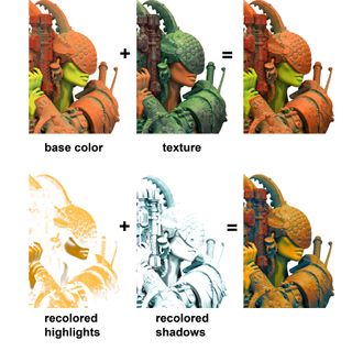
I have my own way of approaching colour, and my ethos is always less is more. I try to use a maximum of three key colours. As you may have noticed, I love playing with primary colours (yellow, red and blue) and then shift them slightly to get more interesting results; blues lean more toward greens, reds toward orange and yellows. Avoid mixing greens and pink or purple shades as they don’t work well together (only the Hulk goes all out with these).
I also use light and shadow to paint more colours into my final piece. While lighter tones go with warmer tones, you’ll find shadows go with colder colours. Experiment and find your style. When compositing, I work with separate renders as this gives me better control. These might include a classic colour render, a normal map and a depth pass.
The first thing I do in Photoshop with my final renders is to isolate the light colours and shadow colours on a separate layer using Color Range (you can use the Eyedropper or select Localized Color Clusters to build a more accurate selection). I apply a Hue and Saturation adjustment on top, and importantly, I set it to Colorize, to force a consistent monochromatic tone across the image. This is one of my trademark touches and I encourage you to try my technique for yourself, and then have fun experimenting with your own recipes. The sky is the limit once you get started!
This article was originally published in 3D World magazine issue 215. Buy it here.
Related articles:
