To power our tabbed navigation, we’ll be using and then extending the jQuery Tools plug-in, which makes setting up tabs (and a number of other useful interaction design patterns) incredibly easy.
To start with, we’ll lay out some basic markup for our navigation:
<nav> <ul id="tabs"> <li><a class="current" href="#">Item 1</a></li> <li><a href="#">Item 2</a></li> <li><a href="#">Item 3</a></li> <li><a href="#">Item 4</a></li> <li><a href="#">Item 5</a></li> </ul> </nav>We’ve created an unordered list of anchors, with an id of tabs so we can directly target it with jQuery. We’ve also wrapped the list in an HTML5 nav element. This adds some semantic structure to our document, and potentially aids assistive technologies in providing a better user experience.
We’ve also added a class of current to the first tab. The Tabs plug-in will move this class automatically between the anchors, and we can use this to emphasise the current anchor with CSS. We’ll then need to create the structure to hold the content that we’ll be switching between using the tabs:
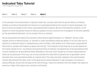
<div id="content"> <section>First section</section> <section>Second section</section> ... <section>Fifth and final section</section> </div>Here we have five section elements (another HTML5 tag) wrapped in a division identified as our content. We need one section for each navigation item we created earlier. We don’t need to do anything to connect the links to the sections, because the jQuery Tools plug-in will map them for us based on their order. Note: In the demo code on the CD, we’ve replaced the text in each section with snippets of Einstein’s Relativity: The Special and General Theory, just to fill it out a bit. We’ve also used paragraph tags to mark the text up. Now let’s style what we’ve put together so far into a horizontal row of links (see below):
nav { margin-bottom: 30px; } nav ul { overflow: hidden; padding-bottom: 10px; border-bottom: 5px solid #bbb; } nav li { float: left; margin-right: 35px; } nav li a { color: #666; font-weight: bold; } nav li a:hover, nav li a:focus, nav li a.current { color: #000; }
A sprinkling of style
At the end here, we’re setting hover and focus styles for our links, and also applying the same black colour treatment to links that have a class of current.
Before we can get started on making our tabs work, we need to hide the sections of our content so that the Tabs plug-in can control which section is currently visible:
Get the Creative Bloq Newsletter
Daily design news, reviews, how-tos and more, as picked by the editors.
#content section { display: none; }The JavaScript
Now we’re all set with our basic markup and CSS, but before we can dive into writing our jQuery, we’ll need to bring in some libraries to give us the tools we need:
<script type="text/javascript" src="http://ajax.googleapis.com/ajax/libs/jquery/1.4.2/jquery.min.js"></script> <script type="text/javascript" src="js/jquery.tools.min.js"></script> <script type="text/javascript" src="js/jquery.easing.1.3.js"></script> <!--[if lt IE9]><script src="http://html5shiv.googlecode.com/svn/trunk/html5.js"></script><![endif]-->Here we’re importing four JavaScript files:
- jQuery from the Google Ajax API (ntrn.cc/dvEnNS).
- The jQuery Tools library (ntrn.cc/c4NCoV), using a custom-built download from the jQuery Tools site, which only includes the Tabs module.
- An easing transition plug-in for jQuery (more on this later).
- An HTML5 shiv file served conditionally to Internet Explorer versions older than IE9, in order to patch in support for the HTML5 elements that we’ve used.

Now for our jQuery to initialise our tab system:
$(function() { $("#tabs").tabs("#content section", { effect: 'fade', fadeOutSpeed: 0, fadeInSpeed: 400 }); });I’ll step through this line by line to explain what’s going on. On line 1 we open a new function that will execute automatically as soon as the DOM is loaded on the page. We need to use this facility because we can’t initialise our tabs until the DOM has been assembled by the browser.
Line 2 makes a call to the jQuery Tools Tabs function. We call this function on a jQuery selection of our tab navigation, which we target using its id of tabs.
The first parameter we pass to the Tabs function is a selector string for our sections of content – the parts of the page we want to switch between when changing tabs.
The second parameter opened with a brace on the end of line 2 is a JavaScript object that contains a set of configuration options. You can find documentation for the full set of available options at ntrn.cc/b03ZWD.
The first option on line 3 tells the Tabs plug-in that we want to use a fading effect when we switch between tabs. This will fade out the old tab’s content before fading in the new content, to create a smoother transition. Lines 4 and 5 configure the speeds (in milliseconds) at which we want to fade out and in.
Hey presto, at this point we have a fully functioning tab system!
Adding some flair
By positioning a small graphic below our navigation and animating its position using jQuery, we’ll be able to indicate the currently active tab with a neat visual touch.
The first step is to produce the graphic. We’ve used a very simple triangle filled with the same solid colour as the bottom border we added to our navigation list.
Next we need to get the indicator onto our page and into position. We’ll use a span element for the indicator:
<nav> <ul id="tabs"> ... </ul> <span id="indicator"></span></nav>Now some changes to our CSS are needed in order to style and position the indicator:
nav { margin-bottom: 30px; position: relative; } nav #indicator { position: absolute; left: 12px; bottom: 5px; width: 12px; height: 7px; background-image: url('../img/notch.png'); }First, we set relative positioning on the nav element so that we can absolutely position our indicator within it.
We’ve set left and bottom values such that the notch starts roughly centred underneath the first navigation item.
We’ve then given the span an appropriate width and height (based on the size of our indicator image), and applied our triangular notch graphic as the background image for the span.
We now have our notch indicator positioned below our navigation. Now all that remains to finish the effect is to have the notch indicator slide along underneath the navigation items to point to the currently selected item.
Before we touch the code, let’s get the maths out of the way. We’re positioning our indicator absolutely, and animating the left CSS property to move it.
In order to centre our indicator directly beneath the navigation anchors, we’ll need to know how wide they are. To work out the formula for calculating the value for the left offset of our indicator, we’ll refer to a diagram using some fake width values (see below).
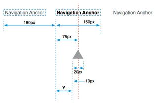
We first take the distance of the current anchor from the left edge of the navigation (180px), and to this we need to add Y.
To calculate Y, we take half the width of the current tab anchor then subtract half the width of our indicator. In this example, Y is 65px, so the left value for our indicator would be 245px.
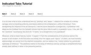
We’ll now extend our tabs code, writing an event callback function to animate the indicator as the user navigates. The Tabs plug-in raises a JavaScript event to which you can attach event callbacks.
In this case we’ll be using one called onBeforeClick. As its name suggests, this event fires when we click a tab anchor, but before performing any of the actual tab switching behaviour. There’s also an onClick, but as this only fires after the tab switching (including the fading transition) has finished, it won’t produce the right effect for us.
We’ll first set up some variables to hold useful values that we’ll need to perform the animation. We’ve written this before the call to the jQuery Tools Tabs plug-in so that our new variables are initialised and ready for use within the Tabs function itself:
$(function() { var indicator = $('#indicator'), indicatorHalfWidth = indicator.width()/2, lis = $('#tabs').children('li'); $("#tabs").tabs("#content section", { ...On line 2, we save a reference to our indicator element to a variable called indicator. If you’re going to be referring to a DOM element repeatedly, it’s more efficient to do this rather than using a jQuery $ selector to repeatedly search the DOM for the same element(s).
The second variable we create on line 3 is the width of the indicator element divided in half, and the variable on line 4 is an array of all the list items in our navigation.
Event callback
Now let’s write our event callback in the configuration of our Tabs function:
...fadeInSpeed: 400, onBeforeClick: function(event, index) { var li = lis.eq(index), newPos = li.position().left + (li.width()/2) - indicatorHalfWidth; indicator.stop(true).animate({ left: newPos }, 600, 'easeInOutExpo'); } });On line 2 we’ve added the header for our onBeforeClick event callback function. We are given two parameters associated with our event; event is a reference to the event itself, which we won’t need.
The second, index, is the number of the tab that was clicked, with 0 being the first tab.
On line 3 we fetch the specific list item element we’re going to examine by looking it up in our list item array. The eq jQuery function reduces our array of list items to the one specified by the index value.
Line 4 is where we calculate the new left value for our indicator. Look back at the diagram to see how we came up with this formula.
Animation
All that remains is to perform the animation, which we do on line 5. We first call stop(true) on the indicator, which cancels any animations currently in progress as well as any that are queued.
We’re then calling jQuery’s animate function, animating the left CSS property to our calculated value (newPos). The second parameter to the animate function is a 600ms duration for the animation.
The third, easeInOutExpo is the name of an easing equation, which is optional. See Expert tip, below left, for more on easing equations.
And that’s it – we’re done! We now have our content sectioned up and navigable using our tab anchors, as well as a sexy custom effect with our sliding notch indicator.
The jQuery code covered in this tutorial is available on this issue’s CD, or for download as a single plug-in package at ntrn.cc/b9W6wo, with the added option of being able to create vertical navigation as well as horizontal.


