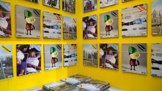
Bridging the gap between a conventional photocopier and laser printer, Risograph printing, aka Riso, is a simple yet brilliant tool for anyone interested in producing high quality prints on a shoestring budget.
Regarded by many illustrators and designers as a more economical alternative to silk screen printing, the technique is popular with both students and professionals seeking affordable ways to self-publish. (For another relatively cheap print technique, see our guide to lino printmaking.)
Environmentally friendly, quick and easy to set up, it's not hard to see the attraction of this printing technique. Understanding the process is key to making the most of your first experience with Risograph printing and avoiding common mistakes associated with creating multi-layered Riso prints.
We speak to two printing and publishing companies to glean their insight and expert advice on creating incredible Risograph artwork, alongside three illustrators who regularly use this technique to produce low-cost prints, including poster designs and handmade books.
Risograph basics
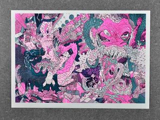
For those of you familiar with silk screen printing, you will find your existing knowledge lends itself well to understanding the process of Risograph printing, which also relies on a layering technique to produce multi-coloured prints.
Established in 2009 to act as a support structure to offer a means of affordable production for others, London publisher and independent print company Hato Press was quick to draw on the early appeal of Riso, as print technician and co-founder Jackson Lam reflects: "When we first started out, hardly anyone knew about [Risograph printing]. Even now, it is still a relatively new and obscure production technique when compared to other printing methods."
Finnish designer Tommi Musturi, whose experience with Risograph is relatively new, believes the appeal lies in affordability and ease of use. "Printing is pretty precise and the machines are kind of handy compared to silk-screening – you can plug it in to your computer and they take up a relatively small space – and it's not that messy to work with."
Get the Creative Bloq Newsletter
Daily design news, reviews, how-tos and more, as picked by the editors.
Colour testing
Risograph duplicators print one colour at a time, so it's important to keep the process in mind when creating your artwork. Esther McManus, an illustrator and printer at independent publisher Ditto Press, recommends producing a separate layer for each colour. "Testing your image first especially if it's the first time you've used the technique is a good rule of thumb so you can make sure the colours and the image's contrast are how you would like them."
Though your colour options are more limited with Riso compared to silk screen (roughly 20 colours available), overprinting different colours together can produce something outside of this spectrum, as explained by Lam. "It is not an exact science but this method of reproducing colours had resulted in some interesting and beautiful outcomes."
Unpredictable process
Indeed, embracing unpredictability is part of the fun, as Musturi points out, "It's better to work the colours by hand separately than work with the computer. Riso print looks more handcraft; the beauty of the process is that it creates small mistakes - there's no point in trying to make it look perfect."
"It's perfect for printing text, fine lines, textured marks or photographs - blocky, crisp details or textured and painterly marks can be easily achieved," says McManus. "Risograph printing has slowly but surely become my favourite method of printing just about anything."
Get the right paper stock
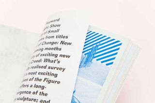
Rather than viewing the limitations as a negative, Lam argues that the challenges involved with Riso inspire a more creative approach. "It forces the artist or designer to really delve into uncoated paper stocks, for which there are hundreds, and find papers that introduce added context to the project."
As far as paper brands go, McManus recommends smooth paper. "I tend to think that Colourplan is a bit too textured to get an overly consistent ink coverage with Riso. Munken produce a wonderful range of papers, and I am a great fan of Popset and Colour Action (as I am of all coloured papers)."
The range of tones available to you with Risography is impressive, and a Riso screen is much finer than the mesh of silk screen, making it easy to achieve a much more subtle range of tones. Experimenting with colour saturation is another variable, as illustrator Sam Peet discovered: "You can specify the percentage of colour you have, so if for instance you are making a pink and green Riso print, you can choose 100% pink and 50% green, which creates a much lighter tone."
Quicker process
"Riso is also much more adept at printing books," adds McManus. "For one thing, it is a much quicker process, which comes in handy if you are printing something with a lot of pages, and the ink is far better for using on thin papers. Riso ink is not wet in the same way as screen-printing ink, and doesn't cause the paper to buckle or become rigid and crunchy."
However there are restrictions within the process, as McManus further explains. "Riso has its limitations - size restriction being one of them. The maximum paper size to go through the machines is A3, and you are limited to printing on uncoated paper stocks (up to roughly 300gsm). Plus, you can't print on wood or steel or fabric."
Offset printing
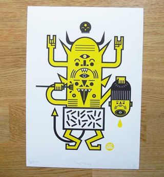
One of the most established and common print techniques, Offset printing involves transferring ink from a plate to a rubber blanket and then on to paper with varying results. When preparing your files for Risograph printing it's good to consider the effect you would like to produce. For example, if you want the image to be offset or if you want to produce a cleaner look by doing a multi colour print.
For Brothers of the Stripe member Sam Peet, experience has taught him that it's best to keep things simple in the beginning, "Try not to go for an 8 colour print straight off the bat. Start with a minimal palette of 2-3 colours till you get the hang of it." Describing his first encounter with Risograph printing, Sam recalls seeing prints by illustrator Rich Fairhead of El Famoso has at Crafty Fox art fair in Brixton a few years ago. "[At the time] I was consciously moving towards more graphic, bold work and [discovering] this technique helped me develop my style and way of communicating visually."
Play around
Together with his brother, Chris Fairhead has been producing Risogrpah prints for years. "I like the fact that layers are offset and don't always exactly line up," he says. "I tend to play around with gradients a lot, so if you are printing a high volume, I recommend having a sample made so you can test the brightness of a colour." Peet agrees: "The unpredictability of the process produces an overlap or flooding of colour on the page. Happy mistakes add a tangibility to the print that other digital processes lack."
Fairhead also recommends taking an experimental approach when starting out. "Go nuts with it. Try colours that you wouldn't normally go for. Try off-setting layers. Try making a zine. Collaborate with other designers and see where your ideas take you."
McManus of Ditto Press agrees that the only way to learn it to get stuck in. "Find a colour swatch of the Riso inks, choose some awesome paper and split your image up into layers. When you see how endless the possibilities are your imagination will run riot."
Self-publishing: Making of The Elder
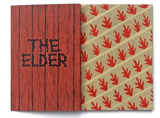
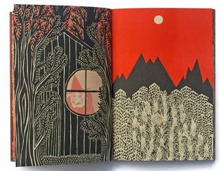
Mcmanus' self-published book The Elder, is a rich and decorative comic produced as a limited run of 100 and printed at Ditto Press. Densely drawn and printed in multi-coloured Riso on coloured papers with a screenprinted gatefold cover, The Elder is a beautiful example of what can be achieved with this technique.
"I often gravitate towards black, red, peach, orange and terracotta within my work, and I didn't stray far from that with The Elder. Colour adds depth and atmosphere to a story, and I wanted to use a combination of coloured papers to suggest emotions like scary/happy or night/day."
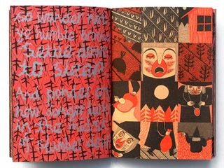
The story tells the tale of an ancient forest dweller and her fears that a community of farmers will alter her way of life. "I produced all my drawings on tracing paper as two layers. I made many dummies of the book during this process, to see how the pacing would allow the story to unfold, and feel what the object would be like when it was bound. I wanted it to have some bulk to it, and feel substantial.
I tested the pages first by screen-printing a few of them, to see if my colour separations looked good to me. When I was satisfied with it all I had the laborious task of setting up the document to print, and picking the final colours for each page. Printing was a very satisfying moment, and I enjoyed being able to print with both Riso and silkscreen. Riso was by far the more relaxing of the two, and the quickest by a country mile!"
This article was originally published in Computer Arts magazine. Subscribe here.
Related articles:


