Warning: the following images may seriously offend your eyes.
Forget how to draw or how to start a blog, in this post we're concentrating on how to kern type. Or not. Every now and again, we come across signs, logos, posters, etc, displaying questionable kerning. Some are frustrating, some are cringeworthy and some are just downright funny.
Here are some of the worst examples we've seen. Let them be a lesson to you: kerning is very important! Here's how not to do it...
01. STOP
This stop sign conjures a different kind of road rage altogether. Whoever painted this little gem was clearly having an off day and should've just, well, stopped.
02. Excuse me?
From afar, the 'c' and 'l' blur in this insurance company's billboard (which has since been taken down) leading a lot of people to read that they should cover their homes in a 'dick' rather than a 'click'. Bad times.
03. Funny. Not.
OUR EYES! OK, so we know this is a deliberate, ironic example of bad kerning, but this design still does what it says on the tin and drives us to distraction.
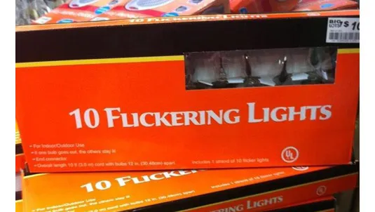
04. 'Special' lighting
We wonder how many people bought these with an idea that they'd end up with something other than just 'Flickering Lights'?
05. For professionals...
Let's hope the sign writers of this design have nothing to do with any of said construction. So bad, it's funny. Kind of.
Get the Creative Bloq Newsletter
Daily design news, reviews, how-tos and more, as picked by the editors.
06. Stop M, yeah?
We're not entirely sure what we're bothered by more, the appalling kerning or terrible punctuation. No, wait, it's the kerning. Definitely the kerning.
Kerrie Hughes is a frequent contributor to Creative Bloq, and was once its editor. One of the original CB crew, Kerrie joined the team back in 2013 after moving from her role as staff writer on 3D World. Since then she's written regularly for other creative publications such as ImagineFX, Computer Arts and Digital Camera World. After a stint working for the police, Kerrie is back reviewing creative tech for creative professionals.