The art of typography, at first, looks pretty straightforward: choose a typeface, fiddle with the size and perhaps alter the colour, right? Wrong. The truth is, there's so much more to effective typesetting than that.
Typography is an almost invisible art form; if successful, the care and attention put into setting type on a page will melt away effortlessly, leaving the content front and foremost in the eye of the reader. As a discipline it's really an act of facilitation – that is to say that it exists to help make the words and meaning the focus, providing a platform for it to shine through.
In other words, typography has to achieve a lot without all the bells, whistles and applause. So it's hardly surprising that it's often misunderstood and abused by designers who haven't been trained specifically in how to handle and set type.
To help you on your way to typography greatness, aside from checking out typography tutorials to see how it's done, we've listed some of the biggest mistakes designers make when it comes to type, and how to avoid them in your own work...
01. Insufficient leading
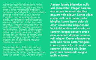
Leading is the space between two lines of type, and is named after the strips of lead used in original metal type press to ensure an adequate gap between the lines. In word processing software such as Microsoft Word, and on the web, it's referred to as line spacing.
Put simply, too little line spacing makes the copy feel bunched up and hard to read. Similarly too much leads to a feeling of disconnection between the lines of type.
There's no absolute hard-and-fast rule to choosing the right amount of leading, but an aesthetic judgement can be made based on how legible the text itself is.
02. Too much positive tracking
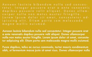
Tracking refers to the space between letters across an entire word or phrase. The greater the tracking, the more the characters that form a word will have space to either side.
Designers commonly use tracking to adjust type so that it fits a particular line length perfectly, and while small adjustments are okay in these circumstances, adding too much tracking can reduce the legibility and readability of the copy.
In general terms, leaving tracking (referred to as letter-spacing on the web) at the default value will provide the best legibility for a specific font. If you're using a font as a headline or display face, it's not uncommon to reduce the tracking to a value of up to -20 in order to make it appear heavier and more like a headline than it would untouched.
03. Confusing tracking and kerning
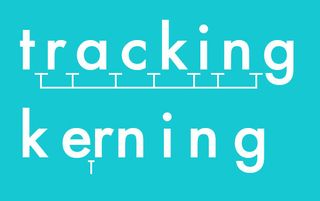
Designers can spend hours poring over the tracking and kerning of their typography. It's important, however, to understand that the two things are not synonymous.
Tracking, as we've already mentioned above, deals with the spacing between characters across an entire word or phrase. Kerning is an adjustment of the specific space between two characters in particular. Kerning is often used to bring characters that naturally have a lot of white space around them closer to their neighbours.
A good example is the combination of the letterforms W and A, which can sit closer together than most fonts will naturally place them, due to the complementary angles that make up their shapes.
04. Using too many faces and weights
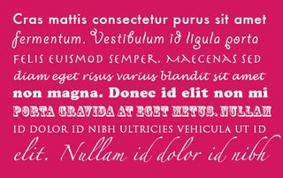
One of the biggest mistakes made by designers, especially those new to the discipline, is a tendency to use too many fonts and weights in a design. As a general principle, it's best practice to limit a piece of work to containing a maximum of three different fonts. You should also choose fonts that complement each other – see our perfect font pairings for inspiration.
Of course there are occasions where you'll need many more than three, but by introducing too many typefaces you'll unsettle the reader, and make the design feel disjointed.
This effect can also be felt when using to many different weights within a specific font, although using the same font with different weights is a little more forgivable.
05. Failing to set reasonable line lengths
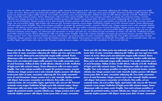
This is another legibility issue that many designers fall foul of: excessive line lengths make it difficult for a reader to find their place on the next line, and can hamper understanding.
In general, it's worth taking a cue from newspapers and magazines, limiting your content's lines to a maximum of 75 characters. Of course there are times when this simply isn't possible, but if your content wraps to more than a couple of lines, you should make every effort to restrict the line length.
06. Inadequate contrast

As with many of the possibilities that modern software provides, just because you can do something, it doesn't mean that you should. One such example is where copy is rendered with insufficient contrast against its background, leading to difficulties reading and understanding the text.
This can either be because the type is set using a colour that's too tonally similar to the background colour, or because it's placed on top of a tinted semi-transparent background that sits above an image.
Either way, this mistake is easily avoided by scrunching up your eyes and checking that you can still make out the characters of your type (as this reduces your colour perception and makes it easier to discern the underlying tonality of different colours).
07. Centering text universally
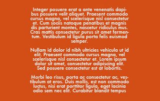
One of the first things you'll often hear a designer say is that you should never centre text.
We don't fully agree with that sentiment; there's definitely a time and place for centred text, and used wisely it can enhance a design significantly. However, novice designers often centre all their text in an attempt to create a sense of balance in their design. This is a critical error as the symmetry is both unsettling and difficult to read – especially in longer passages of text.
Avoid centring text universally, and embrace the asymmetry of a design which features ragged lines, or use justified text where you need a solid block of copy.
08. Two spaces after a full stop
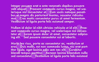
In truth this isn't typically the fault of the designer, but it's worth highlighting simply because so many of these creep through into production. The double-space after a full stop (aka period or full point) is a hangover from the days of typewriters, and was (apparently) necessary to avoid placing the next character too close to the stop.
Modern word processing software, desktop publishing tools, and web browsers all take this into account and can happily render type correctly without the need for this vestige of a bygone era. Let your copywriters know!
Related articles:


