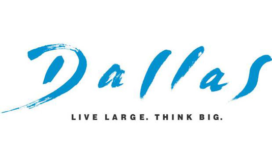
Dallas gets a brand new logo
In a bid to boost tourism, the city's logo and slogan has undergone a complete redesign. What do you think of it?
Sign up to Creative Bloq's daily newsletter, which brings you the latest news and inspiration from the worlds of art, design and technology.
You are now subscribed
Your newsletter sign-up was successful
Want to add more newsletters?

The city of Dallas has a new logo design and slogan, which are part of a new $5 million branding and marketing campaign in a bid to boost tourism. Unveiled today, the new logo replaces the 'Live Large, Think Big' logo, used since 2004.
With an entirely new typeface, the fresh design also uses a star - the shape which features on the Texan state flag - to form the counter of the D.
We like the new, clean look, with a font and colour choice that looks modern and confident - and certainly has to be considered an improvement on the old logo (below), which looks more like it was designed in the 1980s than the 21st century. But we'd love to know what you think...
Article continues below 
In a press release, Phillip Jones, chief executive of the Dallas Convention & Visitors Bureau commented, "The new logo and tag line aim to to convey an image of Dallas as a “city of success … where optimism meets opportunity.”
Liked this? Read these!
- Improve your logo design: 20 pro tips and tricks!
- What is typography? Learn the basic rules and terms of type!
What do you think of the new Dallas logo? Let us know in the comments box below...
Sign up to Creative Bloq's daily newsletter, which brings you the latest news and inspiration from the worlds of art, design and technology.

The Creative Bloq team is made up of a group of art and design enthusiasts, and has changed and evolved since Creative Bloq began back in 2012. The current website team consists of eight full-time members of staff: Editor Georgia Coggan, Deputy Editor Rosie Hilder, Ecommerce Editor Beren Neale, Senior News Editor Daniel Piper, Editor, Digital Art and 3D Ian Dean, Tech Reviews Editor Erlingur Einarsson, Ecommerce Writer Beth Nicholls and Staff Writer Natalie Fear, as well as a roster of freelancers from around the world. The ImagineFX magazine team also pitch in, ensuring that content from leading digital art publication ImagineFX is represented on Creative Bloq.
