Vertex Week day 4: video game art live blog
Join us through the day as we follow along with our artists for Vertex Week 2022. Day 4 is all about video game art.

Welcome to day four of Vertex Week 2022, and we're focusing on video game art. Earlier today we had a talk from Spider's co-founder Jehanne Rousseau, who explained how her team have been using historical references in video game art for new game SteelRising. You can rewatch Rousseau's video below.
We also followed along with Thomas Scholes has he walked through his process for creating an environment concept design using his unique modular process. His video is below to watch at any time.
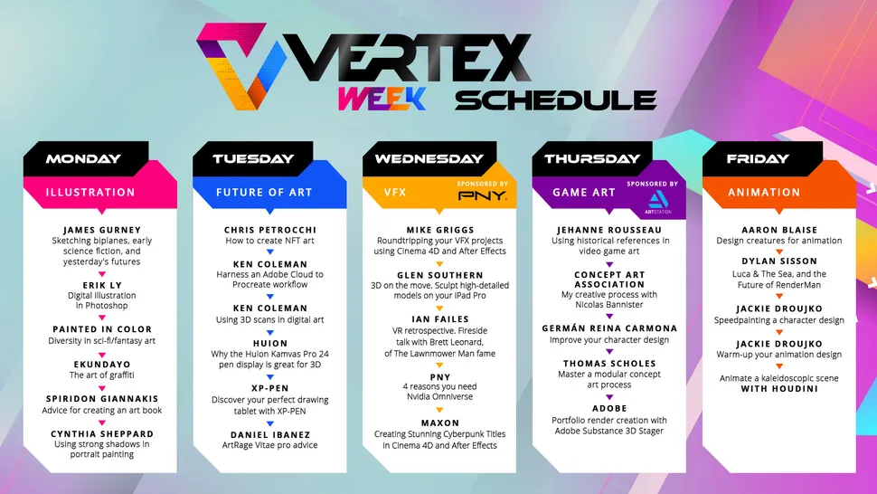
Hello, welcome to day 4 of Vertex Week. We began the day with our first live blog of the day, with Spider's co-founder Jehanne Rousseau. Now we're watching Thomas Scholes as he shares his modular concept art workflow. Follow along with us as we watch.
This game looks great, we love its references for the French revolution and time period. The detail on these 'robots' or automatons is really nice. These mechanical designs are based on real ideas from the 18th century.
France's history is rich with wonderful characters so it seems obvious to base a game on this time period. The art and architecture, the baroque art movement, all feel like a perfect fit for an historical fantasy game.
Using historical references made the team's job 'easier' but had its own problems. But by using old maps of Paris and looking at the buildings around them the team could "immerse ourselves into a historical Paris".
By using characters and places everyone in the team new about and was familiar with helped the team. Jehanne says using cultural references a team knows well can lead to greater creativity and you can avoid cultural problems.
The team has taken an actual melody an 18th century automaton would play and added it to the game.
This game's character designs are so elegant. This composition looks familiar and famous. Can you guess what it is?
Some great concept art being shown here, and now we know a little more about how it was created. The team are based in Paris so are able to gather references, paint in the street, and take inspiration from their surroundings.
The character movement is interesting, there's a mechanical stiffness to the movement. The character can move in 360 directions, so that must take some time to get right!
That was great from Jehanne. The game looks fantastic, it's art direction is quite unique. Don't forget, you can rewatch this video at any time.
If you're looking for more video game art inspiration, why not take a look at our guide to the best laptops for gaming or the advice on how to press start on your game art career.
If you want to see more of this tutorial then order a copy of ImagineFX issue 208 from our store, magazines direct. This game art special includes a print version of what Thomas is showing here as well as interviews with the team behind Final Fantasy XIV.
And we're off…
Thomas’ 30 minute tutorial is designed to get up and running fast. If you want to see episode 2 visit Thomas’ YouTube channel. Or order a copy of ImagineFX issue 208 from magazines direct to read more on this workshop and get the PDF.
Thomas begins by chopping up his existing image using the Polygonal Lasso tool. He’s cutting away sections that interest him in small angular blocks. These are dropped on to a square canvas.
Using this process Thomas can grab anything that catches his eye. He’s using the new canvas/document as a sketchbook. Anything goes. Just keep cutting and collecting.
Keep an eye out for objects that may simply be used as textures rather than objects themselves, says Thomas. He’s looking for objects that can break up angles, colour palettes.
“If a tool is hard to use you won’t use it,” says Thomas. So make your life easier by setting up shortcuts.
“Play,” says Thomas as he compares his process to Lego. “Get inspired by what’s possible rather than impose expectations.”
Thomas’ concept is building nicely, it’s quite a mesmerising thing to watch happen.
Thomas is mirroring the canvas to check the composition and his shape design. He has a mirror function set to a hotkey. He’s looking for a rhythm in the scene.
A character is added for context and helps Thomas refine the environment, to create areas of high contrast and other areas of detail. He says he hates designing characters and does it once a year in bulk – he’s an environment artist through and through.
He’s working on values and readability now. He wants to create paths that lead the eye into and around the scene.
Some of Thomas’ props are over a decade old, but he likes the consistency they offer.
He’s working through some colour value options, using layers.
He crops the image to reduce the file size but he’s also able to use ‘Content Aware Scale’ in Photoshop to pull the image and create a new size.
He adds a chicken! (But a duck will do.)
The Liquify tool is used to pull and push sections of his scene.
Remember, you can watch more of Thomas’ videos on his YouTube channel.
This image was created by chopping up one image to make a kit of pieces. Thomas recommends using multiple images, and using old or unfinished sketches. (Episode 2 is on his YouTube channel.)
Thanks Thomas, remember to visit his YouTube channel for more great tutorials or order a copy of ImagineFX issue 208 from magazines direct to read more on this workshop.
We're here following Germán Reina Carmona's process for creating stylised character designs for video games.
He draws ‘weird stuff, and we love it.
We’re getting tips for designing ‘crazy characters’.
Who’s this weird eggman?
Take a look at our guide to the best tablets for drawing to doodle digitally like Germán.
We can’t decide which is our favourite character, maybe the top right guy with his cute face poking through the shell.
Kind of off-putting, that one is a broken egg with a chick’s face.
We’re into part 2 and Germán is cleaning up the lines, we think he’s kidding when he says it’s “super fun”.
Oh, erm, the double-yoke guy there in the corner is… weird.
Germán has stories behind these odd little doodles… he’s a fried egg turned upside down and his body is dripping out of the yoke.
Part 3, adding flat colours to the line art. You can automate some of this stage in Photoshop. He uses mask > select > inverse to fill his line art with colour. This can be saved and reused as a shortcut.
He’s changing the link art colour here to speed up the colouring process later. He’s masking off areas of the line art to fill sections with clean and flat colours.
The same simple colours are used across all the characters to connect them as a set.
Think about the animation when designing your characters, says Germán. Think about how it will move and not just how “cool” it is, he says.
Just some small details to add now, shadows here and there. Even if some details or art doesn't appear in the game it's worth creating as it can form a mood board or be used to improve features in the game.
Germán says he designs characters he loves to work on and with like-minded people to brainstorm. He's not interested in creating lifelike or realistic designs. The lesson here is create the art you love and you'll find your own way in the industry.
Thanks Germán! That was awesome, wonder if we'll get the egg game any time soon?

Thank you for reading 5 articles this month* Join now for unlimited access
Enjoy your first month for just £1 / $1 / €1
*Read 5 free articles per month without a subscription
Join now for unlimited access
Try first month for just £1 / $1 / €1
