The London Underground map is one of the most iconic in the world. Designed by Harry Beck in 1931, it began simply but the addition of new lines has ballooned the map into an overcrowded mass of interchanging multi-coloured lines. Well, it looks like a major redesign could be on the cards as plans have been announced to shake up one of the newest and most confusing parts – the Overground network.
The London Overground lines weave their way across the map in orange, creating a somewhat convoluted network of lines and junctions, and making the map pretty hard to navigate at first glance (think of the poor tourists). It's a map that rivals the best infographics out there, but it is clear it needs work (if you happen to be heading to the UK capital, see our guide to the best hotels in London).
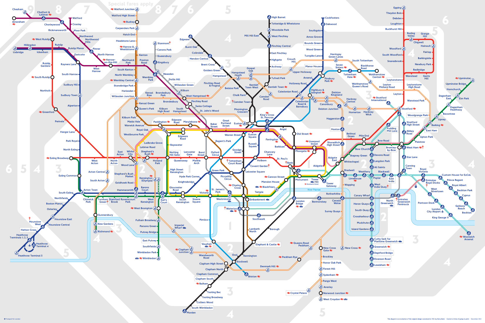
The current map is beginning to feel a little overwhelming (Image credit: TFL)
Current London Mayor, Sadiq Khan, announced plans to redesign the map if he wins the mayoral election in May. Khan wants to give an individual identity to each of the six lines that make up the Overground network (yes, there are six – not that you'd know it from the homogenous orange colour of all of them). According to Khan's manifesto, each line would have a new name and though the manifesto doesn't mention colours specifically, we assume it'd need a diverse set of colours, too.
Though a bunch more colours could risk complicating the design further, if handled correctly an update of this sort could be welcome as the overwhelming nature of the current map is at odds with Beck's original plan. He ditched the usual limitations of scale and location accuracy in order to simplify the experience as much as possible with his groundbreaking system, based on electrical charting. But how could a redesign be achieved?
This concept was created in 2019 (Image credit: Luke Carvill)
In 2019, this drastically different concept for the London Tube and Rail map caught our attention (above), created by designer Luke Carvill. This interpretation veers away from the straight intersections of the current map, creating a sweeping circle for the London Overground instead – a design that definitely makes the presentation more approachable.
So far, there's no indication of how the design aesthetic might change, but we assume it will be handled with care. Want to explore London Underground design of a different kind? Here are our favourite London Underground posters from over the decades.
Read more:
Get the Creative Bloq Newsletter
Daily design news, reviews, how-tos and more, as picked by the editors.
Georgia is lucky enough to be Creative Bloq's Editor. She has been working for Creative Bloq since 2018, starting out as a freelancer writing about all things branding, design, art, tech and creativity – as well as sniffing out genuinely good deals on creative technology. Since becoming Editor, she has been managing the site on a day-to-day basis, helping to shape the diverse content streams CB is known for and leading the team in their own creativity.