The best free fonts offer plenty of options for your designs without costing anything. Whether you're looking for a classy serif, a clean sans-serif, vintage fonts or something completely different, there's no shortage of choice. In fact there, are so many free fonts out there that it can be hard to know where to start looking.
To make it easier for you to find what you're looking for, we've gathered together the best free fonts that we've found in our regular searches of the web. If you're not sure how to use your font once you've got it, see our handy tutorial on how to add fonts in Photoshop. We also have a beginner's guide to font design, Just make sure you brush up on font vs typeface first.
One good resource for fonts, including free fonts, is MyFonts. This library offers a mix of free and paid-for typefaces. Check that out via the link below, or scroll on for our picks of the best free fonts available now.

Buy fonts from myfonts.com
Browse a huge range of fonts and find inspiration for projects of all kinds. Myfonts.com by Monotype features over 130,000 fonts, from brush fonts to display fonts, and more than 900 of them are completely free.
The best free fonts: Serif fonts
01. Giveny

- Free for personal use
- Download Giveny from Behance
Kicking off our top picks of the best free fonts is this stunning serif by Craft Supply Co. Giveny is a stylish and contemporary font that adds a classy look to a diverse range of projects. It's defined as a "fusion of pure geometry and optical balance", that takes inspiration from traditional serif styles. Use it for posters and logos, or personal projects like blogs and invitations to add a luxury feel to your design.
02. Carena
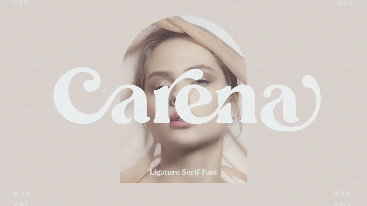
- Free for personal use
- Download Carena from Behance
Carena is a beautiful minimalistic typeface perfect for that rustic yet elevated look. This sleek modern font is in a ligature style, making it perfect for projects that require a more delicate style, ideal for wedding invitations, editorials and personal projects.
03. Harmony

- Free for personal use (commercial licences available from $14)
- Download Harmony from Behance
Harmony is available for download from Behance. This is a stylish modern font that features some gorgeous shapes that make it perfect for a more elegant touch. It is easy to read and professional looking, making it a great option for those looking for a bold statement. It is free for personal use, but also has a variety of licences available for commercial use.
04. Editorial New

- Free for personal use (commercial licences available from $30)
- Download Editorial New from Pangram and Pangram on Behance
This is a great offering from Pangram and Pangram. Editorial New is described as a precise narrow serif designed for long-form copy but with a big-enough personality to be used for titles too. It has a 90s editorial feel but still comes across as rich and contemporary. It comes in seven weights, from ultralight to heavy. Just note that you'll need to buy a licence if you want to use this one for commercial use.
Get the Creative Bloq Newsletter
Daily design news, reviews, how-tos and more, as picked by the editors.
05. Young Serif

- Free for personal and commercial use
- Get Young Serif from NoirBlancRouge
Young Serif consists of heavy, old-style letterforms that call to mind vintage books of yesteryear, It takes inspiration from fonts like Plantin Infant and ITC Italian Old Style, but adds a few flourishes of its own. For instance, some of the letters in Young Serif have interesting axis tilts (you can see in the lowercase 'e', above), and others have generously rounded curves – see the lowercase 'b' and 'f'. In total, the font consists of 348 glyphs.
Created by Bastien Sozeau, the free font was originally distributed by the creative studio Uplaod. It's open-source, licensed under the SIL Open Font License, meaning it can be used, modified and redistributed freely – as long as you aren't selling it.
06. Cormorant

- Free for personal and commercial use
- Get Cormorant from Google Fonts
This is one of the most elegantly formal of the free fonts we've seen – an open source display font that consists of 45 font files spanning nine visual styles and five weights. Cormorant was developed by Christian Thalmann of Catharsis Fonts, and most of its glyphs have been drawn from scratch, giving it a gorgeous distinctiveness. For us, it treads a really neat line between expressiveness and formality, making it an excellent choice for all sorts of applications. There are echoes of the 16th-century typefaces of Claude Garamont in there, though Cormorant has enough of its own personality to not feel derivative.
07. Alegreya

- Free for personal and commercial use
- Get Alegreya from Google Fonts
Looking to design your own book cover? This is an excellent choice of free font – it was crafted by Argentinian designer Juan Pablo del Peral expressly for the purposes of book design. As such, it's an eminently readable font, with a rhythm to it that facilitates the absorption of long texts. It's won awards for its simple elegance, as you can see in the image above, and we love it for its fresh, approachable take on a calligraphic style.
There aren't so many great free fonts created for specific purposes, but here's a strong exception. Alegreya is an award-winning typeface by Argentinian designer Juan Pablo del Peral crafted with book design in mind. With a dynamic and varied rhythm aimed at facilitating the reading of long texts, it provides a fresh and approachable take on the calligraphic style.
08. Restora

- Free for personal and commercial use
- Get Restora from pixelsurplus.com
We love this twist on a classic style – Restora is a fantastic combination of bright, friendly letterforms with an embellishment that feels vintage and classic. It's designed by Nasir Udin, and in its free version it also includes Restora Extra Light and Restora Thin Italic, giving you a good deal of versatility. Whether you want to use it for general editorial text, a book cover or just a simple bit of branding, Restora will fit the bill really well.
09. Emberly

- Free for personal and commercial use
- Get Emberly from Rajesh Rajput on Gumroad
One for the fashionistas, Emberly is a free font that evokes a classic magazine feel. It was created by Rajesh Rajput, taking a few cues from the Didone style, and is also available as a variable font. If you're putting together a magazine cover or a poster, Emberly will give it a feel that's both modern and classic.
10. Rude

- Free for personal and commercial use
- Get Rude from pixelsurplus.com
We love Rude – an immediately striking font created by Masha Chuprova. This serif was painstakingly handcrafted, and is especially good for short, striking headers, slogans and statements. We can see it fitting well into a logo, or making for a good visual pop on an item of clothing, or running across the top of a poster.
11. Grenze

- Free for personal and commercial use
- Get Grenze from Omnibus-Type
We love the visual punch of Grenze, but what's even more impressive is how it manages to make so much impact without sacrificing readability. Created by Renata Polastri and Omnibus-Type, Grenze was originally designed for magazines, but it's versatile enough to potentially work for pretty much anything.
12. Libertinus Serif

- Free for personal and commercial use
- Get Libertinus from Font Squirrel
Now here's a classic-looking serif. Libertinus is a free font that comes in 14 styles, and is useful when you want to add a bit of simple class to a design. It's another font that's available under the SIL Open Font Licence, so you can do pretty much whatever you like with it. A fork of the Linux Libertine and Linux Biolinum font, it also addresses some of the bugs in those designs.
13. Free Saint George Stencil Font

- Free for personal and commercial use
- Get Saint George from Behance
Fans of the classic font Georgia will appreciate this experimental tribute by Vedran Vaskovic. Apparently, it's inspired by the Christian legend of Saint George the dragon-slayer – but more important, it's made up of a collection of cheeky, playful stencil shapes that are perfect for adding a little flair to your designs.
14. Colus

- Free for personal use
- Get Colus from fontfabric.com
With an imposing, classical feel, Colus is great for when you want your designs to feel a little more sombre. It's inspired by carved letter inscriptions in wood and stone, and as such, it hearkens back to the classical ages. An excellent choice of free font for making posters that have a little more sophistication to them.
15. Amagro

- Free for personal and commercial use
- Get Amagro from Font Squirrel
For making a big impact (no pun intended), check out this all-caps serif typeface from Fabio Servolo. Amagro consists of strong, angular serifs that are especially good for making imposing headlines, but it's also got some nice touches like a stylish ampersand, and easy-to-read numerals.
16. Poly

- Free for personal and commercial use
- Get Poly from Font Squirrel
Writing on the web? Poly is a good choice of free font – it's a medium-contrast serif designed specifically to offer better legibility than other web serifs, even when used at small point sizes. The trick is its vertical emphasis – with short ascenders and a high x-height, it offers tremendous clarity.
17. Bitter

- Free for personal and commercial use
- Get Bitter from huertatipografica.com
Sans-serif fonts tend to work better for screen use, but this free slab serif typeface has been designed specifically to provide a comfortable reading experience on screens. Bitter was designed by Sol Matas. It's available through Argentinian type collaborative Huerta Tipográfica.
18. Playfair Display

- Free for personal and commercial use
- Get Playfair Display from Font Squirrel
Designed by Claus Eggers Sørensen, this free display font takes inspiration from the 18th century Enlightenment and the work of John Baskerville. Its high-contrast letterforms have delicate hairlines, reflecting the rise of pointed steel pens, which took over from broad nib quills during the period. Functionally and stylistically it can be accompanied by Georgia for body text.
19. Lora

- Free for personal and commercial use
- Get Lora from Font Squirrel
Lora was originally designed for type foundry Cyreal in 2011, with a Cyrillic extension added in 2013. Brushed curves contrast with driving serifs for a well-balanced, contemporary feel. Although technically optimised for use on the web, it's one of the best fonts for print projects too. It comes in four styles.
20. Butler

- Free for personal and commercial use
- Get Butler from Fabian De Smet
Inspired by both Dala Floda and the Bodoni family, Butler is a popular free font designed by Fabian De Smet. His aim was to add some modernism by working on the curves of classical serif fonts and adding an extra stencil family. He suggests Butler would work well for “posters, very big titles, books and fancy stuff”.
21. Crimson Text

- Free for personal and commercial use
- Get Crimson Text from Font Squirrel
Not many free fonts are created specifically for book production, but here's a great exception, inspired by old-time, Garamond-esque book typefaces. Crimson Text is the work of German-born, Toronto-based designer Sebastian Kosch, who says he was influenced by the work of Jan Tschichold, Robert Slimbach and Jonathan Hoefler. It’s a favourite free font of Taylor Palmer, a senior UX designer based in Utah, USA. "Crimson is a sophisticated serif that makes a nice alternative to traditional Garamond-esque typefaces,” he says. “It also has a very expressive italic, which pairs nicely with strong, geometric sans-serifs like Futura or Avenir."
22. Aleo

- Free for personal and commercial use
- Get Aleo from Graphic Pear
Aleo has semi-rounded details and a sleek structure, creating a strong sense of personality while maintaining balance with a good level of legibility. This family of free fonts was designed by Alessio Laiso, a designer at IBM Dublin, as the slab serif companion to Lato.
23. Libre Baskerville

- Free for personal and commercial use
- Get Libre Baskerville from Google Fonts
Libre Baskerville is a web font optimised for body text (typically 16px). It’s based on the American Type Founder's Baskerville from 1941, but it has a taller x-height, wider counters and a little less contrast, allowing it to work well for reading on screen. This open source project is led by Impallari Type. Taylor Palmer also recommends its sister font, Libre Franklin, which is also free.
24. Slabo

- Free for personal and commercial use
- Get Slabo from Google Fonts
Designed by John Hudson, Slabo is a growing collection of size-specific free fonts for the web, fine-tuned precisely for use at those specific pixel sizes. The blocky feel of its ligatures gives a modern twist to the serif font, making Slabo perfect for online designs.
25. Merriweather

- Free for personal and commercial use
- Get Merriweather from Google Fonts
A hugely popular open-source serif font, Merriweather has its own project on GitHub. It was designed by Sorkin Type to be easy to read on screens. It features a very large x-height, slightly condensed letterforms, a mild diagonal stress, sturdy serifs and open forms.
26. Woodland

- Free for personal use
- Get Woodland from PangramPangram Foundry
This beautiful curvy serif typeface has six weights, and the bold and ultralight versions are offered for free for personal use. It features strong, squared serifs and wide terminals. Touches like the rounded crossbar in the lowercase E give a soft quirkiness to its personality. You'll need a licence if you want to use the other weights or if you want to use it in work for clients.
27. Streusel Kuchen

Serif fonts aren't all serious. Kellie Jane Studio injects a lot of fun into this cute serif font that creates a natural handwritten look. It's a nice addition for crafty projects or for the branding of homemade produce.
- Free for personal and commercial use
- Get Streusel Kuchen from fontbundles.net
The best free fonts: Sans-serif fonts
28. Aquiver

- Free for personal use
- Download Aquiver on Behance
Aquiver is an effortlessly cool contemporary font that's perfect for adding a bit of edge to your projects. The hand-drawn sans serif created by Jessica Solomon is perfect for posters and bold creative projects that require a big impact that stands out from the crowd.
29. Printvetica

- Free for personal and commercial use
- Get Printvetica from Javier Guaschetti on Behance
Created by design director Javier Guaschetti, Printvetica is inspired by old Letraset designs and posters printed with san-serif typefaces. It has rough edges for a vintage look that looks great on posters and flyer designs, be it in colour or in black and white.
30. Newake

- Free for personal use
- Get Newake from Behance
Combining both humanist and geometric elements, Newake is a versatile sans serif that has slightly rounded corners that provide an elegant line to text designs. Created by the Indieground team, Newake is perfect for creating standout titles, logos, editorial, packaging and web design. The font demo is free for personal use and if you need you can also buy the regular commercial version includes the full characters set.
31. Obrazec

- Free for personal and commercial use
- Get Obrazec from Behance
Obrazec is an uncompromising, industrial-style sans serif created by Ilya Zakharov. This sturdy and confident typeface is one of the best free fonts for adding strength and personality to your branding projects, whether you're working on logo design, promotional materials, or advertising.
32. Archive Grotesk

- Free for personal and commercial use
- Get Archive Grotesk from Behance
Created by Tomas Clarkson, Free Archive Grotesk is a clean and minimalist sans that features uppercase, lowercase and numerals. It’s one of those free fonts that would work well in everything from headlines and magazine page furniture to invitations, calendars, postcards and fashion designs
33. Animosa

- Free for personal and commercial use
- Get Animosa from Behance
Animosa is a clean modern sans-serif that comes with a wide range of unique characters. from Created by Stefano Giliberti, this font is available in five weights and includes 93 languages and 508 glyphs. It's one of the best fonts we’ve seen for drawing the reader’s eye to the page, and keeping it there.
34. Red Hat

- Free for personal and commercial use
- Get Red Hat from GitHub
If you're not down with Linux and open source then this name's not going to mean a lot to you; don't worry too much about that, because all we're interested in here the font, designed by Jeremy Mickel. It's inspired by American sans serifs, and comes in two optical sizes and a range of weights.
35. Public Sans

- Free for personal and commercial use
- Get Public Sans from public-sans.digital.gov
Based on Libre Franklin and created as part of the United States Web Design System, Public Sans is a free, open source web font designed to be used in interfaces, text and headings. It's a strong, sober font with a neutral look, plenty of weights and as few quirks as possible; ideal for serious projects where you're trying to avoid unnecessary visual distraction.
36. Loki

- Free for personal and commercial use
- Get Loki from Wildpicks
Loki is a bit of a hybrid font, it's a hand-written brush script with a sans serif base, and contains some rather pleasing curves. Created by Krisjanis Mezulisand Ieva Mezule, this is one for making a statement, and works particularly well in large titles.
37. Salt

- Free for personal and commercial use
- Get Salt from pixelsurplus.com
Atmospheric font Salt comes in two weights: regular and bold. It was created by Masha Chuprova and has a 'low centre of gravity'. Note that you'll need to give your name and email to Pixel Surplus in order to download it for free.
38. Alcubierre

- Free for personal and commercial use
- Get Alcubierre from webdesignerdepot.com
Geometric sans serif typeface Alcubierre is the work of designer Matt Ellis. Following in the footsteps of his original free font Ikaros, this clean, minimal typeface works for a variety of uses.
39. Big John / Slim Joe

- Free for personal and commercial use
- Download Big John / Slim Joe from Dropbox
Big John was created by designer Ion Lucin for his personal use. Eventually, he decided to share it on Behance, and then went on to add an ultra-light sister font: Slim Joe. Both are all-caps fonts, and contrast perfectly when combined together. These free fonts are ideal for titles and headlines.
40. Titillium Web

- Free for personal and commercial use
- Get Titillium from Cufon Fonts
As free fonts go, Titillium has a highly respectable pedigree, born of a type design project at Italy’s Accademia di Belle Arti di Urbino. Each academic year, a dozen students work on the project, developing it further and solving problems.
"Titillium has been a favourite font of mine for a few years now," says Rob Hampson, head of design at The Bot Platform, a platform for building bots on Messenger. "It’s sharp, contemporary and comes in a wide range of weights. In my opinion, it works best in larger sizes; for example, for titles. That said, with careful consideration, it could be used as a body font."
41. Atami

- Free for personal and commercial use
- Get Atami from Behance
Atami's a pretty experimental typeface that comes in two different weights and three styles. Made by Andrew Herndon, we think it would be a particularly good choice for creating posters and logotypes.
42. Chivo

- Free for personal and commercial use
- Get Chivo from Google Fonts
Chivo is a grotesque typeface that’s ideal for headlines, and other page furniture where you want to grab attention. Both confident and elegant, it’s been released in four weights with matching italics. This free font is the work of Héctor Gatti and the Omnibus-Type Team.
43. Comfortaa

- Free for personal and commercial use
- Get Comfortaa from Google Fonts
Comfortaa is a rounded geometric sans-serif type design intended for large sizes. Created by Johan Aakerlund, a design engineer at the Technical University of Denmark, it’s a simple, good looking font that includes large number of different characters and symbols. Part of the Google Font Improvements Project, the latest updates to the family include the addition of a Cyrillic character set and support for Vietnamese.
David Airey, a graphic designer and occasional writer in Northern Ireland, is among its admirers. "A lot of free fonts need too much work cleaning up the points, but that doesn’t mean you can’t find good options," he says. "For an identity project, I used Comfortaa as the base for a bespoke wordmark. The before and after are really quite different, but Johan’s work gave me a great foundation, and the client loves the result."
44. Noto Sans

- Free for personal and commercial use
- Get Noto Sans from Google Fonts
Noto Sans is a free font family designed by Google supporting more than 100 writing systems, 800 languages, and hundreds of thousands of characters. Noto fonts are intended to be visually harmonious across multiple languages, with compatible heights and stroke thicknesses. The family include regular, bold, italic and bold italic styles, and it has a serif sister family, Noto Serif.
45. HK Grotesk

- Free for personal and commercial use
- Get HK Grotesk from 1001 Fonts
HK Grotesk is a sans-serif typeface inspired by the classic grotesques, such as Akzidenz Grotesk, Univers, Trade Gothic and Gill Sans. It was designed by Hanken Design Co with the aim of creating a friendly and distinguishable font that’s suitable for small text. It has recently expanded its language support with the addition of Cyrillic characters (Bulgarian, Russian and Serbian).
46. Aileron

- Free for personal and commercial use
- Get Aileron from tipotype.com
Aileron is a versatile, neo-grotesque sans-serif that’s somewhere between Helvetica and Univers. Created by Sora Sagano, a designer at Tipotype, it aims to provide readers with a high level of visual comfort. It’s available in 16 weights, from ultralight to black.
47. Ubuntu

- Free for personal and commercial use
- Get Ubuntu from ubuntu.com
This free font has been specially created to complement the tone of voice of Ubuntu, the Linux operating system for personal computers, tablets and smartphones. Designed by font foundry Dalton Maag, it uses OpenType features and is manually hinted for clarity on desktop and mobile screens.
48. Clear Sans

- Free for personal and commercial use
- Get Clear Sans from 01.org
Clear Sans is a versatile font designed by Intel designed with on-screen legibility in mind. Suitable for screen, print, and web, this free font is notable for its minimised characters and slightly narrow proportions, making it a great choice for UI design, from short labels to long passages.
49. Source Sans Pro

- Free for personal and commercial use
- Get Source Sans Pro Google Fonts
Released in 2012, Source Sans Pro was the first open source type family for Adobe, and has proved wildly popular. It was envisioned as a classic grotesque typeface with a simple, unassuming design, intended to work well in user interfaces. It was designed by Paul D. Hunt, who continues to work as a type designer at Adobe.
Source Sans Pro is one of the favourite free fonts of James Hollingworth, a senior-level digital designer and illustrator based near Bath, UK. “It’s such a solid, reliable font to use in design work,” he enthuses. “Being dyslexic myself, I find it a very easy font to read, and it works brilliantly in user interfaces.”
50. Misto Font

- Free for personal and commercial use.
- Get Misto Font from Google Drive
Designed by Katerina Korolevtseva, Misto font is a tribute to her hometown of Slavutych in Ukraine. It features sharp contrasts in stroke width, which are inspired by the town’s postmodernist architecture and utopian ideals. This is a multilingual display sans serif, which supports both Latin and Cyrillic. Katerina asks designers using the font to share their designs on Instagram with the hashtag #mistofont.
The best free fonts: Handwriting fonts
51. Kimpo

- Free for personal or commercial use
- Download Kimpo here
Kimpo is a charming handwritten font created by illustrator Elliot C. It resembles his own handwriting, bringing a wonderfully bespoke appeal to any project. The textured effect of the font gives it a hand drawn feel that's perfect for websites, posters and as a delightful accommodation to illustrations.
52. Cervanttis

- Free for personal use
- Get Cervanttis from Behance
With an effortless style and flow, Cervanttis Signature Script is one of our favourite free handwriting fonts and a great choice if you’re looking for a handwritten signature script. Crafted by Mats-Peter Forss, it’s one of the best free fonts for conveying the look and feel of handwriting. It would work well in logos, branding, advertising and social media posts.
53. Timothy

- Free for personal and commercial use
- Get Timothy from Behance
Handwriting fonts don't have to be about swirly letters. In this hand-drawn font, Timothy, it's block capitals that add a hand-written touch. Timothy was inspired by designer Timothy Goodman and we think it'd be a good choice when designing invitations. Note that you'll need to supply an email address.
54. Kavivanar

- Free for personal and commercial use
- Get Kavivanar from Google Fonts
Designed by Tharique Azeez, this bold handwriting font was inspired by the slanting letterforms found in typical Tamal handwriting. As well as a Tamil alphabet, it also includes Latin letterforms.
55. Tomato Soup

- Free for personal and commercial use
- Get Tomato Soup from pixelsurplus.com
If you ever feel like you want to recreate the scratchy handwriting of your doctor or perhaps teacher, this is the font for you. Tomato Soup was made by Typed.one and looks best when there's less text – we wouldn't recommend writing out passages with it.
56. Ambarella

- Free for personal and commercial use
- Get Ambarella from pixelsurplus.com
Ambarella is a beautiful free font from Polem Studio. The handwritten design in a modern calligraphy style includes various swashes, alternates and Western European characters.
57. Nickainley

- Free for personal and commercial use
- Get Nickainley from Behance
Nickainley is one of our favourite free handwriting fonts. This Monoline script with a classic, vintage feel, includes uppercase and lowercase characters, as well as numerics and punctuation marks. Created by Seniors Studio, potential use cases of this font include logos, T-shirt designs, letterhead and signage.
58. Shadows into Light

- Free for personal and commercial use
- Get Shadows into Light from Google Fonts
Shadows Into Light is the work of type designer Kimberly Geswein of Principal Design. Featuring rounded edges and neat, clean characters, this lovely handwriting font would be ideal for adding a personal touch to your projects.
59. Pacifico

- Free for personal and commercial use
- Get Pacifico from Google Fonts
Pacifico is a fun brush script handwriting font inspired by 1950s American surf culture. This open source font was one of the great contributions to the free software community by the late designer Vernon Adams.
60. Cute Punk

- Free for personal and commercial use
- Get Cute Punk from Behance
Cute Punk offers a vibrant, youthful and thoroughly modern take on the handwriting font. Infusing the style with a striking, almost geometric feel, this free font is the work of Flou, a designer and illustrator from Bratislava, Slovakia.
61. Yellowtail

- Free for personal and commercial use
- Get Yellowtail from Google Fonts
Yellowtail is an old-school, flat, brush font that evokes classic 1930s typefaces like Gillies Gothic and Kaufmann. Designed by typography institute Astigmatic, its mixture of connecting and non-connecting letterforms gives it a unique look and ensures good legibility.
The best free fonts: Vintage and retro fonts
62. Retrome

- Free for personal use
- Download Retrome on Behance
Retrome is an effortlessly cool retro-inspired font that brings a groovy '70s vibe to your projects. The sans serif created by Pixel Surplus has a stylish graphic look that's perfect for large-scale use. Emulating the style of vintage VHS tapes, it adds an easygoing vintage flair to any design.
63. Nimitz

- Free for personal and commercial use
- Get Nimitz from Behance
Designed by Bart Wesolek, Nimitz is a simple yet original, all-capitals font that comes in three styles: rough, clean and textured. Beautifully readable and effortlessly stylish, this is one of the best free fonts for giving your design project a retro or vintage look.
For more retro fonts, see our roundup of the best free retro fonts.
64. Rousseau Deco

- Free for personal and commercial use
- Get Rousseau Deco from Behance
Looking to summon the spirit of Art Deco with your typography, but subtly? Rousseau Deco is one of the best free fonts for your purposes. Taking inspiration from that classic style and giving it a modern sans-serif twist, it was designed by Mariano Diez.
65. Lazer 84

- Free for personal use (make a donation for commercial use)
- Get Lazer 84 from Sunrise Digital
Here's one of those free fonts that defies categorisation: it's clearly retro, but it's a brush font too. However you describe it, though, we love its super-1980s vibe, and can imagine it used as the opening titles of a old-school sitcom. This font was created by Juan Hodgson.
66. Nature Sans

- Free for personal and desktop commercial use
- Get Nature Sans from Behance
Nature Spirit is a vintage font by Alex Joganic of 1871 Project. The retro styling recalls hippy communes and an adventurous spirit, making it well suited for a vintage project. There are two styles – rough and regular – depending on whether you like your lines straight or a little rough round the edges.
67. Cheque

- Free for personal and commercial use
- Get Cheque from Font Fabric
Based on geometric shapes and with a classic, vintage look, Cheque started off as a student project by Fontfabric's Mirela Belova, then grew into a full display font. At its best when used in headlines or compositions, it comes in Regular and Black versions that are free for both personal and commercial use.
68. LOT

- Free for personal and commercial use
- Get LOT from Font Fabric
Reminiscent of the stylised block lettering of 1970s and 1980s advertising, posters and magazine design, LOT nonetheless provides a sleek new take on a vintage style with its collection of fat, geometric letterforms. Designed by FontFabric, this free font would work well in posters, logos and headlines.
69. Jocker

- Free for personal use
- Get Jocker from Pixelify
Jocker is a vintage font design with a fun, circus feel, and would be a great choice for posters, logo designs and packaging. The work of Craft Supply Co, this font was drawn from scratch and has since had more layers of detail added to it.
70. Paralines

- Free for personal and commercial use
- Get Paralines from Behance
Featuring idiosyncratic use of parallel lines, Paralines takes inspiration from both decades-old design and modern-day typography. Designed by Lewis Latham, this free font would suit any project aiming to evoke the graphic design of the 1970s and early 1980s.
71. Hamurz

- Free for personal and commercial use
- Get Hamurz from Behance
Hamurz is a hipster-style retro typeface with rough edges and rounded shapes. Created by Bagus Budiyanto, it offers a multitude of potential uses, such as logos, headings, or designs for T-shirts, badges or letterpress printing.
The best free fonts: Brush fonts
72. Strive

- Free for personal use
- Download Strive on Behance
Created by Pixel Surplus, Strive is a stylish brushstroke font that emulates the look of hand-painted lettering. The chunky all-caps style is perfect for quotes, signs, social media and marketing, giving your project a unique, punchy edge.
73. Fjord

- Free with an Envato membership
- Get Fjord from Envato
Fjord is inspired by Norway's natural, rugged landscape. Originally drawn with a thick brush on plastic to appear uniquely distorted, painter Krisjanis Mezulis has made this font both chilling and beautiful. This font is versatile enough to be used in a variety of different contexts.
Want more? See our dedicated free brush fonts roundup for more options.
74. Oh Now!

- Free for personal and commercial use
- Get Oh Now! from pixelsurplus.com
This beautifully textured brush font by Syaf Rizal has an edgy feel that can’t help grab attention, and would work well on perfect on posters, logos and branding. Oh Now! comes with uppercase, lowercase, punctuation, symbols and multilingual support.
75. The Cat Has a Hat

- Free for personal and commercial use
- Get The Cat Has a Hat Behance
Inspired by the classic children’s books by Dr Seuss, this playful font is scrawl-like but still perfectly readable. One of the best fonts we’ve seen for adding a sense of personality to your branding and marketing projects, The Cat Has a Hat was designed by Lukee Thornhill.
76. Mustache Free

- Free for personal and commercial use
- Get Mustache Free from All Freet Fonts
There’s a lovely handmade feel to this superior brush font designed by Joel Maker. Mustache includes a full set of uppercase and lowercase letters, along with a large range of punctuation, numerals, and multilingual support.
77. Festival

- Free for personal use
- Get Festival from pixelsurplus.com
This hand-drawn brush font by Pixel Surplus is great for adding a summery feel and a 'good vibes' feel to your graphic designs. Impressively, the free version of this font even features multilingual characters.
78. Sophia

- Free for personal and commercial use
- Get Sophia from Behance
Sophia is light, friendly and slightly off-kilter, in a fun way. Described as “a hand-lettered brush script with a sweet decorative bonus", the family includes multilingual glyphs, as well as left and right stylistic letter combinations. This sweetest of free fonts was designed by Mats-Peter Forss and Emily Spadoni.
79. Reckless

- Free for personal and commercial use
- Get Reckless from Be Fonts
Reckless is a handwritten brush font that includes uppercase and extended Latin characters. As shown above, it would work well with a watercolour-effect design, either in print or on the web. It was created by Nadi Spasibenko.
The best free fonts: Tattoo fonts
80. Rose Tattoo

- Free for personal use
- Get Rose Tattoo from fontm.com
Okay, so this one's a little OTT, but what's the point of having a tattoo font if it's not gonna stand out? This font was created by Billy Argel and is free for personal use, meaning you are free to ink it all over your body. Just make sure your design is quite big: we can't see this one being legible at small sizes.
81. Betty

- Free for personal and commercial use
- Get Betty from Behance
None of your hipster stars or tribal tattoos here. Betty is one of those free tattoo fonts that reaches back into the past to a bygone age, when every 'real man' had a sailor’s anchor and ‘I heart Mum’ inked on his bicep. This free font is the work of Anastasia Dimitriadi.
82. Angilla

- Free for personal use only
- Get Angilla from fontspace.com
This tattoo script font channels the spirit of calligraphy to create something extremely fresh and stylish. This free font is the work of Måns Grebäck.
83. Serval

- Free for personal use only
- Get Serval from dafont.com
Another calligraphic font that’s perfect for tattoo stylings, Serval is a wiry, scratchy beast of a design. This free font is the inspired work of Maelle.K and Thomas Boucherie.
84. MOM

- Free for personal and commercial use
- Get MOM from Behance
MOM is a font inspired by the old-school tattoo lettering of the American tradition, and a tribute to the great tattoo artists of the past. This free font is the creation of Rafa Miguel.
See our best free tattoo fonts for more options.
The best free fonts: Graffiti fonts
85. Sprite

- Free for personal and commercial use
- Get Sprite from Font Fabric
Sprite taks the chunky and bouncy feel of old-school graffiti lettering, and translates it into a fully useable and readable font. One of the best free fonts for adding a sense of retro urban style, it was created by Arsek & Erase, Ani Petrova and Vasil Stanev.
86. Urban Decay

- Free for personal and commercial use
- Get Urban Decay from dafont.com
One of the wilder free fonts in the field of graffiti lettering, Urban Decay offers a stark and uncompromising approach to typography. This handmade brush font, designed by Zofos, offers a stark authenticity that will bring a real inner city-style feel to your projects.
87. Ruthless Dripping One

- Free for personal use only
- Get Ruthless Dripping One from dafont.com
Most free graffiti fonts are really just stylised cursives that lack the sense of art, style and playfulness that’s so central to the urban street art scene. Ruthless Dripping One by Måns Grebäck bucks the trend with this free font, which combines calligraphy with paint drips to create something more on the money.
88. Blow Brush

- Free for personal and commercial use
- Get Blow Brush from Behance
There’s a real energy and boldness to Blow Brush, a handwritten, marker-style font inspired by hip-hop and urban culture. Quirky enough to feel authentic, but formal enough to provide legibility and font functionality, this free font is the work of Petar Acanski, aka Raz.
See our top free graffiti fonts for more options.
The best free fonts: Unusual fonts
89. The Quick South St Font

- Free for personal and non-profit use
- Get The Quick South St Font from Cufon Fonts
Free for personal and non-profit use, this tech decorative font has unusual detailing and would be perfect or brining an individual edge to a range of projects. Donations to the creator are welcome.
90. Miratrix

- Free for personal and commercial use
- Get Miratrix from Behance
Strongly influenced by Brutalism, Miratrix is a geometric grotesque that’s very far from standard and boring; in fact, it’s one of the most original free fonts we’ve seen in ages. Designed by Andrey Karter, this eye-catching multi-functional font is intended for use in a variety of projects, including web design, logos, brand identity, packaging, posters and headlines.
91. Soulcraft

- Free for personal and commercial use.
- Get Soulcraft from Behance
Soulcraft typeface is a free variable font designed to emulate vernacular lettering. Its creators at Massimo Studio intend creative people to make use in varied ways, so they can “express themselves in a bold, raw and unafraid voice”.
92. Stanley

- Free for personal and commercial use
- Get Stanley from Behance
For a truly stylish font, download Stanley. Created by Jérémie Gauthier, this font combines rounded and more geometric forms and the results are striking. In our view, Stanley would work well for luxury branding or packaging.
93. Gilbert

- Free for personal and commercial use
- Get Gilbert from typewithpride.com
Gilbert Baker, who died in 2017, was a LGBTQ activist and artist who's best known for creating the iconic rainbow flag, and he's been commemorated by this striking free display font. A good option for headlines and banner slogans.
94. Le Super Serif

- Free for personal and commercial use
- Get Le Super Serif from Behance
Le Super Serif is that rare thing: a typographical experiment that actually works. It’s described by its creator, Dutch designer Thijs Janssen, as “a fashionable uppercase typeface with a little modern Western flavour to it”.
95. Borsok

- Free for personal & commercial use
- Get Borsok from pixelsurplus.com
Borsok, from Dastan Miraj, is a bold but smooth display font with multilingual support. Its attention-grabbing rounded shape makes it perfect for branding, apparel design, product packaging, stylish text, quotes, greeting cards, posters and much more. It includes uppercase & lowercase characters, numerals, punctuation and symbols.
For more font fun, check out this font quiz that finds your perfect type. To keep up with the typographical trends, check out Fiverr's Font of the Year which defies the latest trends.