9 great business cards for type and lettering designers
Typography and lettering experts show how a business card should be done.
Getting your business card right is perhaps the ultimate test of your typographic skills. With only a small amount of space, it’s a challenge to create something fresh, original and distinctive while still including all the practical information you need to convey.
Here we bring you nine business card designs by type and lettering designers that creatives of all stripes can learn from.
01. Jessica Hische
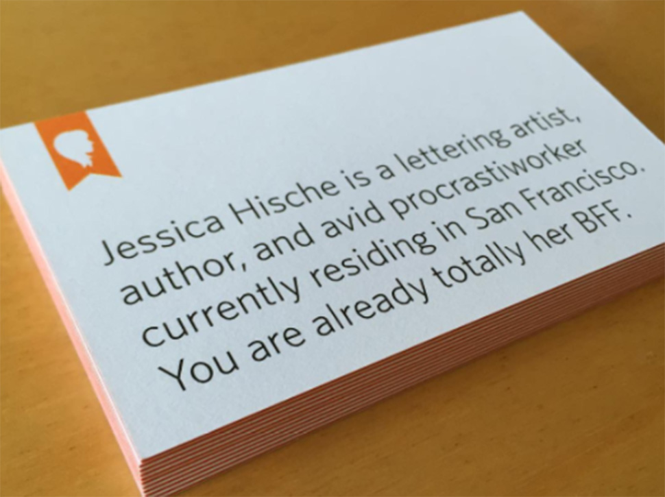
Jessica Hische is a typographer and illustrator working in San Francisco and Brooklyn. Actively involved in the type community (she served on the Type Directors Club board from 2012 to 2015), her clients so far have included Wes Anderson, The United States Postal Service, Tiffany & Co, The New York Times, Penguin Books, Target, Starbucks, American Express, and Wired Magazine.
Hische ordered these ‘quickie’ business cards online from Moo’s Luxe line so she could hand them out at the Adobe Max event in LA. It just goes to show that you don’t need to pay for expensive finishes to make an impact. A dash of wit, a utilitarian design and a clear, legible font can be far more effective.
02. Happy Letters
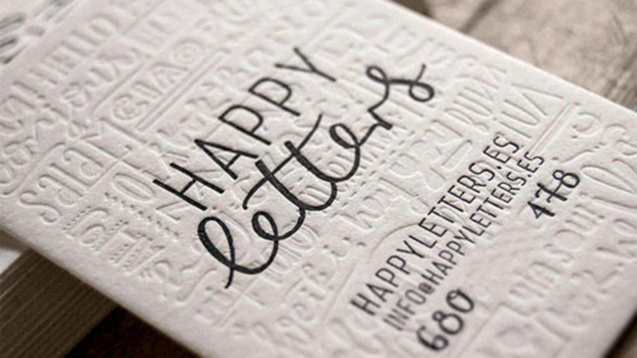
Happy Letters is a lettering, calligraphy and graphic design studio based in Madrid. And it announces itself in style with these sumptuous, blind-pressed business cards. The textured white background combines a variety of typographic and illustrative styles that say ‘hello’ in a number of different languages. It’s a lovely touch that you may not even notice at first, but it leaves a positive lasting impression.
03. Adam G
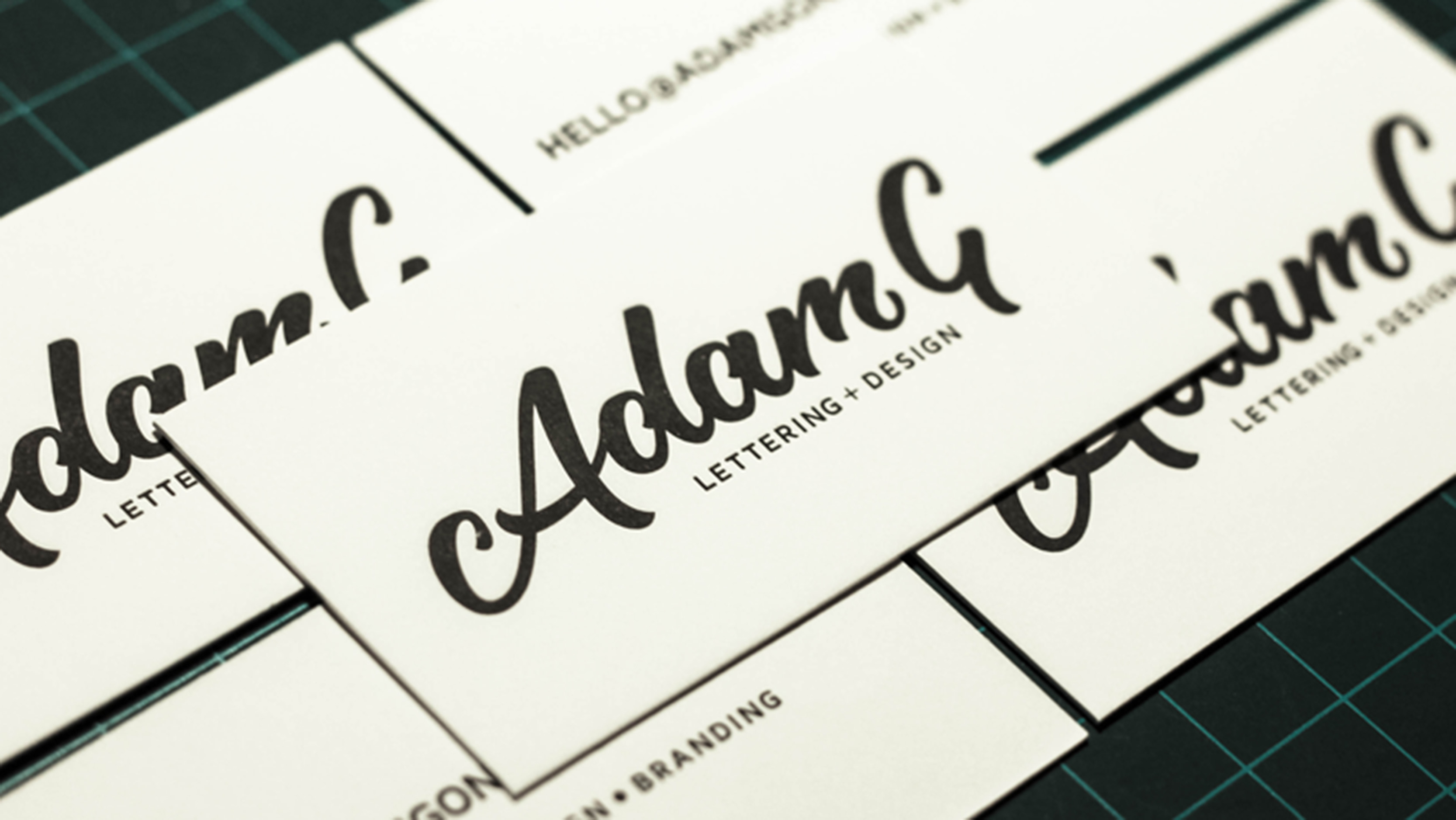
Adam Gonzalez is a full-time designer with a strong focus on typography and illustration. Based in Los Angeles, his skills include hand lettering and sign painting. These lovely letterpress printed business cards show just how simple a design can be, while still effortlessly communicating the skills and artistic judgement of its maker.
04. Sean Tulgetske
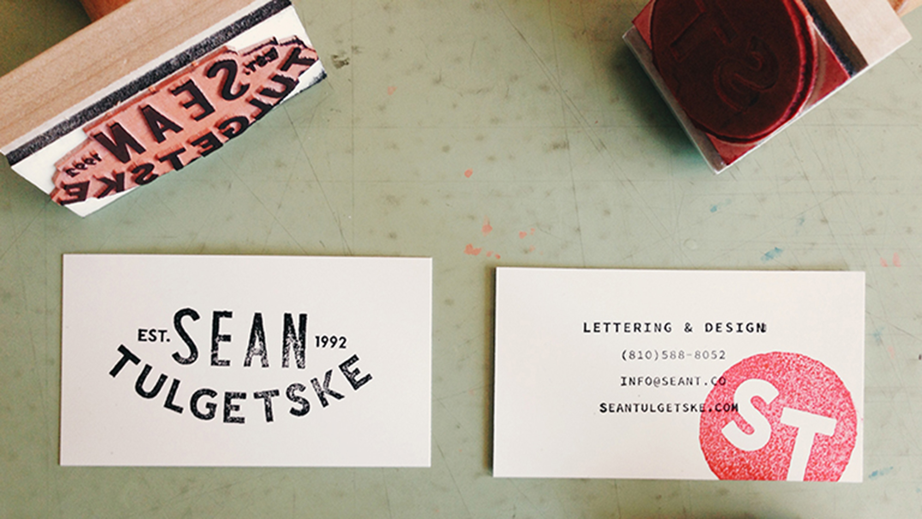
Sean Tulgetske is a freelance designer based in Michigan. With clients including ESPN, Disney, Pixar, VH1, Target, Southwest Airlines and Nike, his work is strongly focused on hand lettering, type design and illustration. We love the hand-stamped effect used in his business cards, which helps the design evoke both a sense of the retro and a feeling of modernity.
Daily design news, reviews, how-tos and more, as picked by the editors.
05. Sean McCabe
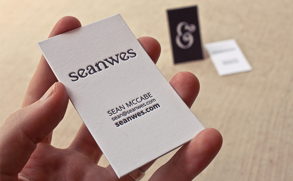
Sean McCabe is a hand lettering artist from San Antonio, Texas, who also runs online training courses and podcasts under the monicker Seanwes. These letterpress cards harness the power of minimalism and white space, conveying his skills far more powerfully than something busy and flashy might have done.
06. Studio Moross
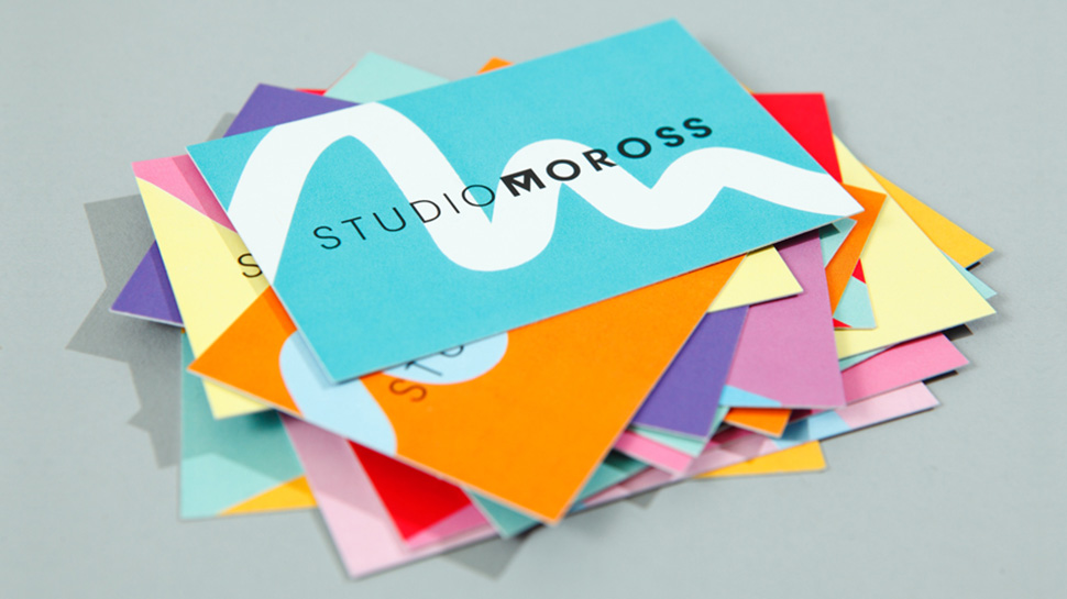
Studio Moross is the creative home of Kate Moross, a London-based art director best known for her colourful, freeform lettering designs. Rather than simply reproduce her crazy letterforms – which might prove a little complex and overpowering for a business card – these cards represent her style in a subtler fashion, through their multiple, bright hues and the artful squiggle running across them.
07. Branding with Type
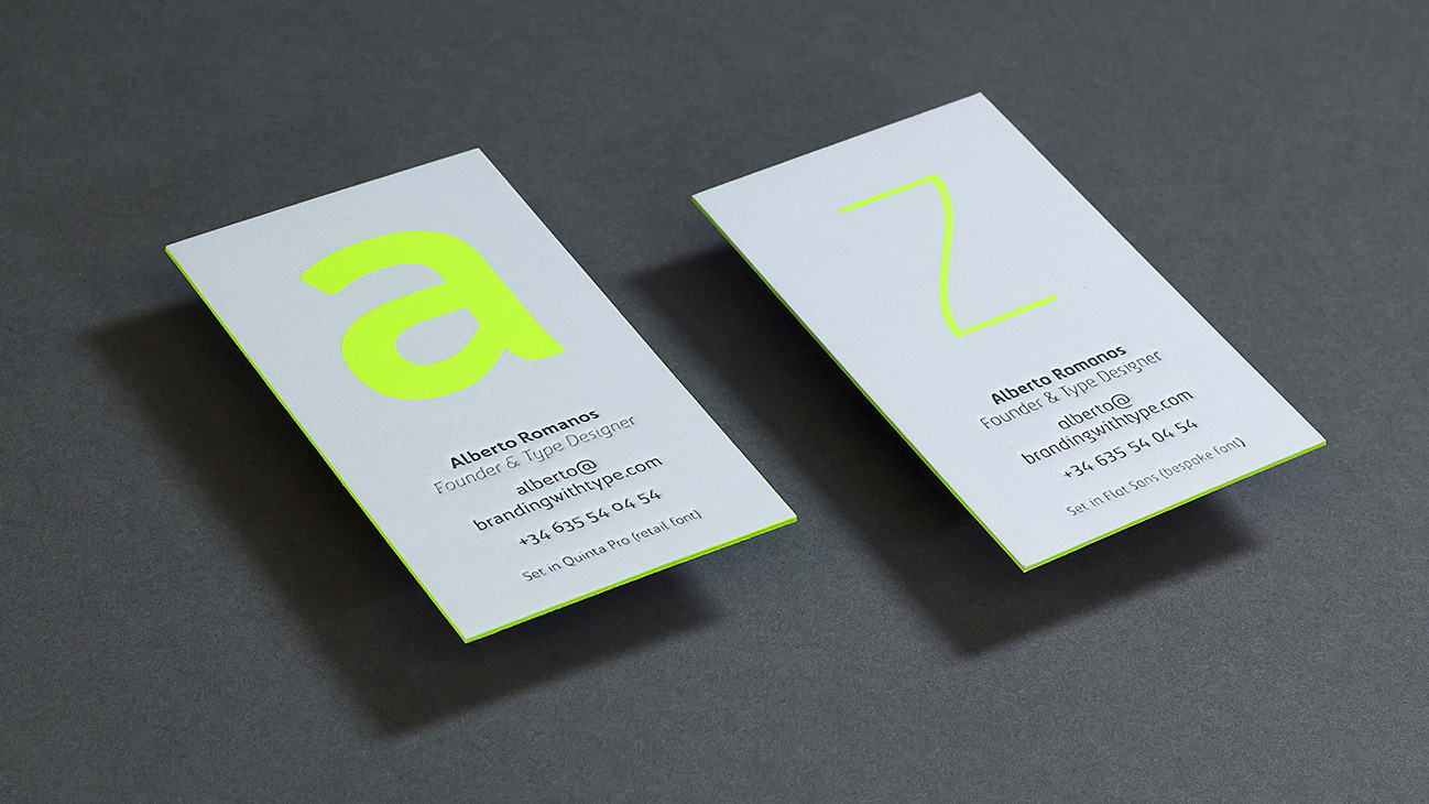
Alberto Romanos is founder and type designer of Branding With Type, a Spanish studio that designs bespoke fonts for brands. As such, he needed the type on his business cards (the company’s own Quinta, and Flat Sans for Flat 101) to be front and centre. Then he added a big splash of neon yellow, and put it all through silkscreen and letterpress printing processes. That might sound a bit nuts, but the result is pretty sophisticated, as you can see.
08. Andrew Wolfenden
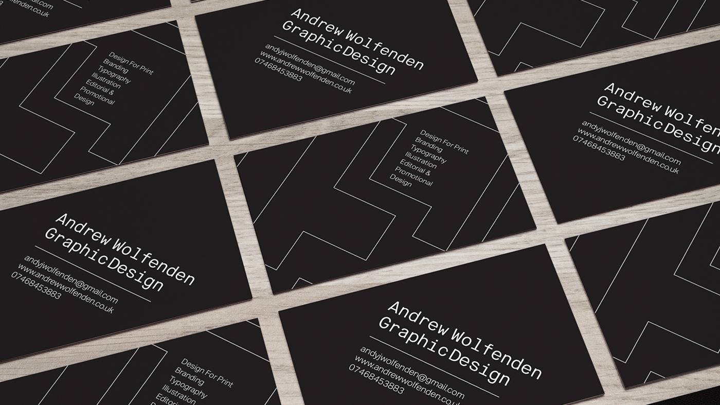
Andrew Wolfenden is a freelance graphic artist and designer from Liverpool based in Road Studios who puts a strong focus on typography in his work. Putting small white type on a black background means entering a legibility minefield, but Wolfenden’s smart, geometric design is eminently readable.
09. Erik Spiekermann
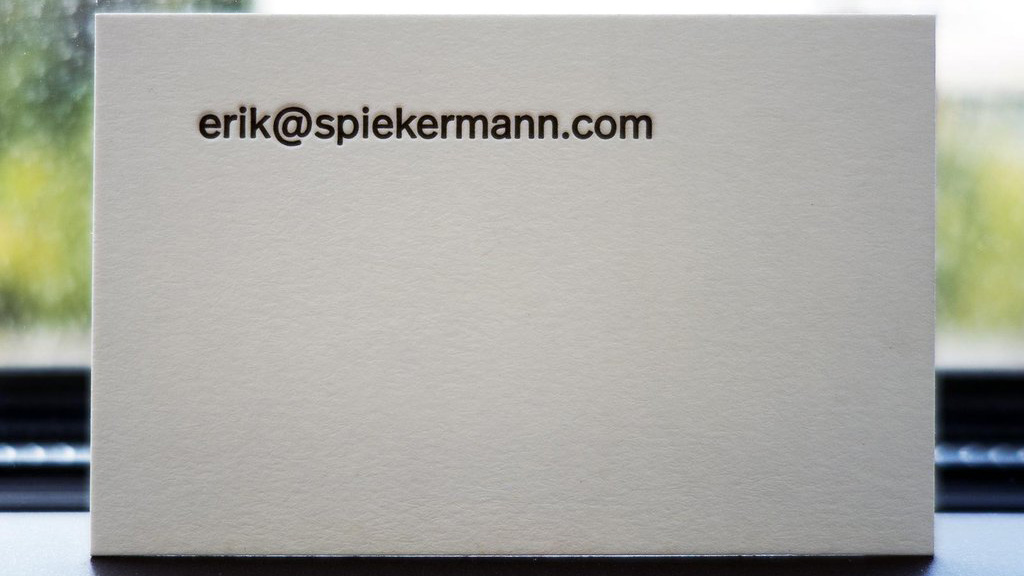
Erik Spiekermann is one of the world’s most respected names in type design. The co-founder of FontShop, two of his typefaces, FF Meta and ITC Officina, are considered modern classics. Plus he’s been behind the design of brands such as Audi, Bosch, VW, German Railways and Heidelberg Printing. And his business card conveys a powerful message: once you’ve got the typography of your design right, what more do you need?

Tom May is an award-winning journalist specialising in art, design, photography and technology. His latest book, The 50 Greatest Designers (Arcturus Publishing), was published this June. He's also author of Great TED Talks: Creativity (Pavilion Books). Tom was previously editor of Professional Photography magazine, associate editor at Creative Bloq, and deputy editor at net magazine.
