5 gems of type wisdom from Erik Spiekermann
The design legend shares his philosophy on how to make it as a type designer.
Sign up to Creative Bloq's daily newsletter, which brings you the latest news and inspiration from the worlds of art, design and technology.
You are now subscribed
Your newsletter sign-up was successful
Want to add more newsletters?
Recently, type legend Erik Spiekermann – co-founder of Fontshop, founder of Edenspiekermann, and creator of commercial typefaces including Berliner Grotesk and Fira Sans – presented a talk in collaboration with Creative Bath. Here are some gems of type design wisdom he shared.
01. There is no such thing as bad type

“There is no bad type, only bad typography,” Spiekermann insisted. It’s all about finding the right context and purpose. “I’m sure you and I could sit down and make a great page with Comic Sans. I’d rather not, though.”
Similarly, great typefaces can be spoiled. Once you put a typeface out into the world, its users can do whatever they want with it. Spiekermann likened the situation to writing a great pop song: you can’t stop people singing it drunk and out of tune in the pub.
02. Know the basics

Although type design is time-consuming, and the plethora of typographic terms and typeface options floating around may seem overwhelming, it’s not as complex as it seems.
“I can teach anyone good typography in two or three days,” Spiekermann said. “The craft is very simple, the rest is just practice.”
03. Be confident and competent
You might not win every pitch the first time round, but if you’re good at what you do you’ll succeed in the end. “If you show confidence and competence, the clients will usually come back,” Spiekermann explained.
While flashy, fancy concepts can win over a client, often they’ll quickly realise that these doesn’t stand up in the real world. Being competent in your skills and confident in your pitch will stand you in much better stead.
Sign up to Creative Bloq's daily newsletter, which brings you the latest news and inspiration from the worlds of art, design and technology.
04. Embrace constraints

Spiekermann’s love of analogue processes was obvious throughout his talk. He runs a letterpress workshop in Berlin – p89a – and has the biggest collection of printing presses in the country.
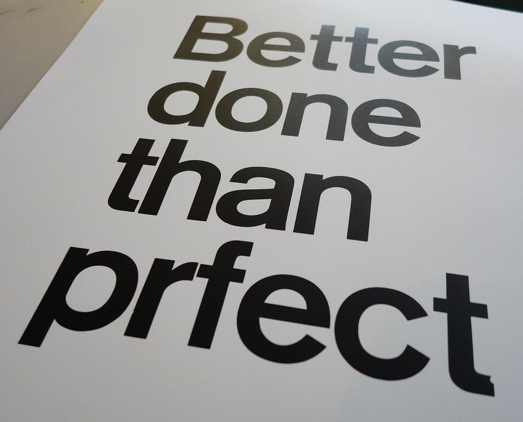
In 2015, p89a printed a poster featuring the phrase 'Better done than prfect'. It’s a clever joke, but wasn’t planned as such – the letterpress set only had four ‘e’s. It’s a lesson in making the best of what you have.
With letterpress, your options are much more restricted than with digital type – and for Spiekermann, that’s part of the appeal. “If you have fewer choices, it doesn’t necessarily make your life more difficult. It often makes it easier,” he commented, before adding, “If we don’t make stuff, we’ll end up as decrepit little one-thumb robots.”
05. Don’t make excuses
The practicalities of letterpress – setting up a print, clearing away afterwards – has the effect of inspiring urgency. “Without a timeframe, you’d never do anything,” Spiekermann said.
“We are judged by our work, not our words,” he continued. You can have all the excuses and explanations in the world, but sometimes you just need to knuckle down and make something.
Related articles:

Ruth spent a couple of years as Deputy Editor of Creative Bloq, and has also either worked on or written for almost all of the site's former and current design print titles, from Computer Arts to ImagineFX. She now spends her days reviewing small appliances as the Homes Editor at TechRadar, but still occasionally writes about design on a freelance basis in her spare time.
