Why typography is key to good branding, straight from a pro
Brand Impact Awards judge reveals the 4 typographic dials you need to get it right.
Everyone identifies with type – whether they know it or not. The shape and form of letters transcend cultures, borders, languages, beliefs, age, time, surfaces, technology, and trends. No other medium connects us all like type. (See our typography through the decades series to find out how that's changed over time).
Letterforms were created to record meaning – to hold ideas and prevent them from being lost. Over time, they evolved to educate – and through typography – to carry a voice or emotion. Type connects us. It’s integral to how we share – and how we grow and evolve together.
I don’t have to tell you that what customers want – or demand – from brands is changing. How and where people interact with brands – the channels, the locations, the ecosystems – is all getting more varied and complex.
Article continues belowChanging landscape
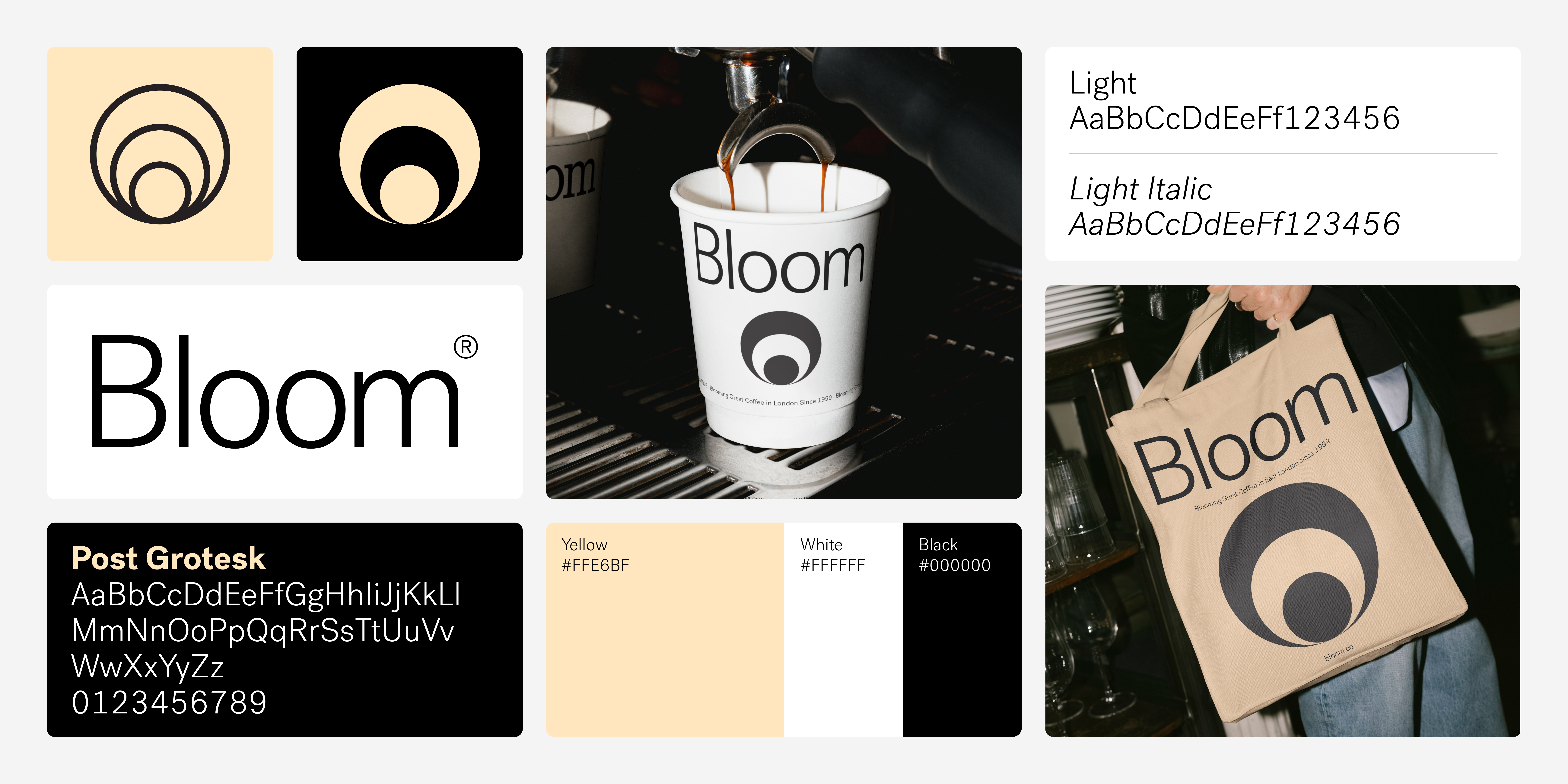
Brands are now in conversation with people, and audiences increasingly demand social consciousness. Customers have higher expectations – and they have more choice. Some brands are tackling these challenges through automation, evolving content and design systems, and of course AI. The variety and scale can be overwhelming, and though we all know that change is a constant – the pace of change is palpable.
Typography too is evolving to meet the needs of brands. Typeface designers, font engineers, and typographers have been hammering away at this evolution for decades – adapting – and in many cases prefiguring – the needs that technology, consumers, and brands bring to communication.
How can type improve a brand’s distinctiveness – its recognition – its memorability – and its reach? There are endless ways to break down typographic design, and what I’m about to share is my approach – the approach we take at Monotype.
Brand type can be broken into four distinct parts: Expression, Legibility, Localisation, and Font Technology. These are the typographic dials we can tune up and down to find the optimal letterforms for any brand, across any market, region, and technology.
Sign up to Creative Bloq's daily newsletter, which brings you the latest news and inspiration from the worlds of art, design and technology.
01. Expression
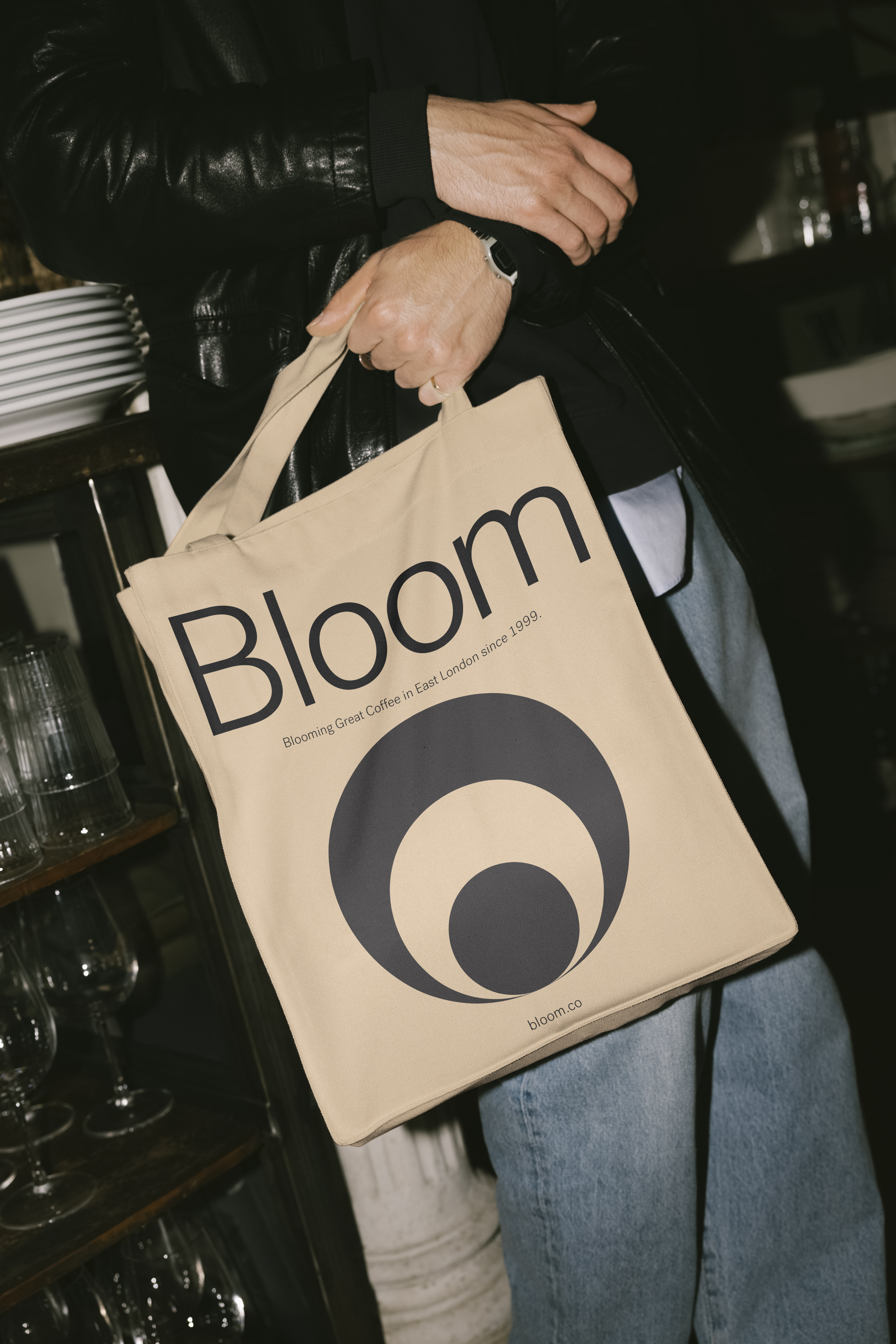
My creative mission is to help brands find their visual voice through typography. At Monotype, we use a range of approaches and techniques to help tease out what a brand typeface should look like – from playful perceptual mapping to qualitative and quantitative data collection with brands, designers, and audiences.
The intention of this approach is to help those who live the brand articulate it in their own words. This is a process of discovery and iteration that ultimately leads to typographic expressions that reflect the brand persona, ambitions, and needs. The focus of this discovery phase is brand expression.
This approach is also where Monotype’s collaboration with Neurons originated. We as designers instinctively know that typography can influence emotions, because we are trained – and are somewhat literate – in the way design can influence how people feel. We wanted to test these instincts and see if large-scale customer testing on brand type would back up, challenge, or expand on this approach.
Neurons is a Copenhagen-based customer research company, and since 2021, we have been working with them to explore how type influences people’s emotions. The results from this ongoing research are striking, revealing that typography can boost positive emotions in test candidates by up to 13%.
It also clearly demonstrates that emotional responses to typefaces differ across countries and languages. For example, the concept of ‘high quality’ for audiences in the UK is most aligned with serif typefaces. For French audiences, geometric sans serif typefaces are most aligned with the concept of ‘high quality’.
02. Function
From expression – the typographic essence, the look and feel – we move to legibility. Here, we interrogate the demographic needs of the brand’s audience and users, and specify the appropriate functional typographic needs.
How we read changes as we grow, learn, and age. In our digital world, we read more than ever – across a range of devices, screen types, browsers, apps, and tools. All of this requires brand typography to adapt and flex across a complex set of use cases, accessibility needs, age groups, reading preferences, and reading capabilities.
Obsessing over character shapes, proportions, weights, spacing, and visual details helps us choose and design typefaces that improve the reading experience for customers – which reflects well on the user’s brand experience.
That’s not to say that when high degrees of functionality are needed, expression goes out the window. Not at all. But maintaining the expressive aspect while ensuring a high degree of functionality requires a deep knowledge of both.
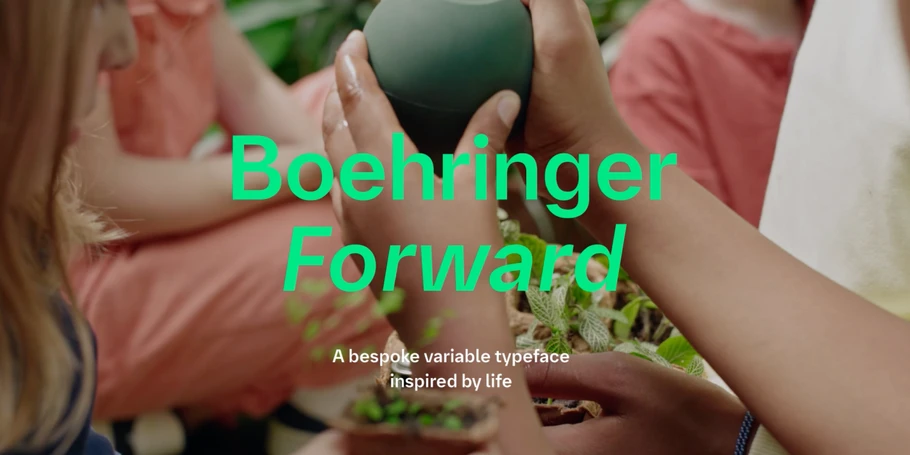
A great example from the Monotype Studio is our work for Boehringer Ingelheim – with a typeface that leans into function, legibility, and accessibility, providing a foundational element to a complex brand system while also remaining expressive and ownable in the pharma vertical.
03. Local and global
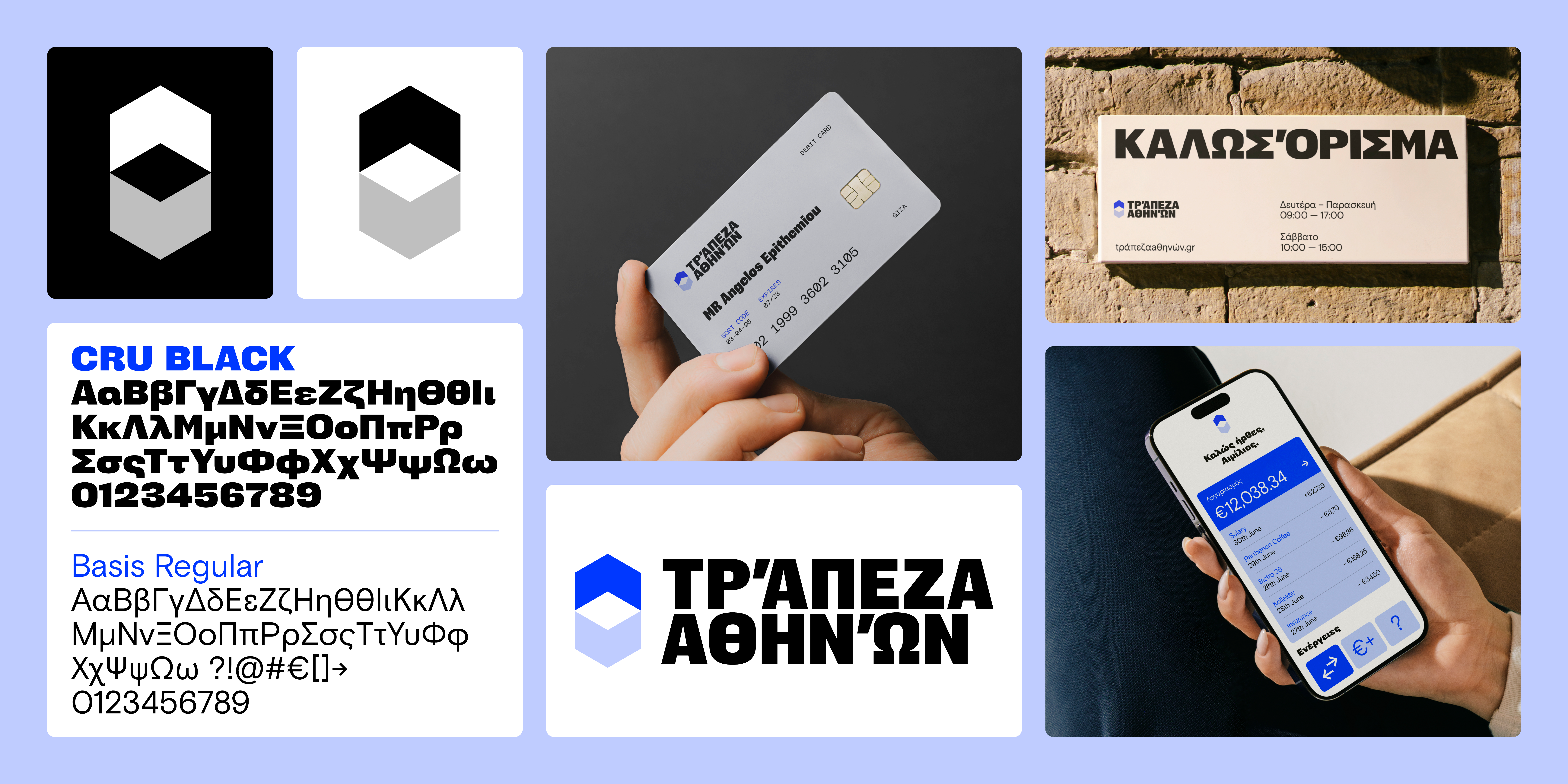
Each language, culture, and region has its own typographic history that creates local tastes, preferences, and conventions. What is perceived as classical to an audience in the UK will not be the same for French, German, or Japanese audiences. As most brands begin their visual journey from a Western consumer perspective, we’re often faced with translating a typeface style chosen for its resonance with, let’s say, an American audience into Chinese, Japanese, or Devanagari. This process requires designers to possess – or tap into – local linguistic and typographic expertise.
The more expressive a brand’s typography is, the more challenging it is to translate into other writing systems. This is often why big global brands tend to choose very neutral geometric humanist sans serifs for their brand typography.
This style of Latin typeface is more easily translated into other script systems than any other. Geometric humanists are inherently neutral and flexible. Crucially, they contain a mixture of humanist, geometric, and grotesque letter shapes, which gives designers of more complex scripts a rich palette of anatomical and visual reference points.
Often, the only way to localise very expressive brand typography is to design new, custom type. This is, of course, a big investment in time and money. A good compromise is to localise the wordmark or headline brand type and employ neutral and functional type for small sizes, websites, apps, print, etc.
04. Font technology
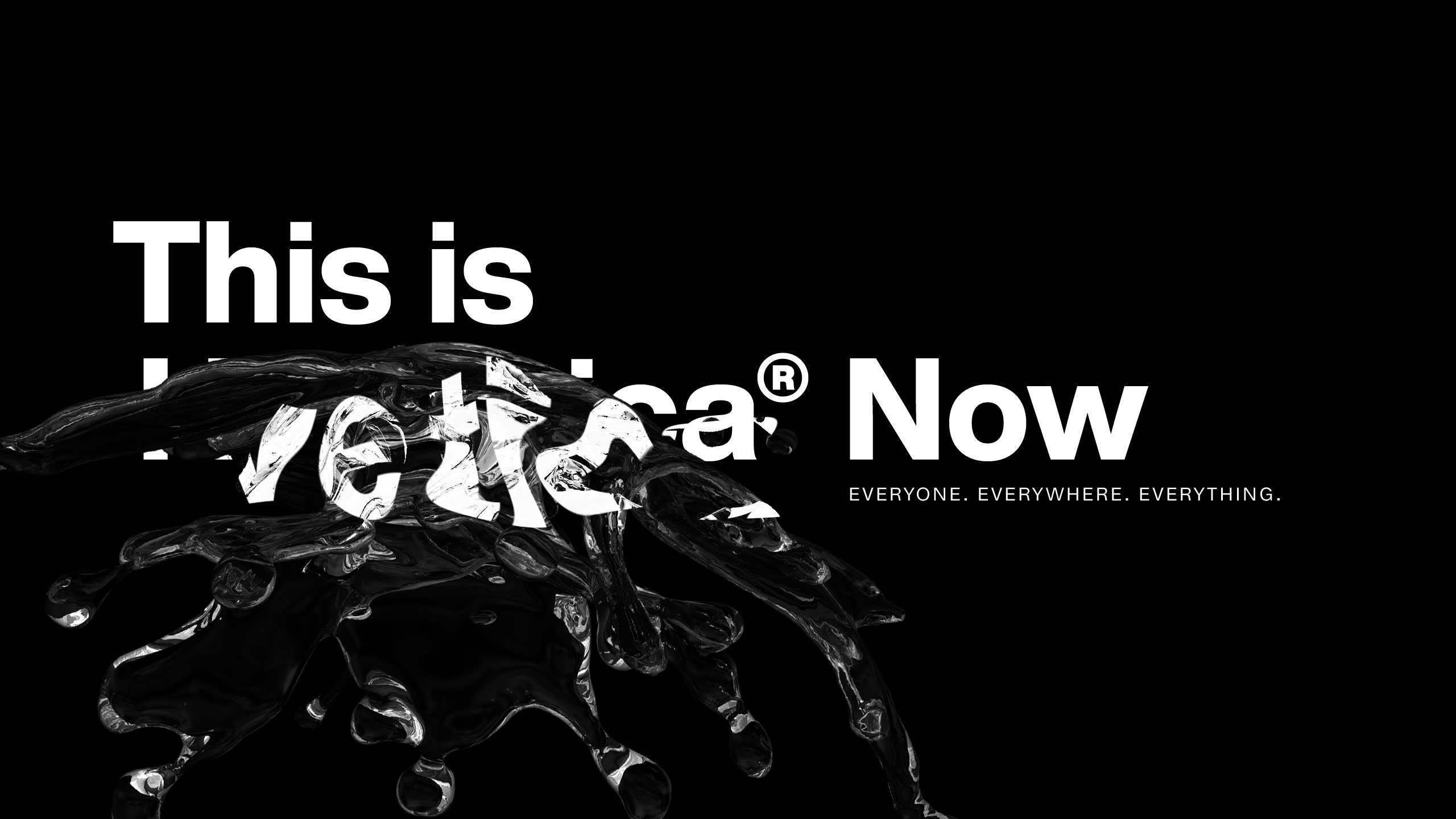
Font files are the software delivery mechanism for all of the creative, functional, and language capabilities of a typeface. They are the most definable and predictable aspect of brand typography.
They are generally small in file size compared to other brand assets like images and video. But despite their predictability, fonts are notoriously complex pieces of software, containing thousands upon thousands of digital instructions that define how a typeface looks, how its spacing and kerning works, whether advanced typographic features like ligatures function correctly, or whether the characters render well on screen.
Font technology is always in flux, and a key feature of fonts today is the transition from fixed to flexible. We’re all familiar with font files that contain a single style of a typeface: Helvetica Now Micro Regular, Helvetica Now Text Condensed Bold, Helvetica Now Display Black. But variable fonts – single font files that contain multiple styles – are changing everything. A variable font might contain all of those styles, plus infinite others, in one file. This brings responsiveness, extreme compression, and creative flexibility to fonts.
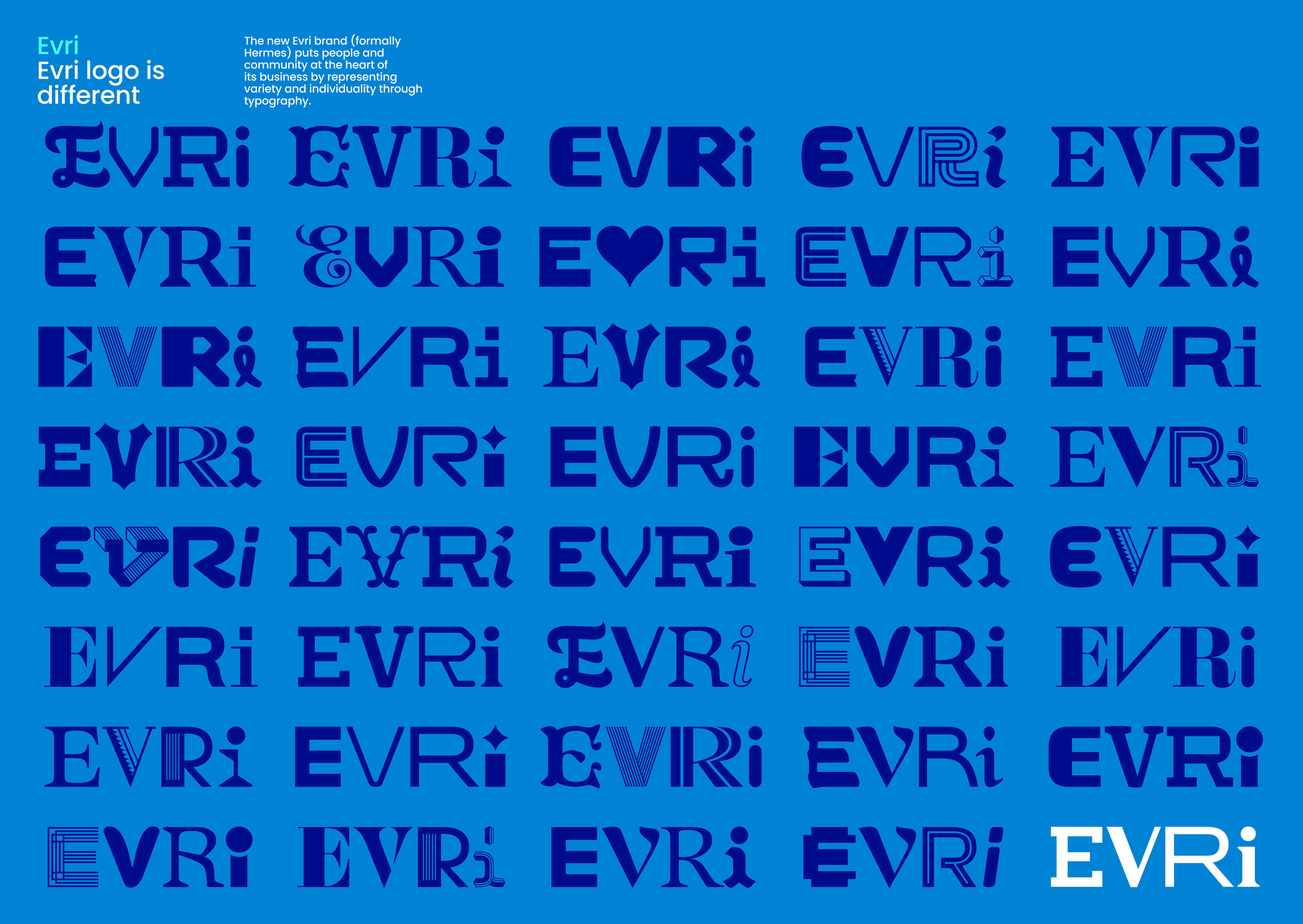
A wonderful example of variable font capabilities is the typeface that the Monotype Studio team designed for EVRi, in collaboration with Design Bridge and Partners (this project won a Brand Impact Award in 2022). Led by Phil Garnham, the Monotype team was tasked with executing an ambitious and visually rich logo system into a functional and easy-to-use typeface solution.
No two expressions of the EVRi wordmark are the same. By designing 25 versions of each letter, and using variable font technology to create automated, random letter variant placement in text, the end result is a truly distinctive brand typeface. A brand typeface like EVRi’s would not be possible without innovations like variable font tech.
We are heading into a new phase of typography – more versatile, more efficient, and for the first time, responsive. With AI, we’re likely to see many more leaps in font technology. Searching, managing, creating, and using type will be transformed by AI, and we at Monotype are embracing all the challenges and opportunities this brings.
But despite all the technical advancements, there are no shortcuts to great brand type. Understand the purpose, strategy and goals of a brand. Then, understand the typographic dials you can tune up to down to find a relevant expression of the brand. Experiment and play until it feels right and functions well. Simple really.
This article originated as a seminar presented at Future London Academy in 2022. Co written with James Fooks-Bale, director of brand at Frontify.
Have you created some beautiful typography in branding? Enter the Brand Impact Awards today. Your work could be judged by the author of this piece, Tom Foley.

Tom Foley is an executive creative director for Monotype, and in his role, is responsible for leading a team of type designers creating fonts for the Monotype Library and corporate brands. Words and letters are in Tom’s blood - his great-grandfather was from a family of stonemasons that specialized in letter carving, and his uncle was a sign painter.
- James Fooks-BaleDirector of brand, Frontify.
You must confirm your public display name before commenting
Please logout and then login again, you will then be prompted to enter your display name.
