These are the fonts that designers are sick of pretending to hate

Graphic designers are hired for their impeccable taste. That's one of the reasons we think AI bots will never be able to replace humans. But does the pressure to be ultra discerning mean designers sometimes pretend to dislike the commonplace?
That's the debate going on over on Reddit at the moment, where designers are discussing the fonts they're sick of pretending to hate. Whether it's an iconic typeface that's become too ubiquitous or a font that's people no longer take seriously, designers see these as controversial choices. But as we mentioned in our guide to how to choose the right typeface, it all depends on the use case.
01. Futura
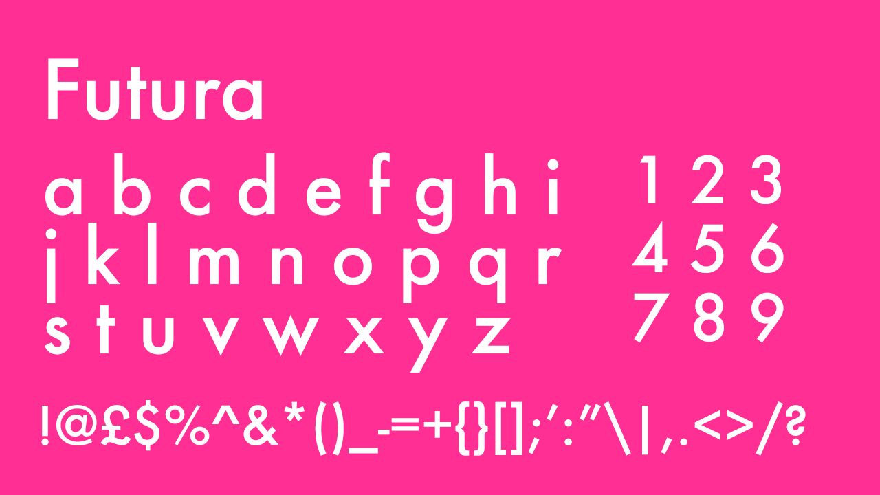
Futura is singled out as one fonts that designers don't like to admit liking. "I like Futura and I’m tired of pretending I don’t," the OP says. And it turns out that many people agree.
Article continues below"My typography teacher at uni did a whole class on Futura and Helvetica and how we should never use them," one person says. "I loved that guy, but we disagreed on that and I used one of them in pretty much every project I did for him after that!"
I like Futura and I’m tired of pretending I don’t. from r/graphic_design
As others point out, reticence towards a certain typeface isn't necessarily because it's bad, but more often because it's overused (in the case of Futura sometimes as a free substitute for Helvetica). "I love Futura, but don’t love how often people use it as a careless shortcut to 'good taste.' It has such a specific feel and doesn’t look good in all applications," one person says.
"Maybe it's something like telling a music aficionado that your favorite band is the Beatles. It's a safe classic. A lot of graphic designer types are looking for avant-garde and fresh," one person suggests. "[Futura] is heavily overused and it seems lazy as a designer to lean on very often due to its ubiquity," someone else agrees.
But while it may be overused, others point out that this sleek Bauhaus-inspired geometric sans serif can be a great choice, with some citing the book Never Use Futura by Douglas Thomas (which is actually a tribute to the font).
Sign up to Creative Bloq's daily newsletter, which brings you the latest news and inspiration from the worlds of art, design and technology.
"It has so much more personality then people give it credit for," one person writes. "It's less boiler plate corporate then fonts like Helvetica. It always gives me utopia clean futurism vibes."
Some note that the most controversial aspects of Futura are the unusual question mark and the lack of curved descender on the lower case j, which can limit its uses.
"The only 'problem' with Futura is that it has personality. It makes sense to use it if you’re trying to evoke that era. If you’re branding beauty products or potato chips, it’s probably not the right choice," one designer argues. "With Futura, you're not escaping the Wes Anderson vibe... at least not for another generation or so," another contributor adds.
02. Avenir
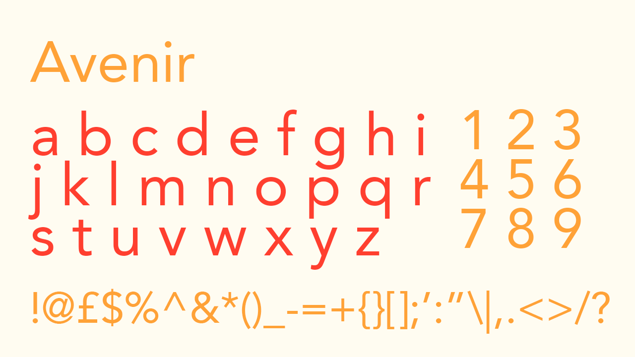
Avenir is French for 'future', and that connection isn't accidental: Adrian Frutiger's 1987 typeface takes inspiration from the geometric sans-serifs of the '20s like Erbar and Futura, while making it more organic.
"I also love Avenir. My boss hates it and that makes me like it more," one person writes on Reddit. Someone else suggests that "Avenir seems like a font that was made for bosses to like."
"I used to be the lead design for a company that almost solely used the Avenir font family and I honestly do really like it, but I’m more obsessed with how the designer of the font also developed sans serif as a concept for use with technology and spurred the Fruitger design styles," another person writes. "It’s fascinating honestly as long as it's not used as a replacement for Helvetica."
03. Arial
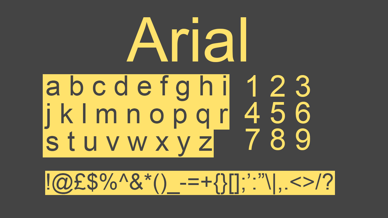
Arial has long been so commonplace – partly thanks to Microsoft – that it's often mentioned as a joke, but several designers point out that there's nothing wrong with this clean Sans Serif.
"I used to hate Arial in my first year of college because I thought of it as a plagiarized Helvetica, but since then I have learned that it’s much more accessible than Helvetica and so I sigh and accept Arial into my heart," one new designer says.
04. Helvetica
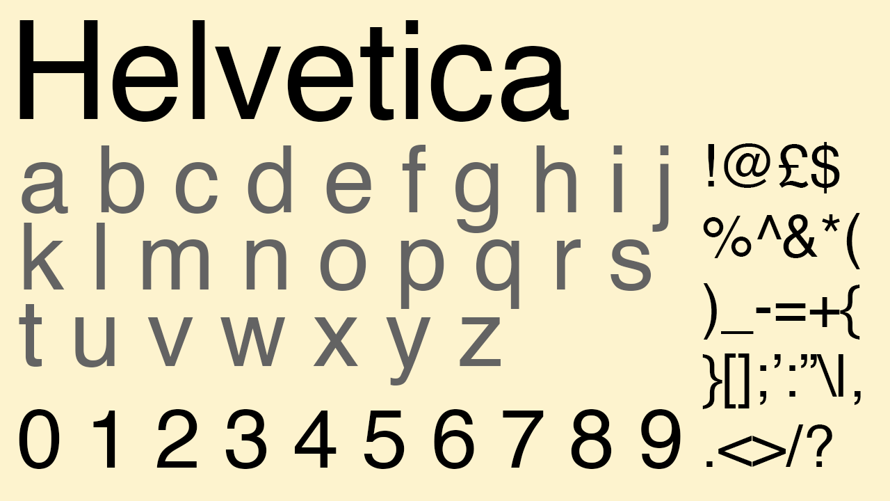
That leads us to the king of geometric sans-serif typefaces, Max Miedinger and Eduard Hoffmann's Neue Haas Grotesk. Surely designers don't have a problem with Helvetica?
"Whenever other designers ask me what my favorite font is I always say Helvetica and they always give me funny looks and talk about how it’s over used," one person complains.
"I swear design professors just indoctrinate students with anti-Helvetica messaging... and then their students carry it on through their entire design careers," another person writes.
Suffice it to say, not everyone listens to their teachers since Helvetica (now owned by Monotype) is still used today by numerous brands and as the basis for many logos (see our roundup of Helvetica alternatives for other options).
05. Comic Sans
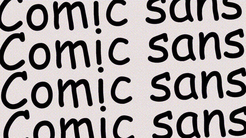
Finally, something completely different. No discussion of maligned typefaces would be complete without mention of the universally mocked Comic Sans. I say universally, and you might think everyone had got the message by now that this isn't a font to use for serious communications, but my electricity provider sends emails in this typeface, which I find hilarious.
Some of those commenting on Reddit say they've come to love it, too. "Somewhat ironically, I used to use it as my placeholder font just to screw with my boss, but the little bugger must've grown on me, because I have dusted it off once or twice recently for some (personal) projects," one person writes.
"I work in retail, and whenever our bottle recycling machine breaks, my only savior & guilty pleasure is the 'kaput' sign I put up with Comic Sans MS," another person admits.
Are there really any 'bad' typefaces?
Perhaps the debate shows there are no 'bad' typefaces, just bad choices and bad applications. This would suggest designers should avoid dogmatic opinions and think about the context of each specific work.
"Typefaces are easy punchlines/punching bags," one person writes. "I've used specific faces as punching bags in the past, but I'd happily work with them now. These days, I'm far more concerned with how letters fit on a page than with typeface selection."
"I think the point is to not always take the easy way, and look for better solutions that may better solve the problems or realize goals. And to understand the effect of using ubiquitous, popularly loved typefaces," someone else suggests.
Another person notes that the great thing about design is that yo can do whatever you like (within legal and ethical standards): "Do only Swiss design or low-culture trash zines. No one is stopping you". You could even present pages of text in Dingbats like David Carson once did for Ray Gun magazine if it feels appropriate (see our guide to famous graphic designers).
What do you think? Are the fonts mentioned really so controversial? And do you have a font that you pretend to hate? (or that you actually hate!) Let us know in the comments below.
For more design debates, see the outdated graphic design trends that designers wish would disappear and the hot discussion about AI giving clients impossible expectations. We've also seen a lot of debate about why graphic designers use Macs.

Joe is a regular freelance journalist and editor at Creative Bloq. He writes news, features and buying guides and keeps track of the best equipment and software for creatives, from video editing programs to monitors and accessories. A veteran news writer and photographer, he now works as a project manager at the London and Buenos Aires-based design, production and branding agency Hermana Creatives. There he manages a team of designers, photographers and video editors who specialise in producing visual content and design assets for the hospitality sector. He also dances Argentine tango.
You must confirm your public display name before commenting
Please logout and then login again, you will then be prompted to enter your display name.
