The history of the sans serif
How the sans serif rose from obscurity to become the go-to font of the 21st century digital age.
Sign up to Creative Bloq's daily newsletter, which brings you the latest news and inspiration from the worlds of art, design and technology.
You are now subscribed
Your newsletter sign-up was successful
Want to add more newsletters?
It's Typography Week, and we're delving into the the history of sans serif, one of the most iconic typefaces in use today. Literally translating to ‘without serif’, this typeface can be mapped to changes in society, whether it’s the birth of industrial mechanisation or the digital age. For a large part of history, before the invention of Gutenberg’s printing press, text had to be written by hand. It’s no surprise that serif reigned supreme for so long – in fact it wasn’t until the 1800s that a successor emerged.
From humble beginnings, the sans serif dragged the design world kicking and screaming into the 20th century and is as relevant today as ever. If you want to try some sans serifs for yourself, have a look at our guide to free sans serif fonts.
Ancient beginnings
It’s hard to nail down the origins of the sans serif font. It’s widely accepted by scholars that sans serif existed in antiquity in informal writings of Ancient Greece and Rome, but these could be viewed as rough scratchings and mark making without any convention. In Jon Melton’s lecture The True Source of then Sans (above), it’s argued the earliest known example of an intentionally “geometrical serifless letterform” was by John Soane in an architectural drawing for a parliamentary building.
Article continues belowAccording to the book ‘Universal Principles of Typography’, the first sans serif typeface appearing in the 19th century when William Caslon IV designed ‘Two Lines English Egyptian’, published in a type specimen book in 1816 (the two lines refers to the size of the font, roughly 28pt). However if wasn’t until the 1830s, when Vincent Figgins designed several sans serif fonts for use in advertising and headlines, that the term sans serif came into use. The new typeface caught on quickly and proliferated through Europe and America, and was used on gravestones during the Victorian era and onward.
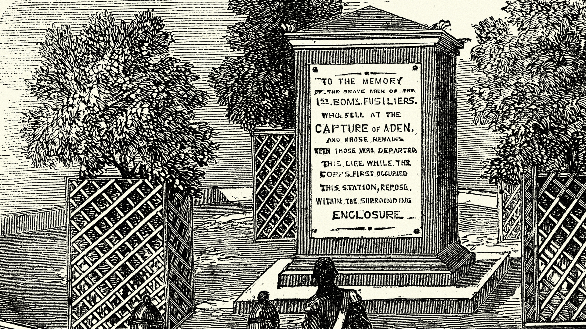
William Thorowgood was the first to create both uppercase and lowercase fonts with his Seven Line Grotesque – possibly so named because they looked strange to the eyes of the time. It’s very likely that font development around this time took inspiration from the growing interest in Egyptology, as well as the recent advent of slab serif fonts. Initial experimentation still followed classical roman capital proportions, and was more notable for the absence of serifs rather than by any revolutionary new ideology.
Geometric revolution
In the wake of modernism and mass production, the 1920s saw the rise of the Bauhaus movement in Germany as a foil to the more extravagant, flowing Art Nouveau style. Gone were ornate embellishments of the past in favour of clean, sleek geometric shapes. During this time, some of the most famous and popular sans serif fonts were created, as signage and advertising demanded functional fonts that stood out among the crowd.
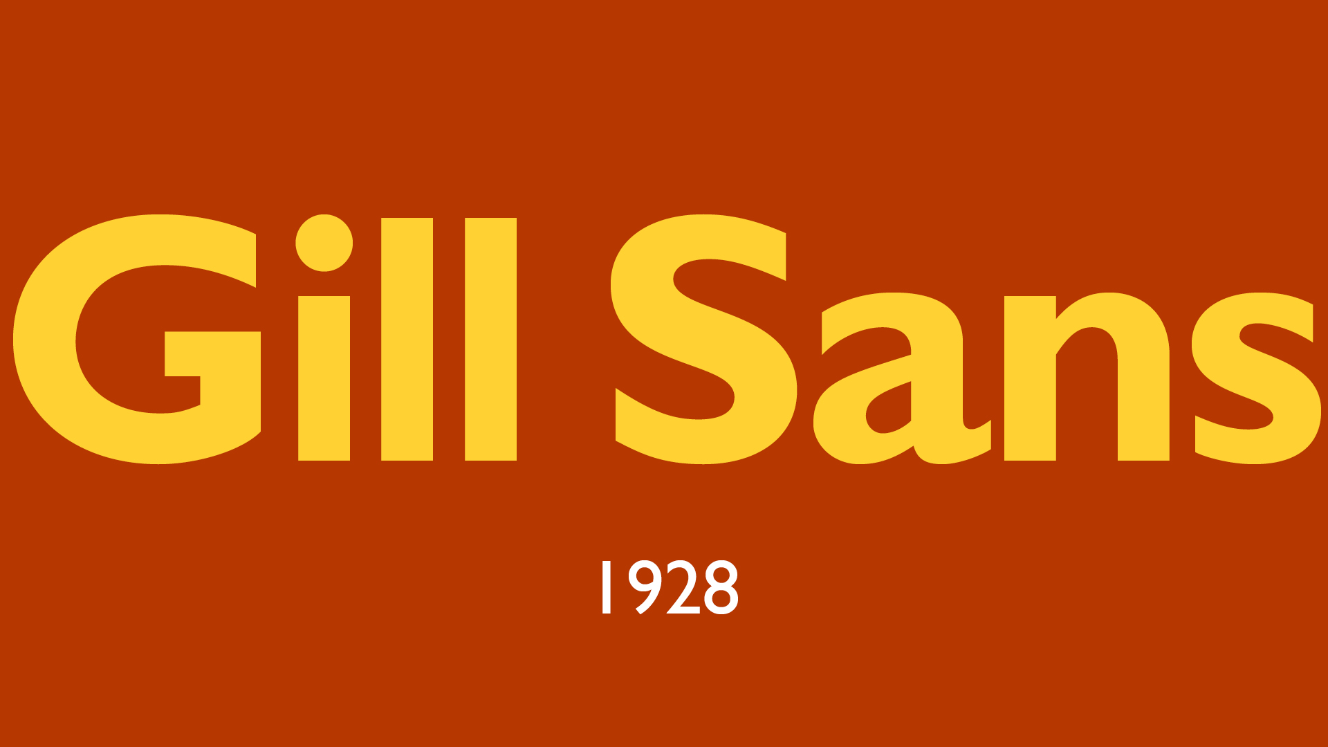
In Eric Gill’s Essay on Typography, he refers to Mr Edward Johnston as the first notable attempt to work out the norm for plain letters when he designed the sans serif letter for London Underground Railways. Gill himself was commissioned by Stanley Morrison (originator of Times New Roman) to develop a new sans serif font for Monotype and came up with Gill Sans in 1928. It was immediately adopted by the Church of England, BBC and Penguin book covers (although Gill’s personal life may not have been quite as clean as his font – you can read more in Fiona MacCarthy’s biography).
Sign up to Creative Bloq's daily newsletter, which brings you the latest news and inspiration from the worlds of art, design and technology.
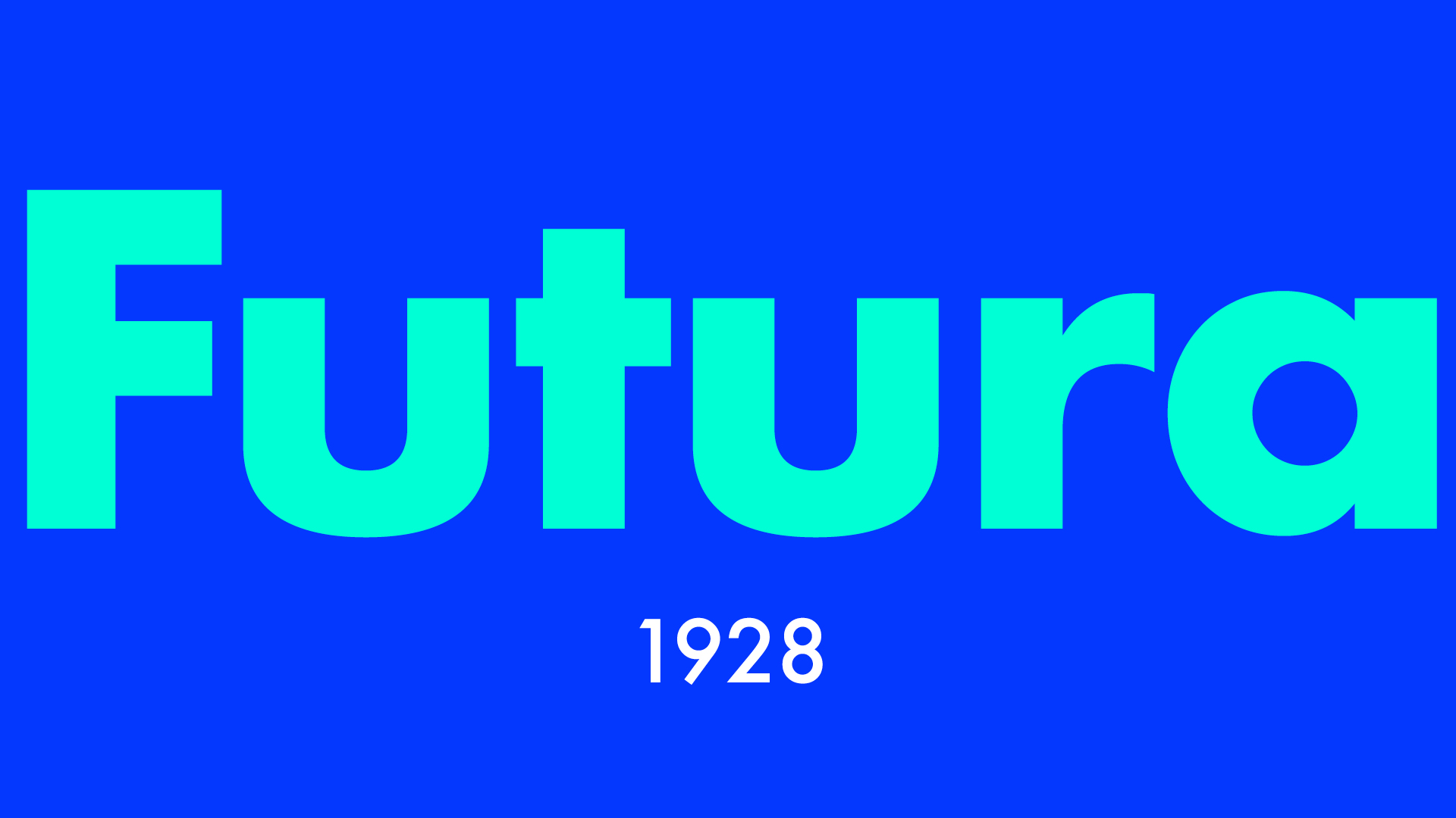
1928 also saw the creation of German Paul Renner’s Futura, initially drawn with compass and ruler to maintain its composition of basic shapes. Its influence continues to modern times – in 2009 IKEA changed its brand font from Futura to Verdana in an attempt to marry its digital output with its catalogue, drawing wide backlash as it lost its clean, sharp Skandi look. It’s also the font used on the plaque left behind by the Apollo 11 astronauts on the moon. Other influential typographers of the time include Herbert Bayer and Jan Tschichold, who contributed fonts and pushed the craft forward.
The Swiss connection
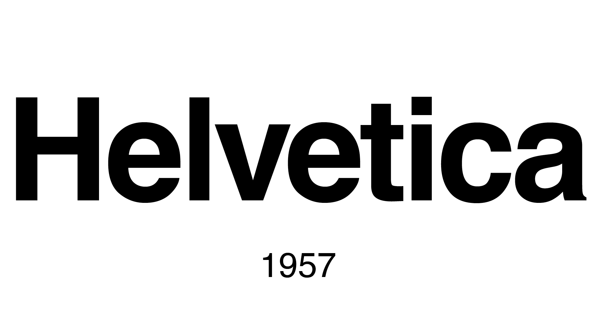
The function of sans serif continued to evolve throughout the 1900s as Swiss designers focused on creating fonts that were both modern and neutral. Max Miedinger and Eduard Hoffman designed the iconic Helvetica in 1957, which went on to take over the world – a love affair that has only begun to mellow in recent years. Simon Garfield goes into the story of Helvetica in his book Just My Type, explaining that the font began in 1957 as Neue Haas Grotesk, but was renamed Helvetica after Helvetia, the Latin name for Switzerland.
In the same year, Univers also emerged from Switzerland from designer Adrian Frutiger – there was clearly something in the water. After initially being confined to light and medium, these fonts soon came to contain extensive libraries, became the foundation of an International Typographic style and were considered Neo-grotesque. In the 1980s, Linotype attempted to condense all the disparate Helvetica faces into one consistent family – Helvetica Neue was born and is the version most of us know and love today.
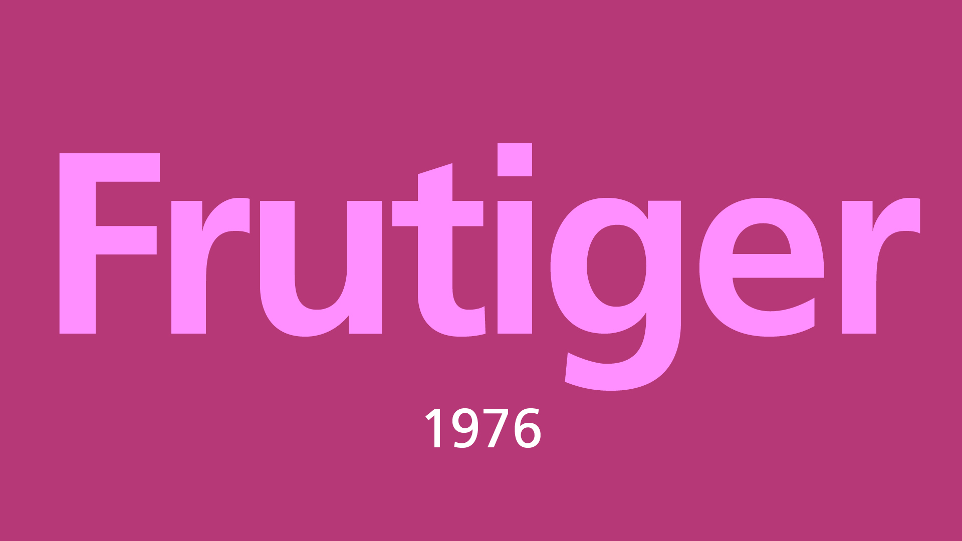
Remember Frutiger? Decades after coming up with Univers, he put his own name to a new font. Commissioned for Charles De Gaulle airport, it needed to be readable both close up and from distance, on illuminated boards as well as coloured backgrounds.
The digital age
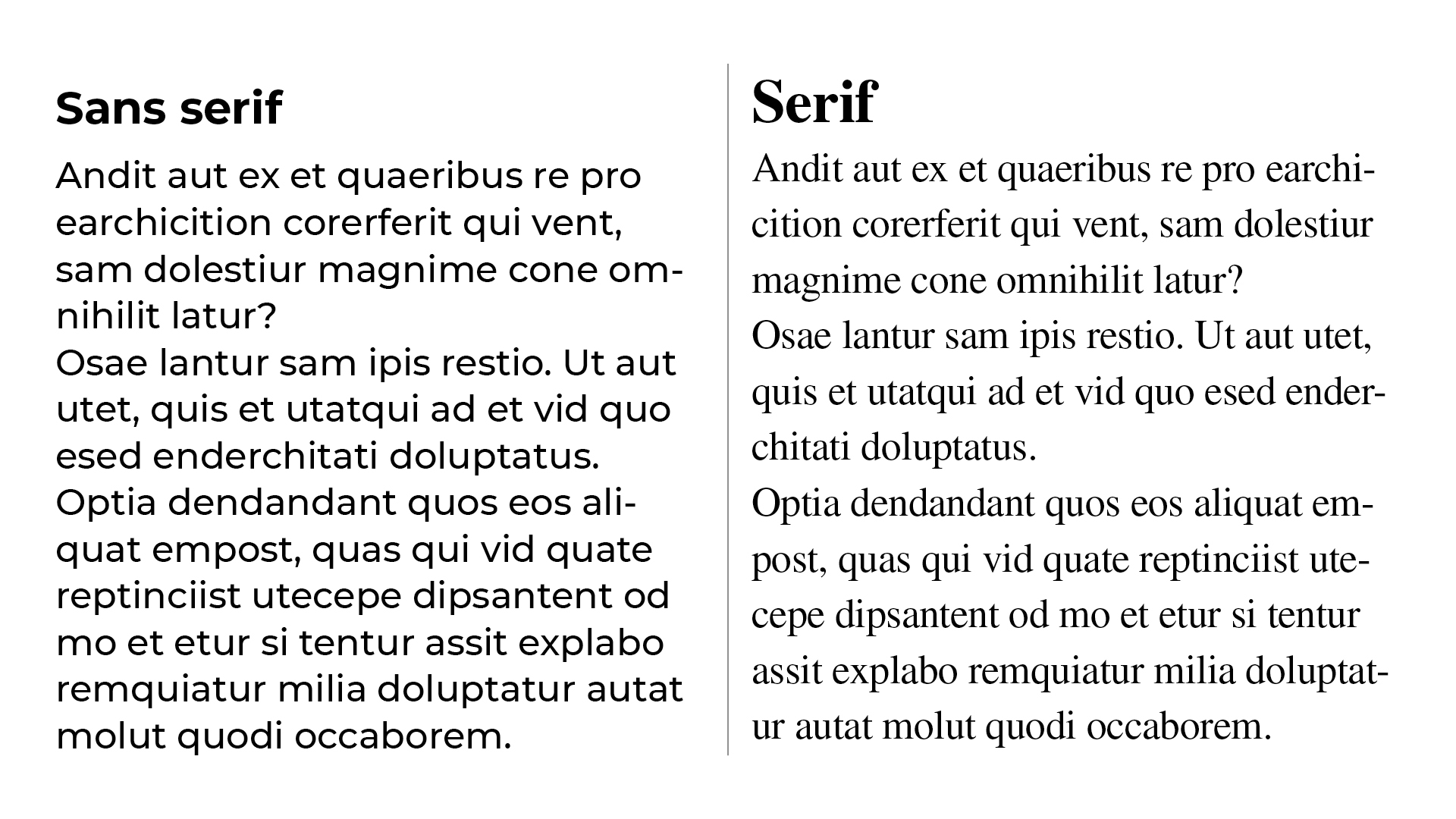
As digital displays began to replace print as the format of choice, a new methodology towards fonts was needed. Although many designers consider serif to be easier to read as it helps guide horizontal movement of the eye, research has never proved this. Ultimately it comes down to the individual and what you’re familiar with. With digital, when text can be small and risks a low pixel count, it is more important to differentiate between readability and legibility.
Typography by Ambrose and Harris describes legibility as ‘the ability to distinguish one letterform from another via physical characteristics that are inherent in the design of a particular typeface’. Meanwhile readability concerns ‘the properties of a piece of type or design that affect the ability to understand it.’ While a serif font might work in print, the same may not be true on a digital screen, especially where a low resolution can lose or blur elements of letters. Beatrice Warde gave the analogy of a public speaker being more audible when they bellow, while a good speaking voice is inaudible.
Helvetica Neue has similar shapes that can confuse people with impaired vision or reading disorders (eg. B8, 1lil, O0 and pq). Atkinson Hyperlegible was created to address this problem. But the distinct characters of this font produce a spotty appearance, while Helvetica forms a smooth field of text. Readability is quite subjective – the qualities that make Helvetica comfortable for some people can cause problems for others, while the same can be said for Atkinson Hyperlegible. There has been little conclusive research made in either direction (Vecino et al 2022). You can read more in Sophie Beier’s Reading Letters: Designing for Legibility.
In the early days of digital screens, sans serif fonts were preferred to serif, as they improved legibility. The first digital typeface – Digi Grotesk – was designed by Rudolf Hell in 1968. Early digital fonts were bitmaps, which resulted in poor readability at small sizes. It was only in 1974 when we saw the first vector fonts developed. Although for a long time Verdana was the font of the web, Arial is the web safest CS font stack with a 99.84% presence on Windows and 98.74% on Mac.
In the 1980s, Apple and Adobe developed competing font standards with TrueType and PostScript, which aimed to increase workflow and reliability in printing. In 1997, OpenType was derived from TrueType, allowing Mac and PC to use one single font file. Towards the end of the 20th century, designers had access to huge libraries of fonts and font-making software, leading to a proliferation in the number and variety of sans serif fonts. If you want to explore the options we’ve picked out best free fonts available.
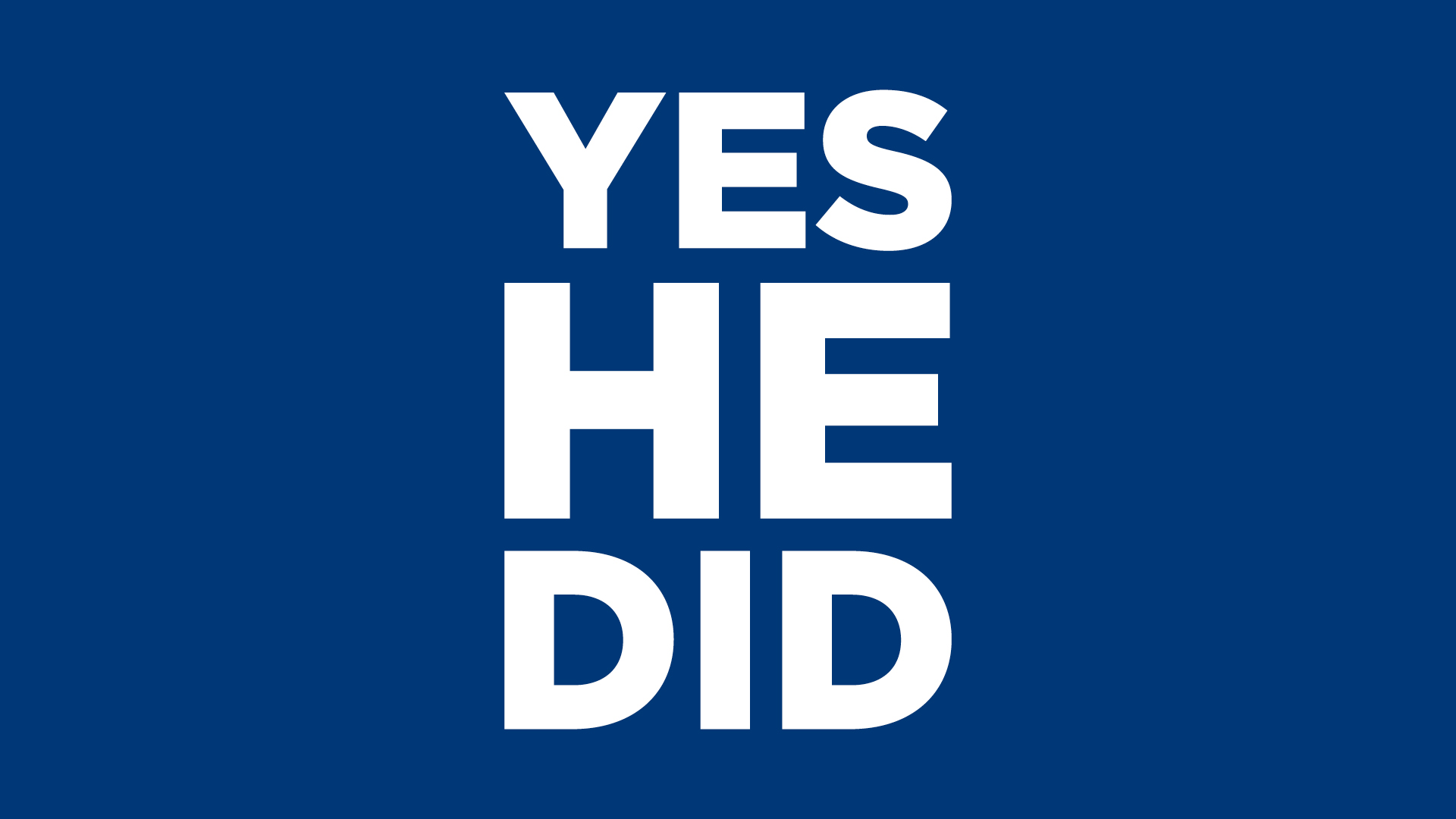
One of the success stories of recent times is Gotham (one of my favourite sans serif fonts). Designed by Tobias Frere-Jones with Jesse Eagan in 2002, commissioned by GQ magazine, it was used in Obama’s 2008 presidential campaign and is associated with his victory. It's still being used to this day and a range of new fonts will be created for the opening of the Obama Presidential Center in 2026.
The future of Futura
Like Linneaus defining species, Maximilien Vox set up the Vox-ATypl classification in 1954 (read more in the book Thinking with Type), which gives the following categories for sans serifs:
- Grotesque: These include most of the earlier sans-serif types, often found with no lowercase or italics. They tend to have limited variation in stroke width and terminals of curves are usually horizontal. Examples are Headline, Monotype 215 and Grot no.6.
- Neo-Grotesque: Derived from earlier Grotesques, less stroke contrast, more regular design terminals of curves are usually slanted. Examples are Helvetica and Univers.
- Geometric: Constructed from geometric shapes, curves and lines are often repeated throughout the letters. Examples are Century Gothic and Futura.
- Humanist: Unlike other sans serif, these are unrelated to earlier 19th century grotesque, but take inspiration from classical handwritten fonts. Examples are Gill Sans and Optima.
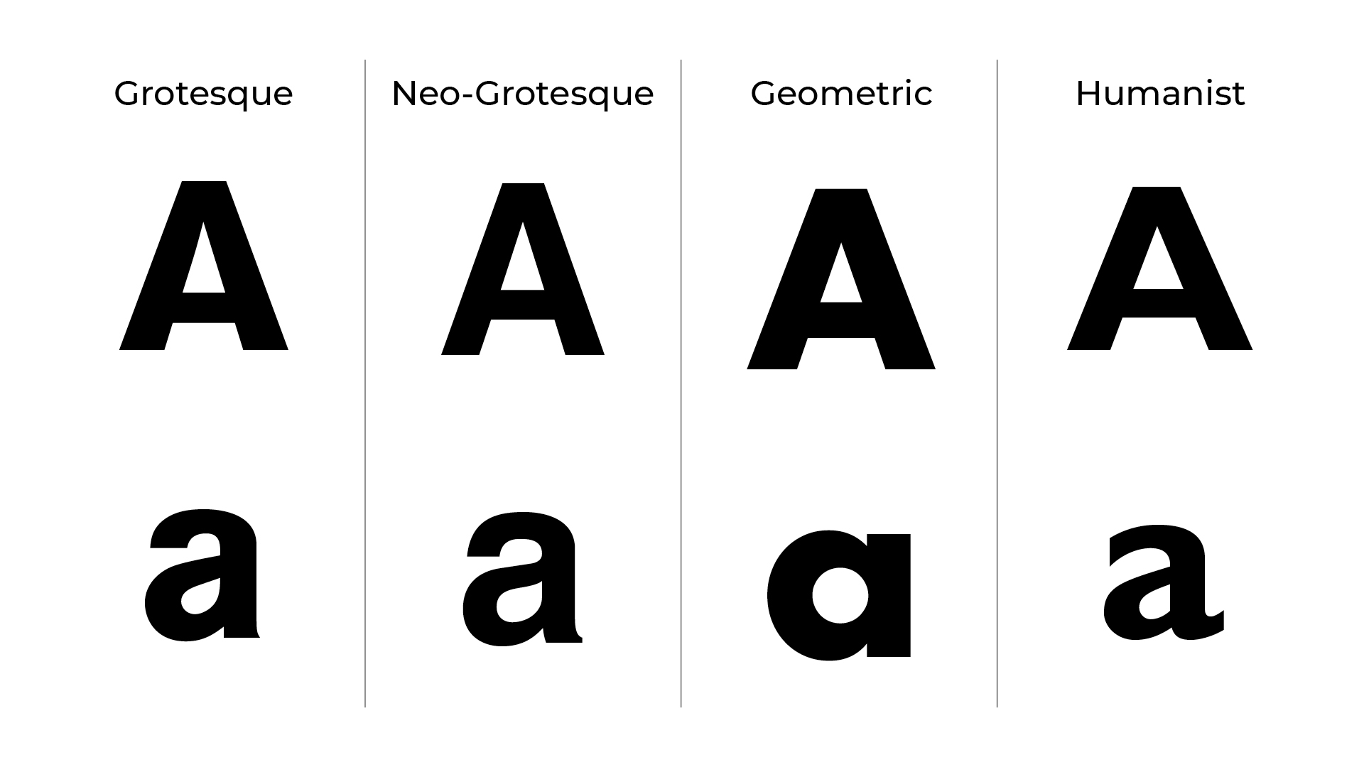
These were set up before computers existed, so it might be time for a new categorisation to come into play. The current trend for reducing traditional branding to minimal reflections of the past lends itself towards sans serif, which are clean, neutral and adaptable. We risk homogenising the world into one boring characterless style and we may see a backlash in the coming years. Which do you prefer in logo design, serif or sans serif?
The introduction of variable fonts in OpenType means more flexibility, using fewer font files and faster page loading. The creative landscape is constantly evolving and designers are always running to keep up, so who knows where sans serif fonts will go next – perhaps AI will come up with a totally new and revolutionary category of fonts altogether.
Want to use a sans-serif with something else? See our guide to font pairing. And for definitions you need to know, see our typography glossary.

Matt has worked for various publishing houses and design agencies, covering studio photography, video production, editorial design, branding, illustration and motion graphics. He currently works for Future PLC with brands such as T3, Woman&Home, Marie Claire, Music Week, TechRadar, Golden Joysticks, Cycling Weekly, Brand Impact Awards, Horse&Hound and Tech&Learning. In the past he has designed titles including Mac|Life, IQ, Bow International, Drummer, iDrum, Acoustic, Clay Shooting, Sea Fishing and GunTradeNews. He has experience across the full Adobe Suite and is currently spending a lot of time creating projects in Blender and After Effects.

