Bauhaus design: a guide to the design movement
The Bauhaus school has had a huge influence on the history of design – and continues to do so today.
Sign up to Creative Bloq's daily newsletter, which brings you the latest news and inspiration from the worlds of art, design and technology.
You are now subscribed
Your newsletter sign-up was successful
Want to add more newsletters?
The Bauhaus was a state-funded school set up by by architect Walter Gropius in 1919. His mission, which became clearer when the school began writing manifestoes about its purpose, was to use the visual arts to bring about a better society. He thought the way to do this was to break down the hierarchies of the creative world, which would mirror German society at the time.
The Bauhaus would smash through the divisions between fine and applied arts, and develop a new aesthetic: made for the people. In real terms, this meant that crafts such as ceramics, print-making, textiles and metalworking would be afforded the same status as painting and sculpture. Later on, photography and graphics would be added to the mix, with a new focus placed on function and, ultimately, design. This has led to the design world we now know, and many of the best graphic design portfolios are influenced by the movement, whether their creators realise it or not.
Over the years, The Bauhaus existed in three different German cities: Weimar (1919-1925), Dessau (1925-1932) and Berlin (1932-1933). The Bauhaus was unique at the time because it asked how the 'modernisation process could be mastered by means of design'.
Article continues belowThis year marks 100 years since the school's opening. Here, we take a quick look at the design movement, including some of the trends and philosophies connected to the school, as well as the Bauhaus logo, and ultimately the closure of the school.
Bauhaus design: Mass production

Gropius realised machines offered a great opportunity to mass-produce appealing and practical products. The Bauhaus vision was to embrace the new technological developments unifying art, craft, and technology. It was primarily focused on clean geometric forms and balanced visual compositions.
The results were both both beautiful and simplistic, from the modern Barcelona Chair designed by Ludwig Mies van der Rohe and Lilly Reich to abstracted line-form paintings by Wassily Kandinsky. Each practice was examined, explored and experimented further by both the students and encouraging tutors.
For objects you can buy today in the style of the Bauhaus, see our post on objects to bring Bauhaus style to your studio .
Sign up to Creative Bloq's daily newsletter, which brings you the latest news and inspiration from the worlds of art, design and technology.
Bauhaus design: Futuristic trends

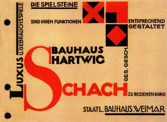
Futuristic designs for the real world were being considered with various mediums including wood, metal and glass. Graphic designers such as Moholy-Nagy, avid user of red and experimental layouts, set strong design trends. He was not shy to augment the typography by standing it vertically or diagonally on the page – as designers, we know this is a difficult technique to implement.
Maholy-Nagy's work influenced, and was influenced by Jan Tschichold, who championed a new movement in typography and wrote many of the rules of graphic design that are still there for us to break to this day. He looked at posters, pages and double-page spreads structurally, considered the benefits or disadvantages of symmetry and asymmetry, and introduced the concept of balancing headlines and body of text along with images as forms on the layout.
Bauhaus design: Typography
Another key designer in the Bauhaus movement was Herbert Bayer, known for developing the typeface Universal. This 'universal' alphabet was commissioned by Walter Gropius in 1925 for exclusive Bauhaus use, unfortunately it was never cut as a typeface. The characters are formed from perfect circles, and there’s zero contrast and no embellishment whatsoever. It was meant to be clear, direct and efficient in its communication – an ideological statement of intent. Although its forms lacked balance and failed to achieve the legibility Bayer hoped for, elements of it were drawn into Joe Taylor’s typeface Bauhaus 93 in 1969.
Below is a re-issue of Bayer's typeface named called Architype Bayer; It was drawn from Bauhaus Archiv sketches, based on his single-alphabet student thesis, and is now available from The Foundry.

Sometimes Bauhaus typefaces are described as Art Deco, but the word ‘mechanistic’ seems more accurate. Beautifully engineered lettering for an age of mass production was part of the aim. Even today when designers wish to express a sense of purity, often the answer is to reduce characters to pure, geometric forms.
Bauhaus design: the Bauhaus logo

Although the Bauhaus aimed to develop a visual language for the future, the school never had a logo. Arguably, the work spoke for itself and the Bauhaus identity was there to be seen in the beautiful objects created.
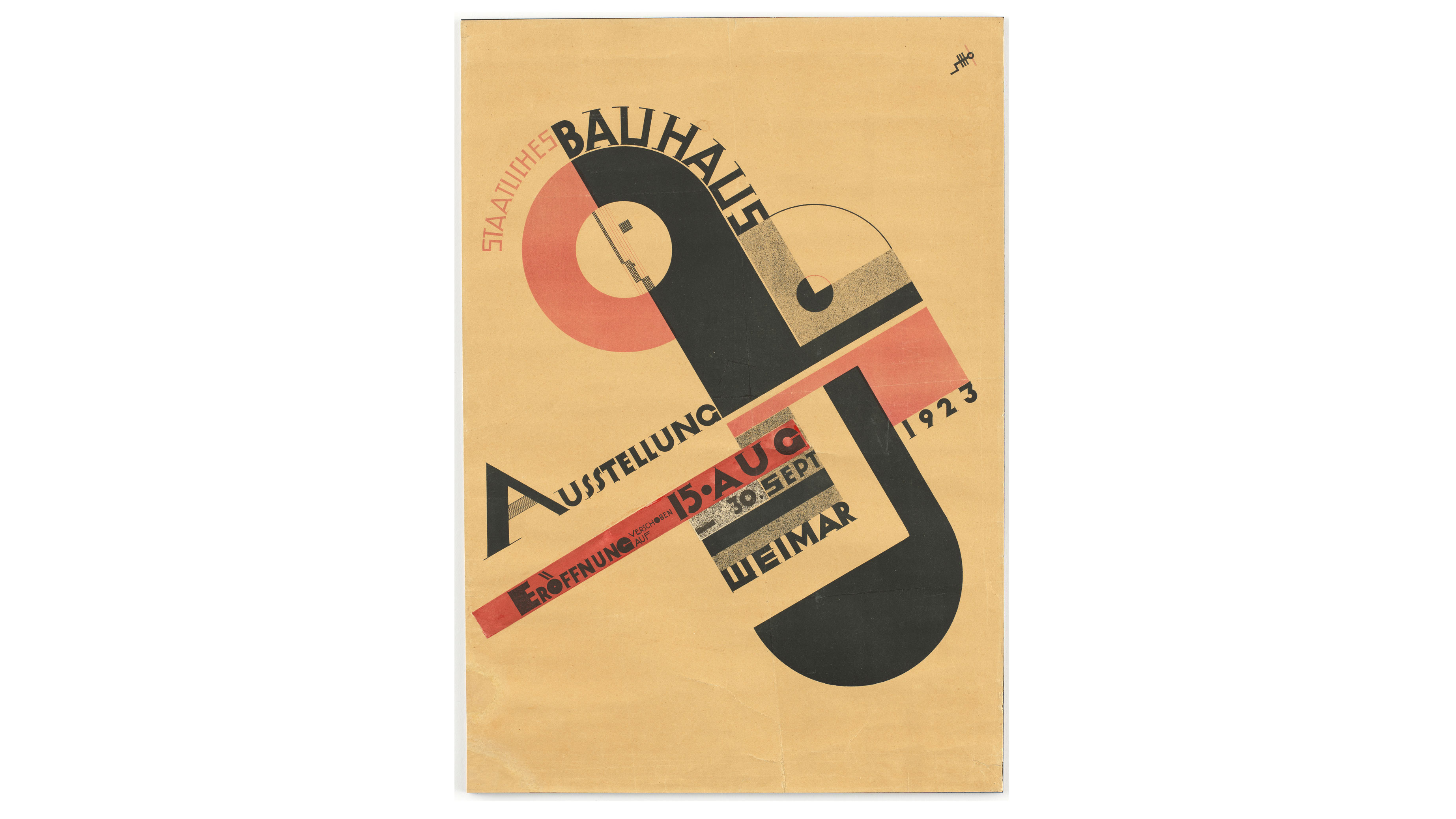
Of course, there’s also the distinctive Dessau school building itself, designed by Walter Gropius. Perhaps the closest the school came to an emblem was the side-on face created by Oskar Schlemmer. It became the motif of the movement.
The machine aesthetic is there to be seen in what is essentially a composition constructed using rectangles, constrained in a perfect circle. In it, there’s the sense that the Bauhaus would reshape the world, and perhaps there is even a hint of Mona Lisa-like contentment in the expression.

The form was incorporated into a poster promoting a 1923 Bauhaus exhibition while the school was still in Weimar. With its asymmetric tilted oval form, dashes of geometry and hairline serif type, it feels like a half-way house between the school’s Expressionist beginnings and new functionalist philosophy. Many a design student has mimicked this design in their coursework – and why not? The image was directly lifted and used as a logo by a 1980s British gothic rock band fronted by Peter Murphy, which called itself Bauhaus and was influenced by German Expressionism.
Bauhaus design: Closure of The Bauhaus
Political pressure and constant scrutiny by the Nazi movement (which strongly opposed modernism in favour of classicism) continued to cast a shadow over the school. In 1928 Gropius resigned and was then succeeded by Hannes Meyer. The school carried on with practice as usual.
In the 1930s the Bauhaus received criticism from the Nazi writers Wilhelm Frick and Alfred Rosenberg, labelling the Bauhaus 'un-German' and disagreeing with the modernistic styles the school was predominately based on. The writers characterised the Bauhaus as a front for Communists, Russians, and social liberals. Further pressure from the Nazi régime forced the Bauhaus to close on April 11, 1933.
With many design movements, the outcomes look out-dated over the years. In contrast, the Bauhaus philosophy has had a constant influence on all forms of design. Most major cities incorporate design elements from this theory of 'form follows function' – such as white walls, clean lines and glass, which is even more impressive when you consider that the school that only existed for fourteen years.
Parts of this article were originally published in Computer Arts magazine; subscribe here.
Read more:
- The impact of the Bauhaus on modern culture
- The best office chair for back pain
- The best office chair for home working
