22 of the best typewriter fonts
The best typewriter fonts for your designs, from vintage classics to more modern typefaces.
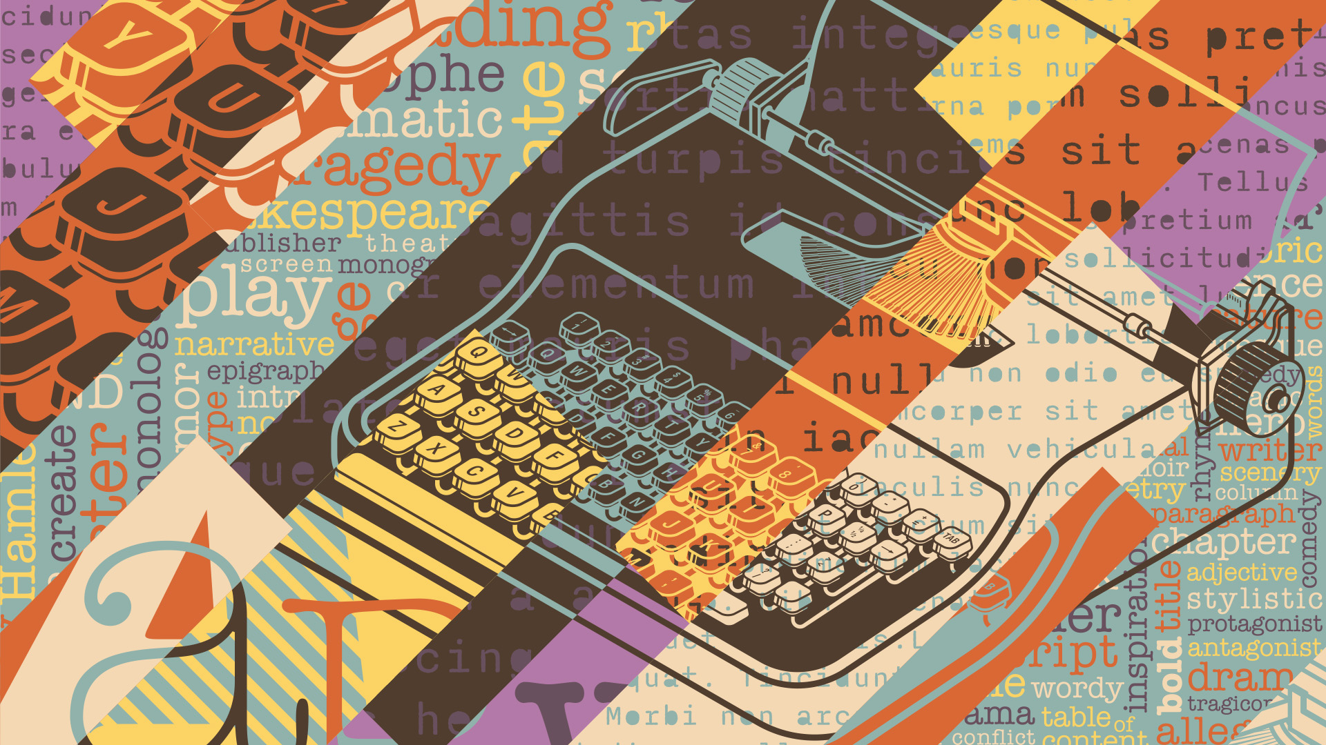
The best typewriter fonts can bring a much-needed dose of character to your designs, whether you're going for a broody, grunge aesthetic or a nostalgic vintage feel. While Courier might be the most famous typewriter font, there are an array of different styles available to suit your creative needs.
In this guide, we've compiled a diverse array of typewriter fonts that capture the charm of old-school letterforms. If you're looking for more creative inspiration, take a look at our font pairings guide to see how you can build the ultimate typographical power couple (top tip: they pair beautifully with professional fonts for designers).
Buy fonts from myfonts.com
Several of the fonts in our selection of the best typewriter fonts below can be purchased at Myfonts.com by Monotype. The site boasts over 130,000 fonts, including more than 900 free options.
The best typewriter fonts
01. Love Letter
- Price: Free for personal use or donate to creator
- Download Love Letter from Dafont
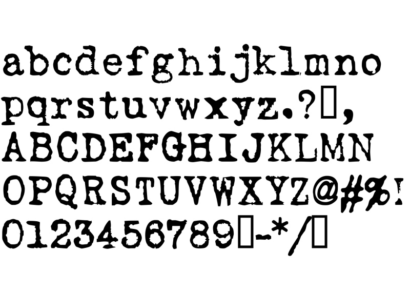
Kicking off our list is this romantic typewriter font created by Dixie's Delights. Love Letter's delightfully imperfect forms provides a rustic feel that can give projects a comforting vintage look, perfect for adding a sentimental human touch.
Love Letter harks back to a time when typewriters were used to spill out our feelings for our loved ones. Reach for this most amorous of free typewriter fonts if you want to put a bit of old-school passion into your designs.
02. CarbonType
- Price: Free to use
- Download CarbonType from FontSquirrel.com
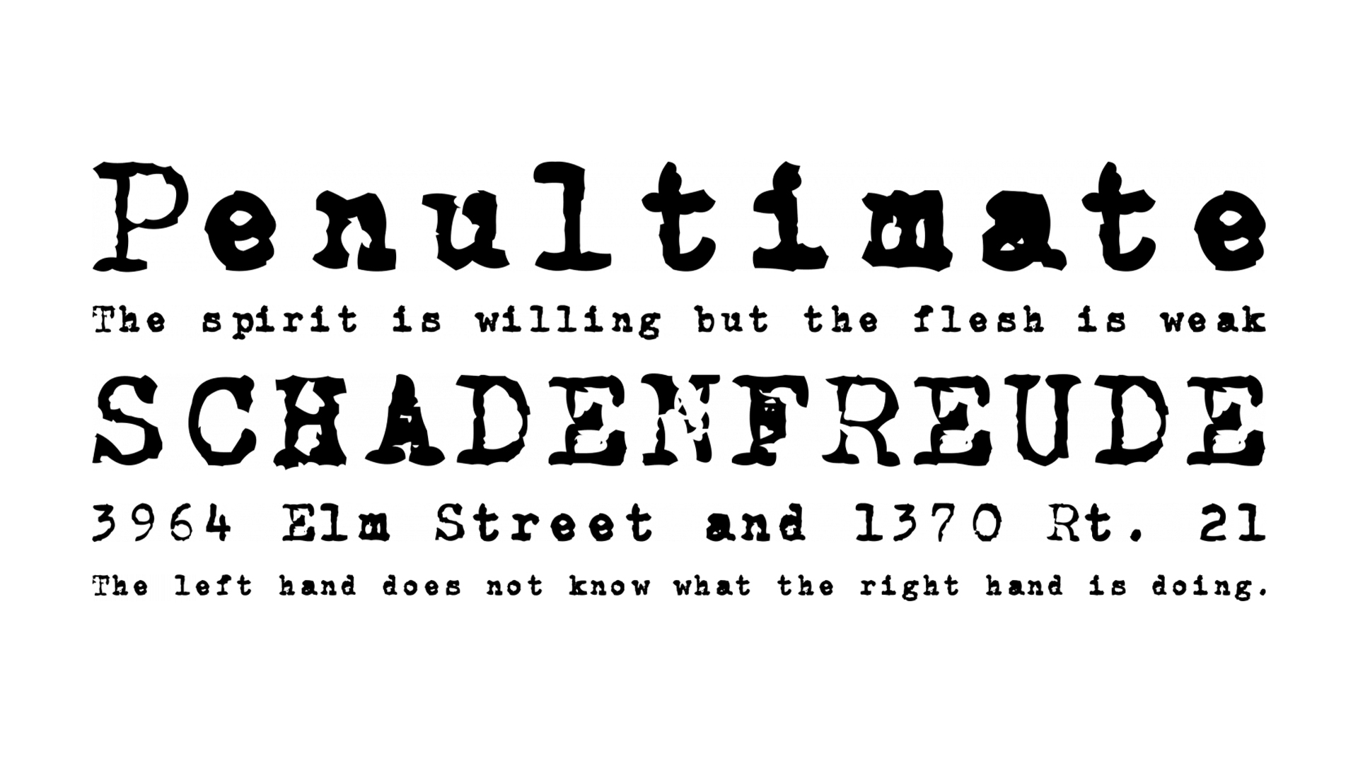
CarbonType is a stylish grungy typewriter font that's scanned directly from letters produced by a Samsonite typewriter. It can give projects an authentically worn feel that's effortlessly cool. The best thing is it's completely free to use. Use it for posters and projects that need a bit of edge.
03. Thesis Typewriter
- Price: From $6
- Download Thesis Typewriter from myfonts.com
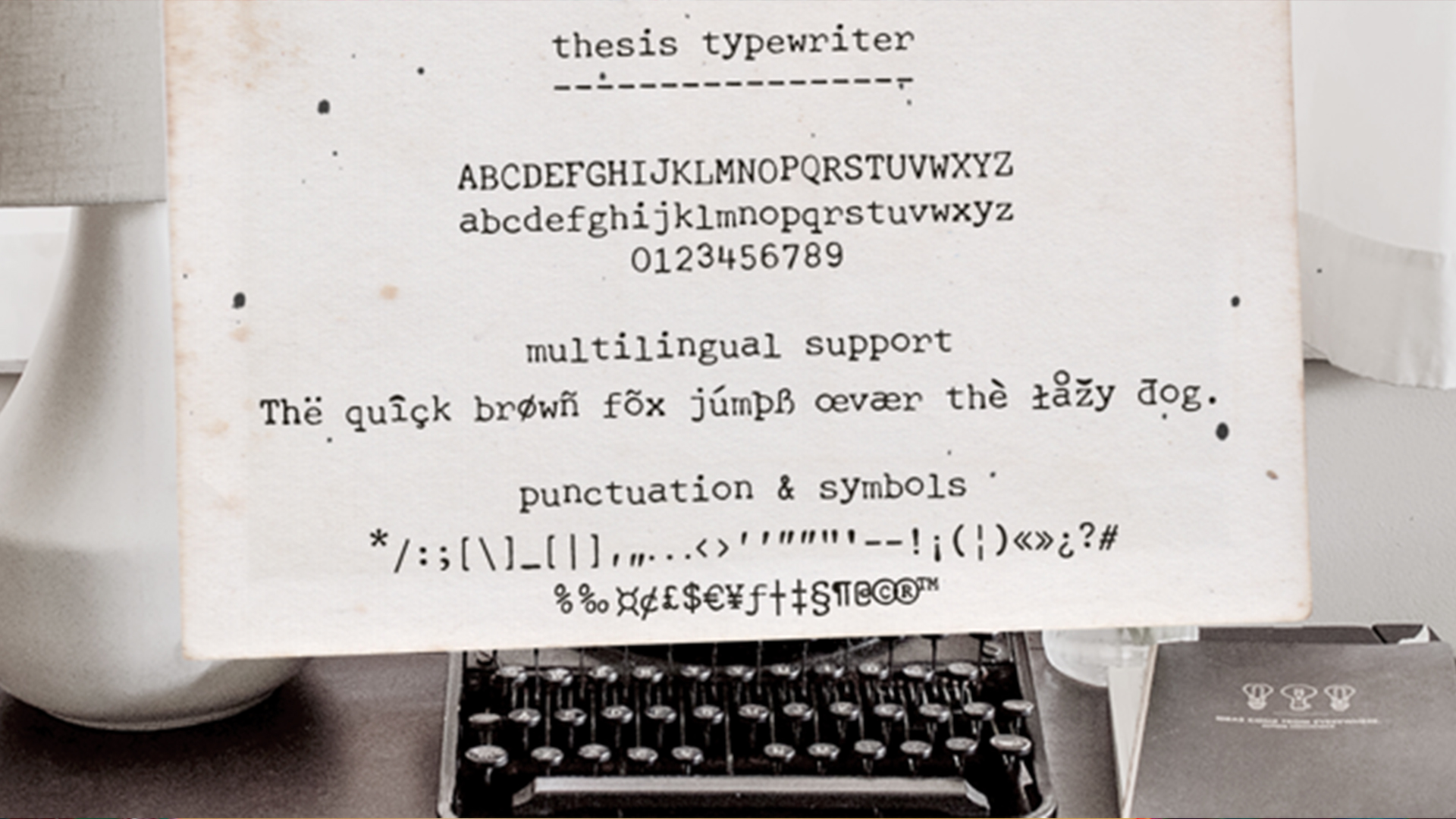
Thesis Typewriter typeface from Ana's Fonts comes in three styles (Weary, Regular and Bold) sampled from three different theses and reports from the 60s and 70s. That makes it versatile and able to suit a multitude of projects, from vintage designs and digital collages to branding and packaging.
The smoother Thesis Typewriter and Thesis Typewriter Bold include math symbols and Greek letters. The cost of the Thesis Typewriter is $6 per style or $18 for the whole family.
Sign up to Creative Bloq's daily newsletter, which brings you the latest news and inspiration from the worlds of art, design and technology.
04. Detective

- Price: From $17
- Download Detective from Creative Market
Handcrafted Detective is an eccentric and nostalgic typewriter font perfect for projects that require an element of mystery. What we like about this font is the fact that not all the letters are uniformly straight, meaning it gives an authentic and playful feel for a subtle, personal quirkiness.
05. Grandpa's Typewriter
- Price: From $20 / £13.99
- Download Grandpa's Typewriter from myfonts.com
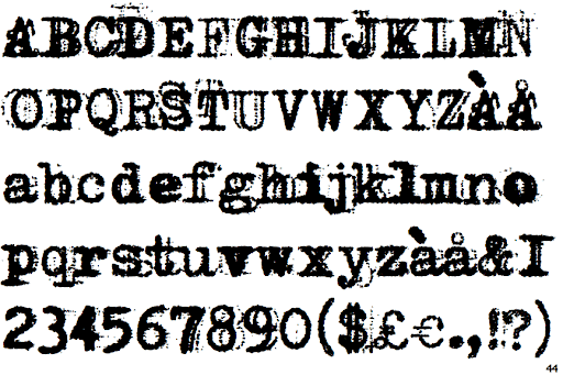
If you want a really thick, smudgy old typewriter look for grainy or superimposed type, then Grandpa's Typewriter is a creative option. Designer Eduardo Recife based this five-font family on an antique Olivetti, and he includes all the effects you get from an old typewriter machine. There's a regular version, a strong hit version, a light distressed version, a double-hit version and intriguingly an X version, which is a compilation of typewriter mistakes, tests and stains. It's great for designs that require a distressed grungy look.
06. Intimo
- Price: From $60 / £40
- Download Intimo from myfonts.com
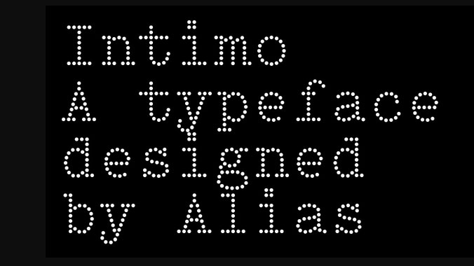
Type designer Gareth Hague's Intimo is quite a unique alternative typewriter font that uses the simplicity a dot matrix to create elegant serif type. There are two versions with the second having curved lines for a a softer feel. This offers something a bit different while retaining effortless readability and a nice visual effect at various sizes. It could work well in poster designs.
07. Bohemian Typewriter
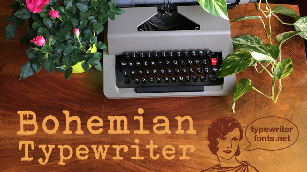
- Price: Free for non commercial use / contact for commercial
- Download Bohemian Typewriter from Dafont
Created by typewriter typeface specialist Lukas Krakora, this typewriter font was used in captions in the movie Greyhound with Tom Hanks and in Oliver Stone's The Untold History of the United States documentary series. It feels authentically inky, recalling old inked cloth typewriters while maintaining legibility.
The font is free for non-commercial use. For any commercial use contact Lukas to request a licence. He's also able to customise the font as needed. He has a range of typewriter fonts on his website.
08. Scripter Serif
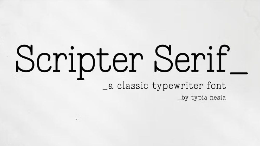
- Price: Requires Envato subscription: $16.50 per month
- Download Scripter Serif from Envato
Here's another nice and clean typewriter font, but this one's a serif. It's highly legible, making it more suitable for logo and branding work but still has a clear typewriter feel. The clean lines make it feel more modern, so it's not necessarily one for creating a vintage look, but more the timeless elegance offered by a typewriter typeface.
09. Olivetti Typewriter

- Price: From £29
- Download Olivetti Typewriter from MyFonts
Created by designer Iza W, this classic typewriter typeface is great for mimicking the look of older typewriters but with a relatively crisp and neat execution. It's available in five different weights, including a less-usual shadowed version, making it a flexible family to work with.
09. Courier M

- Price: From $19.95 / £14.96
- Download Courier M from youworkforthem.com
A version of the classic Courier font, Courier M is a complete typewriter typeface with bold and oblique fonts as well as regular. Designed by Howard Kettler in 1956 and released by font foundry URW, it's a clean, classic lightweight typewriter font.
10. Colón Mono

- Price: From $30 / £22.50
- Download Colón Mono from MyFonts
A monospaced slab serif type family, Colón Mono was created by architect and graphic designer Ramiz Guseynov. It comes in two weights of roman and alternative styles and matching italics respectively.
11. Erased Typewriter 2
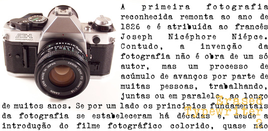
- Price: From $27
- Download Erased Typewriter 2 from MyFonts
For something less neat and tidy for designs that require a rough and irregular typewriter look, Erased Typewriter 2 is a distressed font from type designer Paulo W. It's great for creating an authentic type feel for editorial layouts, flyers and more. There's a choice of four weights: regular, bold, italic and underscore.
12. LTC Remington Typewriter Pro
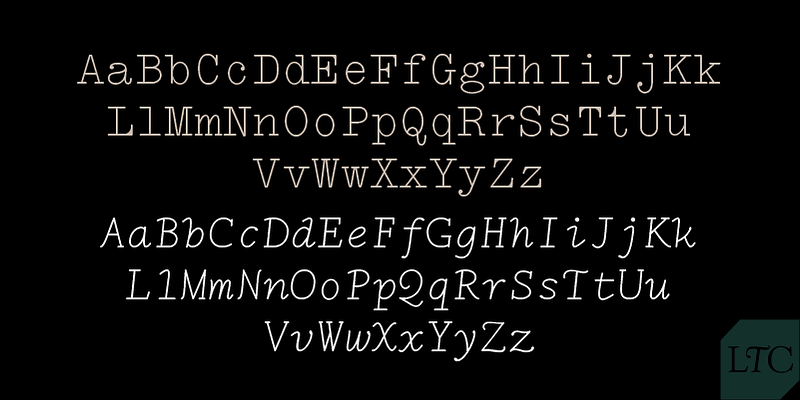
- Price: Free with Adobe Creative Cloud
- Download LTC Remington Typewriter Pro Set from Adobe Fonts
LTC Remington Typewriter Pro is a beautiful classic lightweight typewriter font with a hint of class and unconventional characteristics in the letterforms. Far removed from the traditional bulky ink spilt typewriter style, this clean alternative is a great way to combine a hint of classic design with more technological visuals or to add some formal elegance to designs that require a vintage touch.
13. P22 Typewriter
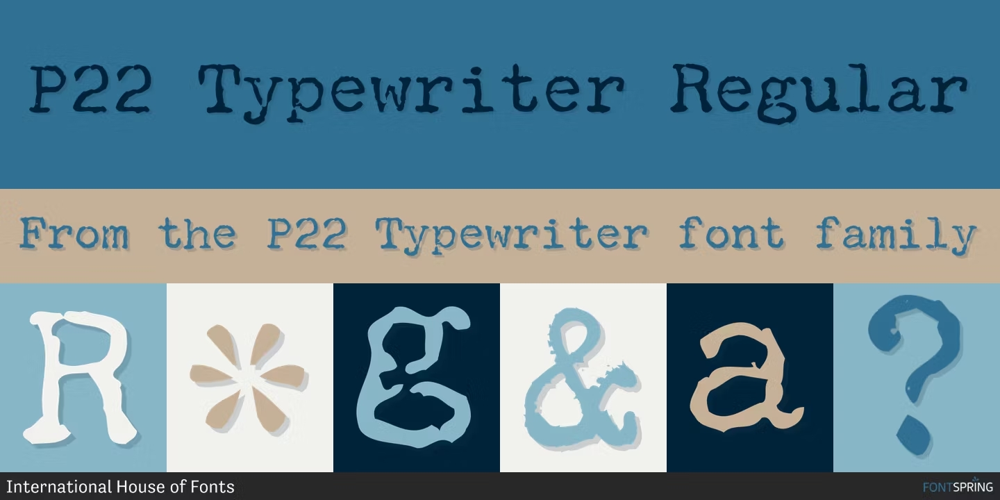
- Price: From $24.95
- Download P22 Typewriter from fontspring.com
Created by International House of Fonts, the P22 typewriter font is based on a typewriter typeface originally used in a document for a German type conference in the 1960s. Striking a balance between distress and clean legibility, it offers myriad uses. There's also now an underlined variant.
17. EF Mono
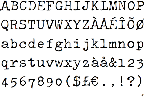
- Price: From $35 /£24.99
- Download EF Mono from myfonts.com
Designed by Ilko Höppin for the Elsner + Flake design studio, this is another playful alternative to the classic Courier typewriter font. The cutout effect and distorted lettering offer an interesting visual dynamic.
18. EF Techno Script
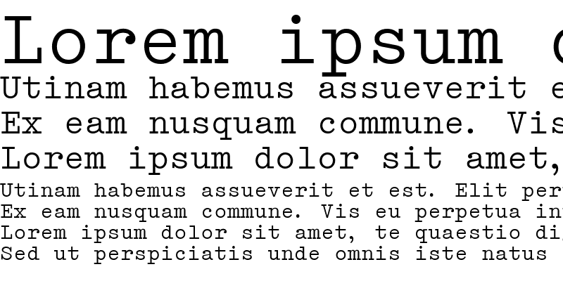
- Price: From $35 / £23.99
- Download EF Techno Script from myfonts.com
Another example brought to us by the Elsner + Flake design studio, Techno Script combines clean-cut digital elements with the typewriter aesthetic for a style that wouldn't look out of place in more modern applications.
19. Firenza

- Price: From $45 / £33.75
- Download Firenza from youworkforthem.com
Based on a design used at the turn of the 19th century, the Firenza font family has character shapes that resemble those which became common on typewriters throughout the second half of the 20th century. Each weight has a full character set of 232+ letterforms, with all characters designed in the style of the font.
20. Chapter 11
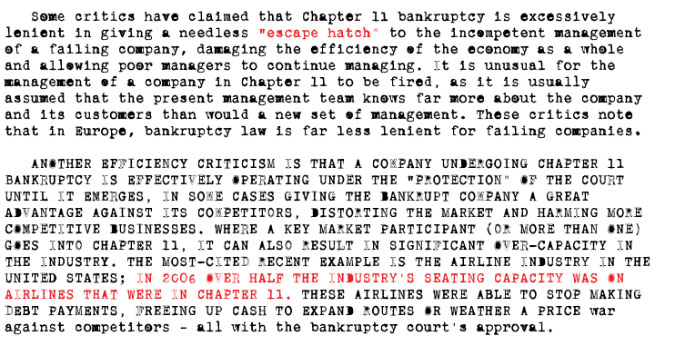
- Price: From $24.95 / £18.99
- Download Chapter 11 from myfonts.com
Chapter 11 is the perfect font if you're looking for an authentic typewriter feel redolent of official classified government papers and the like. Designed by Canadian typographer Rebecca Alaccari, it's a great typeface to use when you want to get creative with a more organic typewriter style.
21. Mom's Typewriter

- Price: Free
- Download Mom's Typewriter from DaFont
Moms Typewriter is a great font for adding an authentic grungy appeal to your projects. Created by Christoph Mueller, this custom typeface was created from scans of an original old typewriter. In his own words: I just typed the whole alphabet on my mom’s old typewriter, scanned it, and made the font," Christoph says. Moms Typewriter is completely free to use for personal and commercial use.
22. Last Draft
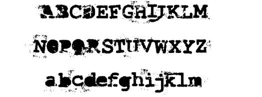
- Price: Free for personal use or donate to author
- Download Last Draft Font from Dafont
Designer Andrew Hart has a ton of free fonts, all of which are available on his website. But we particularly like this fanciest of free typewriter fonts. Free for personal use, the download includes a full set of upper and lower case letters, numbers and special characters.
What font looks most like a typewriter?
While there are plenty of creative typewriter fonts available, the most popular option is Courier or Courier New. This font is found on most word processors and features the familiar, retro serif style typography that we often associate with typewriter fonts.
Courier New was specifically designed to emulate the style of a typewriter, featuring a slab serif style with a monospace design.
How can you create your own typewriter fonts?
Some of the most authentic-looking contemporary typewriter fonts are made by digitising text produced using real vintage typewriters. So if you have an old typewriter and like the style of the type it produces, you could try creating your own typewriter font.
You'll need to type out all of the characters using your typewriter of choice, including both upper and lowercase and punctuation marks. Remember that typewriters can produce a lot of variation because the weight of the letters can depend on how hard you hit the keys, so you may want to create several versions of each.
You'll then need to scan the typed characters and take them into image-editing software like Photoshop to clean them up. Remove any ink blots or smudges, and make sure that each character is clearly isolated and defined. You can then use font editing software like Birdfont, FontForge, Fontstruct to trace or vectorise the characters to convert them into scalable outlines. Other options like YourFonts.com and Calligraphr are designed for handwriting fonts but can also work.
Determine the font's characteristics, including x-height, cap height, ascender and descender height, and adjust aligning, spacing and kerning. When you're happy, you can export the font in OTF or TTF format so that it can be installed on a computer and used in software.
Many digital typefaces come in different weights. This isn't a characteristic of typewriters, but you can use design software to create a bolder or lighter version of a digitised typewriter font if you want to have that option.
Also see our guide to how to create your own typeface.
Why do typewriter fonts look the way they do?
The characteristic look of typewriter typefaces is determined by fashion of the time and by the mechanics and limitations of typewriters. They are usually monospaced typefaces as most typewriters give each character the same amount of horizontal space. They usually have slab serifs since this was popular in the 19th century, while some are sans-serif in a bid to aid readability.
Typewritten text tends to have variations in weight due to the impact of the keys on paper and bleeding from from the ink, which can cause that distressed look with some letters looking more bloated and others having gaps. Even the text from two typewriters of the same model can look different due to imperfections, alignment issues and wear and tear.
Typewriter manufacturers had their own typefaces, and many offered typewriters in multiple typefaces. Technological changes also transformed how typewriter typefaces looked as companies moved from inked cloth to carbon film ribbons. By the 1960s, companies like IBM offered changeable typefaces on typewriters. IBM's Selecteic and Selectric II used changeable 'golf ball' type elements that included even script typefaces and special symbols for mathematical notation and multiple languages.
If you'd like to learn more about typography, check out our jargon-free Font vs typeface guide where we clear up a common confusion.

Kerrie Hughes is a frequent contributor to Creative Bloq, and was once its editor. One of the original CB crew, Kerrie joined the team back in 2013 after moving from her role as staff writer on 3D World. Since then she's written regularly for other creative publications such as ImagineFX, Computer Arts and Digital Camera World. After a stint working for the police, Kerrie is back reviewing creative tech for creative professionals.
- Joe FoleyFreelance journalist and editor
You must confirm your public display name before commenting
Please logout and then login again, you will then be prompted to enter your display name.
