Create your own 3D typeface
Discover the creative process behind 3D type family Rig Shaded.
Sign up to Creative Bloq's daily newsletter, which brings you the latest news and inspiration from the worlds of art, design and technology.
You are now subscribed
Your newsletter sign-up was successful
Want to add more newsletters?
Creating any type of 3D art is tricky, but throw typography into the mix too and it can become all kinds of daunting. To get you started, I will talk you through how I created 3D type family Rig Shaded.
Perfect for eye-popping headlines and logotypes, Rig Shaded is a layered or ‘chromatic’ typeface, which means that you can choose your own style and colour combinations. Its geometric letterforms are picked out with a distinctive halftone shading style and its four weights include a unique ‘zero’ weight.
The process of creating Rig Shaded was as elaborate and unusual as the typeface itself, involving several tools and collaborations. Here's how I did it...
Article continues below01. Hunt for inspiration
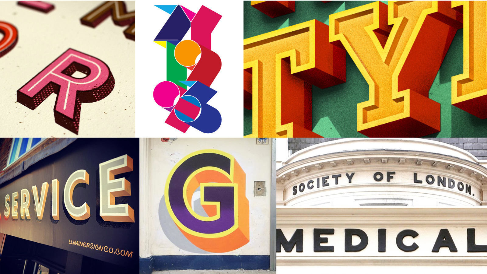
I can’t get enough of 3D signwriting and tactile lettering. I wanted to capture that magic in a typeface. My previous chromatic typeface, Brim Narrow, was a serif design inspired by antique woodtype from the 1800s, and this time I wanted to design something that was thoroughly modern. I had lots of ideas and sketches, but before I opened my font software there was much to figure out.
First, I made a Pinterest board with dozens of 3D lettering examples. I collected sign painting by Ged Palmer, graffiti by Gary Stranger and bold building signage. I gathered gorgeous digital lettering, including some by Jeff Rogers and Bobby Evans, both of whom I contacted to ask about their processes. Jeff has a very painterly approach to letter shading, while Bobby favours a textured, screen-printed style.
02. Collect shaping ideas
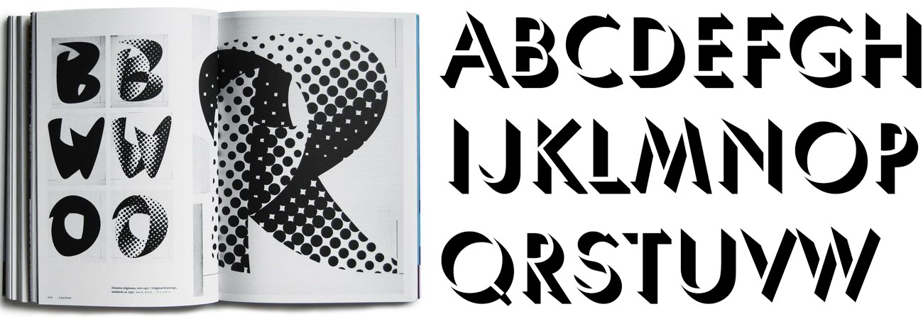
When I was exploring the other chromatic fonts available, I couldn’t find a geometric sans serif option. Of the sans serif typefaces, many struggled with how the angles of their drop shade, or extrude, were affected by their diagonal shapes.
For example, if you apply a 45º extrude to an X that falls from the bottom right, the result will look very uneven. The stroke of the X running from top left to bottom right will show almost no extrude but the extrude on the opposite stroke will be overly deep. These need to be equalised while tricking the eye so the viewer does not notice.
Sign up to Creative Bloq's daily newsletter, which brings you the latest news and inspiration from the worlds of art, design and technology.
R. Hunter Middleton’s Umbra typeface does an outstanding job of this, however its proportions are those of Roman capitals rather than geometric. The same goes for the angles at the ends of the characters (the terminals).
03. More research and development
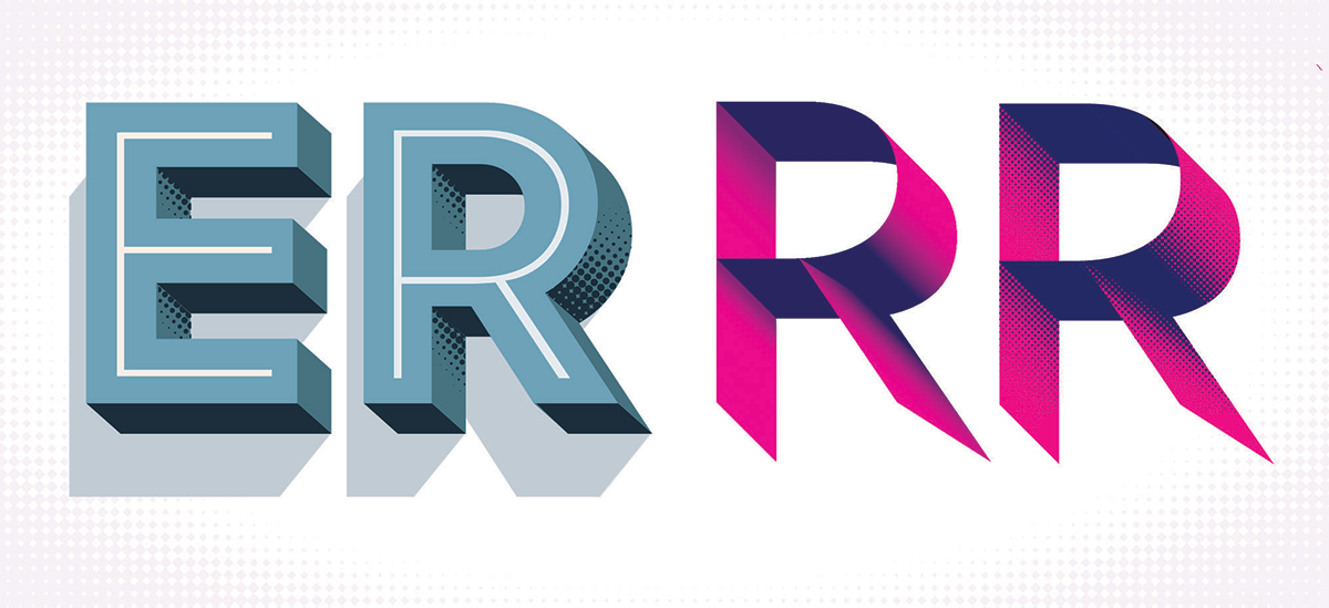
I applied a rough, mechanical extrude to a variety existing sans serif fonts, using a simple Adobe Illustrator blend (If you’d like to know more about making 3D lettering I‘d recommend Jeff Rogers’ excellent 3D Skillshare tutorial).
I studied characters like the N, S and X to figure out the best character shapes and what issues to look out for. I began to wonder: what if I designed a typeface that 'allowed the tail to wag the dog’ and adjusted each the letter shapes specifically to suit an extrude style? Could a geometric typeface work in harmony with 3D effects while maintaining its geometric principles and proportions? This question eventually led to Rig’s distinctive design.
To accentuate Rig’s solid appearance I wanted to add some shading to its extrudes, which would also make the letters feel more like custom lettering. I played around with halftones using traditional circles, but the amount of data required to plot thousands of circles across the entire font would result in enormous file sizes and slow software rendering.
A square however, requires a third of the data required to render a circle, so I found a way to make halftones with squares by using Astute Graphics’ Phantasm filter in Adobe Illustrator.

04. Write yourself a brief

Typefaces take a long time to produce so it’s important to establish a brief for yourself to follow. Months into production, neck-deep in detail, you’ll undoubtedly have a critical decision to make about your design direction; without a firm guide to keep you on track it’s easy to go astray. I also kept a detailed Evernote document recording technical details and decisions in case I wanted to reconsider an option.
There seemed to be room in the market for my idea. So the brief to myself was:
- A typeface with geometric shapes, specifically to complement 3D effects
- Well balanced extrudes that have a visual harmony with the letter shapes and/or spacing
- All terminals angled to suit the connecting extrudes
- Maintain clear, open, legible character
- Create shading styles that emphasise the design’s solid, 3D appearance
- Keep it modular with interchangeable options so the creativity stays with the end designer
- Produce four weights, including include a razor-thin weight (the eventual ‘Zero' weight)
05. Design the face
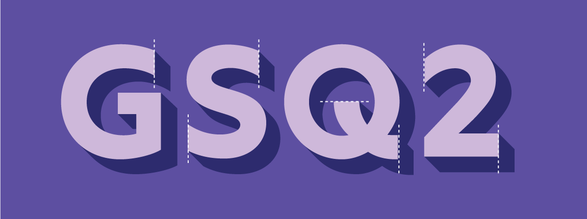
It was now time to start designing the face of the characters. For this I used Glyphs, a font editing program. Glyphs’ vector drawing tools are second to none, allowing for precise control and accuracy. Working within a dedicated type design tool also encourages you to think about the spacing of your type while you draw it.
I drew my initial A-Z, focusing on the overall shapes and proportions of the letters. I made all terminals end at 90º, with a few exceptions at 45º, to suit the extrude style. I designed the characters a fraction narrower than a strict geometric, which steepens the angles of the diagonals (helping the uniformity of the extrudes) and makes the font more economical with space when it’s used in long headlines.
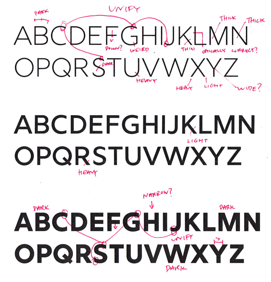
I designed the A-Z in Bold and Light weights and used Glyphs to create the Medium weight by interpolating from my two extremes. When completed, I asked a couple of friends and veteran type designers, Dave Foster of Foster Type and Toshi Omagari of Monotype, for their feedback on my alphabets.
Next page: five more steps to creating your own 3D typeface...
- 1
- 2
Current page: Create your own 3D typeface: steps 01-05
Next Page Create your own 3D typeface: steps 06-10
Jamie Clarke is a type designer and lettering artist, expertly bridging both fields. Since refining his skills at Reading University in 2013, Jamie has created a growing collection of contemporary typefaces. He unveiled his first font, Brim Narrow, in 2015, followed by his award-winning 3D font, Rig Solid, which became part of Canva’s library in 2018. His lettering projects are known for blending words and imagery to create meticulously crafted illustrations. Notable examples of his work include branding for Kelmscott Bakery and his cover design for The Woman in Black.
