Learn how to paint a cityscape on a tablet with Kan Muftic
Turn an overcast urban scene into digital landscape painting with this expert advice.

Sign up to Creative Bloq's daily newsletter, which brings you the latest news and inspiration from the worlds of art, design and technology.
You are now subscribed
Your newsletter sign-up was successful
Want to add more newsletters?
Living in London is a constant source of inspiration – its stunning architecture and rich history offer endless material for painting. But for this workshop on how to paint an urban scene, I’ve chosen to focus on something more universal: a familiar, everyday urban scene that could be found in almost any modern city.
There’s a certain poetic charm in washed-out, overlooked corners – places that might seem mundane at first glance, yet hold their own quiet beauty. Using my Samsung tablet as a portable digital painting kit, I take every chance I get to head outside and paint from life, capturing these fleeting urban moments as they unfold.
For this workshop, I'm using the Android app Sketchbook on a Samsung Galaxy Tab, but you could use any of the best drawing apps for Android or the best digital art software, and you could also use an iPad or one of the best drawing tablets.
Article continues below01. Setting up
The first tip I can give for anyone intending to do urban sketching is to make sure you are not putting yourself in harm’s way by picking locations which could potentially be dangerous, such as railways, unmarked roads, or dodgy areas where you could get mugged because of your tablet.
Find a safe spot where you can spend a few hours comfortably. Coffee shops offer great views through the window, they are warm and they have… well, plenty of coffee. Also try your local museums – they have great lighting conditions
02. Lay-in
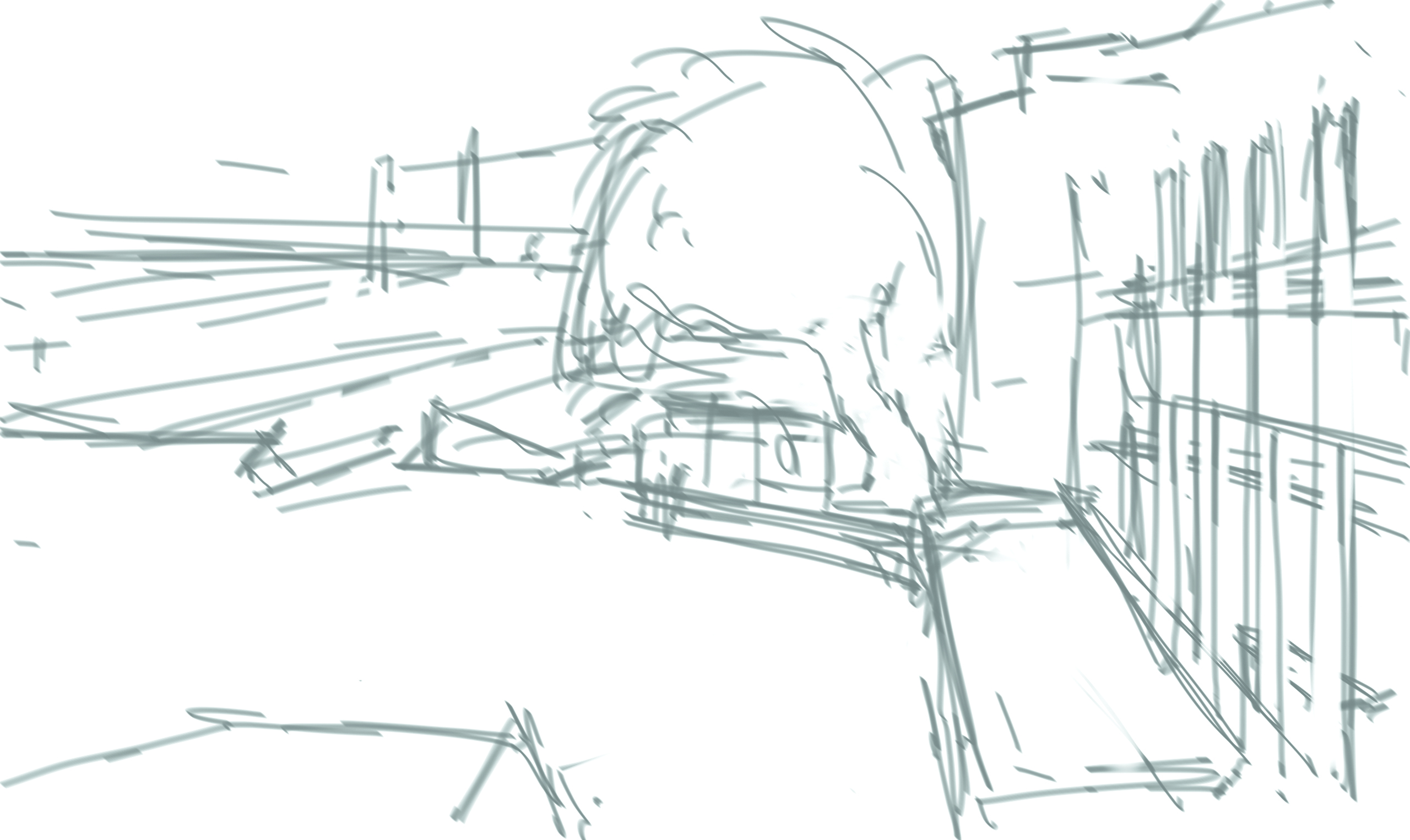
I fire up Sketchbook. This is the most intuitive and easy to use software I have encountered. Facing a real-life environment can be overwhelming, so I decide to pick out a section from my field of vision that would make an interesting composition.
Then, I take a moment to observe. It is impossible to process all the details at once so I have to simplify the scene and group objects into large masses. I quickly lay in some very rough marks defining my composition.
03: Tools
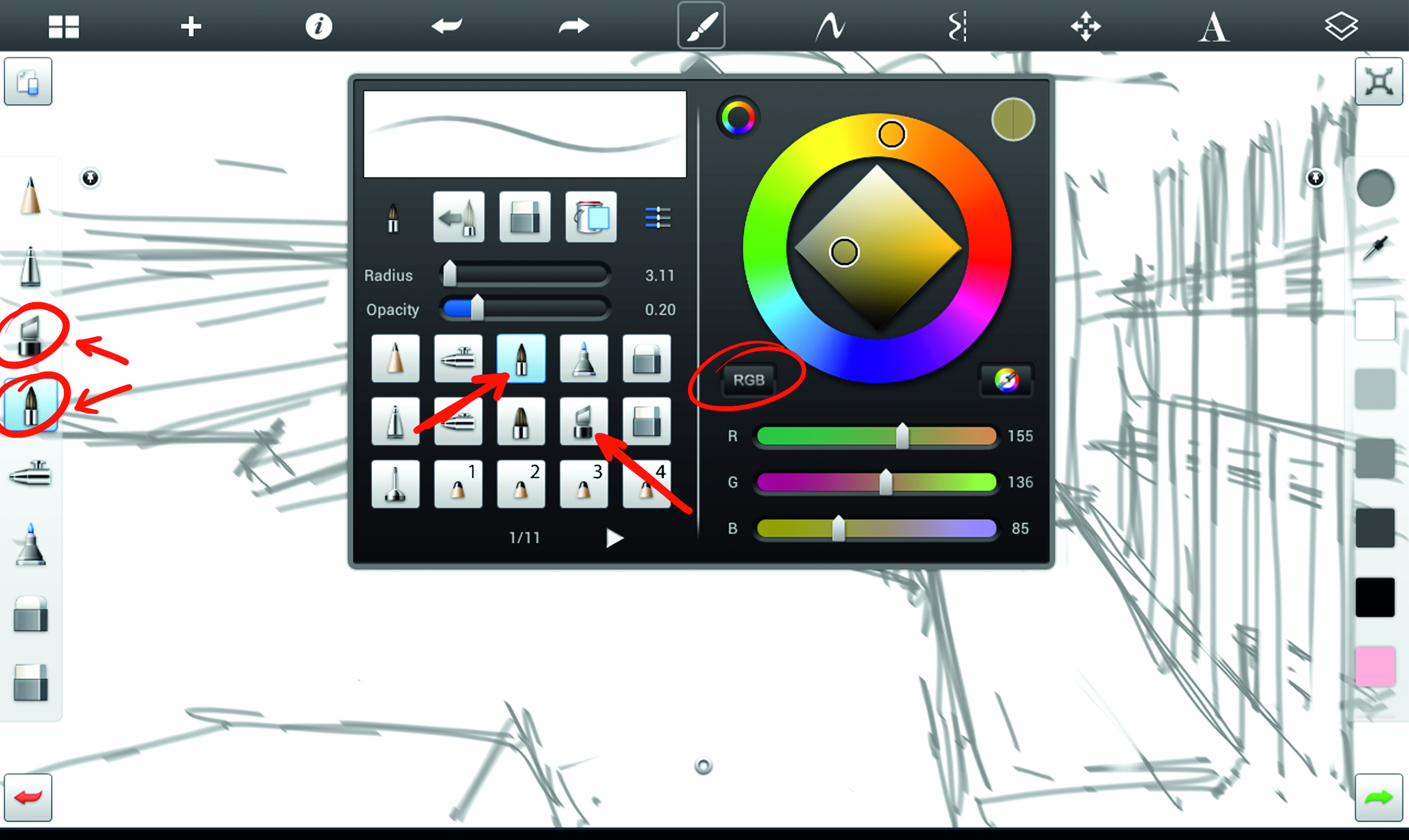
For quick sketching and solid marks, I use the Marker brush, and for most of this workshop, I use the Oil brush. The Marker is just amazing for sketching while the Oil brush really does a great job of creating creamy strokes which I love so much.
In fact, I prefer it to any other digital brush in any available software on the market. Next, I change the colour mode to RGB, mainly because I am more used to it.
04: Colour foundation
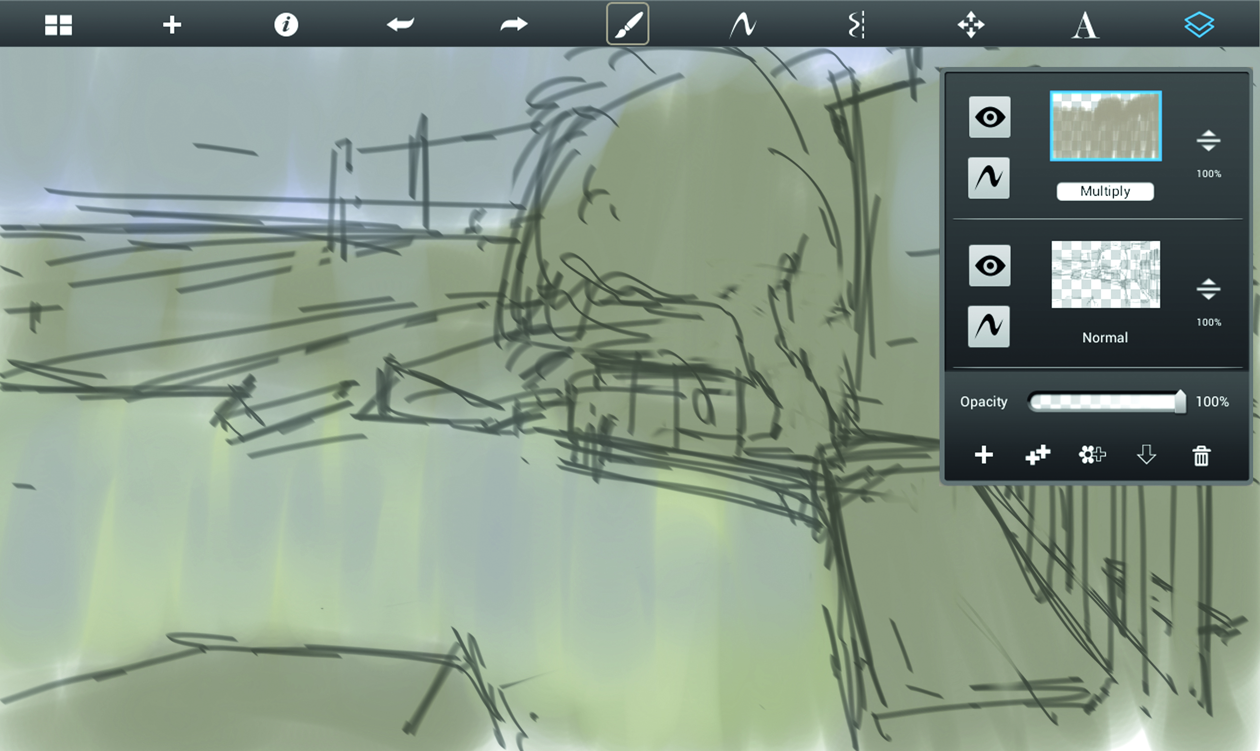
Normally, I would paint straight on top of my lines but since I am facing a rather tricky palette, I create a new layer and set it to Multiply. That way I allow myself more room to make mistakes and to fix them, without losing the main composition.
I observe carefully again. I need to find colours that dominate the scene. This step will influence everything I do afterwards, so I take my time. It’s all about trial and error at this point. Real life colours are quite tricky to get so again, I simplify them into the ones that seem most prominent.
05: Overcast
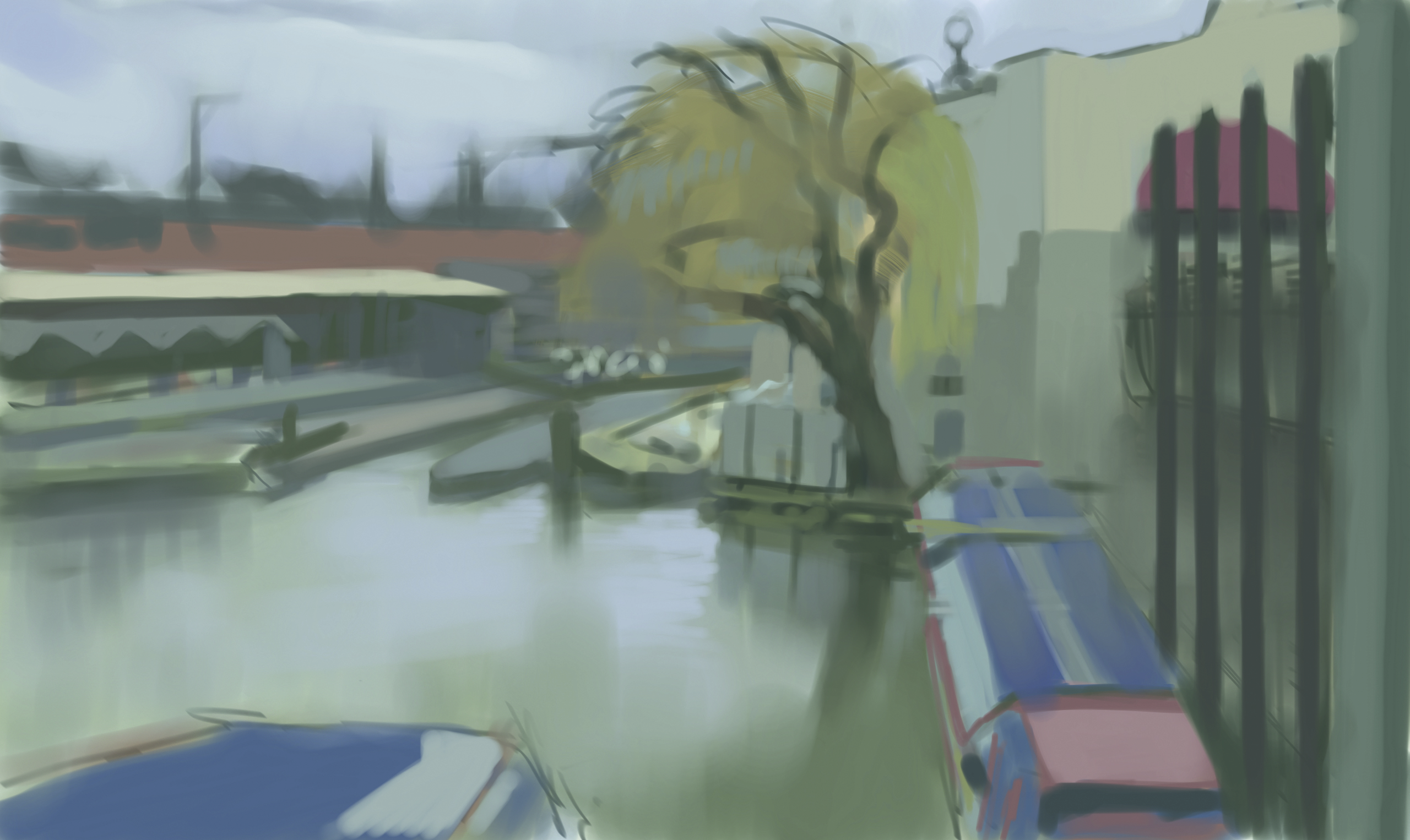
I picked a day with grey sky which we define as overcast light. There are no spectacular bright colours or dark cast shadows, which makes the scene look a bit flat. But there is one huge advantage when painting overcast from life: it stays the same! Anyone who ever painted from life will know how frustrating it can be to have light changing in a matter of minutes.
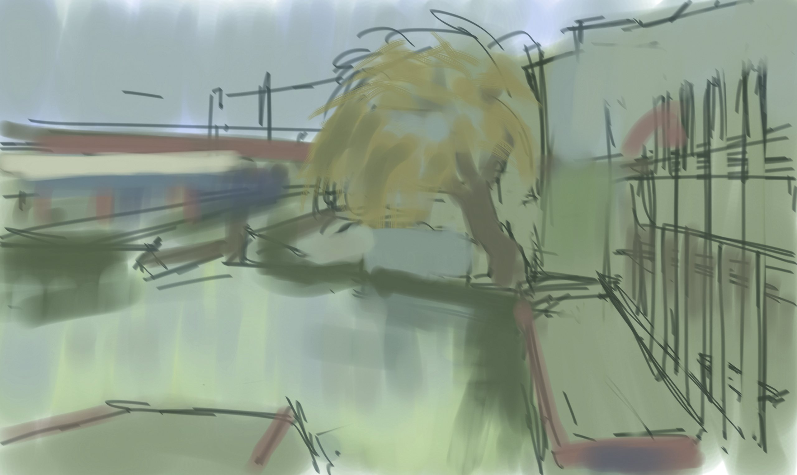
On an overcast day, the light remains largely the same for the majority of the day. Also in overcast, you will find a great amount of local colours, unaffected by strong sunlight. I start putting a lot of different colours down but I keep them within the similar value range. I add a Normal layer on top of the Multiply one and paint in a Normal layering mode.
06: Colour matching
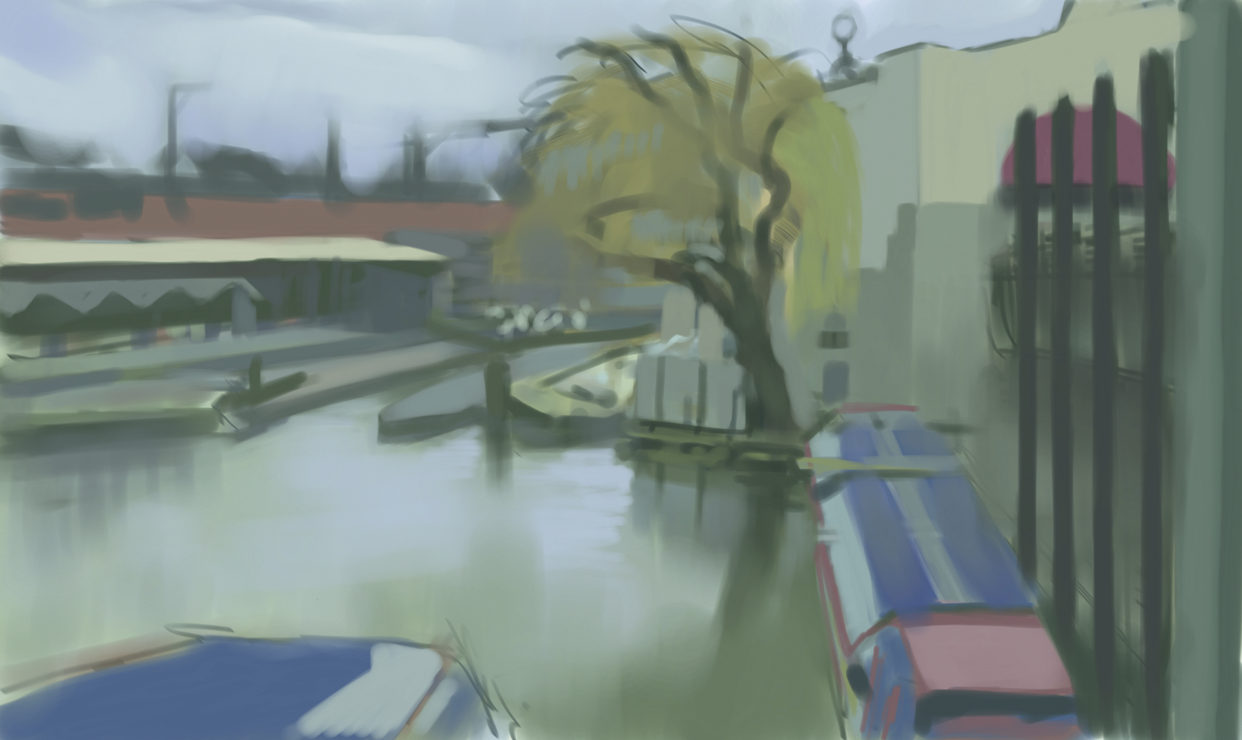
A lot of times, artists stylise and enhance real-life colours in order to increase the dramatic impact on the viewer. Other times, it is about trying to capture the moment as it is. I am taking the latter approach which requires a lot of exploration.
I constantly paint stroke on top of stroke, while trying to exactly match the colours I see in front of me. Avoiding Undo will create a very nice illusion of underpainting and will provide richness to the final piece.
07. Binding colours
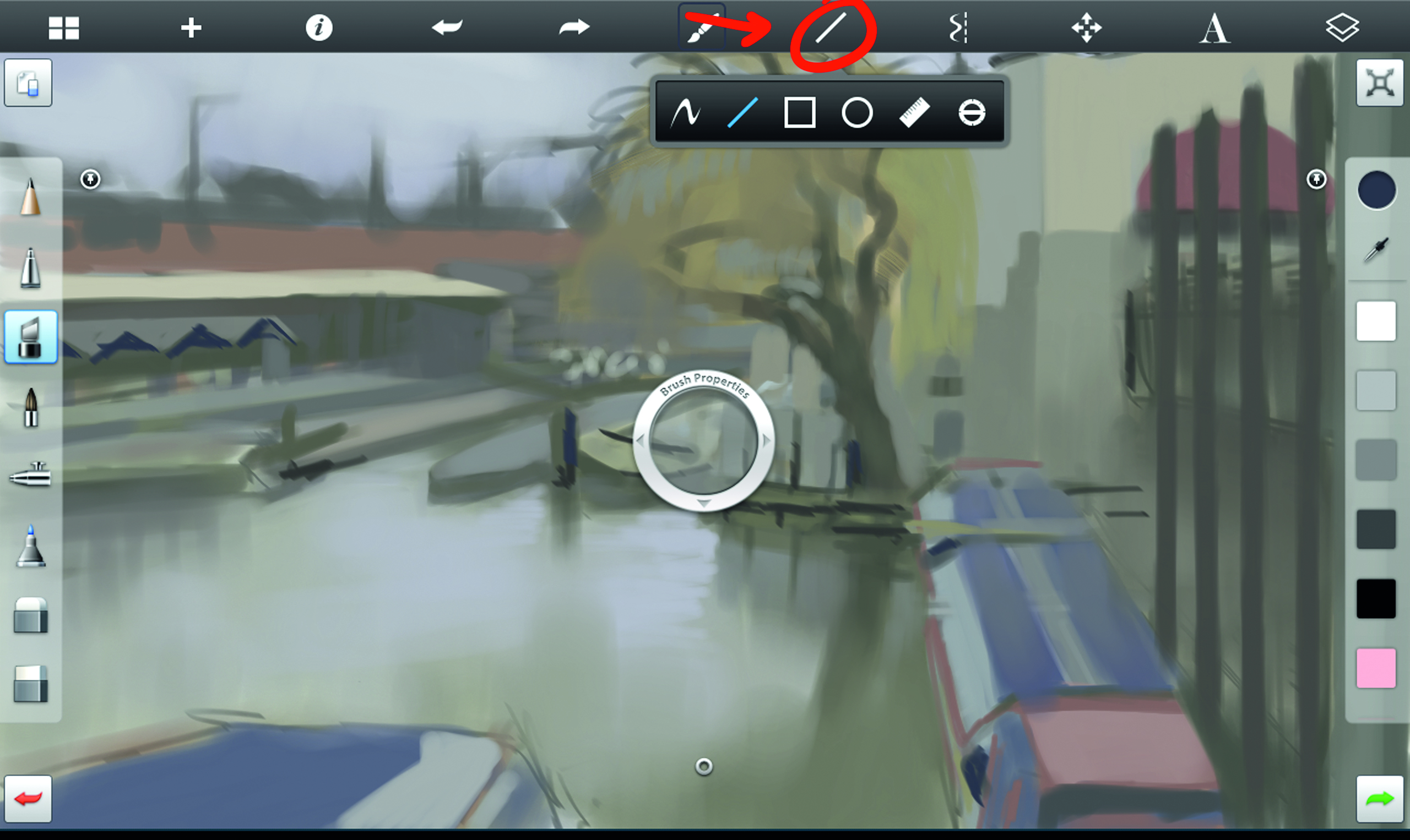
The cloudy sky affects everything I see, so I spend some time matching its colour and value. It turns out being a bit on the cool side, so I ‘cool down’ the rest of the canvas, particularly in the brighter areas.
Putting grey next to warm colours creates an illusion of a bluish tone, just as grey next to cool colours makes it appear warm. Colour relativity can play games with your mind sometimes, so it’s a good idea to try all your options.
08. Lining up
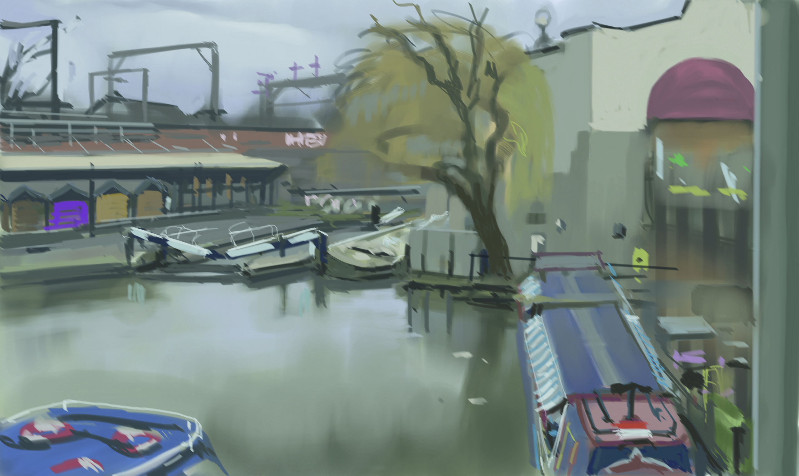
In Sketchbook, there is a tool that can be of great help when you are painting urban environments. Open your Tool Selection menu and select the Line tool. Every line you make will be straight and will go in any direction you want.
There is a group of pillars on the right hand side and I want them straight. Since my lines look as if drawn by a baboon on espresso, I use my Line tool to get those pillars lined up nicely.
09. Adding dark accents
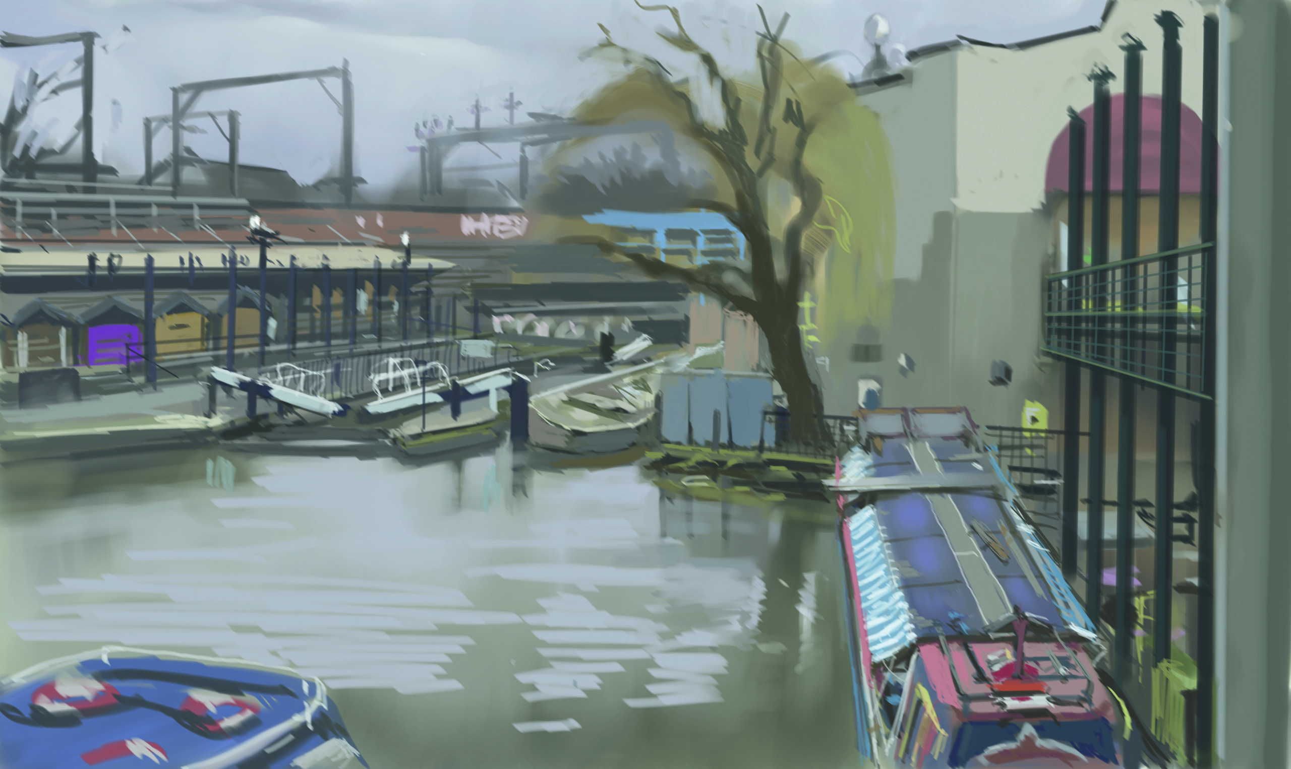
The painting feels too flat because I don’t have the proper range of values. Again, I need to look exactly where to find darkest spots and also, what colour they are. I need to clean up the area behind the pillars because I spotted some warm tones in there.
Next, I indicate some structural details on the boat to the right, realising that it is quite an important compositional element in the picture. I still ignore the tree and paint the area behind it. The tree will be a payoff since I find it easier to paint than all those other things I see.
10: Defining elements
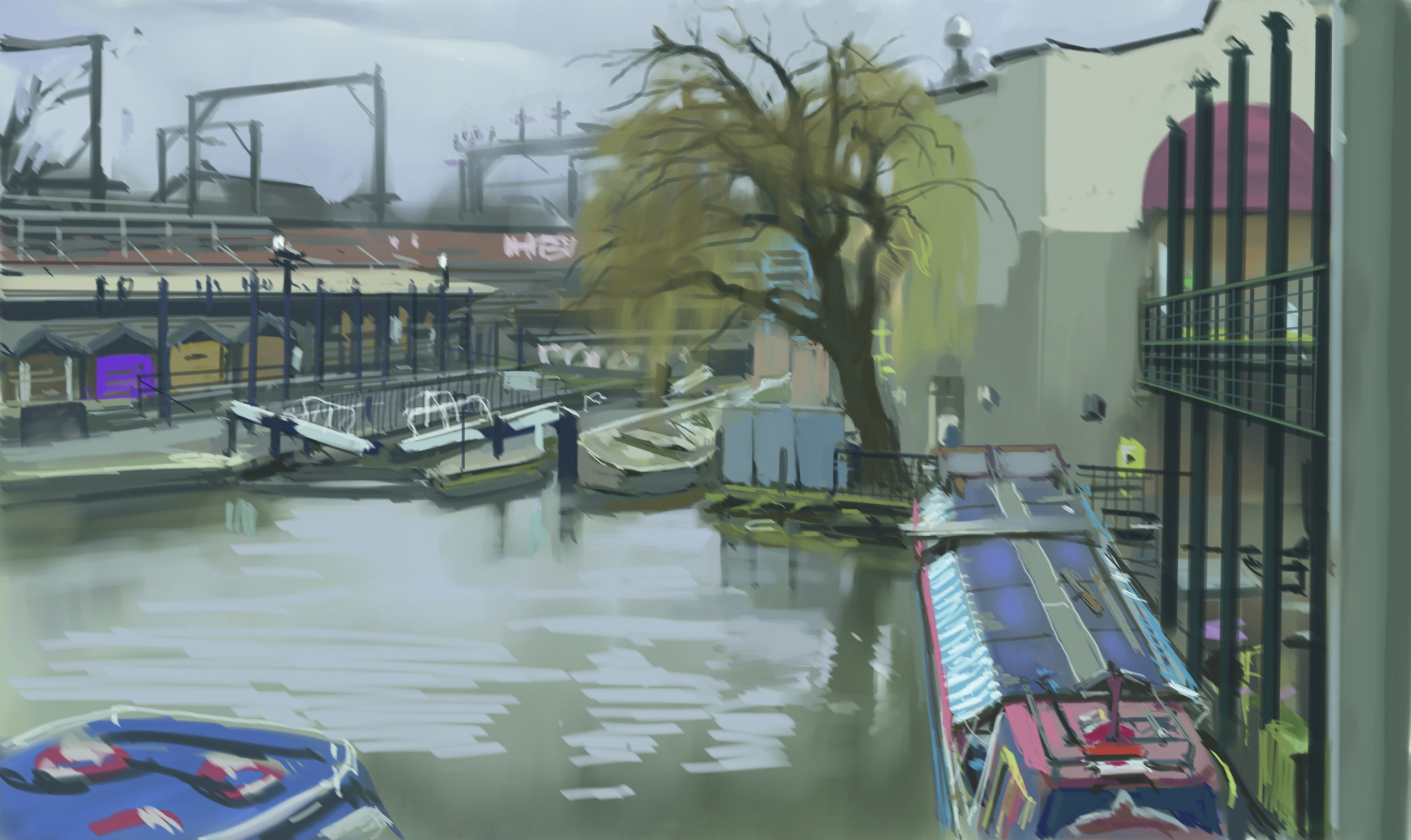
Combining my Marker and Oil brushes, I start defining elements in the picture. The canal lock gives an interesting contrast in values and the water displays nice reflections, so I make sure to capture all that. The little shops on the left and the boats offer a lot of different local colours and I start putting those down. Who would know that there are so many colours on such a grey winter’s day.
11. Blocking in the tree
I want to be able to get a hint of the area behind the tree top so firstly, I define its trunk. This gives me a strong base on top of which to paint. However tempting the idea of zooming in seems, I do not allow myself to do that.
I group the branches into masses with bold brush strokes. They vary in value and colour so I pay attention to keeping in line with reality. I need a base first which I can detail a bit more in the next step.
12. Branching out
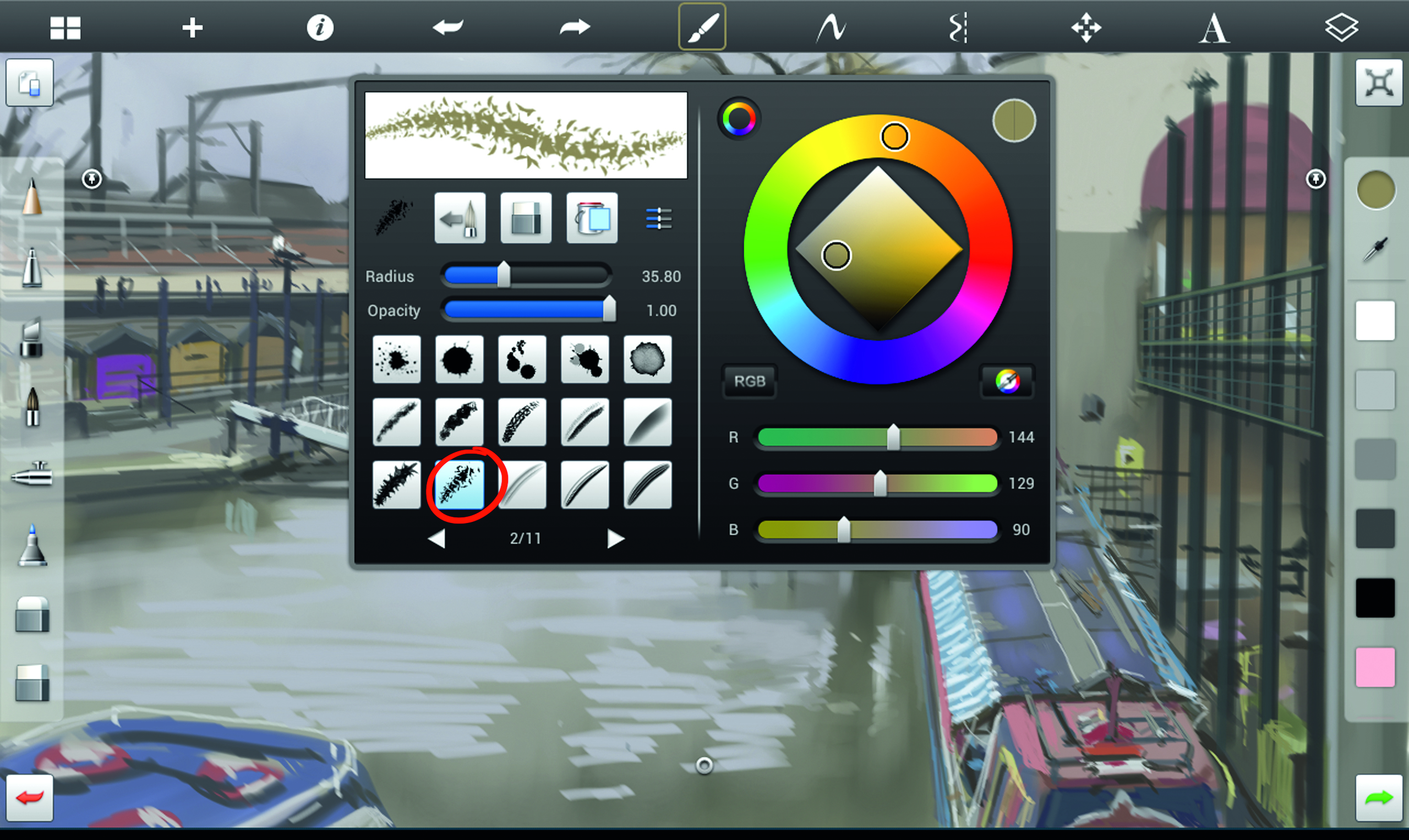
Time to put more information in the tree. From my brush selection menu, I pick this leafy brush which should give me the right type of texture. I normally pick brushes that leave marks similar to the object I intend to paint.
Following the rhythm of the branches, I draw some highlighted sections and still resist zooming in. And very soon, I start realising that it’s not working out.
13. Time to simplify
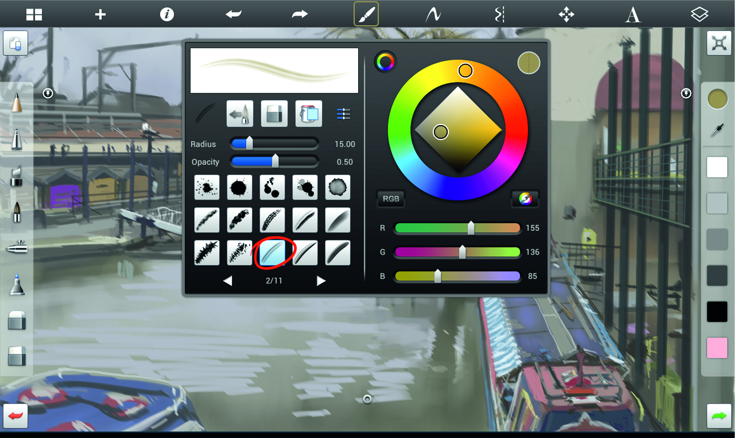
The tree is a mess and is disturbing the balance of detail across the painting. It is crucial to have a good economy of detail as too much can destroy a piece. So it’s time to simplify things.
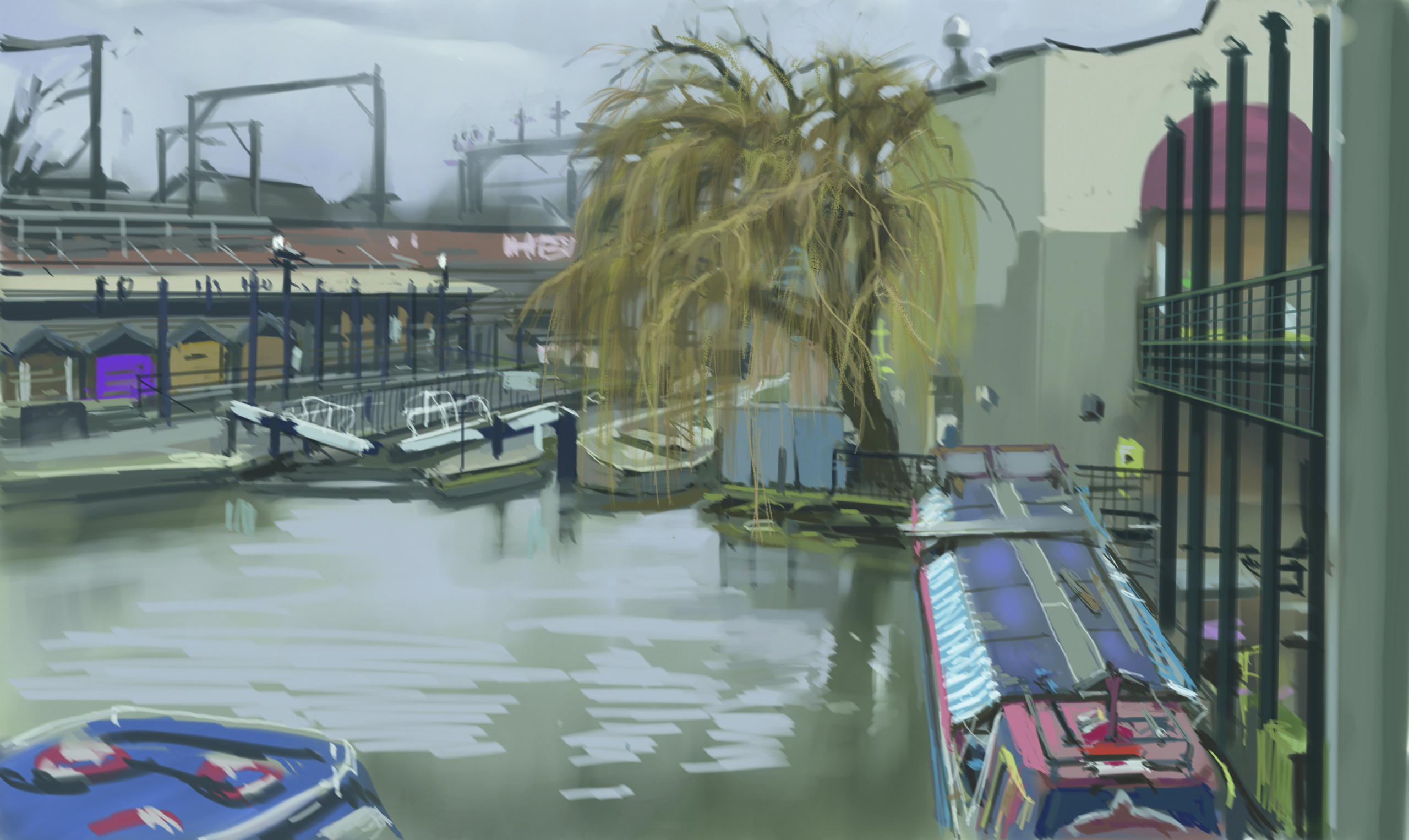
I open up my brush selection menu and pick this streaky brush that leaves marks which indicate the direction of the stroke and with that, the direction of the form.
14. Smoothing things out
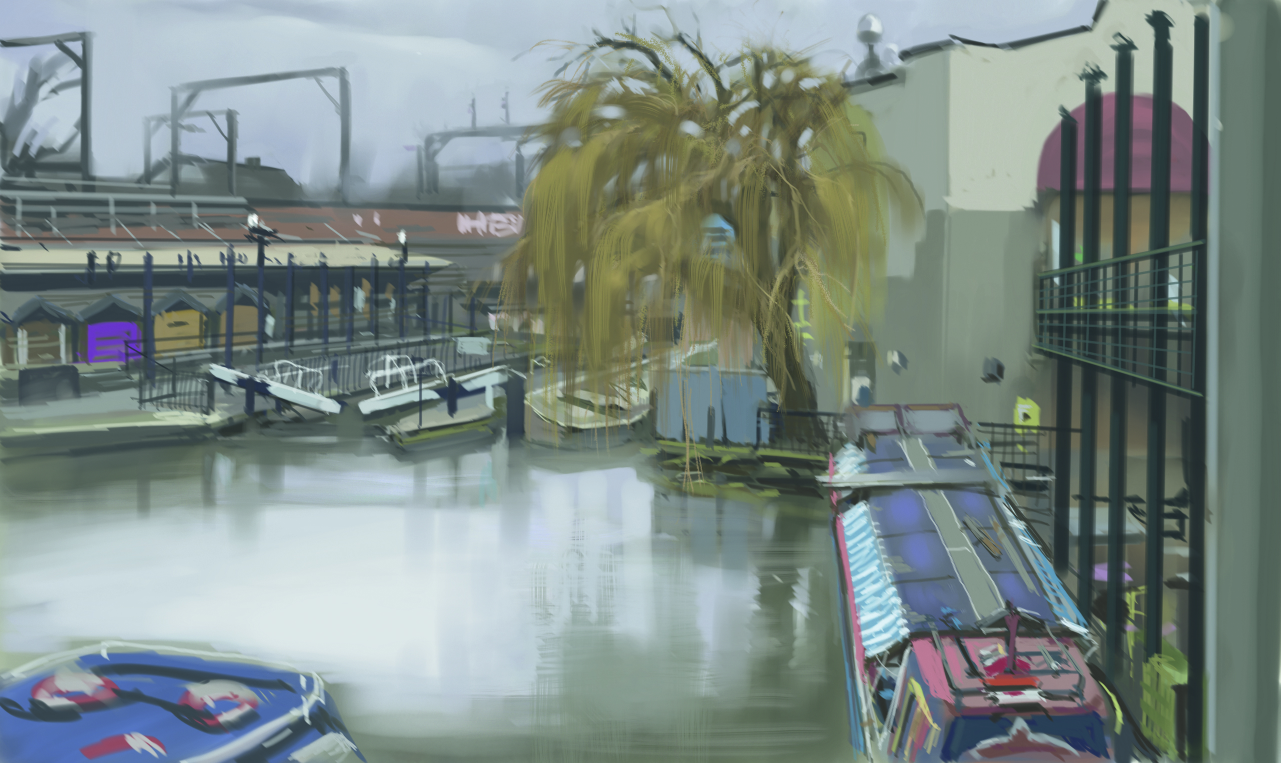
I start by grouping tree branches and simply indicating detail, rather than painting it out. It works much better and, with the brush I picked, I paint the hanging branches with no effort at all. Motivated by this little success, I place horizontal strokes across the water surface with the same brush. It takes just a few brush strokes to achieve the effect of water ripples.
I go back to my Oil brush and paint some negative space into the tree, which gives the image an immediate depth. Next I push back the distant background because it looked somehow too close. In reality, the distant houses and telephone poles are much darker. This is where I took the liberty of stylising the scene for the sake of readability.
15. Geese and seagulls
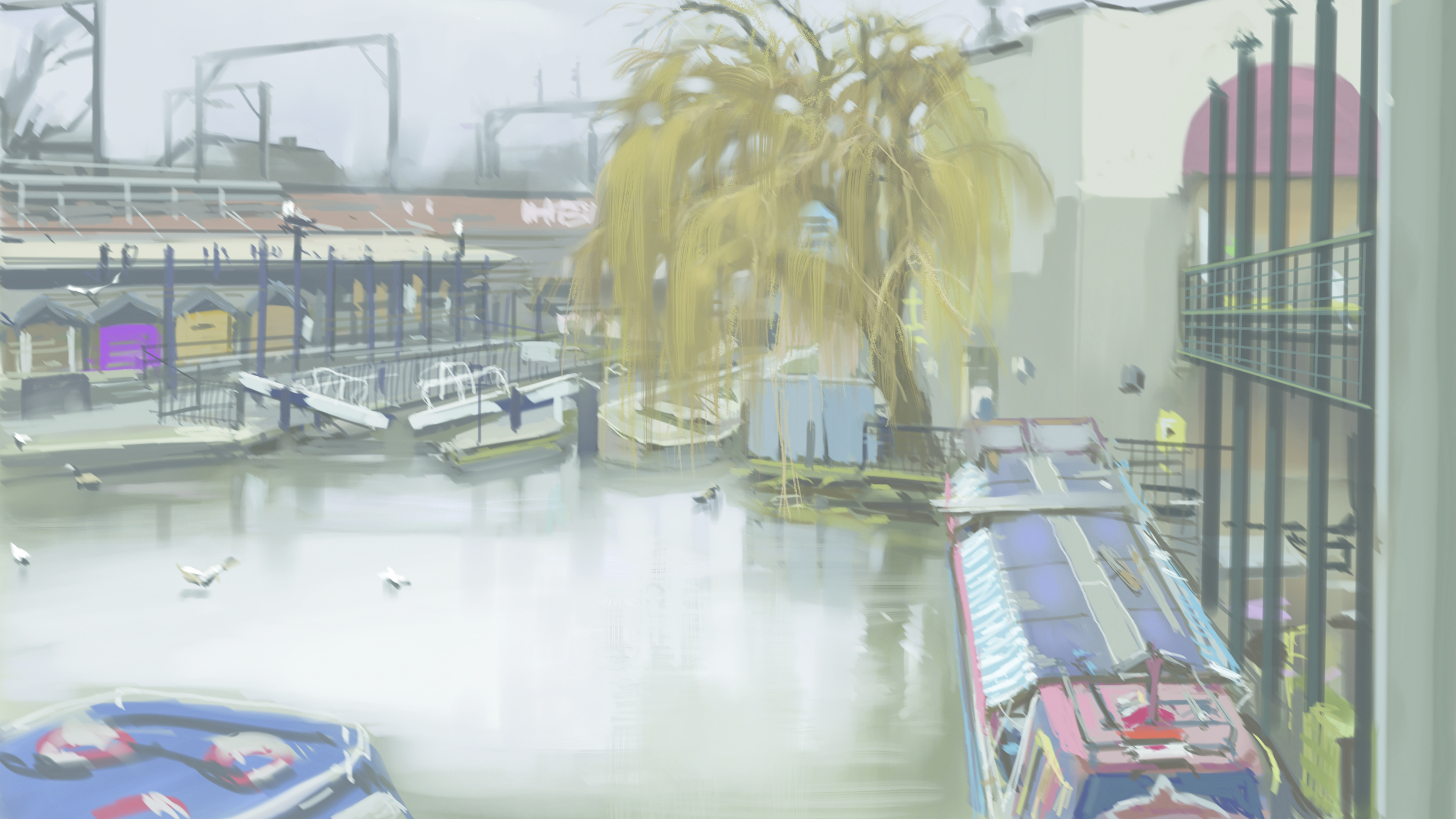
There is a flock of seagulls and a few Canadian geese flying in and out, hunting, fighting and generally making a lot of noise. Visual noise, that is. So I decide to paint them in. I grab my Marker brush and I try to capture the essence of the birds by putting down just a couple of marks for each one.
They put things in reality because we have seen such scenes so many times in our lives that our brain will immediately agree with it. As much as I’d like to keep working on this piece, it’s time to move on. I’ve got plenty of murky overcast days ahead.
For more tips on painting on Android, see our piece on how to paint from life on a Samsung Galaxy tablet. See below for Samsung Galaxy Tab prices.
Do you have a tip for digital painting on a tablet? Share your advice in the comments section below.
Sign up to Creative Bloq's daily newsletter, which brings you the latest news and inspiration from the worlds of art, design and technology.
Kan Muftic began his career in Switzerland, directing commercials and music videos before moving to the UK, where I found aniche as a concept artist for video games and films. He has worked on the Batman Arkham video game series, Mowgli and was Director of Animation for KISS ME FIRST. He is developing an animated horror film titled The Migrant and directing a documentary called Blackbelts.
You must confirm your public display name before commenting
Please logout and then login again, you will then be prompted to enter your display name.
