How I use comic book techniques to create striking black-and-white digital paintings
Karl Simon visits Highgate Cemetery to show us the importance of contrast in black-and-white painting on a tablet.
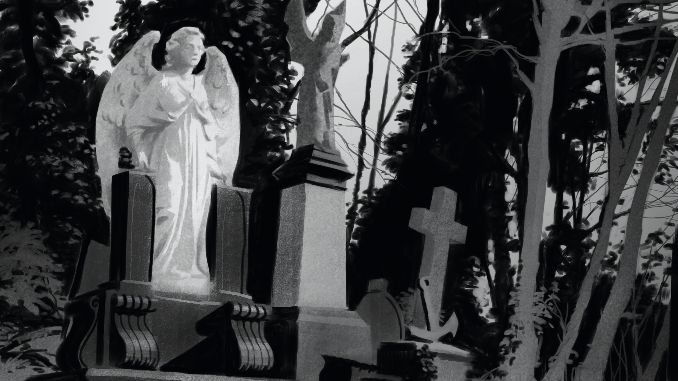
I get inspiration from all kinds of sources, including books, films, photojournalism and other artists’ works. But most inspiring are the things I see around me in my daily life. Great compositions and subjects are everywhere, not to mention the moods and light that the weather and seasons bring! One of my favourite places for sketching is Highgate Cemetery in London. No matter where you turn you see something that wants to be drawn.
For this tutorial, I’ve settled for a simple view of some graves against a backdrop of dark trees covered in vines. I’m planning to make a contrast drawing using techniques similar to the ones I apply when tackling this type of subject in traditional media.
When I do a study on paper, I tend to split the work into three stages: drawing, inking and colouring. This works just as well for digital mediums but since this image is to be black and white, I won’t be using any colour. The last step is simply done in shades of grey instead.
If you need the tools, see our pick of the best drawing tablets and the best digital art software. If you're ready, let’s start drawing.
01. Finding a view
I look for a composition, trying to find a spot where the subject of my painting looks interesting. I consider the position of the sun, how much of my subject is in light/shadow, and so on.
I decide to sit in a spot where the angel statue of the grave closest to me has a dark mass of green behind it. This will be the main focus of the image and the light angel against the dark backdrop should make for a nice graphic read.
02. Blue lines
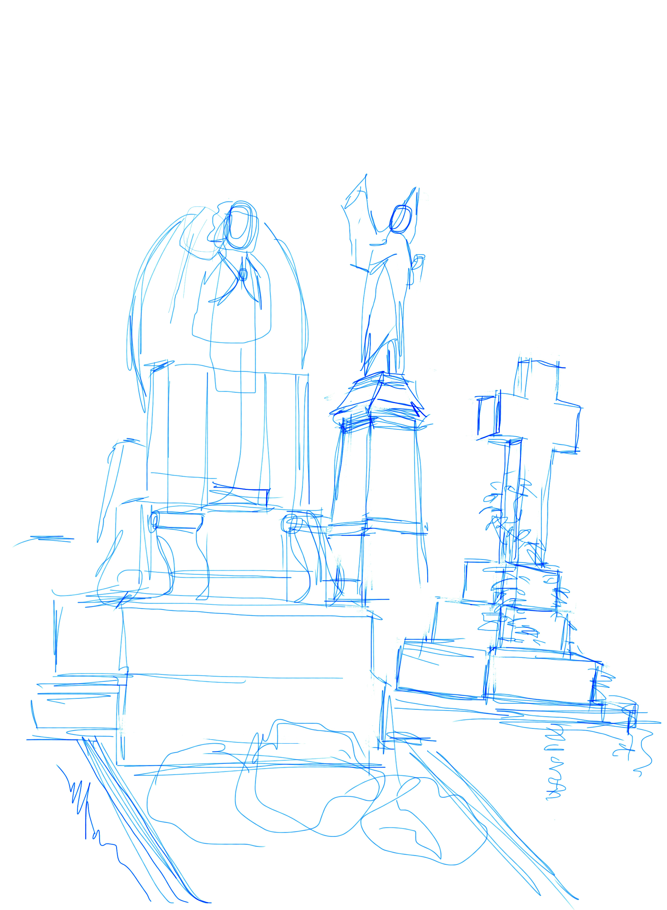
I’ve decided to go for a traditional approach here, so I start off with a line drawing. Making sure I measure things carefully, I sketch in a blue line (it will help later) on white background.
Drawing on a tablet is quite fiddly compared to pencil on paper and the resulting line work is not exactly beautiful, but the important thing here is that the perspective and the relative scale of things is correct.
03: Adjusting the composition

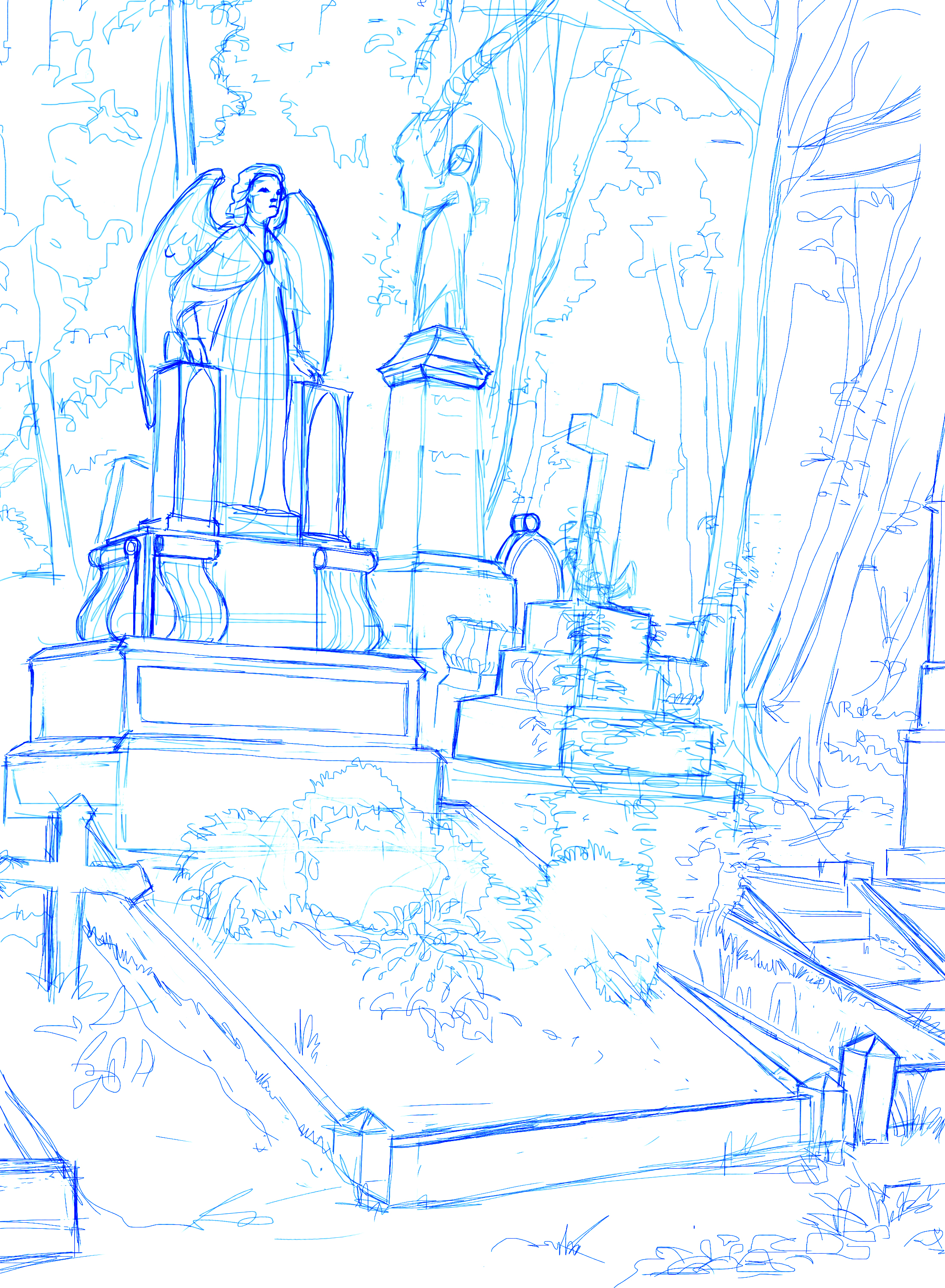
Despite looking carefully for the right framing when I started, I feel the composition is not right. I scale the whole image down, allowing for more of the ground plane to show at the bottom of the image.
This adds depth and leads the eye into the picture. I also divert from reality a bit by scaling down the cross on the right and by moving the small angel in the middle up. After some additional perspective adjustments I’m happy with the drawing.
04: Preparing for ink
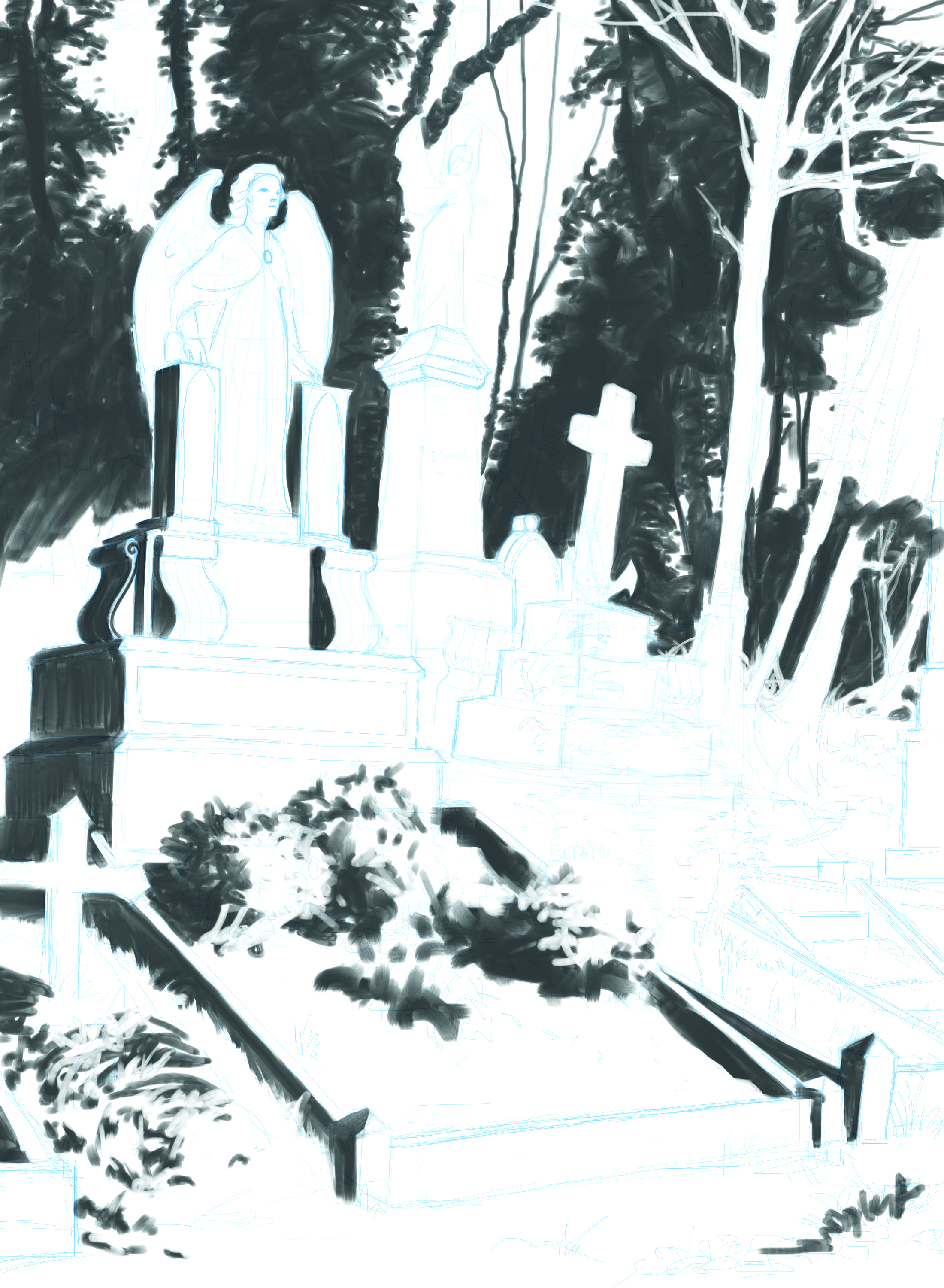
I set the drawing layer to multiply and create a new layer underneath. This will be my ‘inking’ layer. On this layer I will work only with pure black and pure white, but to see the line work on top of the black, I reduce the opacity of the layer to about 75 per cent. I’m careful not to colour pick after doing this, as I would be picking grey rather than pure black.
The blue line makes it easier to see the drawing against the dark ink. I’m using Procreate’s default Wet Round and Wet Square brushes. Any grey values come from the smudging of the brushes. In my mind I’m thinking of only black and white. The trick here is to make the image work with only these two values.
05: Design what you see
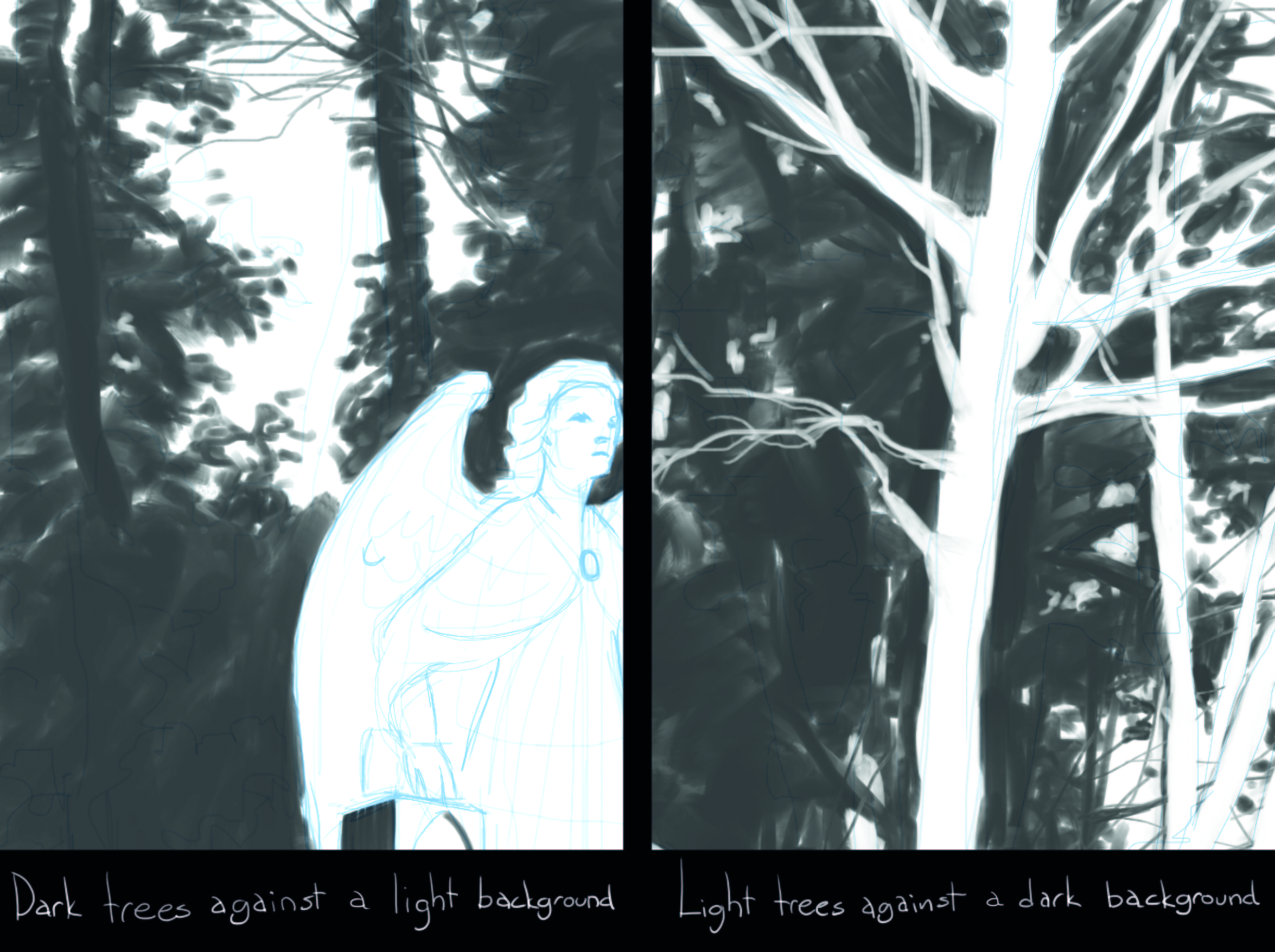
I observe the scene in front of me and start to plan out what shapes to paint black and what to leave white. This is where your design sense comes in. Plan carefully as the two options available are black shapes on a white background or vice versa.
In some places I put a black shape next to a black shape, losing the edge, and sometimes white against white.
06: Simplify the background
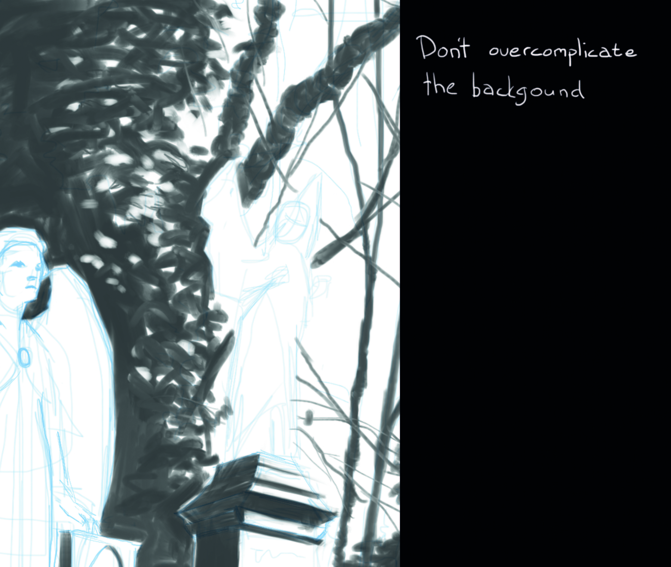
The foliage behind the graves serves as a nice backdrop. Despite the fact that I can see a lot of different values in there I decide to make it into an almost solid black shape. In a few places I paint in some white patches describing a few leaves. If I had been doing this in real ink, I would have had to draw these leaves and then carefully paint around them.
07. Silhouette or form?
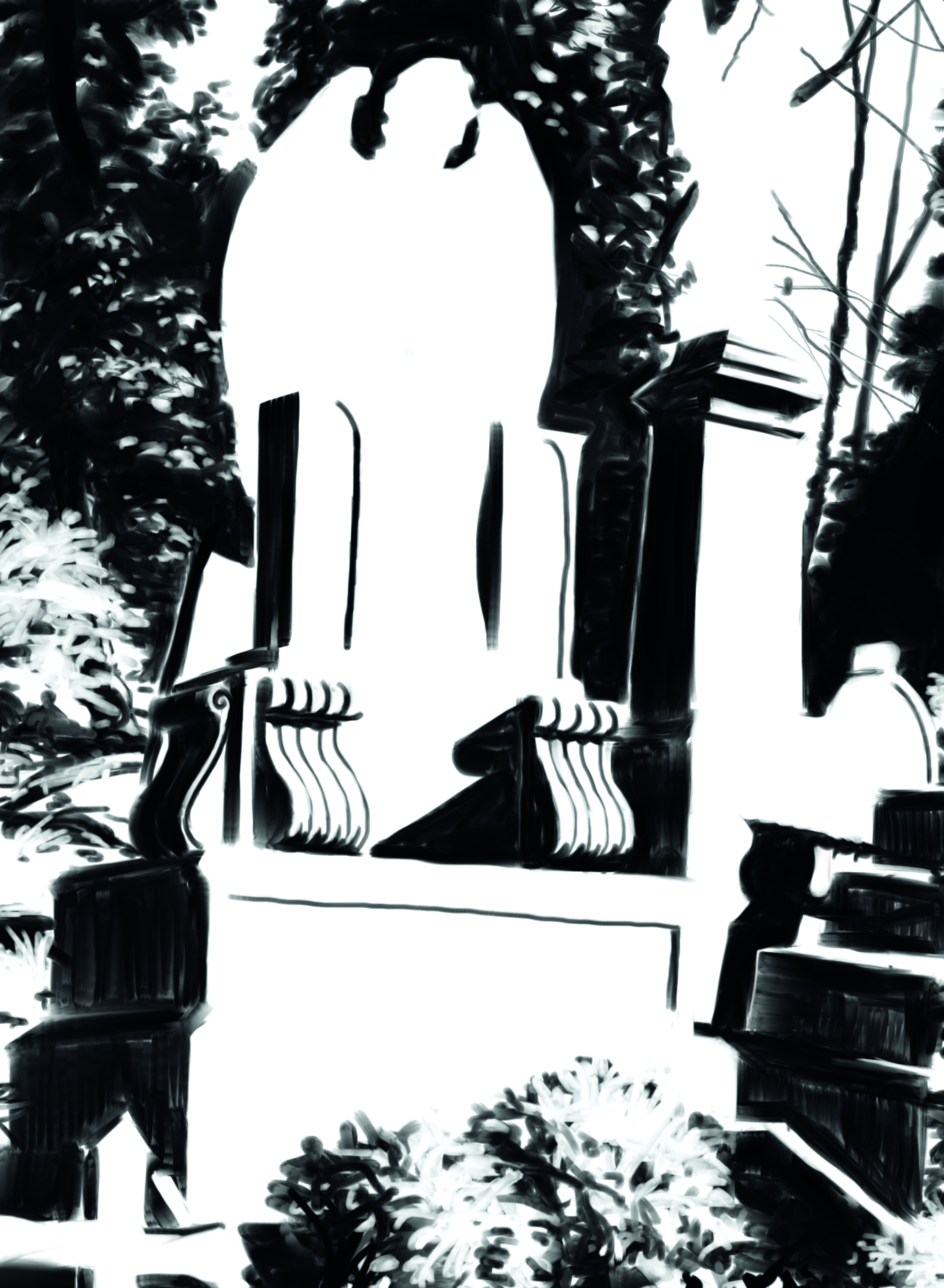
I work around the image, designing the black and white shapes that I feel best Describe the form. For the background, the shapes are simply silhouettes, whereas in the foreground, the shapes show which side of an object is lit and which is in shadow.
The only thing I leave out is the leftmost angel. I want this to pop out so I plan to give it a lighter shadow value later.
08: Simplification is key
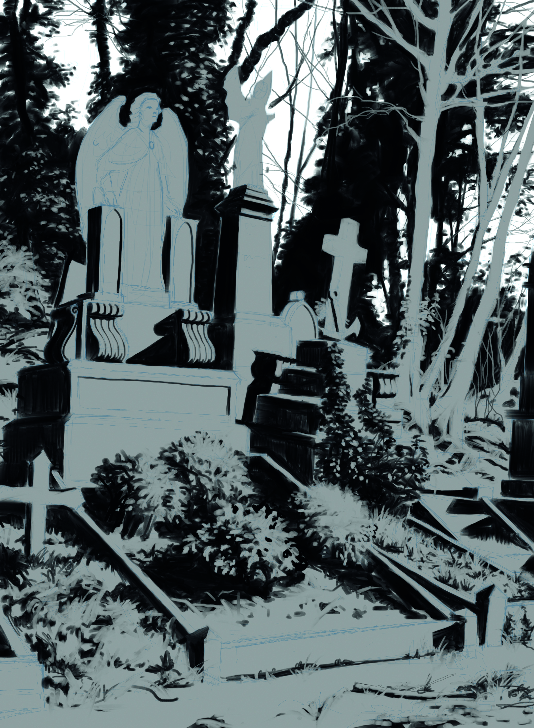
Even when I paint from life, I like to sometimes simplify and stylise the values of the image. By putting the contrast where I want it, I can lead the viewer’s attention to, or away from, something. So at this stage I think it’s okay to move away even further from trying to copy reality exactly, and shift more towards a design that I think will work well for the mood I want to create.
For now I’m leaving the sky completely white and everything else a darker value. I make a new layer underneath the ink and fill this with a medium grey. On top of this, I make a new layer for the sky. I go around with a solid brush (no transparency) and mask in the sky with white paint. Now I’m free to paint anything underneath without running the risk of staining the white sky.
09. Low contrast washes
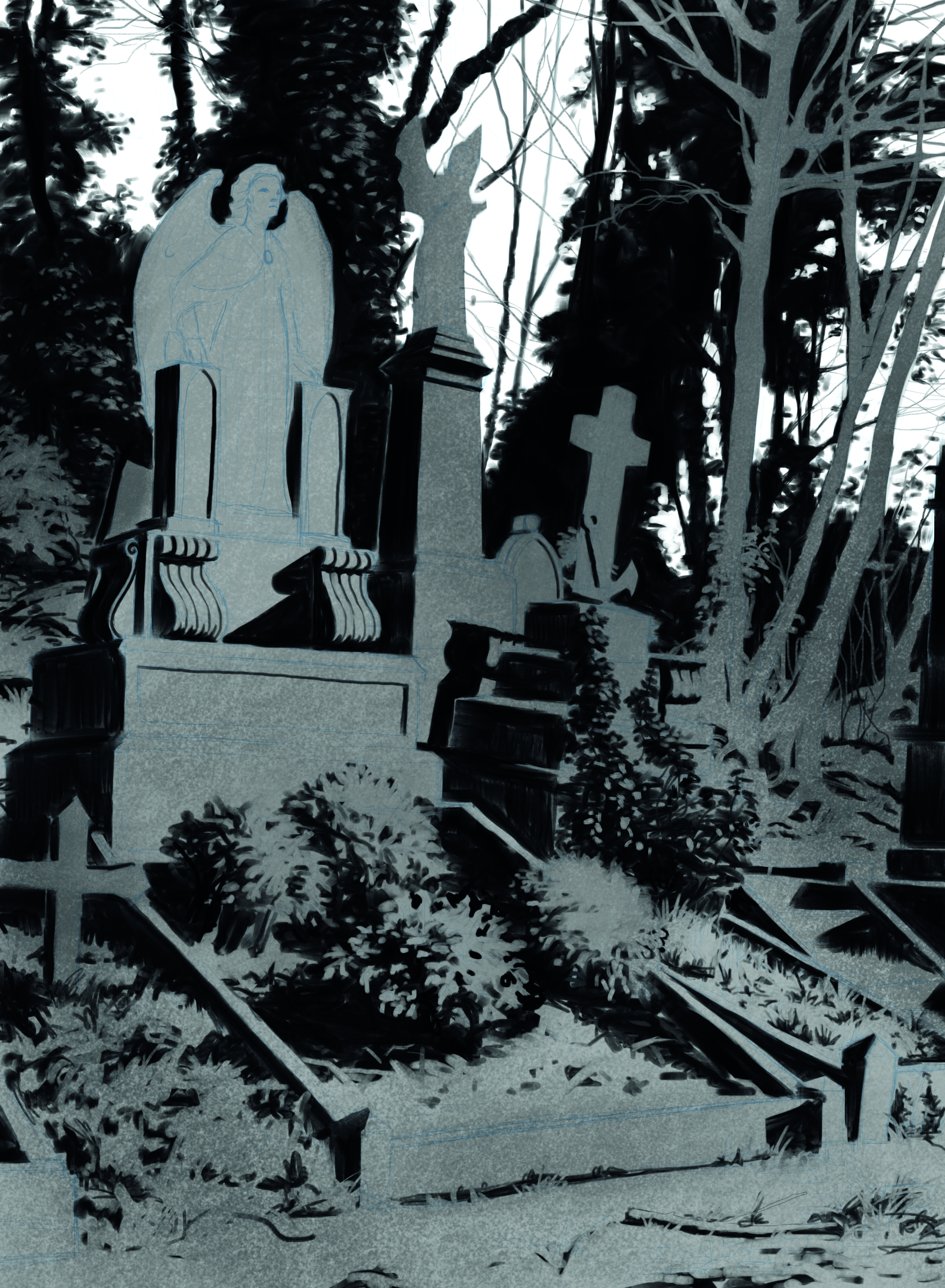
Using a slightly textured, big oversized brush, I start laying down some values. I don’t go into any detail, only big gradient washes of paint. I want the trees and the vertical planes of the graves to be slightly darker, and the ground/ horizontal plane to be slightly brighter. Watching my value range, I make sure I don’t use too much contrast, only subtle shades of grey.
10. Local value differences
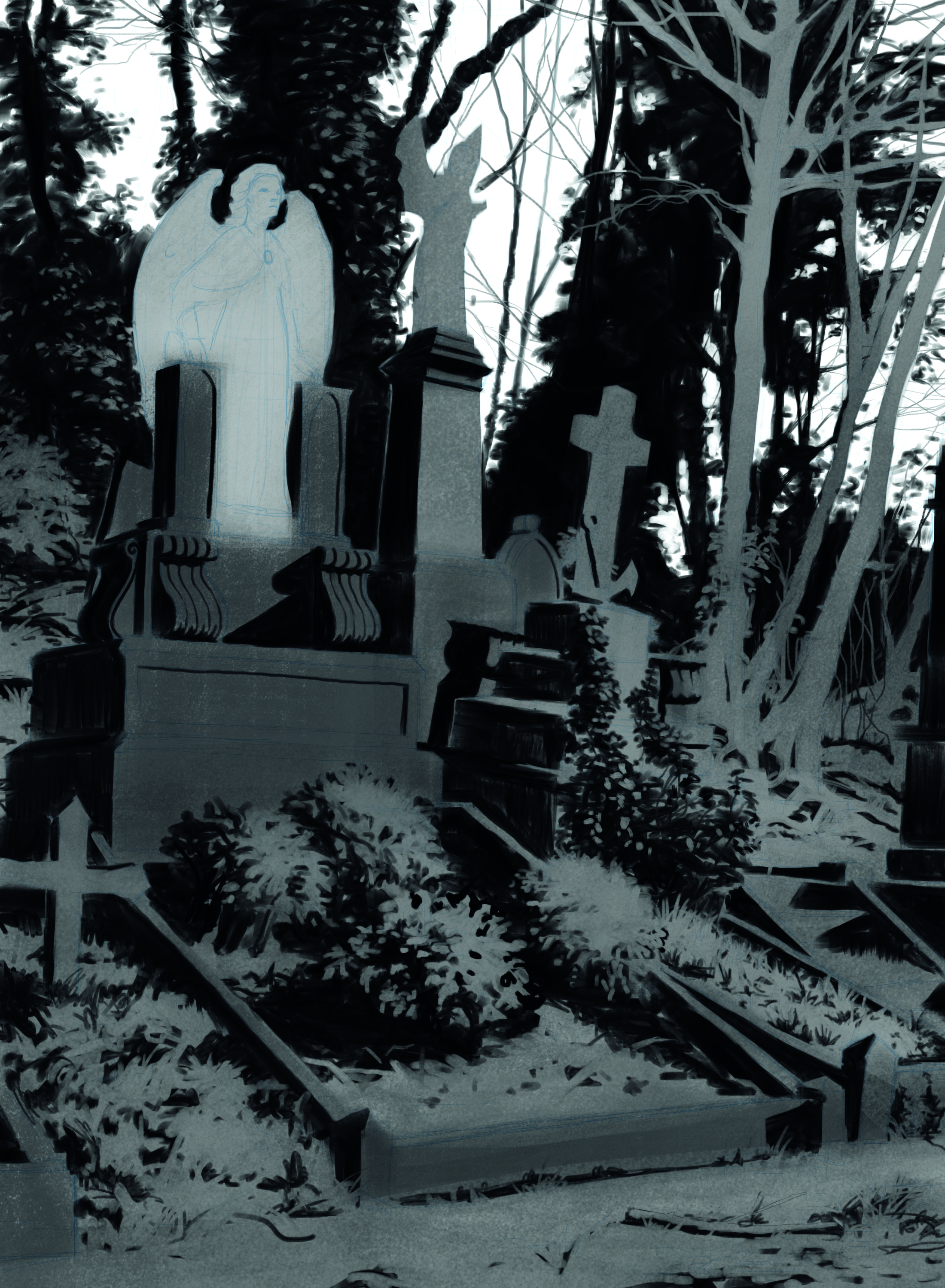
Not all the things in front of me are made Not all the things in front of me are made of the same material, so after I’m happy with the initial value washes, I go in with a medium sized brush and bring out the local values of the different elements
11. Going back to the focal point
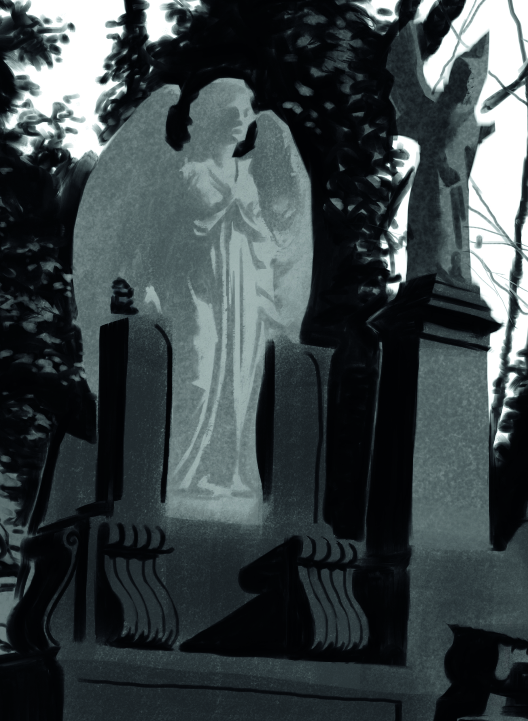
Now is the time to go back and ink the angels as I want to make sure that they ‘pop’ just enough from the background. On a new layer, I start working with the Wet Round brush to describe the form of the angels. I don’t want the shadow side to blend in to the background, so instead of black I use a medium grey.
Once I’m happy that the shapes are looking okay, I lock the alpha pixels of the layer and then give it a bit of texture using the same brush that I used for the value washes.
12. Materials
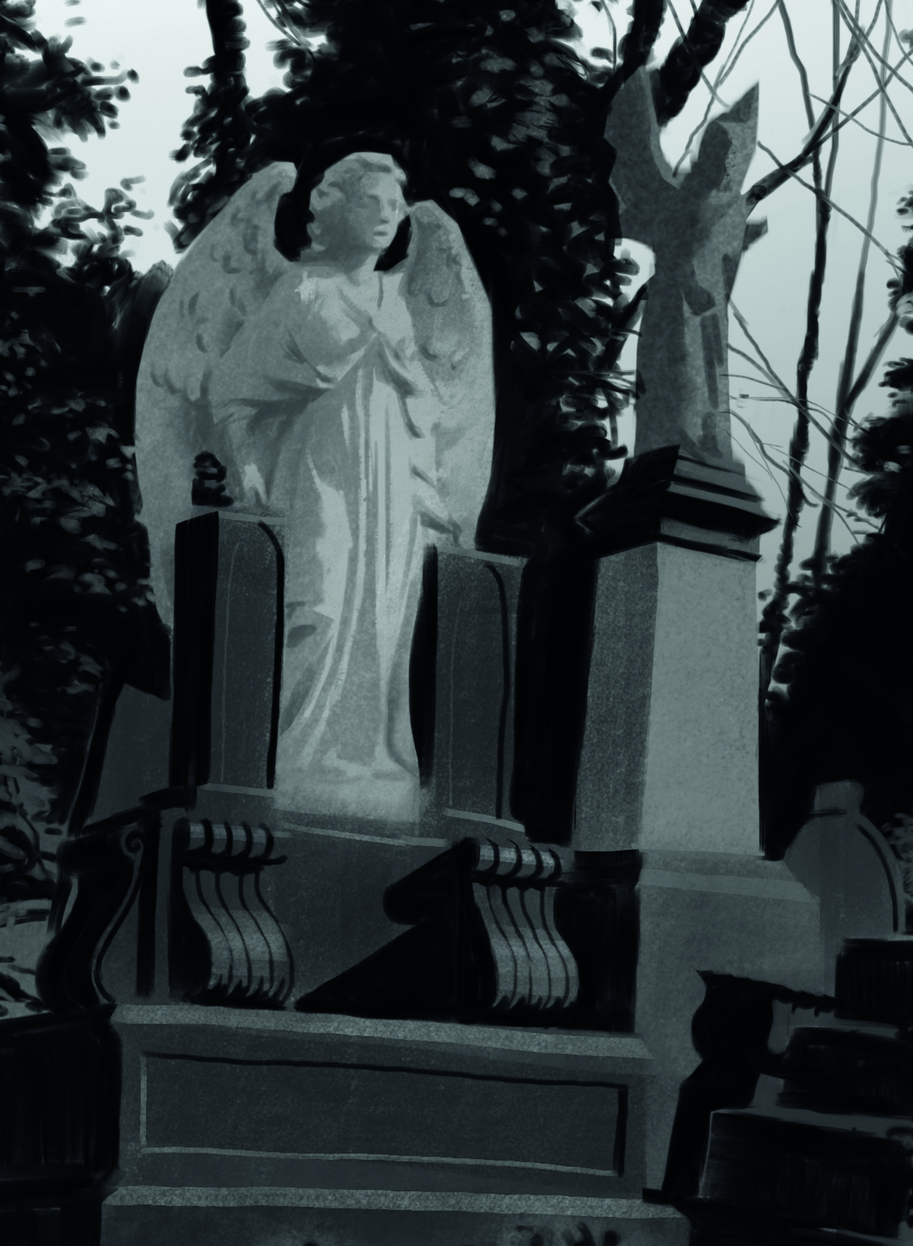
At this stage the image is starting to feel coherent so I decide to put down some details, making more accurate material descriptions. I like the contrast between the light, matte angel and the dark, shiny gravestone, so I play that up by putting some highlights on the dark material.
I also decide to give the angel a third value, it being the main focus of the image. After that I jump around all over the image darkening and lightening areas as I see fit to make it work better.
13. Finishing up
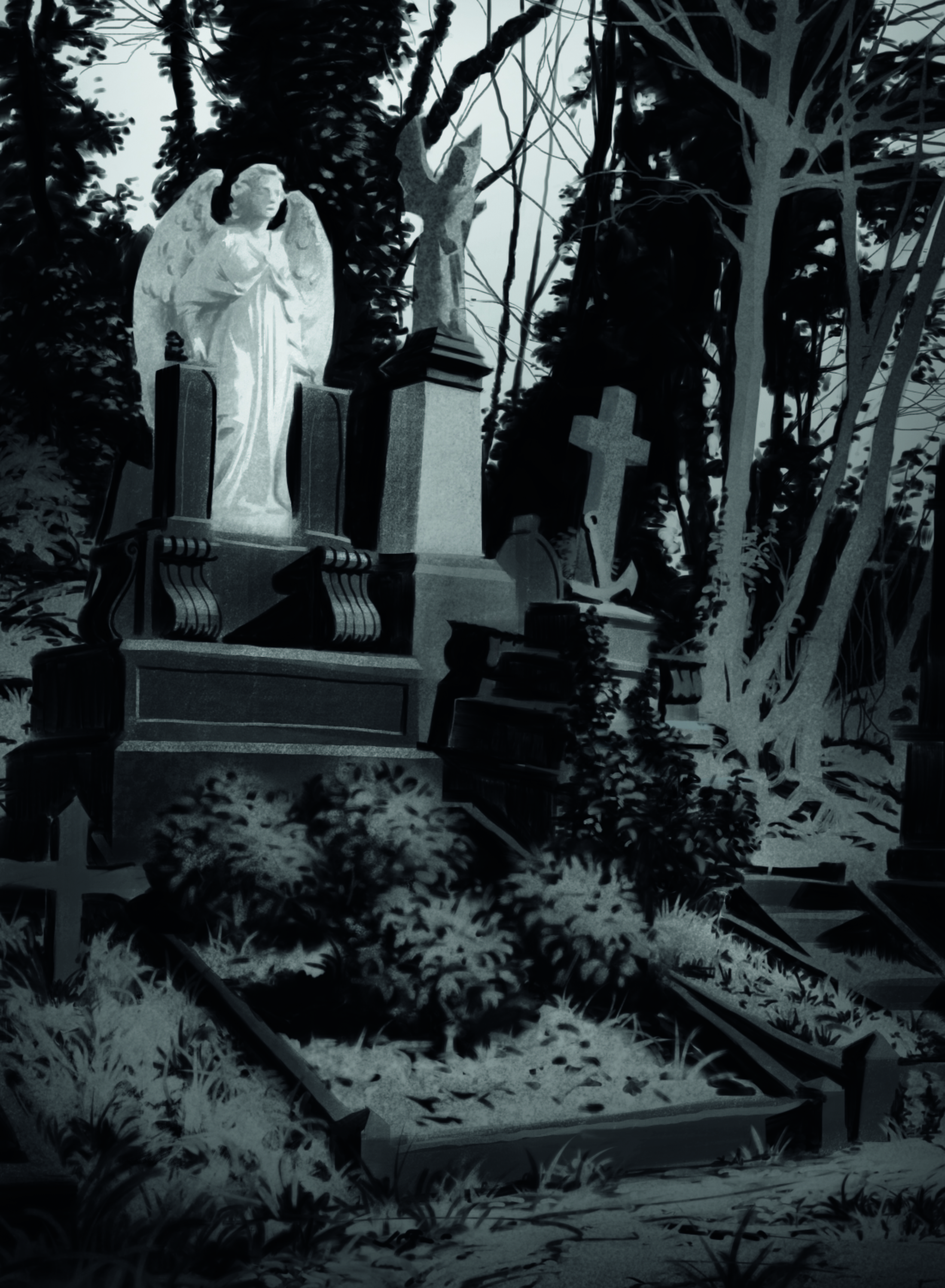
I’m not quite happy with the foreground, especially the foliage, so I go back to the ink layer and re-work some areas. The white sky looks a little bit too strong so I knock it back with a subtle gradient. After that it’s time to go home and load the image into Photoshop for some final contrast adjustments and then we’re done!
For more tips, see my tutorial on how I use an iPad to paint from life in a museum.
Do you have art tip? Share your advice in the comments below.
Sign up to Creative Bloq's daily newsletter, which brings you the latest news and inspiration from the worlds of art, design and technology.
Karl Simon is an experienced concept artist who works in the film and games industries. His projects include Les Miserables and Total Recall.
You must confirm your public display name before commenting
Please logout and then login again, you will then be prompted to enter your display name.
