Quick tips to bring interiors to life: how colour, light and texture can transform your digital art
From flat to full of life – how this advice will make you a better artist.
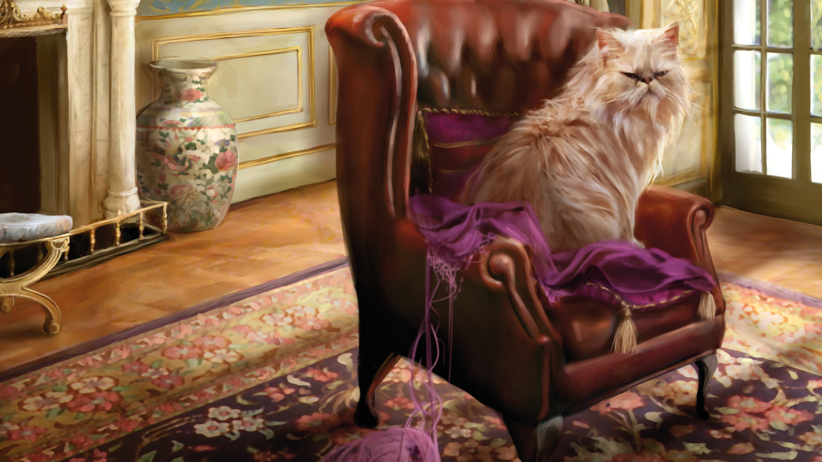
Painting interiors can be a bit of a challenge. There are several factors that must be learned and then implemented to create a successful composition. The first and most fundamental element is perspective. It’s simply impossible to paint a believable object without fully understanding its interaction with its surroundings.
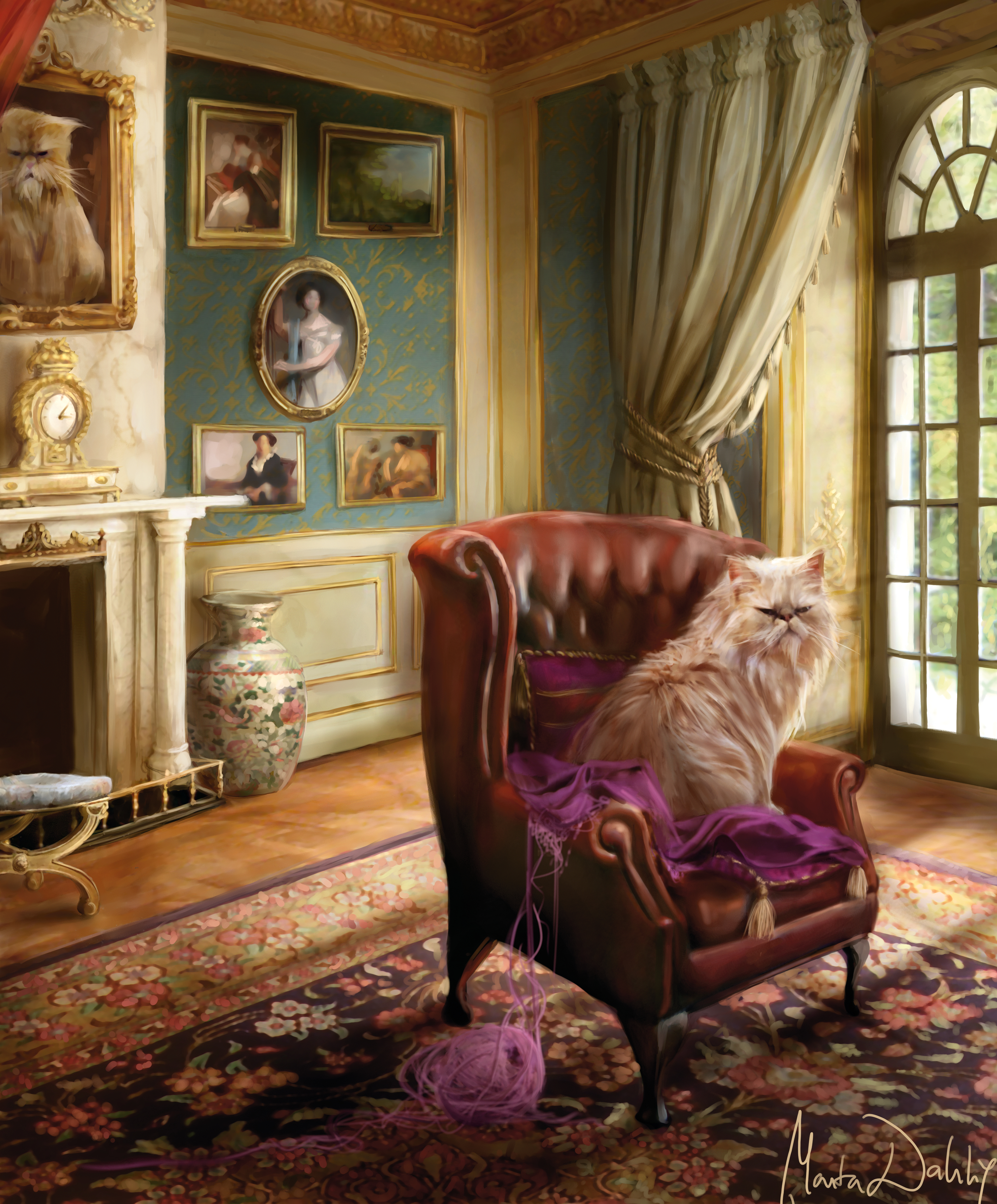
The second part is lighting – once you have the elements designed, you should shade them according to a consistent light source and make them interact with each other in terms of colour. For these steps, some theoretical knowledge is required.
Finally, there are colours and textures to consider. Aside from the theoretical knowledge of how to compose the scene, you still have to actually colour and shade it in real life. That’s where knowledge and experience of what your software can do come into play. The preliminary stage of this painting was created using Photoshop, but the absolute core, the definition process, was done in Painter. I will describe the stages of working in both of these programs and give the reasons why I switched between them during my painting process.
(Read Marta's advice below, and remember, while she uses Photoshop, these tips can be applied to all the best digital art software, using the best drawing tablets.)
01. One-point perspective
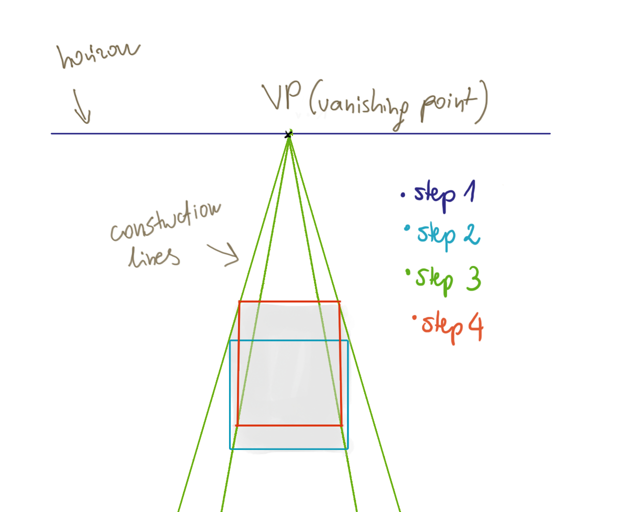
One-point perspective is a situation in which parallel lines converge to one point somewhere in the far distance. This is the vanishing point. One-point perspective is the easiest way to give a painting a feeling of depth and is often used for depicting streets, railroads, and so on.
To construct a one-point perspective, first draw a horizon line (1) with a spot in the middle of it. (This will be the vanishing point.) Then paint in a rectangle (2) somewhere below the horizon line. Now draw lines connecting the corners of the rectangle with the vanishing point (3). Finally, place a shape connecting those lines (4), while remaining parallel to the edge of the box.
02. Two-point perspective
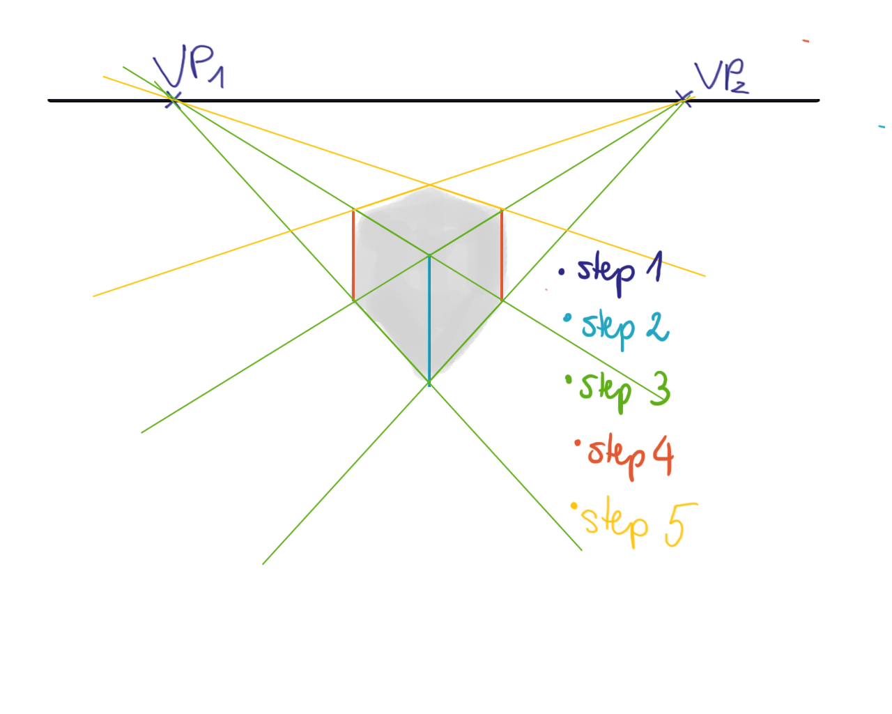
Two-point perspective is a situation in which you can see a one-point perspective object rotated. In other words, you can depict the same object as in one-point perspective, but also rotate it on another axis – useful when painting interiors. For this, use two vanishing points.
Draw a horizon line with two spots on it, far apart from each other (1). Next, draw a vertical line below the horizon (2), then paint in construction lines from the top and bottom of the line (3) all the way to the vanishing points. Now paint in two additional vertical lines (4). Finally, paint in construction lines from the vanishing points to the other corners (5).
03. Three-point perspective
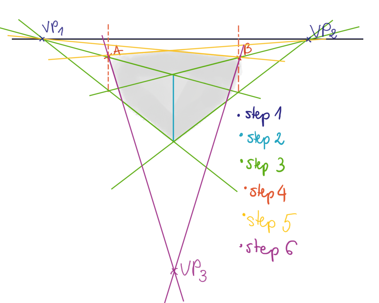
Three-point perspective is a view where you see the two-point perspective rotated on a third axis. It’s useful when painting a building from above or below. To paint an object in this way, paint the horizon with two vanishing points (1); a vertical line (2); construction lines linking it with vanishing points (3); and the extra vertical lines simulating walls (4). Do the last step with a dashed line, since the only needed parts are the intersections (points A and B). Now, connect A and B with the vanishing points (5). Paint in a third vanishing point below the vertical line and connect A and B with it (6).
04. Preliminary sketching
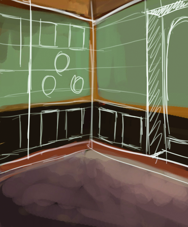
I think you have enough of the theory now, so let’s move on to practice. Interior scenes usually use two-point perspectives, and that is exactly what I’m creating here. After sketching in the basic two-point perspective lines, I create a basic scene layout. As you can see, I’m not using generated lines, unlike in the previous exercises. I do not care for too technical a look and want to keep this scene looking painterly.
05: Light source issues
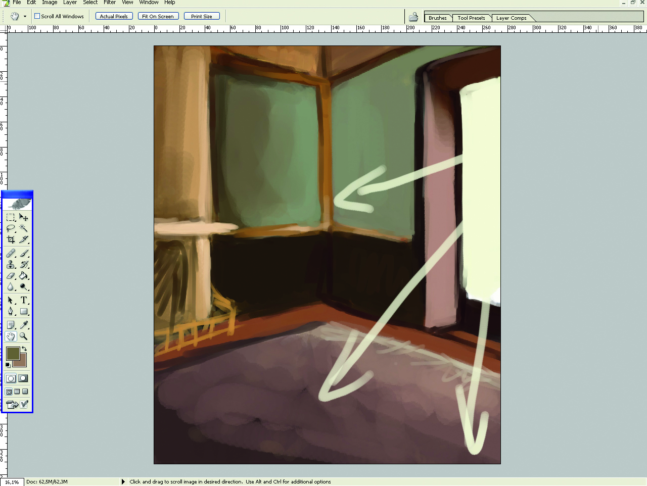
Still using Photoshop, I sketch in a basic light source and some coloured and some coloured blobs to enrich the raw look. The light source is a basic ambient light with additional directional illumination. As far as the directional light goes, I’m not too scientific. The length of the window’s shadow should technically be determined by the position of the sun, but as long as the angle is okay, I’m fine with it as it is.
06: Dealing with wood
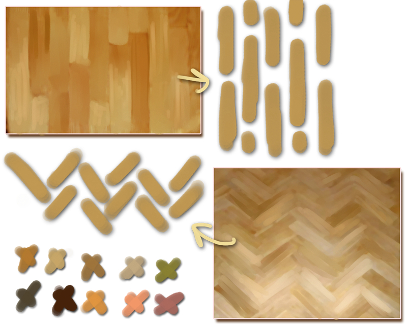
To work on textures, I move the image into Painter: it encourages less particular strokes in my workflow than Photoshop, and is amazing for hinting at detail rather than strengthening it.
Wood is among the most common surfaces you’ll see, so it’s good to know how to paint it quickly. In interiors, you usually won’t have to texture a wooden plank up close: just knowing the tricks for painting panelled floors will be enough. What you do is apply colours, scattering shades over the floor to simulate wood’s natural variations. I create a wood palette with my regular ‘use brush modes on top of a midtone method. My favourite brushes for this are Bristle Oils, with Basic Round for tinting. Strokes should be short and linear.
07: Patterns
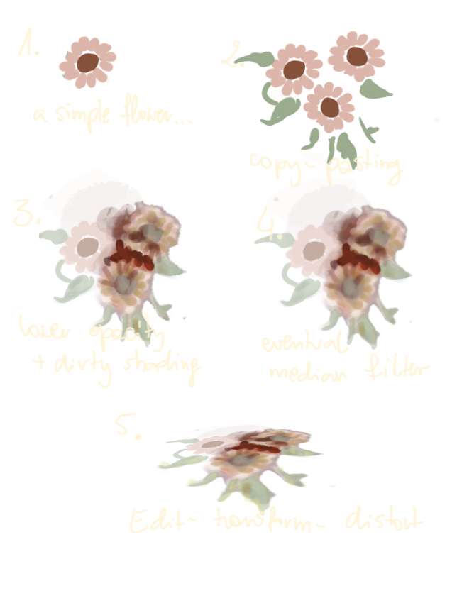
To make patterns work, I first roughly shade the base that the pattern is to lie upon. In this case, I just added some rough highlights and shadows to the carpet. Then I add a layer and sketch in my shape with a clean, textureless brush. (An unscattered Pen will do.) I copy and paste the shape around, resizing and rotating it to create a more intricate pattern.
Then I change the perspective (Edit > Free Transform). I know it’s cheating, but it makes mistakes easier to correct. Then I lower the opacity of the blobs and run over them with a very smeary brush (Oily Bristle smoothed by Blender Bristle from Artist’s Oils, perhaps), adding in strokes of varying colours. This is to simulate the colour variations and texture of the carpet.
08: Pushing it further
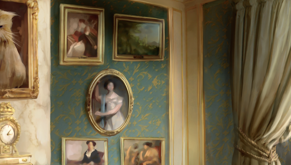
Next up is the seemingly tricky carpet and wallpaper, which are going to be heavily patterned. Using the pattern technique I described earlier, I sketch in some basic carpet and wallpaper blobs and define the fireplace, curtain, and chair a bit more. For the wallpaper, I quickly jump back into Photoshop and create a basic canvas texture on top of it to break up the smooth, uniform look. You can perform this process in Painter as well by choosing Effect > Surface Control > Apply Surface Texture, but I’m just used to working with Photoshop filters.
09: Detail focus
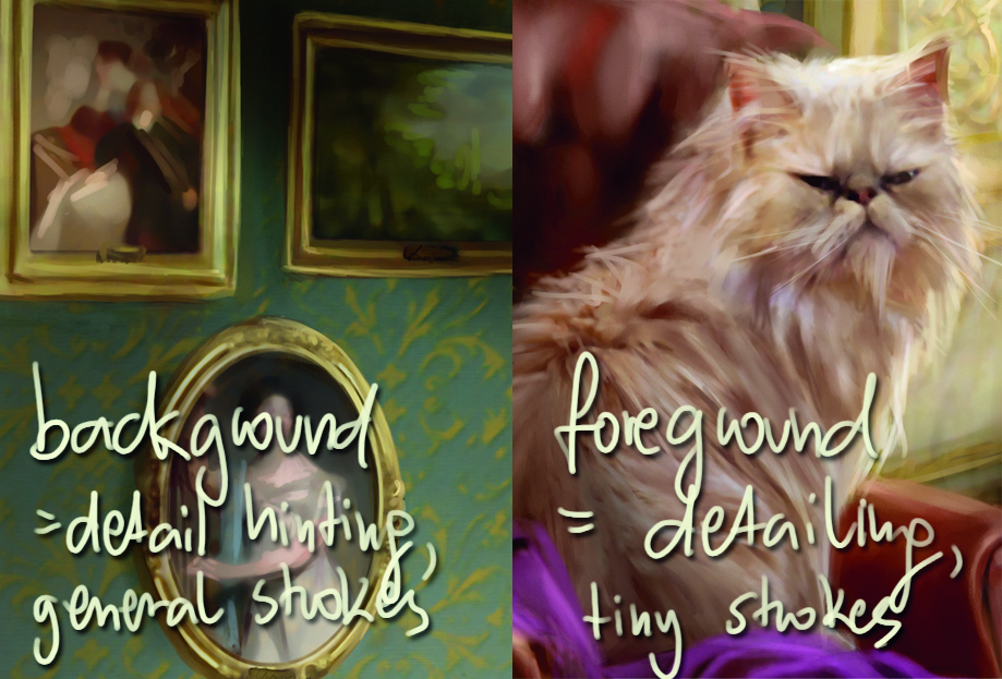
Another fundamental rule when creating a feeling of depth is not to go overboard with background details. It not only speeds up your work because you don’t spend time painting every last pixel in the background, but you also create a focus blur effect, which might be a cool addition to the painting.
You can do this in two ways. For outdoor scenes, I find the Blur tool useful, whereas for indoor scenes, I try to paint when zoomed out, using huge colour blobs instead of detailed strokes. Check the little master copy portraits in the background to see what I mean – they are painted with bigger, much looser strokes than the elements you see in the foreground.
10: Basics of shading metal
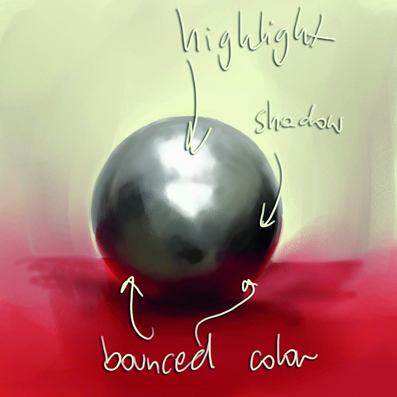
The basics of shading metal are the same as for any curved surface exposed to a light source. You have the regular form shadow, which is a shade created on the side of an object that is simply not exposed to lighting.
In addition, you have the bounced off lighting on the very edge of the shape. There are two important distinctions when shading metal: first, the highlights are much bolder; second, the bounce light (and therefore colour) effect is also much stronger, and its saturation is comparable to the saturation of the original object’s hue.
Don’t use Burn and Dodge to shade metal from scratch. While they can be useful for strengthening existing shading, you’ll want to do it manually at first so it doesn’t look obviously Photoshopped.
11: Gold in practice
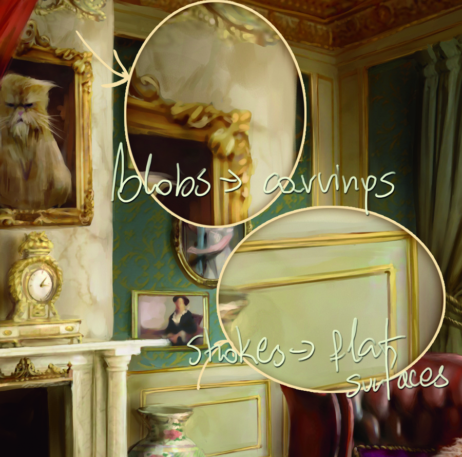
In some cases, it’s enough just to hint at the metallic colour. See the gold ornaments or small gold frames in the final image to see what I mean. Gold is a mix of yellows, browns, and khaki greens. To quickly simulate a flat golden element, paint a yellow stripe, with a bold lemon-yellow highlight in its middle and green-brownish shadows on the edges.
For more intricate designs (including the huge cat portrait), use contrasting coloured blobs on top of each other, paint them dark brown, and put light yellow blobs on top of it. This only works for loose paintings and will simulate carvings when seen from afar. An Airbrush or well-blended Oil will do just fine.
12: Shading the marble
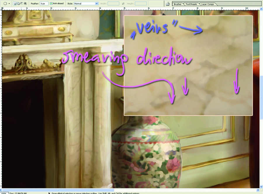
Another surface detail that might be helpful when doing interiors is marble. What you should do is pick a smearing brush (the Wet Detail brush from Acrylics, for example) and add in dark, vein-like shapes.
Afterwards, run over the area with a blender, smearing only one side of the vein. Between the veins, add in some colour variations, relying on brightness and saturation changes instead of hue changes. Highlights can be underlined by bold and yellow lights smeared across the area. Be sure to use only oily brushes for this particular stage.
13: Drop shadows and cast shadows
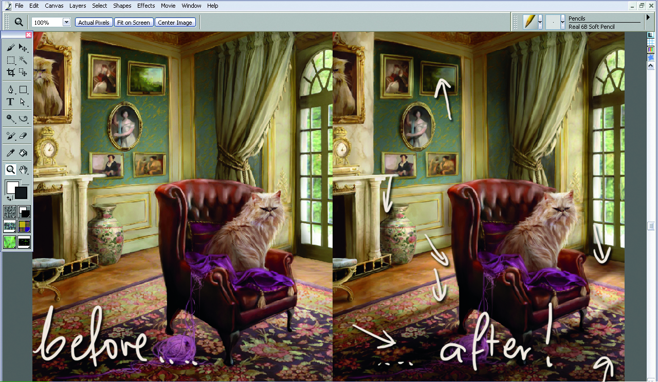
Elements in your painting must interact. You can create a feeling of depth through perspective, but if you forget about adding lighting interaction, it will all end up looking artificial. Nothing will add as much to the three-dimensional feel of the piece as appropriately added shadows and highlights. Aside from form shadows (areas not exposed to light), you also have cast shadows, which are formed by elements exposed to the light source.
To demonstrate this rule, I refrain from painting in any bigger cast shadows during my working process. Do you see how flat it all looks? Successive elements, despite a common light source, seem copied and pasted in, and altogether, it just doesn’t look right. I open up a layer and, using Multiply and Normal modes, I airbrush in the necessary shading that’s lacking. Doesn’t it instantly seem so much better?
14: Final image
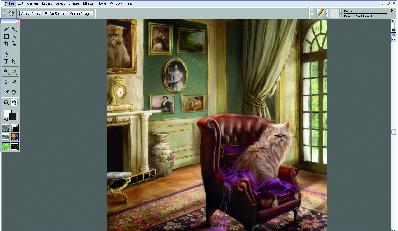
After painting in the vital parts of the image, it’s always a good idea to search for things to improve. I flatten the layers, load the piece back into Photoshop, and quickly Dodge (with Airbrush set to Highlights) the most highlighted part of the image to strengthen the light source. It’s a subtle stage and has to be done with care – too much Dodge and it will look artificial. After that, I take one final look and consider myself done… Phew!
Sign up to Creative Bloq's daily newsletter, which brings you the latest news and inspiration from the worlds of art, design and technology.

Marta Dahlig is a talented Polish artist who has been working with Photoshop and Painter for years. She has freelanced and now illustrates children's books for mother and daughter publisher Tumilu.
You must confirm your public display name before commenting
Please logout and then login again, you will then be prompted to enter your display name.
