Here's how we made the cover art for the new Mega Man Timelines
Artists Kenny Ruiz and Noiry take us through the process step by step.
Sign up to Creative Bloq's daily newsletter, which brings you the latest news and inspiration from the worlds of art, design and technology.
You are now subscribed
Your newsletter sign-up was successful
Want to add more newsletters?
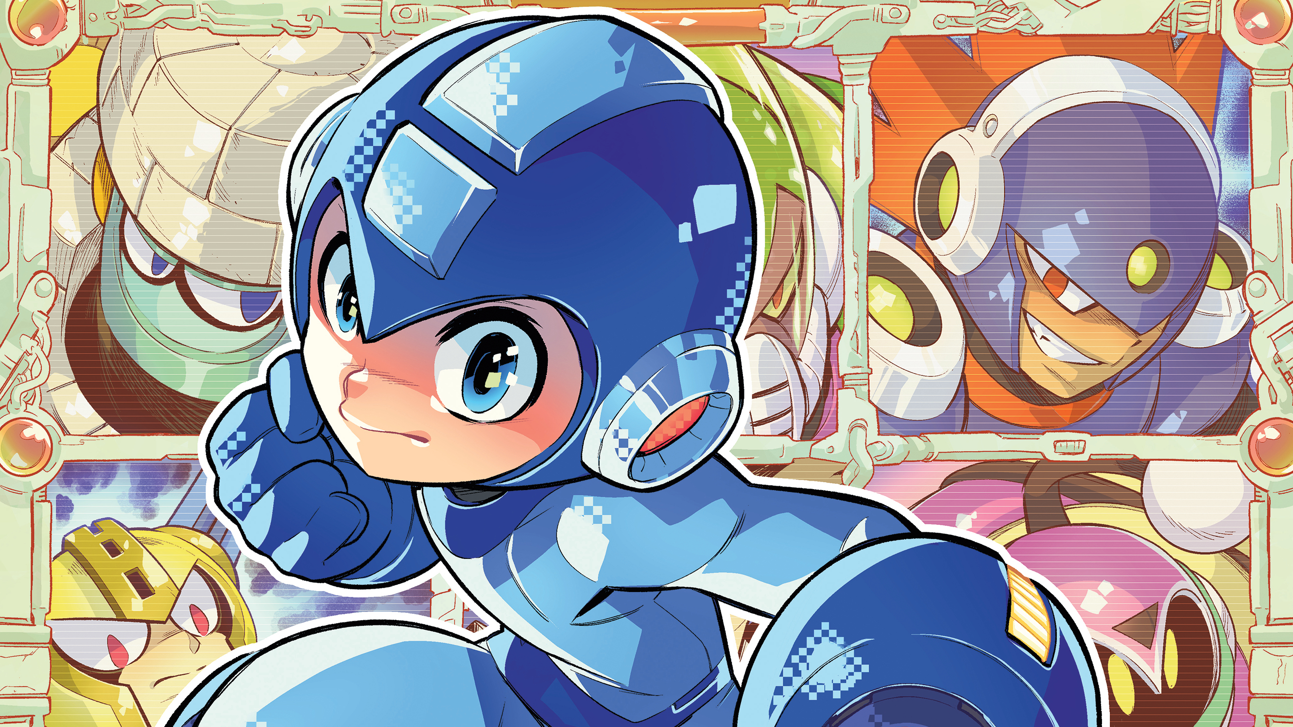
What better choice for teaching you how to create stunning character cover art than the iconic Mega Man. Udon Entertainment commissioned us to create a cover for Mega Man Timelines #1, inspired by Mega Man 11, and we're going to show you how we went about it.
The idea was to use the game’s iconic enemy selection grid and make Mega Man stand out. The main challenge for us was to capture the character’s strength and agility. For character cover art, it’s crucial to work directly in the final reproduction format or a proportional one. From the start, you must consider the space needed for the logo, publisher, and other essential information, which impacts the composition.
First, Kenny will show how he created a rough sketch and test some options. Often, the first is the best, but it’s important to push beyond our comfort zone and try alternatives. He’ll then work on the main character separately, before Noiry takes over to talk about her process for using colour and light to make the character pop.
Article continues belowIf you need tools for your own character art, see Creative Bloq's guides to the best digital art software and the best drawing tablets.
01. Explore visual connection
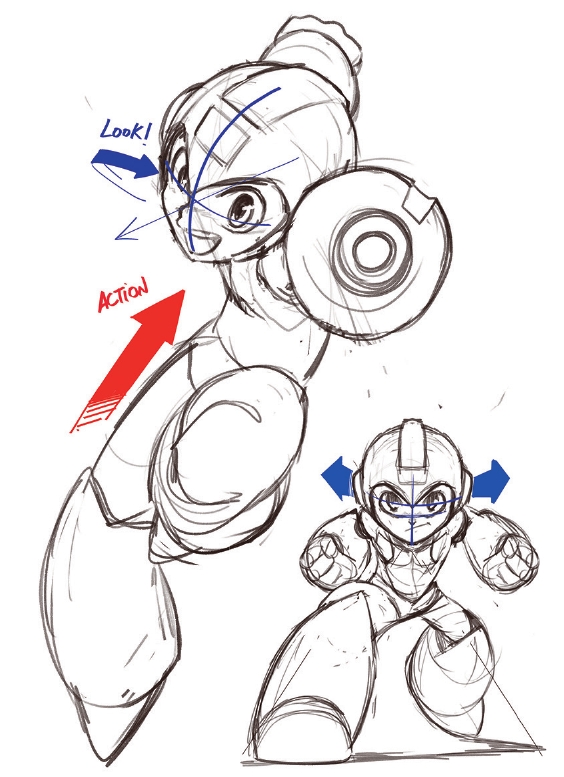
I began with two options for creating a connection with the viewer. The first was a direct frontal gaze that challenges the audience. I also tried a secondary gaze where Mega Man is pictured in dynamic action but, for a split second, locks eyes with the viewer.
02. Make motion lines
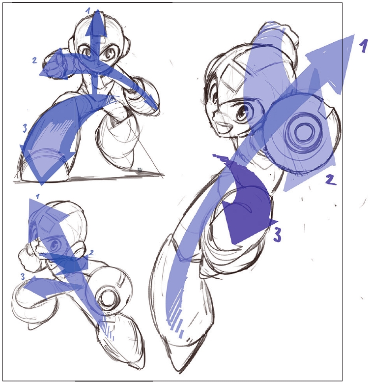
I love dynamic poses, so I also explored different options for them. For me, the recipe for success divides a character’s movement into three axes:
• Main movement: the body’s general direction.
• Shoulder axis: connects the hands.
• Hip axis: defines leg positioning.
Sometimes all three of these reinforce the same action. If the second and third axes go in opposite directions, then the action feels more dynamic. I also try simpler compositions, which can often get better results.
03. Consider the silhouette and negative space
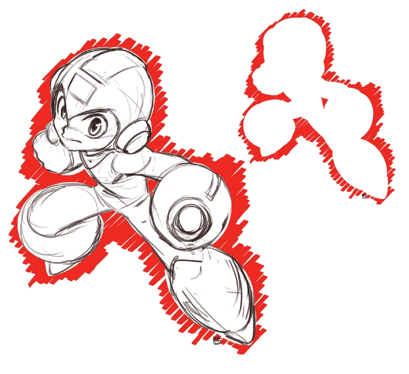
The silhouette is crucial. Throughout the process, ensure the negative space – the space left by the character – is clear and easy to read. It’s essential to find those gaps between the joints. If necessary, I slightly modify the pose to achieve them. You can see this between Mega Man’s laser cannon and his hip.
04. Create an imbalance
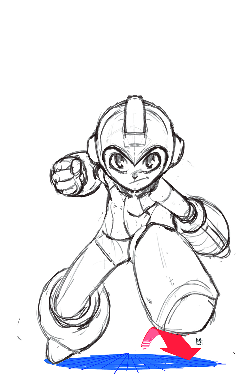
Imbalance always suggests movement. If the character isn’t fully grounded, the viewer immediately imagines the next step in the action. Simply lifting one foot can create that sensation of a step in motion. Instinctively, I tend to look for balanced poses because they are more visually comfortable, but I fight against this and push the angles to the maximum.
05. Depth and movement
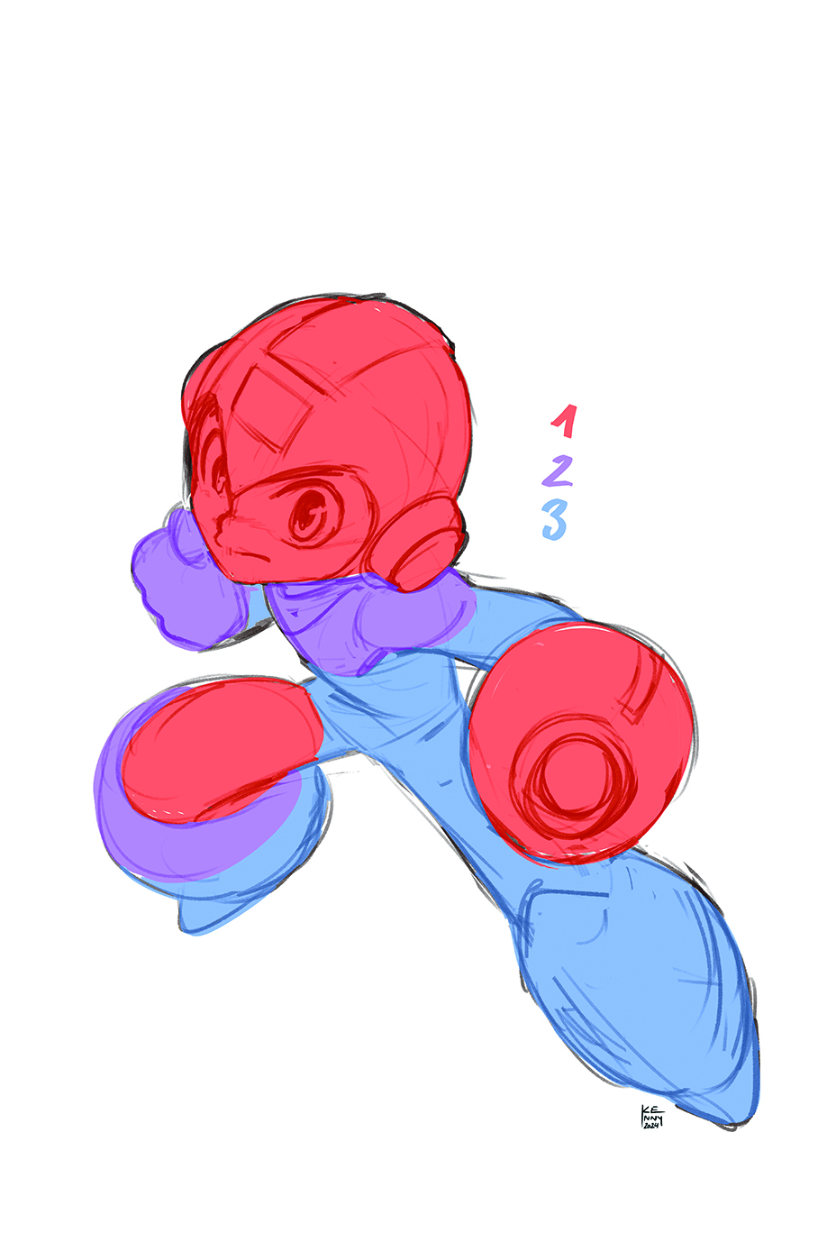
Pay close attention to depth in the figure and ensure there are at least three depth planes in the pose. Specifically for a cover, making the character leap forward creates the feeling that they’re bursting towards the reader. You may remember Wolverine and the New X-Men breaking through the cover. Although my option isn’t that extreme, I always keep the idea in mind.
06. Perfect the facial expression
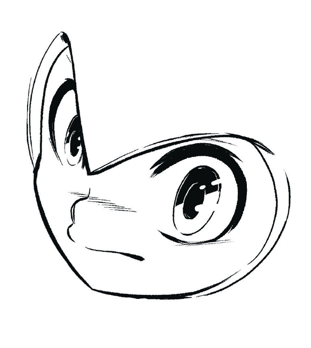
I always ink the face first – if the gaze is on point, everything else falls into place. The line in drawing is like the words in a poem; each one conveys shape, volume, movement and rhythm. It’s amazing how much a single line can express. I always keep in mind the priority of each stroke. For the eyes, I aim for fluidity and a lighter stroke because I believe it conveys humanity.
07. Develop outlines and details
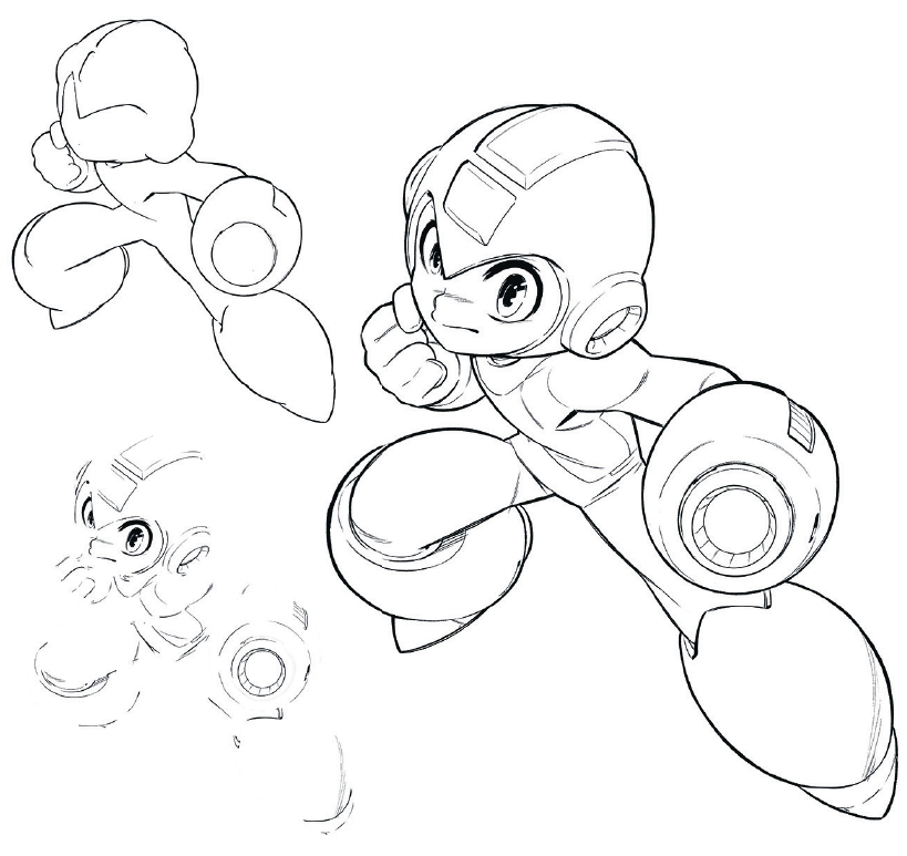
Thicken the contour lines and vary the strokes to add volume. Where the volume is more defined, we want the stroke to thicken slightly. You can see this on the right thigh, where it overlaps with the boot. With a thinner stroke, we’ll refine textures and auxiliary lines. The lines that convey less important information are kept very thin with little modulation; they’re light and subtle.
08. Mechanical texture
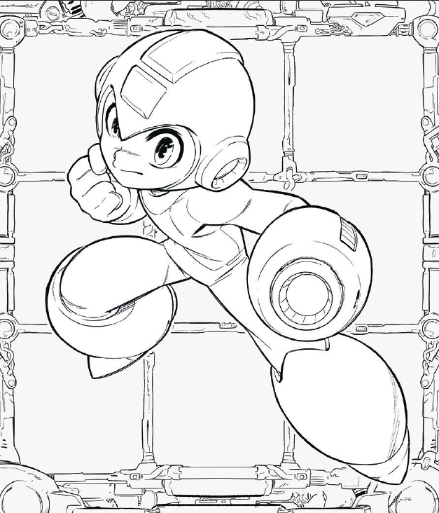
A machinery-style design places Mega Man in his universe, and for this I use thin lines to avoid visual noise. The background is like another character, but we often don’t give it much attention. My technique is to think about the purpose of everything I draw. For instance, a fuel container that connects to a pipe, which then powers some gizmo, which needs a turbine. Giving everything an internal logic makes it more fun to draw, and that way, can help us pay more attention to it.
09. Fill the background with villains
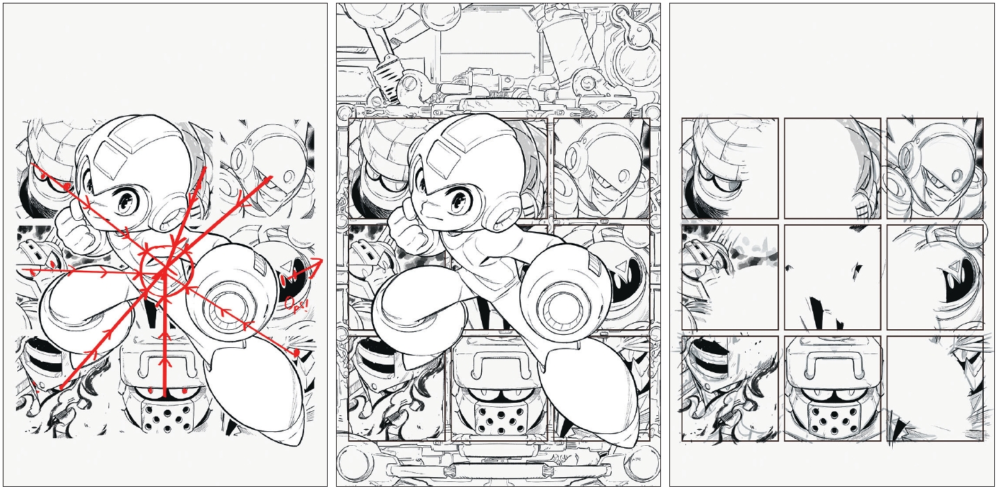
Each frame features an enemy from Mega Man 11, all directing their gaze to the centre, other than Bounce Man and his tricky silhouette, for which I chose the lesser of two evils. There’s little space to characterise them, but tilting the perspective in closeups is useful; a slightly low-angle shot gives a sense of superiority, while a high-angle shot feels more challenging. To avoid repetition, I had to use several tricks.
10. Beat the final boss
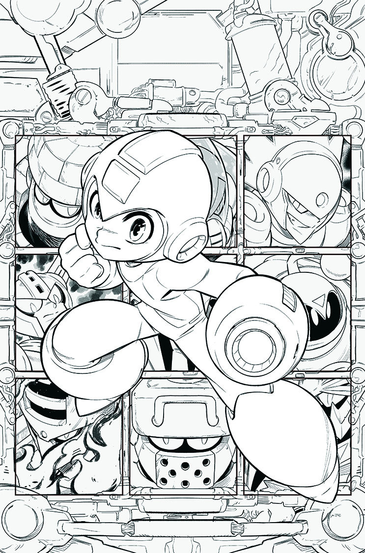
Once everything is together, add a power line, in this case a white contour that separates the figure from the background. With that done, it’s time to pass our Mega Man over to the colourist, Noiry. There might be some things that I’d like to change, and this can be the hardest part of the profession: we have to live with the imperfections and accept that our flaws are just as much a part of us as our strengths. When I see something that doesn’t work, I make sure to learn from it for next time. But this illustration? It’s already in the past – and no one should live trapped in the past. The only way is forward!
11. Find the right style
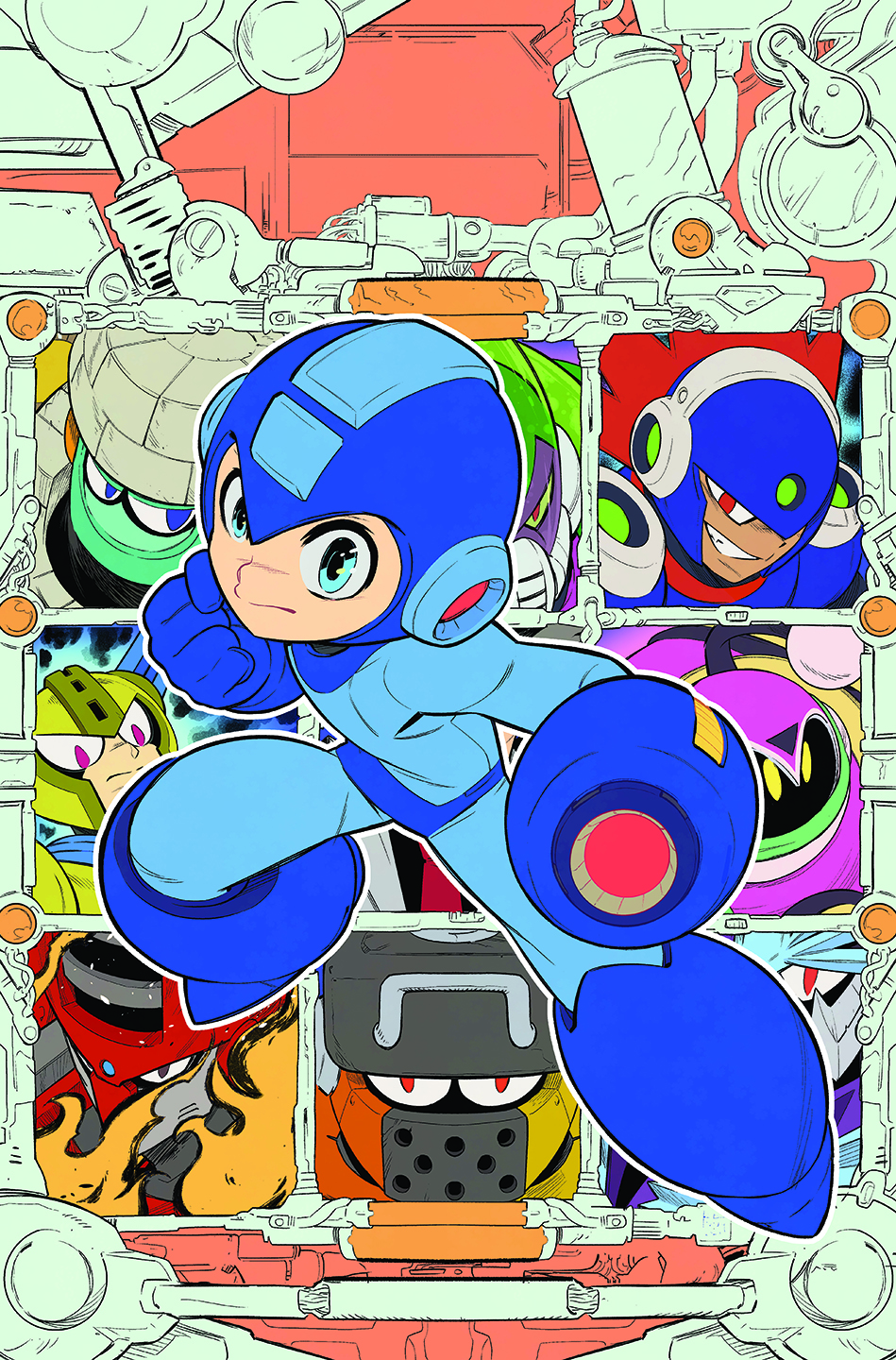
Whenever you get a new artwork for colouring, read the image and try to figure out what style fits it the best. Sometimes you’re lucky and can ask the artist about their ideas, but sometimes you’re on your own. My purpose is always to elevate the artwork, bringing the best out of it, without imposing colour over the line-art. For this cover, I chose simplicity and effectiveness to develop a more typical anime look.
12. Work smarter, not harder
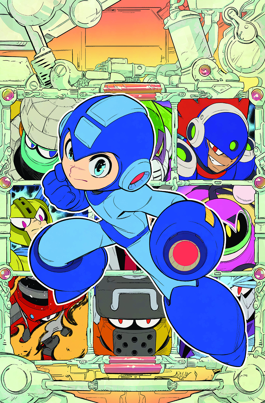
You should want the viewer to focus on the main character, then the secondary characters. Most of the background will be covered with logos and text, so overdetailing it will only be distracting and make it all harder to read. Keep things simple by adding a soft shadow, mild texture and some gradients to enhance the contrast between background and central figure.
13. Add a touch of depth
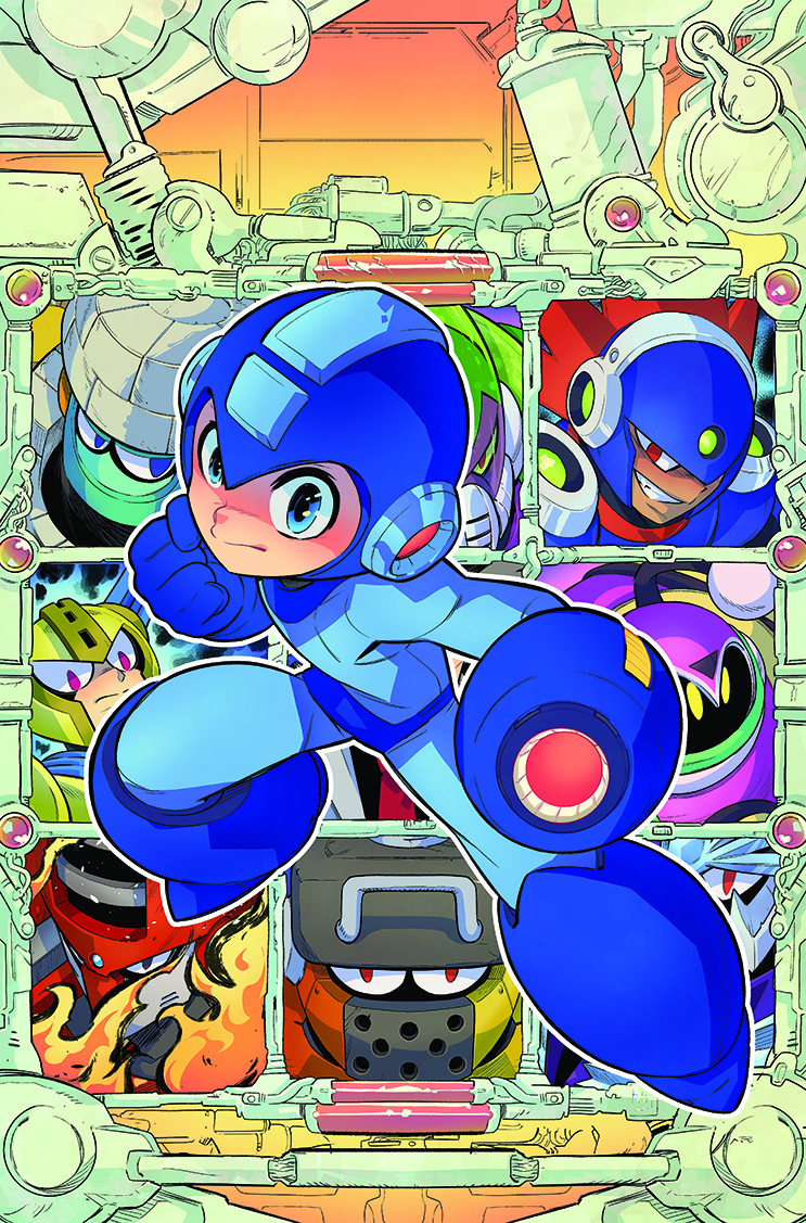
While I chose an anime style with sharp-edged shadows and blocky shapes, I also felt that subtle gradients here and there could make a world of a difference. With a soft brush of your choice, add faint blush on the skin, and subtle highlights or shadows in the metallic parts; just enough to bring some life but still retain the anime look.
14. Make it pop
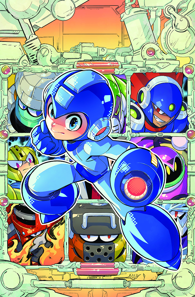
With the basics down, it’s time to give the cover some shine – literally! I kept the blocky style as a nod to Mega Man’s origins as a video game. On Mega Man himself I took that to the extreme and created a pixel-like brush to make him more unique. Rim lighting also helps the character to pop out.
15. Final fixes
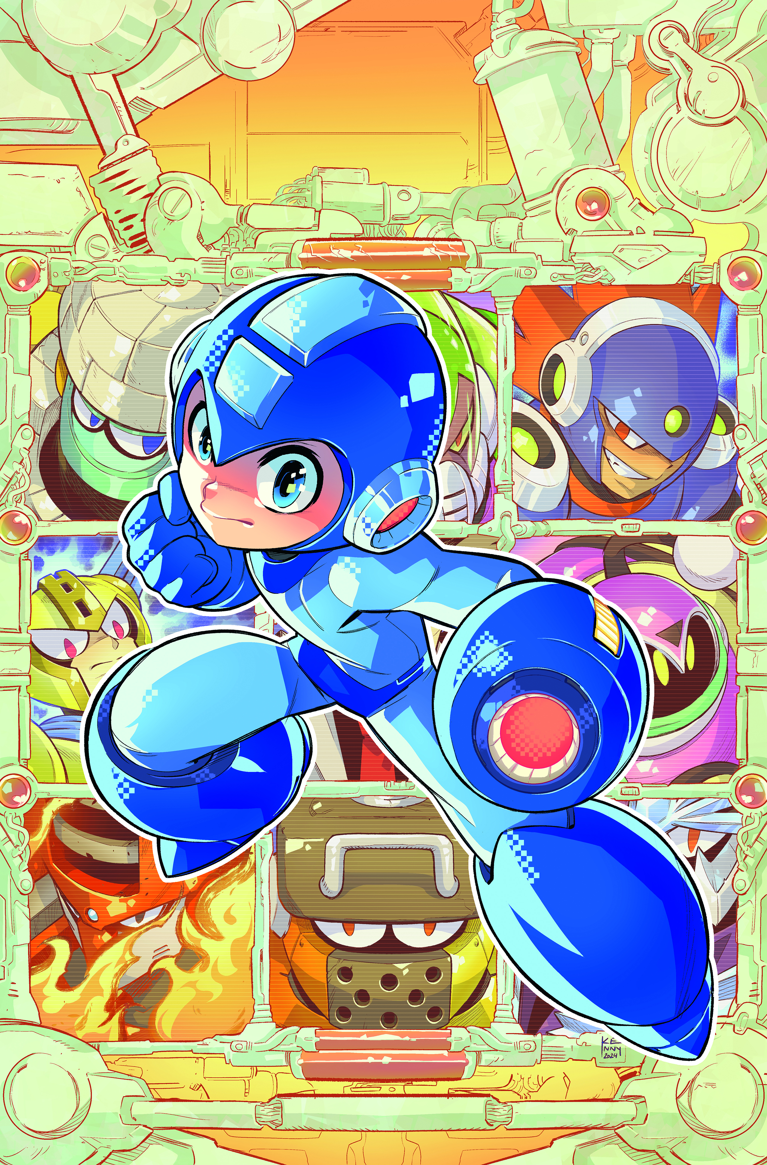
In the final stage, I balance out the colours and add effects like the screen texture over the baddies here. I want Mega Man to stand out more so I lighten and even the palette of the characters behind. Zoom out until the picture is barely the size of a stamp on your screen, and if the colours and shapes are still recognisable, you can call it a day.
Mega Man Timelines #1 can be preordered from Udon Entertainment.
This content originally appeared in ImagineFX magazine, the world's leading digital art and fantasy art magazine. ImagineFX is on sale in the UK, Europe, United States, Canada, Australia and more. Limited numbers of ImagineFX print editions are available for delivery from our online store (the shipping costs are included in all prices).
Sign up to Creative Bloq's daily newsletter, which brings you the latest news and inspiration from the worlds of art, design and technology.
You must confirm your public display name before commenting
Please logout and then login again, you will then be prompted to enter your display name.

