How to colour digital art without losing your sketch's raw charm
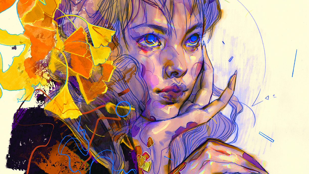
Eliza Ivanova explains her process for colouring artwork in Proreate without losing that personal sketchbook feel.
Sign up to Creative Bloq's daily newsletter, which brings you the latest news and inspiration from the worlds of art, design and technology.
You are now subscribed
Your newsletter sign-up was successful
Want to add more newsletters?
It’s not uncommon to see a beautiful pencil or ink drawing that’s been butchered under multiple layers of poorly constructed digital colouring. Textured brushes are designed to replicate real-life brush, pencil, or ink marks, so why not utilise the power of those real marks that have already been laid down on the paper?
In this tutorial, you’ll be able to follow along with my colouring process, see which brushes I use to mimic my drawing and shading, and learn how to maintain valuable information, such as line quality, shading, textures, and imperfections, while elevating your piece digitally.
It’s important to keep in mind that your basic setup is key to lining up for success from the beginning; the things I look out for are scanning resolution (I use 600DPI or more), and selecting brush packs that contain brushes close to the ones used in the original piece. However, there are plenty of default brushes already available in Procreate that work wonderfully, especially the pencil and ink ones. Keep in mind, if your digital blending appears too smooth, it can overpower any nearby textures and stick out as a mistake.
Read our collection of Procreate tutorials for more advice, and our list of the best iPad for drawing to see which is best for you.
1. Separate the original scan into multiple layers
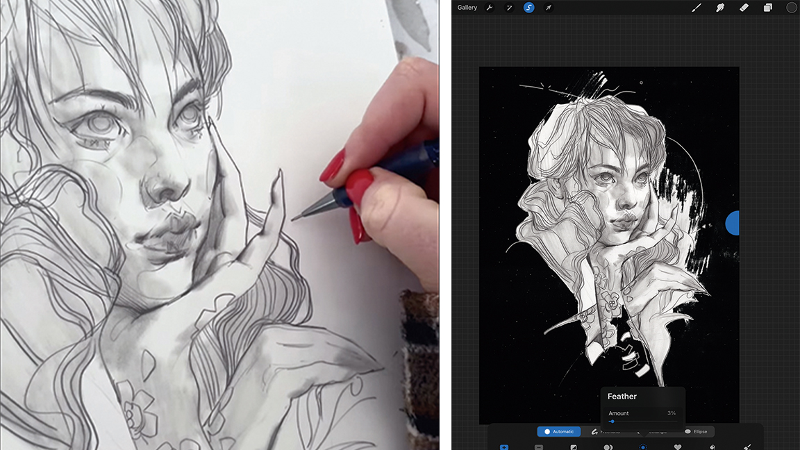
The first thing we’ll need to do is set up our scanned drawing ready to be worked with digitally. Split it into at least two layers, most importantly, the subject layer and a background layer. If the subject is pretty well contoured but there are additional elements of shading outside the subject lines, include those in the subject layer. To avoid harsh edges while separating the image into layers, use the Feather option at 2-3% to soften the selection’s edges, then Cut and Paste. I also use the Multiply Blend Mode for the subject layer.
2. Use layers as quick selection tools
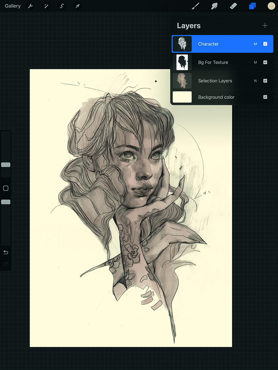
The main reason for Step 1 is to have a quick way to select the subject and start colouring. Do this by going to the subject layer and clicking on it again to prompt more options to pop up. Click the Select button to choose the whole contents of that layer, then create a new layer while the selection is still active. Finally, use Procreate’s ColorDrop option (dragging and dropping the colour from the Color Wheel) or a brush to block in a new layer in the shape of the subject. From now on, we’ll use this layer for colouring and shading.
3. Decide on your line-up of basic brushes
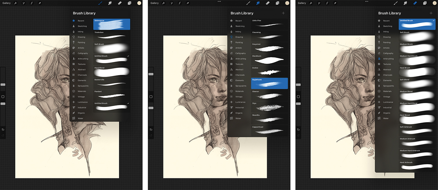
Let’s prepare the basic brushes that we’ll use throughout this piece. For the general colouring, I chose Salamanca, for blending, I selected Eaglehawk, and for erasing, I picked a basic hard airbrush with a little extra Fall Off at the ends. I prefer my erasers to have a clean, hard edge that I can always texture later on with the blending tool. Finally, my blending brush leaves a textured look without smoothing out the original brush too much, so I get a nice pairing and variation without needing to redo the brushes.
4. Add colour textures and variation from the beginning
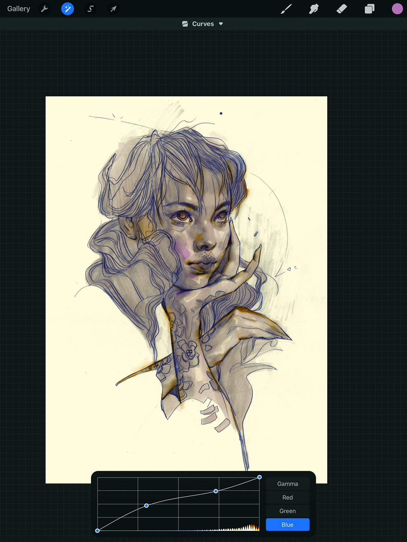
I like to get some fun textures into the base colour as early as possible to move on from the basic block colour as quickly as possible. Using the painterly brushes, punch up the light and shadow values from the pencil layer to highlight what’s already there. Next, add some colour bleeds to again punch up the darker spots in the drawing, as well as around the silhouette. With the quick addition of one extra colour, you create the impression of sophisticated colouring just by the gradation and combination of the two colours used.
5. Make the background dynamic
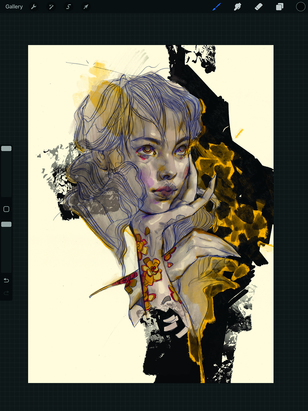
I often leave the backgrounds around my figures as blank negative space. This effect works well with pencil sketches, where a lot of the missing elements are implied environments. However, in this case, I wanted to build on what was already there and needed a drastic change to add a new point of interest that still highlights the main figure. So, with a chunky brush, I blocked in a dark background shape, with the negative space now broken up into a midground and background to add a subtle dimension. I also introduced a third colour to the figure, ochre, and tied it with the background in the form of rough flowers and leaves. The black shape cloaking the character was also expanded, and the colour temperature of the pencil was adjusted to be a touch more blue.
6. Create a new layer for the details
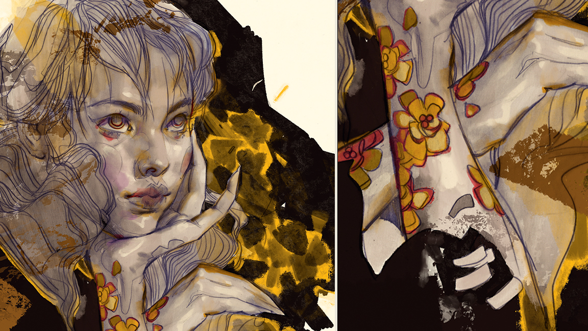
The next step is to begin adding and refining the overall detail. I typically add five or six detail layers for different purposes: one to refine roughed-in shapes, another to try out design elements, another to test ideas for lighting or textures, and so on. These layers are rarely flattened, as it’s imperative to be able to control and revise as we go. In this step, you could also add a clean-up layer like I used to work on the flower tattoos on the subject’s arms, as well as some highlights in the face and eyes to make them appear supple and dewy.
7. Dig out some depth
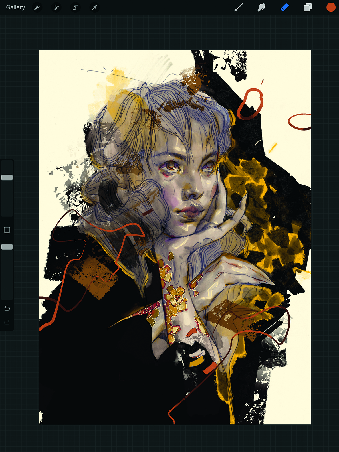
At this point, I was happy with the direction of the piece and decided to try out some floating elements to add yet another foreground detail and slightly expand the depth. The floating ribbon is coloured in such a way that it overlaps itself, and the same goes for the floating ovals. Any small variation adds to the overall effect of depth and sophistication, even if it’s a subtle touch. Such details are playful and important in having the figure feel suspended in its environment; a dance between fantastical design and what’s real.
8. Pay attention to details
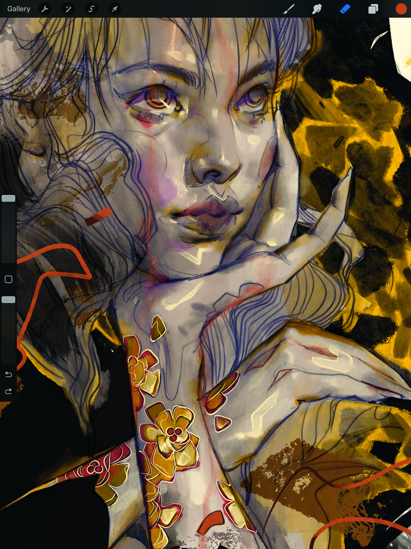
Zoom in and address small notes as if with a magnifying glass, as digital screens can be deceptive when zoomed out. Pay extra attention to details on the face, because any subtle additions will drive the viewer’s eye right to that focal point. We can turn highlights into designed shapes to tie everything together.
At this point, make sure the lighting is punchy but without fighting the original lighting of the pencil sketch. The tattooed flower outlines in my piece weren’t working, so I used an eggshell white ink brush to invert the lines and turn them into gilded jewellery. This isolated element draws subtle attention to itself.
9. Use invisible details for visual effects
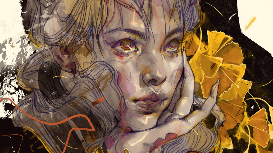
What I call ‘invisible details’ unify all the different layers, especially the digital and pencil elements. Throughout the colouring process, periodically throw in a bit of chromatic aberration (no more than 2-3%) as well as blurs on certain background elements and colour blooms. These effects break up areas that appear too perfect, which is a trait of digital art, into areas of colour offsets and lines that go in and out of focus.
The goal isn’t to draw attention to these effects but to blend everything together. Only do these on colour and detail layers and don’t touch the pencil sketch. Above, you can see how the colour aberration looks in the colouring of the eyes, which have a blue/yellow tint.
10. Refine the background elements
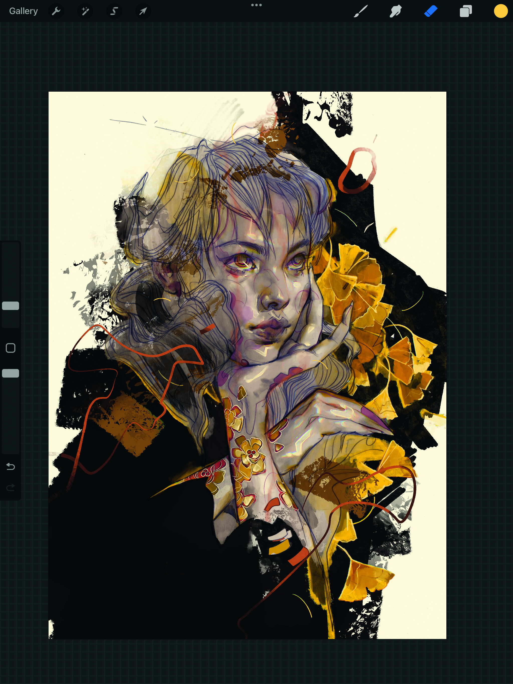
Next, I refined the background leaves. I went with ginkgo leaves, because their shape is so recognisable, even as silhouettes. The goal is to make sure that, as the leaves are being refined, they don’t overpower the details of the figure. To avoid that, I made sure the line work of the leaves is closer in value to their base yellow. The outline is closer to the inverted outline of the flower tattoos, but doesn’t have the same inverted effect, as the leaves’ outline is blended into the colour layer.
11. Touch up the tones
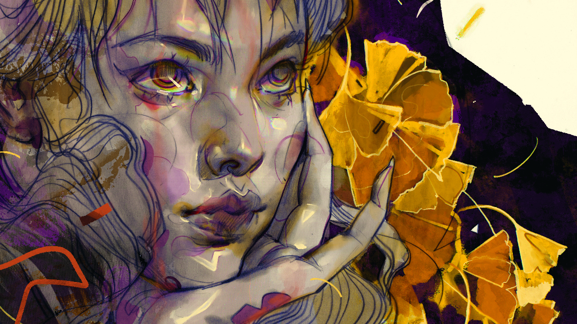
Sometimes changing pure white or pure black elements to different shades with cool or warm undertones can add sophistication to the overall look – a big difference with a seemingly minor adjustment. In my image, I changed the tone to a dark magenta that paired well with the blue tone of the pencil sketch. I also added a magenta colour that bleeds onto the arms and fingers, as well as some of the ginkgo leaves, to further unify the various layers.
12. Address any feedback
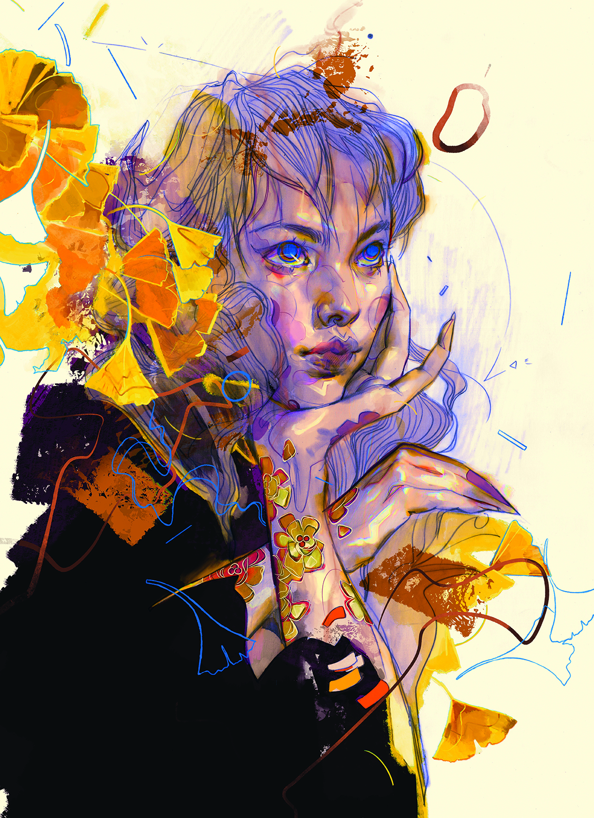
In the final images, I had to push the colours and further boost the blues and yellows. I added some more chromatic aberration to the highlights this time, as I felt they were looking slightly underbaked compared to the rest of the image. This had the bonus of adding a magical, technicolour effect that felt nostalgic. Lastly, I created some blue ginkgo leaf outlines as design elements to fill some of the cleared space. The blue tones were requested, which is why I added them throughout.
Each piece has its demands for colouring, and some require a heavier digital pass than others. With that said, my general setup is pretty much identical to this one, and it’s a matter of how much or how little I lean into colouring and boosting the original. The only time my process can slightly differ is when I create a digital sketch from scratch, though even then, the layer setup largely ends up being close to this one.
This content originally appeared in ImagineFX magazine, the world's leading digital art and fantasy art magazine. ImagineFX is on sale in the UK, Europe, United States, Canada, Australia and more. Limited numbers of ImagineFX print editions are available for delivery from our online store (the shipping costs are included in all prices).
Sign up to Creative Bloq's daily newsletter, which brings you the latest news and inspiration from the worlds of art, design and technology.
Eliza is a Bulgarian fine artist, illustrator, and animator based in San Francisco. She worked as a 3D animator at Pixar for a decade and helped create the likes of Cars 2, Inside Out, Monsters University, and more.
You must confirm your public display name before commenting
Please logout and then login again, you will then be prompted to enter your display name.
