How I use an iPad to paint from life in a museum
Concept artist Karl Simon shares his creative tips on painting with an iPad in a museum setting.
Sign up to Creative Bloq's daily newsletter, which brings you the latest news and inspiration from the worlds of art, design and technology.
You are now subscribed
Your newsletter sign-up was successful
Want to add more newsletters?
Painting from life is a deeply rewarding practice – one that can't be fully unpacked in a single tutorial. But in this session, I want to share a method I really enjoy when it’s not practical (or warm enough) to paint outdoors.
For me, life painting is less about producing finished pieces and more about sharpening my observation skills. It’s a way of studying reality that feeds directly into my studio work. Traditional painting from life requires planning, commitment and the willingness to live with each mark you make. But we’re now spoiled for choice when it comes to digital tools, and these can encourage a looser, more forgiving approach.
I’ve found that working on a tablet, especially something like an iPad with Apple Pencil, hits a sweet spot between the structure of traditional media and the flexibility of digital painting. While apps like Procreate can’t match Photoshop for features, their focused, streamlined toolsets make them ideal for on-the-go studies. In fact, I find Procreate’s limitations helpful since they encourage deliberate decision-making and keep the process direct and intuitive. Its responsiveness, portability and affordability make it a near-perfect companion for life painting in the wild (or in a museum like I'll be doing here).
For this session, I took my iPad to the Wallace Collection in London’s West End – a quiet, atmospheric museum filled with incredible subjects. I chose to paint a suit of medieval armour, drawn to its complex surfaces and subtle colour shifts. Here’s how it went, and how you can try this approach for yourself.
See our guide to the best iPad for drawing if you're wondering which model to go for, or see our pick of the best drawing tablets for other options. We also have a guide to the best laptops for drawing.
01. Find a composition
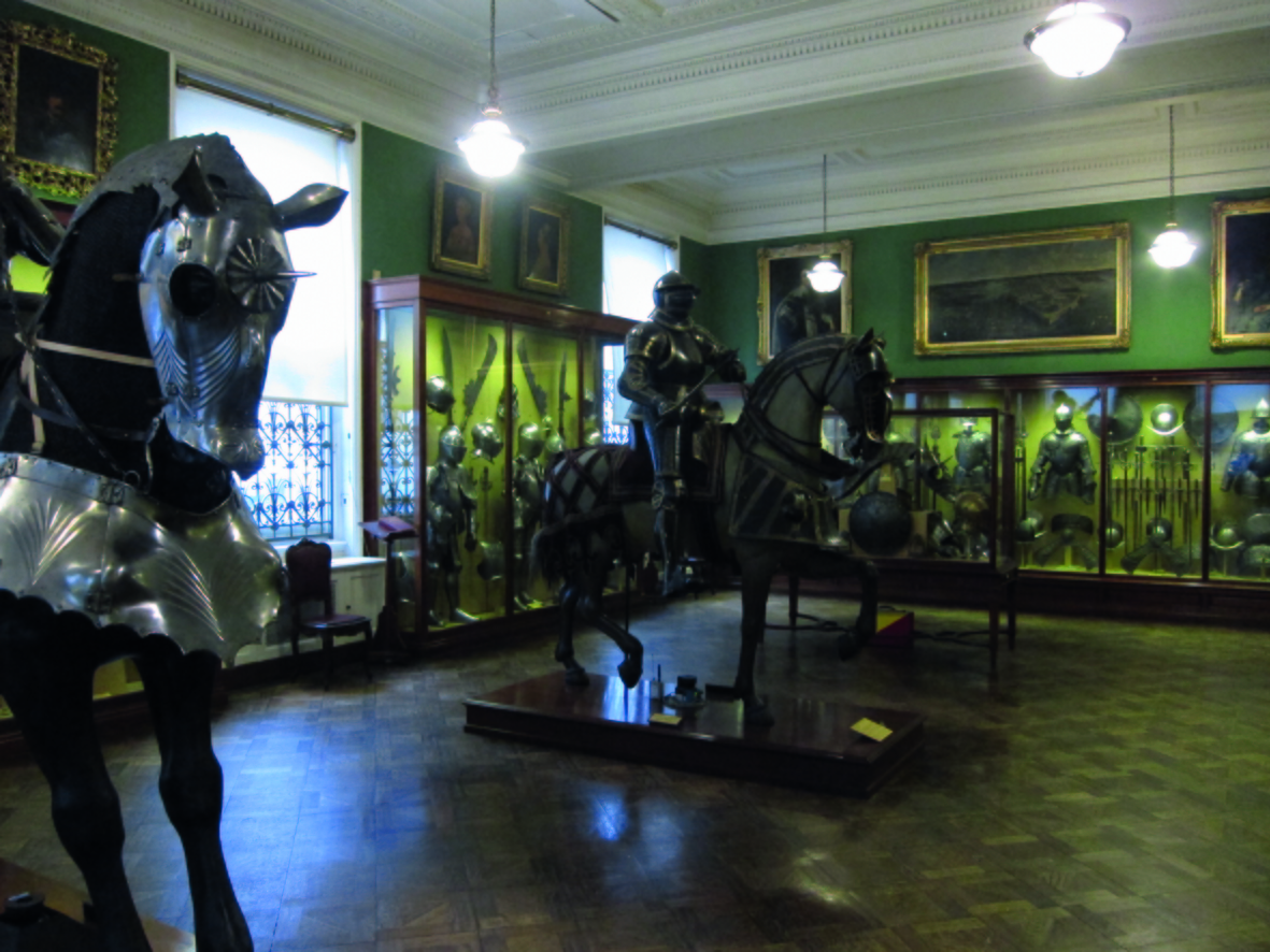
Once I’ve decided what to paint I take a look at it from different angles, trying to find a pleasing composition. Most museums provide stools to sit on so you don’t have to stand up or sit on the floor.
I settle for a spot where I’ve placed myself in a position that puts a bright window right behind the head of the knight. This should hopefully give a contrasting focal point to my composition. The lighting in the room is a bit dull, but there’s a nice variation of materials so I can probably focus on that.
02. Get your canvas wet
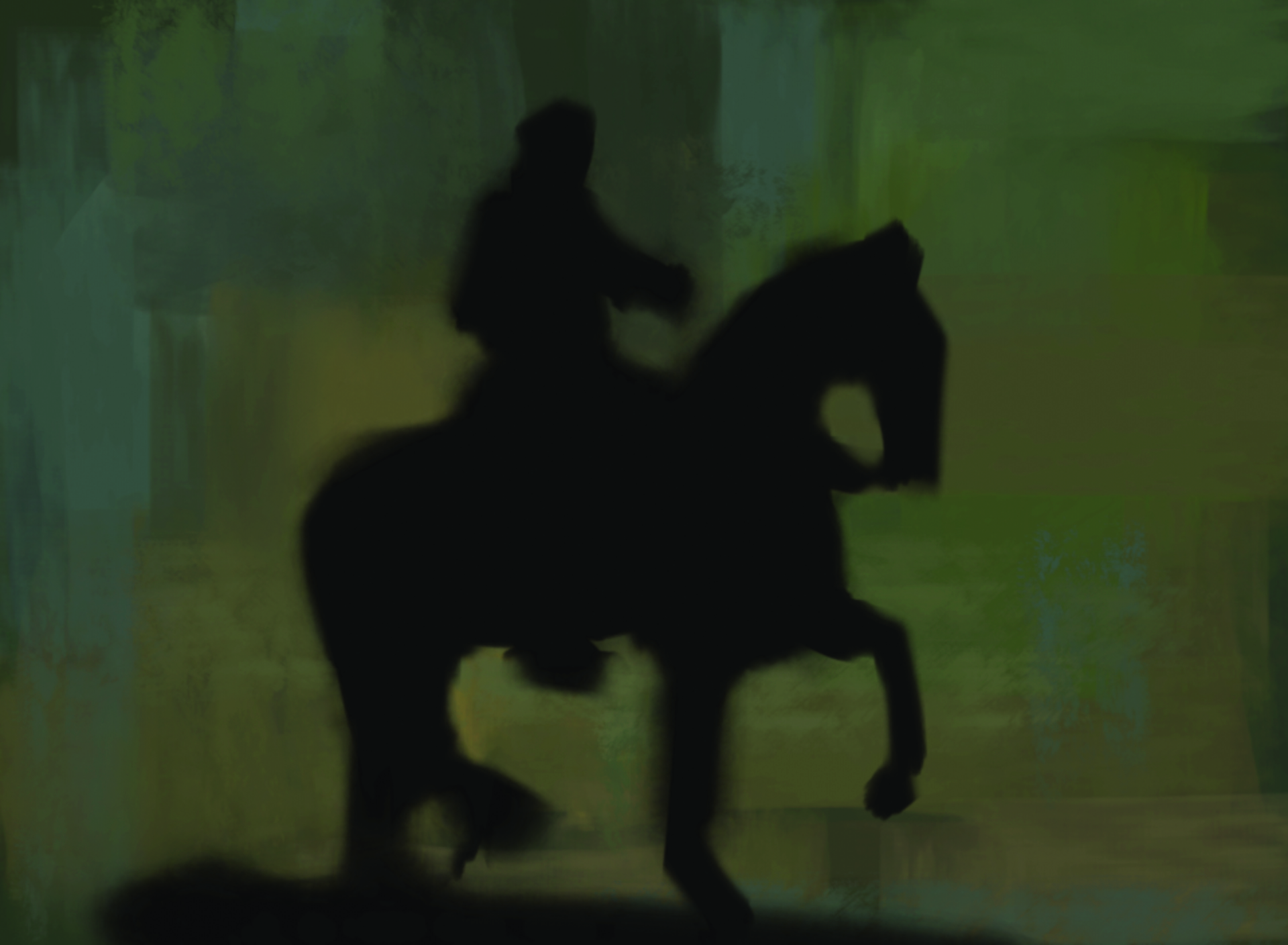
First I lay in some background colours, picking values in the lower midtones. I want to create a flat background that has some vibrancy to it. On top of my background, on a new layer, I rough in the shape of my main subject using a soft-edged brush.
I make it look ugly almost on purpose, ensuring that I include all the different elements. I then move this shape around, transforming it to see how it’ll fit into the composition. I start painting in a landscape format, but then realise that this image will probably look better as a portrait.
03: Measure the proportions
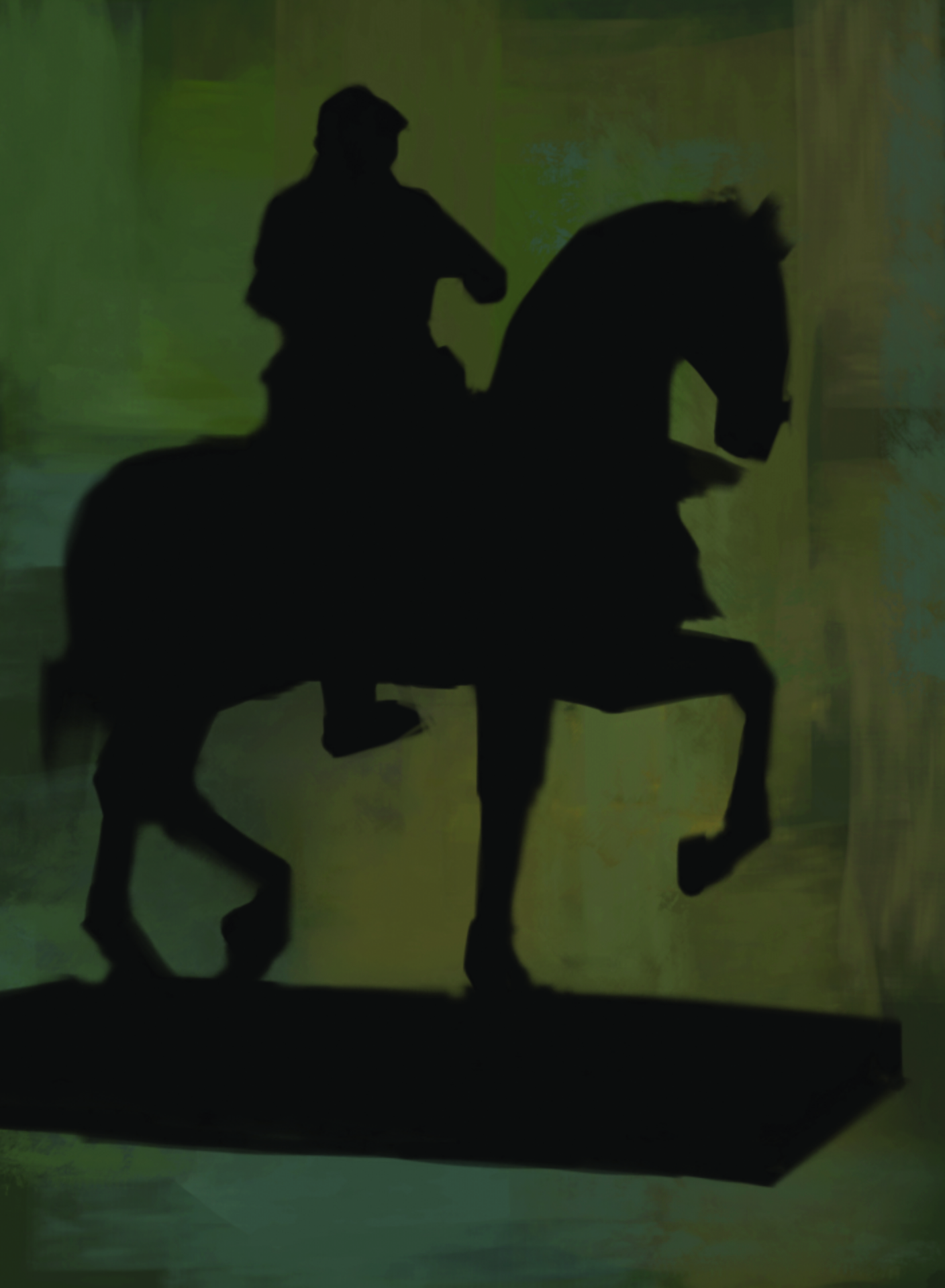
Once I’m happy with the shape and its size on the canvas, I start assessing its various components. What I’m trying to do is make sure things are correctly placed relative to each other; I’m attempting to see the three-dimensional form in front of me as a two-dimensional shape that I can paint.
When I paint this big shape, I’m toggling between the Brush tool and the Eraser tool. This leaves me with a clean shape that I can later lock as a mask. As I grow more confident that things are in proportion, I slowly work towards a sharper-edged silhouette.
The foreground shape helps me to measure and compare the sizes of the shapes in the background. If things don’t add up, there’s probably something wrong with the foreground shape, so I jump back to it every now and then to make alterations or corrections. I pay particularly close attention to the perspective of the walls and floor, trying to capture the right depth by accurately measuring the size of the shapes further back in the room.
04: Greater perspective
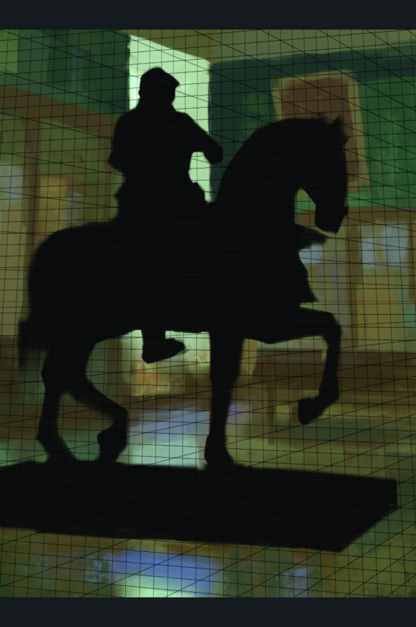
Even though I try to be as precise as I can, I’m not happy with the perspective. To help me along, I load in a grid as a Multiply layer to make sure all the lines go to the correct vanishing points.
This is a great help, but I always try to paint without the grid first, for practice. Once these initial steps are done, what I end up with is essentially a drawing. Not a conventional line drawing, but a drawing made up of shapes of flat paint. From here I can move on to the next stage of my creative endeavour.
05: Lock alpha pixels
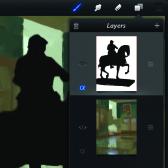
One of the great advantages of digital tools is the possibility to create masks. There’s no Selection tool or Layer Masks in Procreate, but I work around this by locking the pixels I’ve painted so that they become their own mask. It’s the same thing that Photoshop calls Lock Transparent Pixels. Simply click the alpha symbol on any layer and you’ll lock its pixels.
06: Model the form
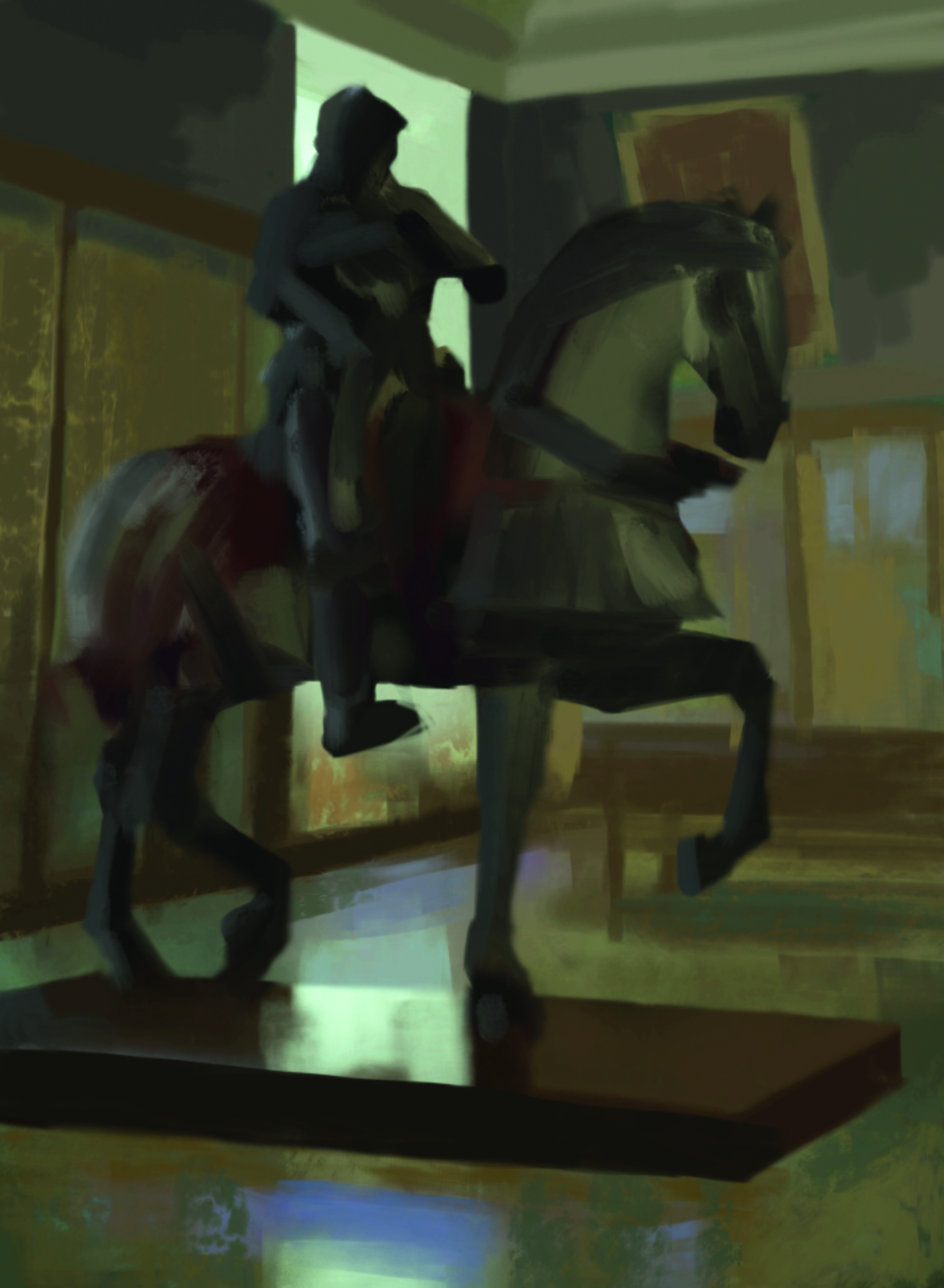
After locking the foreground, I pick a big brush and blob in some colours. I use brushes that have semi-transparency and smudgy characteristics. Still keeping things soft, I’m trying to show the form with some subtle differences between cold and warm areas. I look around the room, noting which lights are present.
I also try to take note of how the lights affect the colour temperature of the shadows. The green walls don’t look particularly nice to me, so I decide to redecorate and paint them grey instead. So far so good!
07. Describe materials
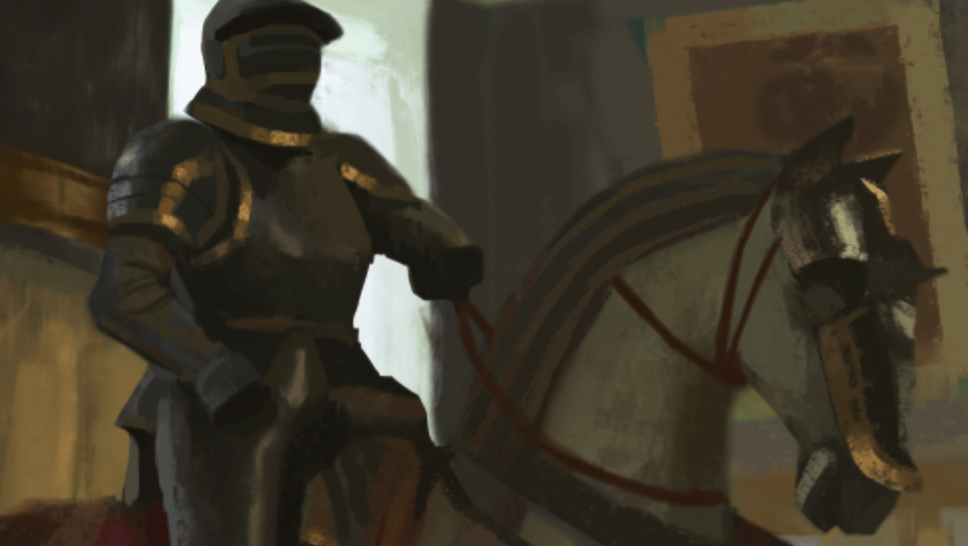
I try to play up the differences in the materials, painting the velvet cloth at the back of the horse with very soft brush strokes, contrasting this with the sharp, edgy look of the armour on the horse’s chest. When painting up the different surfaces like this I tend to jump between foreground and background, painting whatever draws my attention.
This way I can slowly build up the focus where I want it. When reflections and edges look too sharp or bright, I use the Smudge tool with a scatter brush assigned to it, to soften the paint strokes.
08. Mask important details
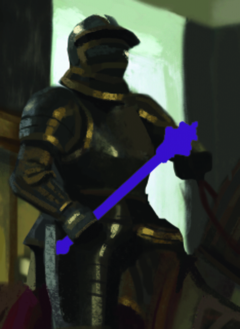
There’s a lot of overlapping going on around the knight so I decide to paint the mace he’s holding separately. To help me see what I’m doing I paint it in a strong contrasting colour at full opacity. Up until this point I’ve hardly zoomed in at all. Staying zoomed out helps me see the bigger picture, but sometimes the brushstrokes just aren’t accurate enough so I zoom in to make sure things end up in the right place.
09. Colour the mask
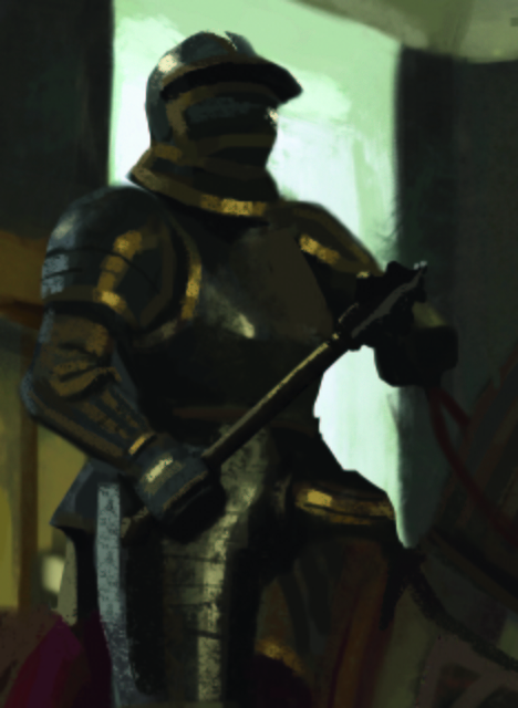
Once again, when I’m happy with the shape of the mace, I lock the layer and colour it in. To make the knight’s hand read a little better, I broaden the reflection on the leg armour behind the hand.
10: Bring life to the background
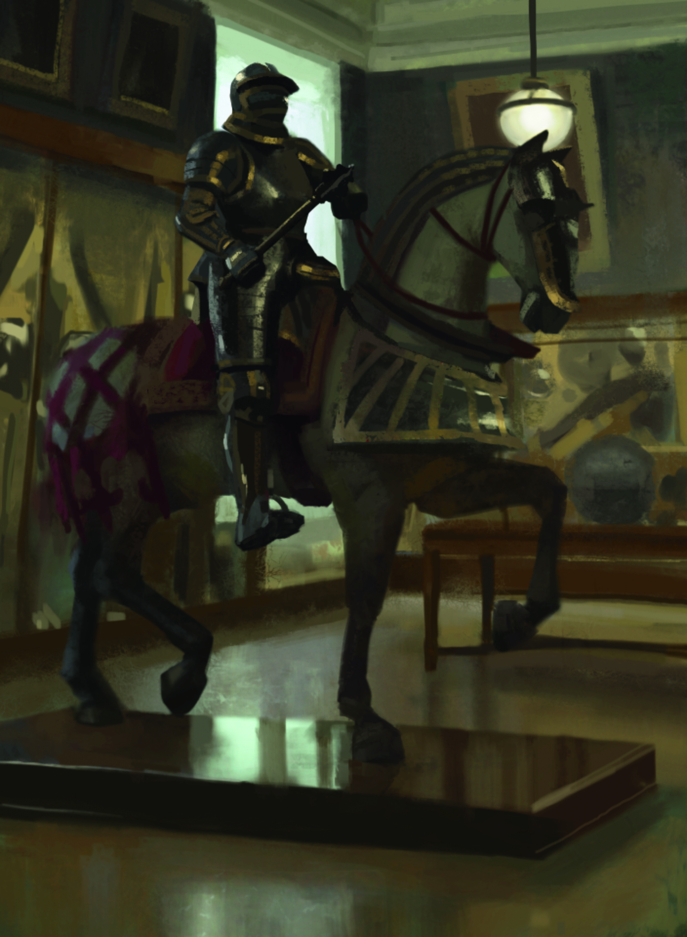
After working up the foreground, the background starts to look plain. I paint the cabinets behind the knight on a separate layer. To make the foreground pop out I make sure no edges in the background are too sharp, but I still try to describe the shapes as accurately as possible.
I pay close attention to the window’s dull reflection across the floor, remembering to bring out the sharp contrast as it reflects in the plinth. accurately as possible. I pay close attention to the window’s dull reflection across the floor, remembering to bring out the sharp contrast as it reflects in the plinth.
11. Add atmosphere
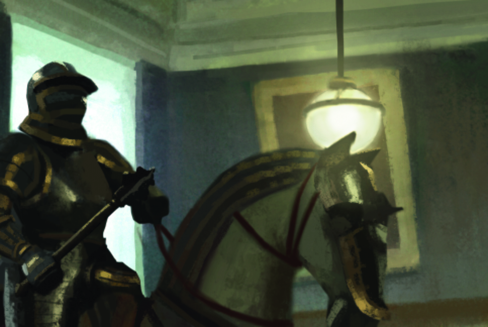
To make the horse and rider stand out a little, I add some lighting effects. Using a large brush I rough in some dark blue paint on a new layer set to Add.
Then I smudge this paint with a Scatter brush until I produce a pleasing, textured gradient. I use the same process to create a glow for the ceiling light, but this time I put it in front of the horse’s head to create a sort of flare.
12. Glass reflections
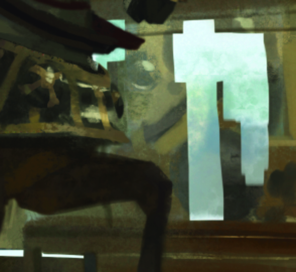
These can be tricky to get right so again I do them on a separate layer. I paint an opaque shape, lock it, and give it some texture and colour variation. It takes a little while to get a shape that looks satisfactory.
13: Balancing reflections
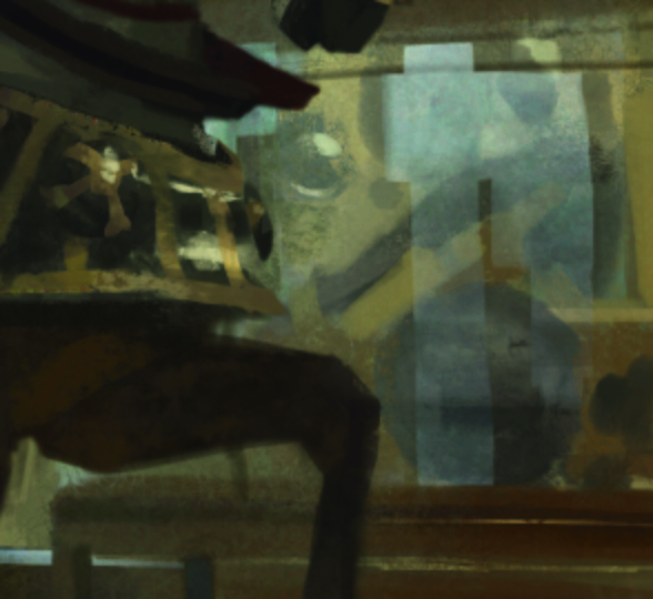
When the reflected shape looks just about right I use the Eraser on a very low opacity to carefully reveal what’s behind it.
14: Final touches
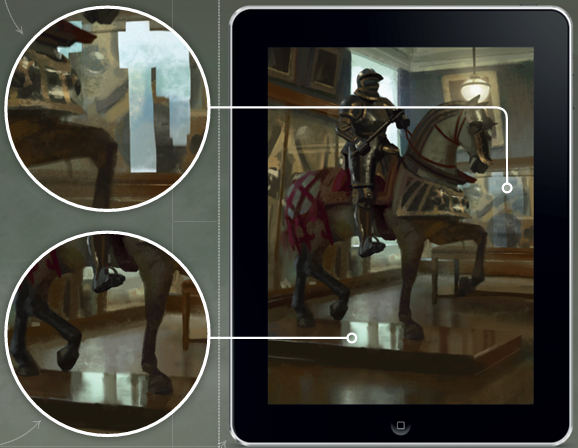
I have a tendency to paint a bit dark with not enough contrast, so after I finish a sketch I sometimes open it in Photoshop to crank things up with a Curves or Levels adjustment layer. One nice feature of Procreate is that you can export PSDs if you do want to implement specific tweaks to certain layers.
You can see more of Karl Simon's work on his website.
For more tips, see our piece on life drawing on an iPad and our roundup of Procreate tutorials. Also see one writer's experience using a drawing tablet for photo editing.
Do you have a tip for digital art practice? Share your advice in the comments below.
Sign up to Creative Bloq's daily newsletter, which brings you the latest news and inspiration from the worlds of art, design and technology.
Karl Simon is an experienced concept artist who works in the film and games industries. His projects include Les Miserables and Total Recall.
You must confirm your public display name before commenting
Please logout and then login again, you will then be prompted to enter your display name.
