10 essential Procreate portrait tips every new artist should learn first
How to take your digital art from flat to lifelike.
Procreate is a great app for digital art generally, but also portrait painting specifically. There’s something uniquely daunting about staring into the eyes of a blank canvas, especially when that canvas is destined to become a face. But portrait painting in Procreate can be as thrilling as it is intimidating. From nailing skin tones to rendering believable lighting and brushstrokes that capture character, it’s a delicate balancing act that even seasoned artists can find overwhelming.
But here’s the good news: Procreate on iPad isn’t just powerful, it’s purpose-built for digital artists who want to get personal with their art – making it one of the best drawing apps on iPad. Procreate features fluid touch controls, responsive Apple Pencil support, and an intuitive interface, making it the ideal studio-on-the-go for creating everything from traditional portraits to stylised character studies. (Read our guide to the best digital art software for desktop alternatives.)
To help make that first stroke a little easier, we turned to character and portrait artist Pauline Voss, via our sister magazine ImagineFX, for a set of tried-and-tested tips. Whether you’re learning how to layer colour for realistic skin or figuring out the best brush settings for expressive hair, these 10 Procreate techniques will kickstart your portrait painting and take your digital art to a new level.
Article continues belowFor more art advice, read our tips for painting environments in Procreate art and our list of step-by-step Procreate tutorials.
1. Work dark to light
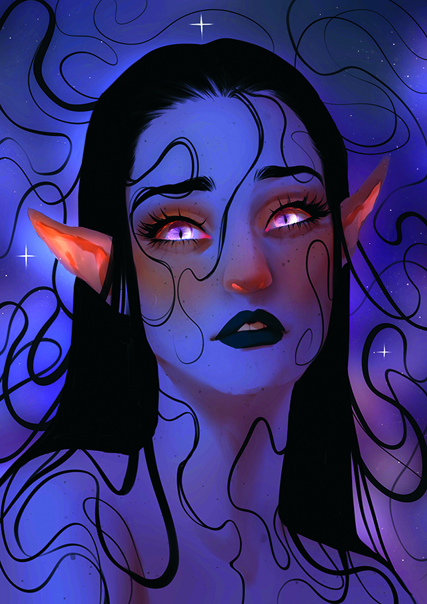
One of my favourite lighting techniques starts with placing a coloured Multiply layer on top of the whole painting. This pulls all the local colours together and gives the image an instant atmospheric base. I’ll use soft violets, dusty pinks, or teals, depending on the desired mood. From there, I’ll slowly start to build up the light using Add or Linear Dodge layers. This helps me to sculpt the light while remaining in control of the value and contrast. It’s like moving through fog: you start in the dark, and let the light guide your way.
2. Painting 3D information
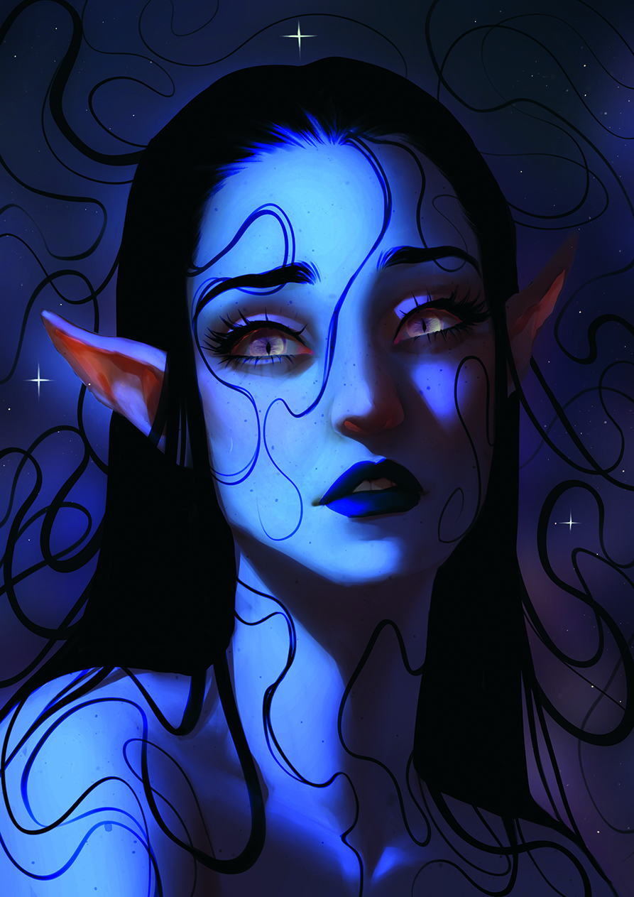
Instead of painting a visible light source, focus on how light interacts with the object itself. I block in the lit areas with a hard round or square brush, paying attention to the object’s 3D structure. Then I smudge or soften the edges to control transitions and shape. I typically imagine a basic 3D form like a cylinder or sphere underneath and place the light accordingly. Realistic lighting depends on understanding surface planes, so searching for suitable references helps.
3. Additional light sources for realism
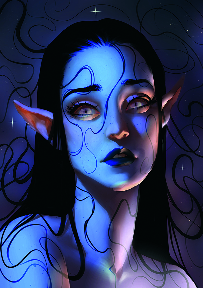
I like to introduce a second or several light sources and bounce lights in
an image. This can come from the ground, nearby objects, or ambient surroundings. I keep it less intense than the main light and often use a contrasting hue to add depth and visual interest. Using multiple light directions makes the object feel more embedded in the scene. Normally, I have one Add Blend Mode layer, duplicate it, and apply a Gaussian Blur to enhance the glow.
4. Rainbow Sparkles for a hint of colour
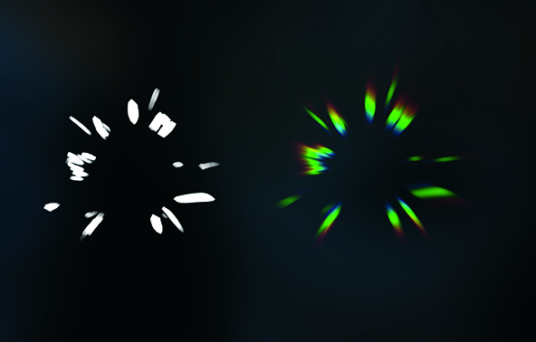
To create holographic sparkle effects, paint sharp white shapes like starbursts or shards on a new layer. Set the layer to Add and use the Chromatic Aberration tool, pushing the slider to the max, which splits the light into subtle RGB fringes. Finally, apply Perspective Blur to stretch the shape so the separate colours blur into each other. The result feels like magical, prismatic light, perfect for adding highlights in eyes, around glowing elements, or in spell effects.
5. Custom Smudge brushes
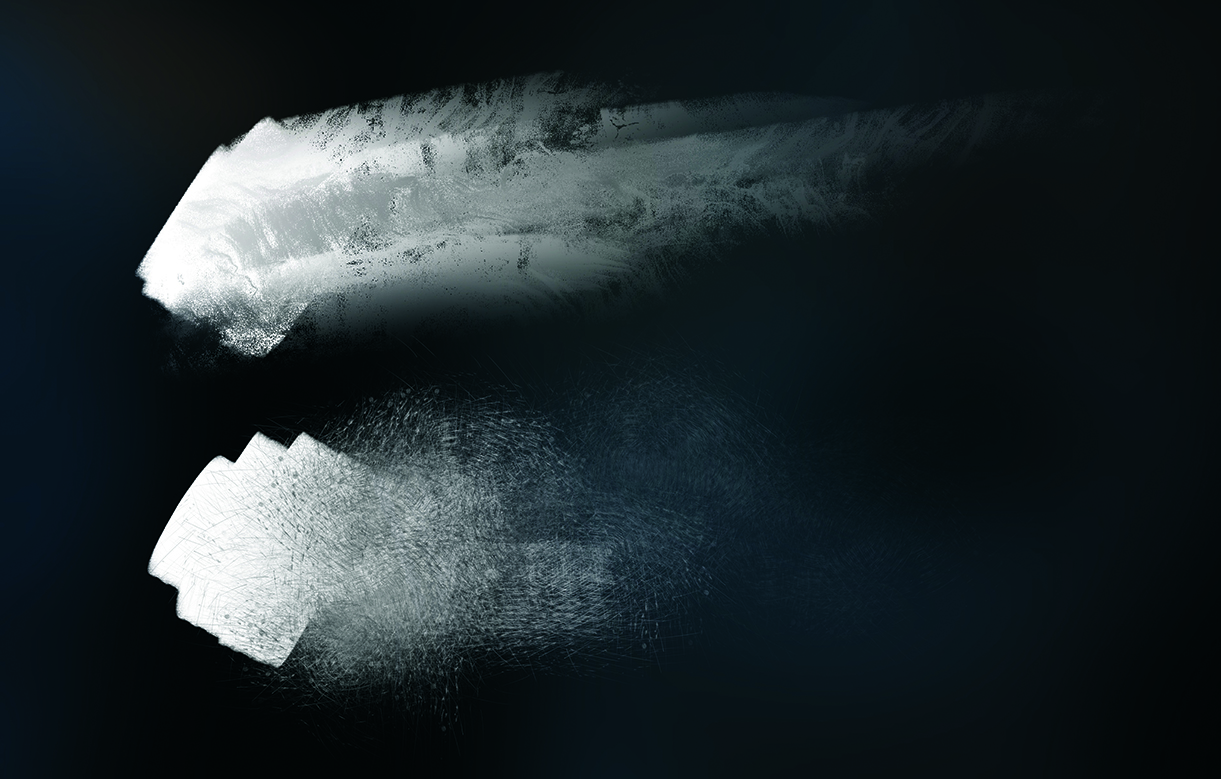
In Procreate, you can turn any brush into a Smudge tool. Just tap the Smudge icon, then select your desired brush. In the Brush settings, increase the Smudge slider under Apple Pencil to 100% for full control. You can also import custom textures in the Grain settings to shape the way your brush smears. This lets you blend areas with rich texture instead of using a soft round brush. I use this technique to soften glow edges or blend values while maintaining a painterly, handcrafted feel.
6. Paint saturated shadows
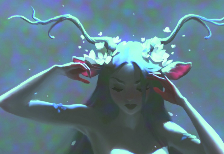
Subsurface scattering happens when light penetrates translucent materials like skin, petals, or wax and diffuses. In Procreate, I exaggerate this effect by painting saturated reds, oranges, or pinks into areas where light would pass through, like ears, fingertips, or flower edges. Soft blending into nearby shadows creates the illusion of a glow from within. This effect works especially well when aiming for an ethereal look. It’s perfect for anything delicate or organic.
7. Use Perspective or Motion Blur to create movement
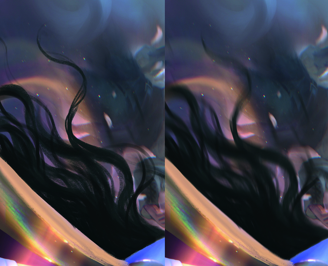
Perspective Blur and Motion Blur are powerful tools to suggest movement or depth instantly. I’ll duplicate a layer, apply one of these blur modes, then softly erase parts to control where the motion hits. This is especially useful for creating flowing elements like hair, fabric, mist, or ambient particles. You don’t need to repaint everything, as a subtle directional blur makes your scene feel more cinematic and dynamic in seconds.
8. Shift the mood with Color Balance
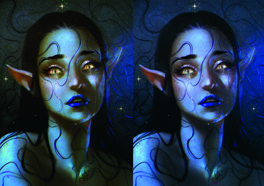
The Color Balance adjustment is one of Procreate’s most powerful tools for atmospheric lighting. Instead of repainting, we can tweak the sliders for shadows, midtones, and highlights separately, shifting each subtly towards a specific hue. For example, pushing highlights into blue and shadows into red instantly develops tension, while midtones towards magenta add warmth and a fantasy feel. This adjustment acts like colour grading in film and can dramatically change the light language of your image with just a few moves.
9. Using Liquify for Organic magic
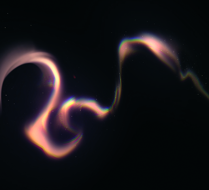
The Liquify tool is ideal for creating dreamy smoke trails, magical wisps or flowing light. Start with a rough shape using soft brushes on Add or Color Dodge layers, then go to Adjustments>Liquify. Using the Push, Expand and Twirl modes, shape the glow into fluid, ribbon-like forms. Soft or textured smudging breaks up the shapes even more.
10. Add iridescence with Saturation
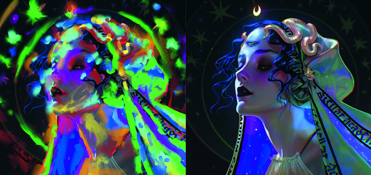
To break up large, homogeneous areas and give your art a pearlescent shimmer, paint wild, colourful strokes on a separate layer, using all colours of the rainbow. Set the layer to Saturation mode and reduce its opacity to around 10-20%. This keeps the underlying value and hue intact, while adding delicate colour variation that mimics iridescence. This technique works especially well on fabric, skin, abstract backgrounds, and glowing materials.
This content originally appeared in ImagineFX magazine, the world's leading digital art and fantasy art magazine. ImagineFX is on sale in the UK, Europe, United States, Canada, Australia and more. Limited numbers of ImagineFX print editions are available for delivery from our online store (the shipping costs are included in all prices).
Sign up to Creative Bloq's daily newsletter, which brings you the latest news and inspiration from the worlds of art, design and technology.
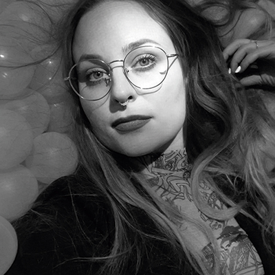
Pauline, also known as Skadivore, is a freelance illustrator and concept artist based in Erfurt, Germany. She specialises in creating strong female characters and magical themes. Her clients have included Disney, Marvel, Wizards Of The Coast, Netflix, HarperCollins, Axis, Apel, Zillakami and more.
You must confirm your public display name before commenting
Please logout and then login again, you will then be prompted to enter your display name.
