How Avatar: Fire and Ash’s brutal new visual design rekindled my love for the series
James Cameron has always been obsessed with worlds. But Avatar: Fire and Ash isn’t just another lush trip to Pandora; it’s a visual gut punch that weaponises design. Gone are the tranquil blues and bioluminescent forests. In their place: scorched skies, fractured masks, and a brutalist architecture that crushes the soul before a single word is spoken.
I remember when Avatar first released, it was a tentpole 3D event, a technological and artistic PT Barnum moment that made audiences cry; it felt so real that people needed to relive the world time and again. The game Avatar: Frontiers of Pandora, too, picked up the same vibrant world and design notes. Now, it looks like Fire and Ash is blowing the whole thing up.
The Ash People (Mangkwan), revealed at this week's San Diego Comic Con, are designed to disturb, and they might be Cameron’s most powerful artistic choice yet. Because this isn’t just worldbuilding, it’s world-breaking, and it's some of the most subversive, emotionally rich production design I’ve seen in a blockbuster in years.
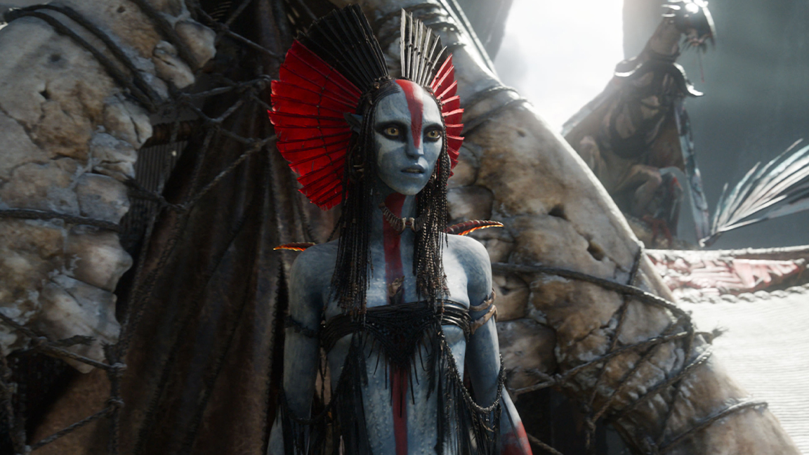
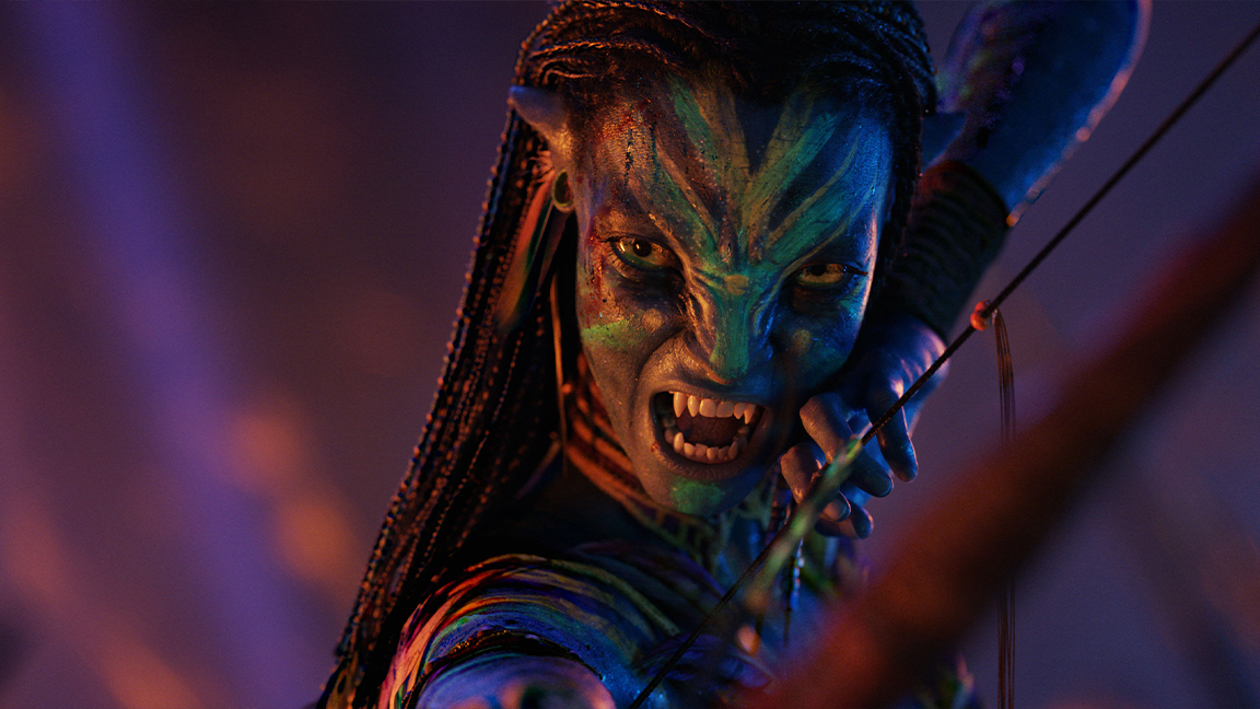
Article continues belowCameron, despite backing the use of AI, has gathered a team of exceptional artists, including concept artists Dylan Cole, Steve Messing, and Zachary Berger, who have created a visual language that intentionally rejects everything Avatar used to stand for. The Ash People, introduced in Fire and Ash, don’t just look different; they feel designed to unsettle. Their angular, soot-covered costumes, cracked ceremonial masks, and stark red-black palettes evoke a society in spiritual collapse. There’s no harmony here, no balance with nature, just fury, grief, and fire.
Brutal new look impresses
It’s a bold move that could work and reestablish Avatar as one of the great sci-fi trilogies, particularly for a film series that originally felt Disney and 'cute' – the Smurfs in space tag kind of stuck, until now.
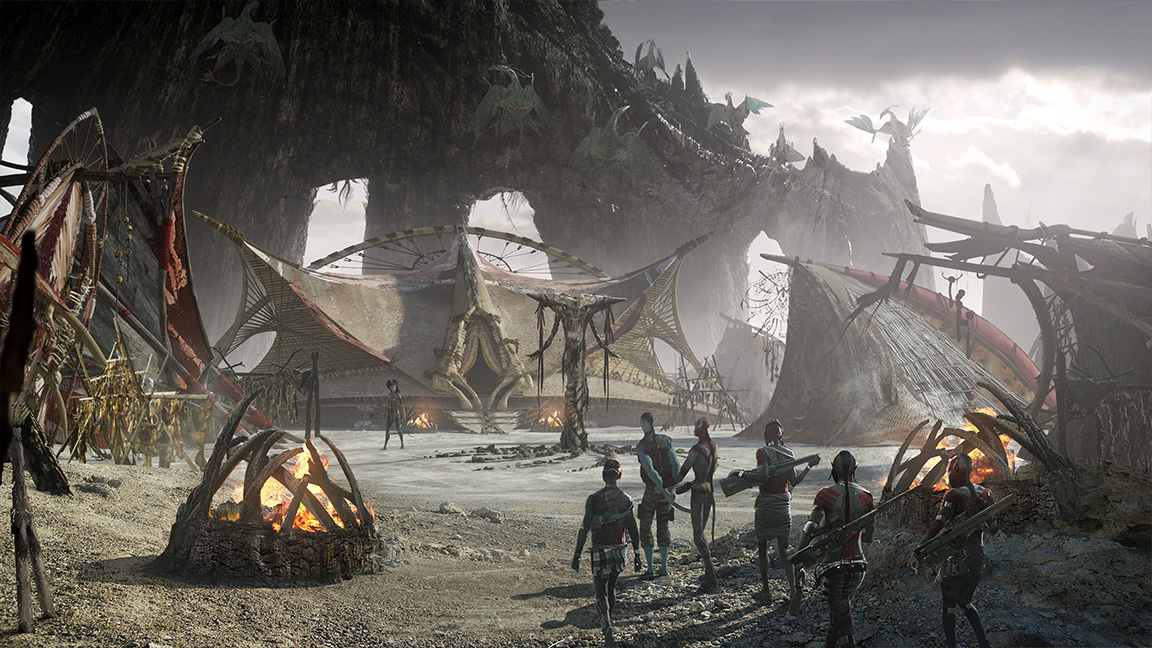
For designers, the real masterstroke is how form and emotion are inseparable. In the trailer, we can see how the Ash People’s costume silhouettes disrupt the flowing lines of the Omaticaya (the primary Na’vi clan featured in the previous Avatar films). Their weapons are jagged, almost industrial. Their homes are carved from the remnants of a World Tree, a Tree of Souls that connects the Na’vi to Eywa, the films' spiritual entity. These aren’t just aesthetic choices; they feel like ideological ones.
Even the colour palette tells a story. In Avatar (2009), Cameron famously leaned into a luminous jungle dreamscape and a bright blue tone. In Fire and Ash, colour looks to be drained. Scenes hang in smoke-drenched oranges and greys, as if grief itself has leaked into the soil.
Sign up to Creative Bloq's daily newsletter, which brings you the latest news and inspiration from the worlds of art, design and technology.
Art supports narrative
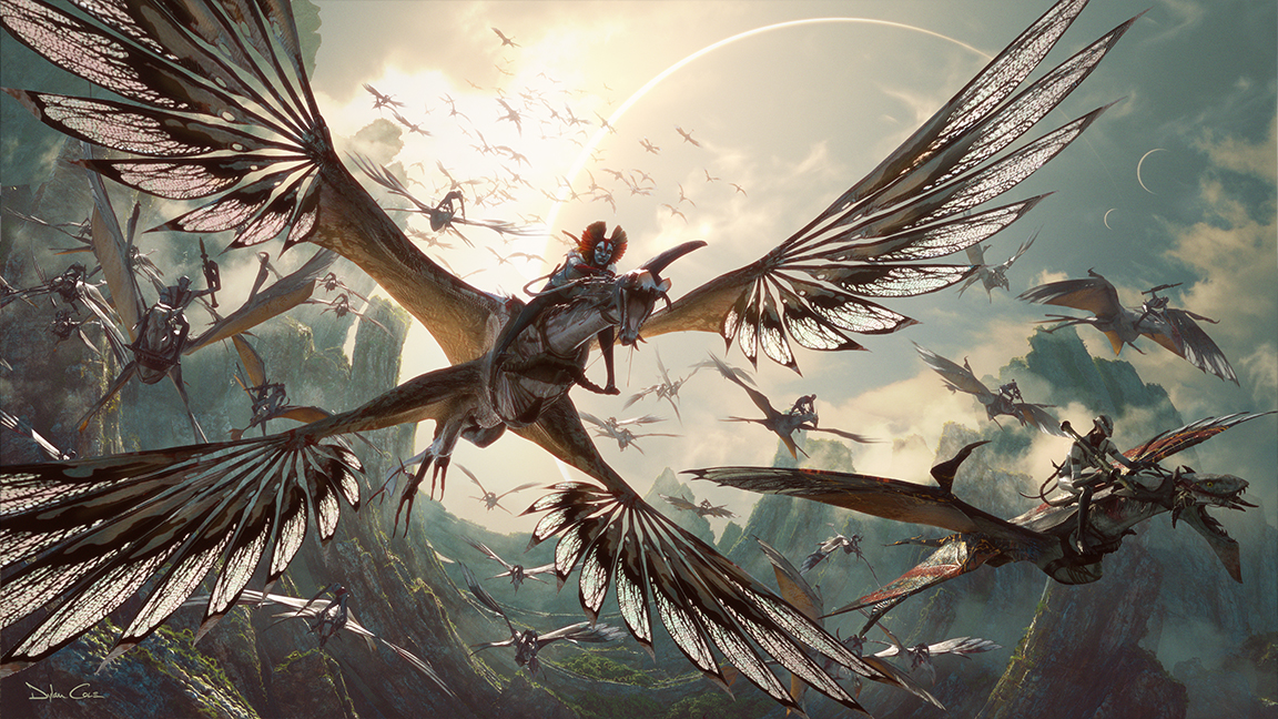
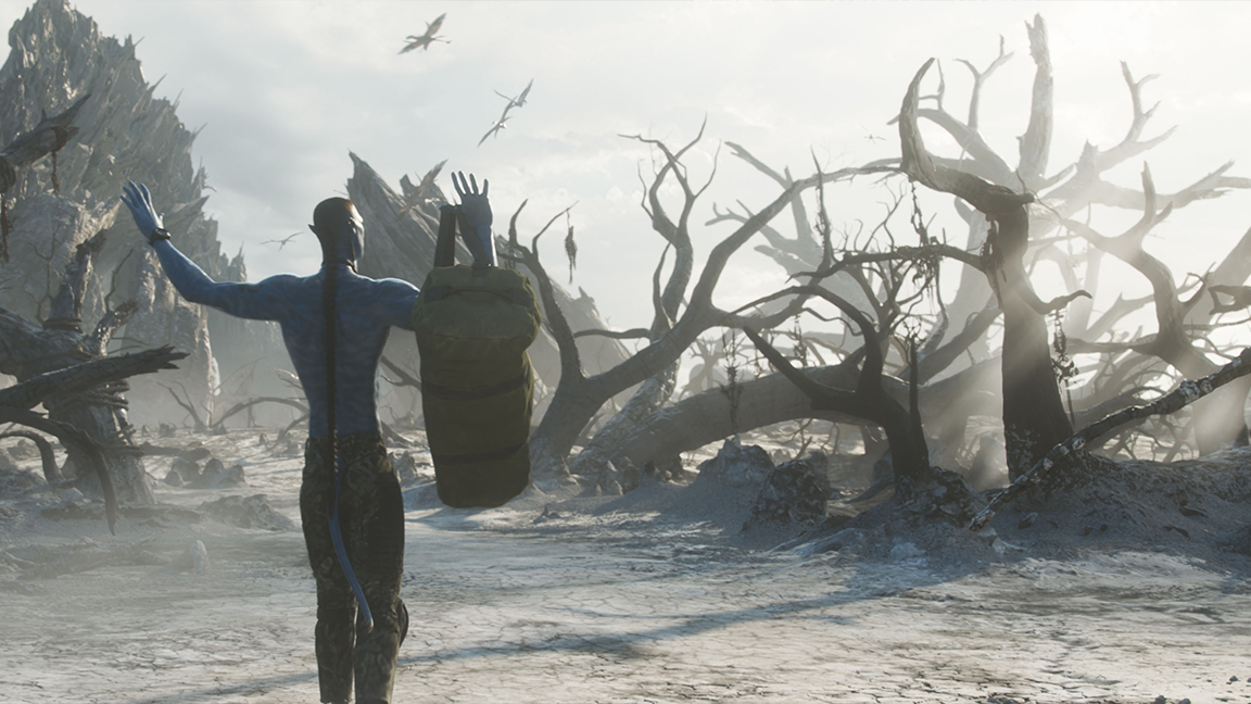
Just from the trailer, I can see how the film's visual shift is helping to support and deepen the narrative, just as all good art should. The film’s emotional tone looks to be embedded in every texture, silhouette, and lighting choice. It’s the kind of storytelling-through-design that concept artists strive for: where every surface and prop carries weight.
In many ways, even just from this first trailer, Fire and Ash feels more influenced by Brutalist architecture, Aztec symbology, and post-industrial design than traditional science fiction and fantasy. And that’s what makes it so exciting. We’re not looking at another glossy utopia; we’re seeing the cracks, the burn marks, the emotional fallout etched into the design of a collapsing world.
I was a little cool on the previous film, Avatar: Way of the Water, as it felt like a stop-gap, more of the same, particularly visually. But Fire and Ash, from this trailer, looks like Cameron is taking risks, literally deconstructing one of cinema's most complex and believable worlds right before our eyes. I predict that when it is released, Avatar: Fire and Ash could be a wake-up call for visual storytellers.
For more, read our reveal of the Wicked concept art, and if you're inspired, learn from our list of Procreate tutorials for advice on crafting digital art that can tell stories.

Ian Dean is Editor, Digital Arts & 3D at Creative Bloq, and the former editor of many leading magazines. These titles included ImagineFX, 3D World and video game titles Play and Official PlayStation Magazine. Ian launched Xbox magazine X360 and edited PlayStation World. For Creative Bloq, Ian combines his experiences to bring the latest news on digital art, VFX and video games and tech, and in his spare time he doodles in Procreate, ArtRage, and Rebelle while finding time to play Xbox and PS5.
You must confirm your public display name before commenting
Please logout and then login again, you will then be prompted to enter your display name.
