Avatar The Way of Water, the sequel to 2009's Avatar is released today. It hasn't exactly received rave reviews. But one thing it tried to put right was to update the franchise's logo, which became one of the most mocked logos in film due to its use of the off-the-shelf typeface Papyrus.
The Avatar logo became something of a running joke after a 2017 Saturday Night Live sketch that starred Ryan Gosling as a graphic designer haunted by the design. Now, the film's producer and director James Cameron has revealed that he saw the sketch and hadn't been aware of what font was used (if you're looking for typeface's for your own designs, see our pick of the best free fonts and best free handwriting fonts).
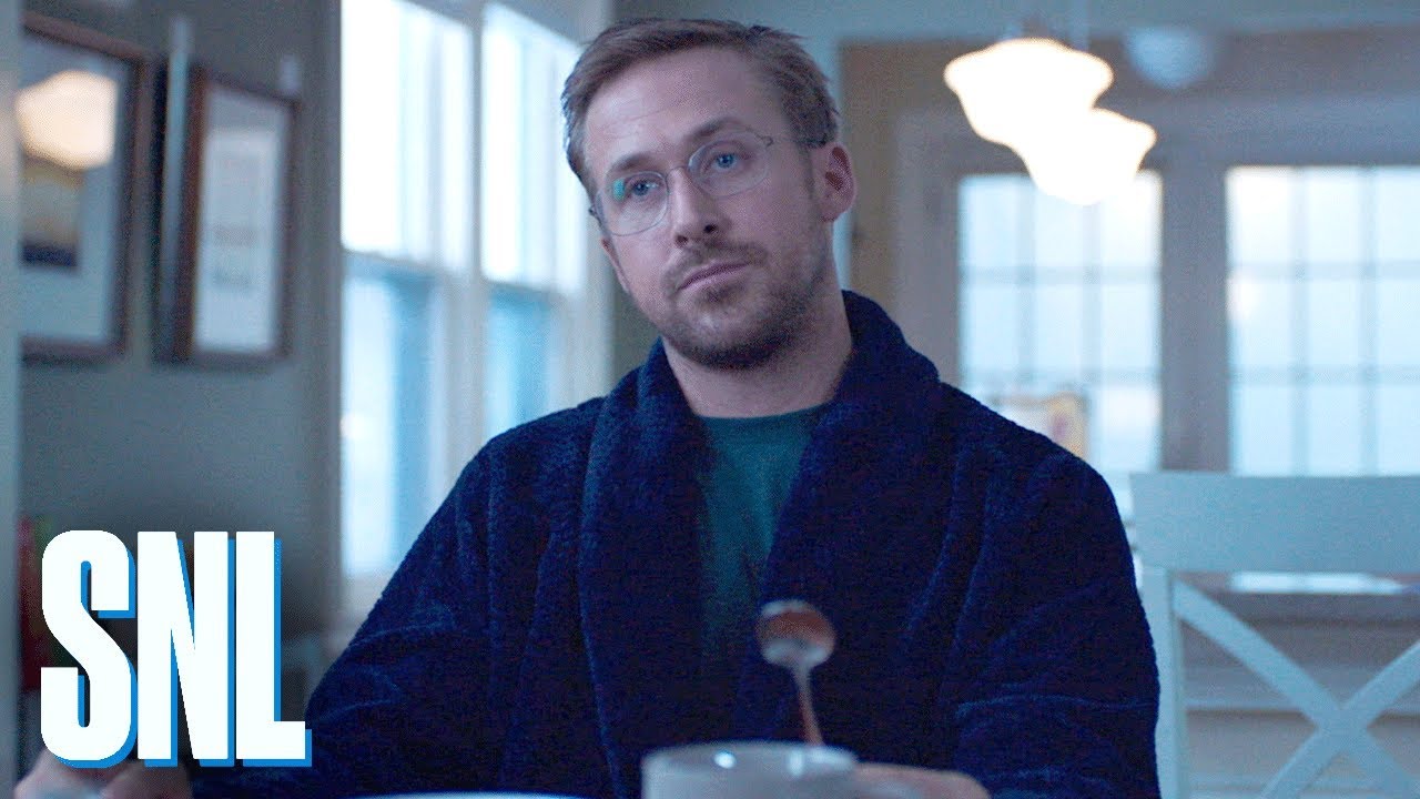
Written by Julio Torres, the SNL sketch depicted Gosling losing sleep and his sanity, as he gets consumed by the fact that someone used such an easily available font for the logo of a blockbuster move. They "clicked the dropdown menu" and "randomly selected Papyrus like a thoughtless child just wandering by a garden, just yanking leaves along the way," he laments.
Avatar director and co-producer James Cameron has finally broken his silence on the matter. He tells January's edition of Empire magazine (as quoted at SlashFilm): "Just think of how much we could have grossed if it wasn't for that damn font."
Asked by Chris Costello, who designed the font back in 1982 if Papyrus was used to reference Indigenous tribes, Cameron says: "I was not aware that our font was an off-the-shelf thing; I assumed the art department or the title company came up with it. Of course, it was trolled mercilessly as a lazy choice, but frankly, I like the font."
"Ryan Gosling needs to get out more, instead of freaking out over our font," he adds in jest. "Time to move out of your mom's basement, Ryan! And if Papyrus resonates with the issues of Indigenous cultures in the public consciousness, then that fits well with Avatar, so I'm not losing any sleep over it."

It might have been fun to see the franchise stick it to everyone and keep its much mocked font, but alas, The Way of Water has gone for a bespoke replacement. Speaking with Entertainment Weekly, co-producer Jon Landau also admitted that he had seen the SNL sketch, and he was keen to point out that the sequel sports an entirely new font named Toruk.
"Yes, I've seen that. Ryan Gosling. Absolutely saw it," Landau said. "It's fun that it stimulated a conversation. When we realized that the movie was going to expand into a franchise and we'd have other IPs, we went out and created our own font that we're now using, and we call it Toruk, and it's available for people to use."
If you're looking to learn more about typography – or looking for a great gift for a designer – see our pick of the best graphic design books. We also have a comprehensive guide to the rules and terms in typography design.
Read more:

