
Looking for logo design inspiration? Then you'll want to learn from the finest examples of the craft. And to help you out, we've compiled this list of the best logos of all time, arranged alphabetically. We've also roped in some of today’s leading design voices to explain why they work so well.
From the Apple logo’s elegant simplicity to FedEx’s ingenious use of negative space, these logos are all memorable, meaningful and built to last. Some date back over a century, others emerged from specific cultural movements, but all deserve to be studied. If you're starting to learn how to design a logo, you could hardly ask for a better place to start. Also see our guide to the five types of logo to get your head around the lingo.
Apple

The Apple logo is perhaps the purest example of how restraint can create maximum impact. Designed by Rob Janoff in 1977, this symbol replaced Apple’s original ornate illustration of Isaac Newton with something infinitely more elegant and enduring. “To me, it's a perfect example of how less really can be more,” says Alex Andlaw, co-founder and creative director at FORM Brands Studio. “It’s stripped back to its purest form: no fuss, no clutter, just a beautifully simple silhouette with that clever little bite to make sure you know it’s an apple, not a plum or a tomato. That tiny detail gives it character without overcomplicating things.”
“The fact it hasn’t really changed since day one says everything about how right Apple got it,” he adds. “It works on a billboard, a laptop lid, or in the palm of your hand; timeless, adaptable, and quietly confident.”
Arizona Coyotes: Kachina

Sports logos often fall into generic territory, but the Kachina stands as a brilliant exception. Originally designed in 1996 for the Arizona Coyotes hockey team (which has since relocated and become the Utah Hockey Club), this logo represents regional identity at its most authentic and vibrant.
“For me, it doesn’t get better in sports identities,” says Brian Gartside, global design lead at Iris Worldwide. “The design team consulted with local native artists on the way the logo was drawn, the colours used, etc. A lot of sports logos feel generic and sterile. This is anything but.”
By drawing on authentic local heritage, the designers crafted something that feels genuinely rooted in place. “It's hyper specific and regional, and carries an authenticity and energy you seldom see in this world,” Brian notes. "The colours are vibrant and fun and feel unmistakably southwestern.”
Audi

The Audi logo's four interlocking rings once represented the unity of four founding companies, but over time have become synonymous with engineering excellence. Dominic Goldman, founder and chief creative officer of You're The Goods, calls it "a timeless symbol of precision, luxury, and engineering excellence. The simplicity of the logo, with its clean circular rings, speaks to Audi's dedication to elegance and precision."
Bass Ale

Bass' red triangle holds the distinction of being the UK’s first registered trademark, dating back to 1876. Yet it still holds up today as one of the world's best logos. “It’s brutally simple: a red triangle you could spot on a barrel across a crowded pub," explains Graham Sykes, global executive creative director at Landor. "At a time when many people couldn’t read, it was a fast visual guarantee of authenticity.”
Its effectiveness was so profound, it even transcended commercial use, appearing in Édouard Manet’s painting A Bar at the Folies-Bergère. And its endurance speaks to the power of geometric simplicity in an age before mass literacy. “Nearly 150 years later, it’s still doing the same job: clear, confident, instantly recognisable,” Graham notes.
CBS

Every designer's drawn an eye at some point, but William Golden’s 1951 creation for CBS represents the definitive version—one that has arguably never been surpassed. “Bill Golden ruined it for us all by creating the purest version of an eye that will arguably ever exist,” says Scott Madill, senior designer at Design by Structure. “I love that CBS knows they have one of the best logos ever created, and still uses it to this day.”
The symbol perfectly captures TV's core function, while maintaining an almost hypnotic quality that draws viewers in. Its bold, graphic treatment ensures it works across all media, from tiny programme guides to massive billboards. “I wonder if anyone will ever produce a better eye than Bill?” Scott muses. After seven decades of the logo’s continued effectiveness, the answer seems increasingly likely to be no.
Coca-Cola
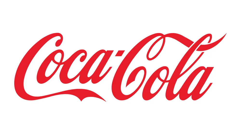
Created by bookkeeper Frank Mason Robinson in 1886, Coca-Cola's logo remains one of the most recognisable pieces of typography in the world. “Its flowing, cursive script perfectly captures the brand’s heritage: a lively gracefulness offset by warmth and consistency, conjuring memories of family gatherings, summer picnics, and that iconic truck rolling into town each Christmas,” says Connie Whittle, art director at Anything is Possible.
This logo demonstrates that sophistication doesn’t require simplification; sometimes the most elaborate solution is also the most enduring. “In a world dominated by minimalist, sans-serif logos, Coca-Cola’s script stands out – proof that more can be more, when done with refinement," says Abi Grummitt, designer at SIDE ST. "While the brand’s identity extends far beyond its logo, those flowing cursive letters are perfectly balanced, instantly evoking its heritage. Even just a glimpse, such as a curve on an angled can, or a sliver on a passing truck, is enough to know exactly what you’re seeing."
Cooper Union

“I've been a fan of Herb Lubalin ever since I first encountered his work, and he has been a major influence on my love for geometric typography and lettering,” enthuses Max Zimmerer, designer at Wolff Olins. “The original logo for the Cooper Union is one of my favourite pieces of his.”
Its genius lies in its layered construction. Two solid shapes form the foundation, while the school’s name is positioned to create negative space that clearly reveals the letters “C” and “U.” It’s a masterclass in making typography work harder. “The mark feels unapologetically bold, relying on the interplay between two layers," says Max. "The longer you look at it, the more wit and cleverness it reveals, making it a timeless example of Herb’s mastery.”
Crate & Barrel

"Crate & Barrel’s simple wordmark is one of the longest living, un-changed retail logos in the US," observes Val George Vollmer, VP global product and creative at tms. "Its meaning goes back to the original founders and their desire to bring imported goods to the US. How those goods were transported, via barrels and crates, led to the naming of the store. The logo, which so elegantly has withstood the test of time in Helvetica Bold, is one of my favorite usages of modern type."
Davidelfin

Personal expression in logo design has rarely reached the level achieved by Spanish fashion designer David Delfín for his eponymous brand. The name also references the dolphin (“delfín” in Spanish), an animal that evolved from land to sea; a metaphor for his own creative evolution.
Written with his left hand, the logo's deliberately imperfect execution creates a sense of transformation and vulnerability. “It feels raw, personal, and completely tied to who David was,” says Fernando Casado Gordillo, designer at We Are Collider. “The logo has a slightly awkward, imperfect look, almost like it’s been quickly drawn with a marker. But that’s exactly what makes it beautiful."
Dunkin’

The evolution of Dunkin’ represents one of the smartest brand pivots in recent memory, transforming it from a doughnut shop to a coffee destination while maintaining its distinctive character.
“It’s a great case study in using brand presence to pivot for growth," says Connie. “They understood the world runs on coffee, so they eventually dropped ‘Donuts’ from the name entirely. Yet they kept the playful, welcoming energy.” The logo’s careful apostrophe and modified Frankfurter typeface showcase how successful rebranding doesn’t require wholesale reinvention.
FedEx

No logo better showcases the power of negative space than Landor Associates’ 1994 design for FedEx. The hidden arrow between the E and X has become legendary; as Emma Grant, co-director at Figment, notes: “It’s something that people actually point out to each other in conversation, which is exactly what every brand wants.”
As Graham explains, the logo was created at the time of a major name change. “The company was called Federal Express, but everyone was already saying ‘FedEx’," he explains. "Instead of correcting them, they embraced it; a rare case of a brand listening to the street.”
The arrow itself is almost subliminal: present but not obvious, rewarding those who notice it with a moment of delight. “I still remember sitting in my Year 11 visual communications class when my teacher pointed out the hidden arrow,” recalls Georgia Wilkinson, designer and partner at Quiet Storm. “That little detail sparked my love affair with graphic design—the way small, clever elements can hide in plain sight.”
Hillary Clinton

Hillary Clinton's 2016 presidential campaign may not have been successful, but its logo is still fondly remembered by designers. "At first glance, it’s just a bold “H” with a right-pointing arrow," says Anshul Nagpal, head of design at Toaster INSEA. "But the genius? It’s in how Michael Bierut and the Pentagram team built it to be playable and fluid. You could throw in bright, youthful colours for campus rallies, drape it in rainbow tones for Pride, add textures for small business events, or drop in local symbols for community stops. No matter what you did, it still felt like the same mark and that’s the magic.
"From a designer’s point of view, that’s gold," he continues. "The geometry is so clean it can scream off a giant rally banner or sit quietly on a button, and it’s just as happy living on a printed flyer as it is in a slick motion graphic. The best part is how it invites participation: staff, volunteers, partner groups, even random supporters could remix it, and it would still hold its identity."
I Love New York

Milton Glaser’s 1977 design for New York’s tourism campaign achieved something remarkable: it transcended its commercial purpose to become a cultural phenomenon. Milton famously sketched the initial concept in the back of a taxi and never made money from it; it was his gift to a city he loved. That generosity of spirit is perhaps what gives the logo its enduring warmth.
“Few logos have achieved such iconic status,” raves Iain Lawrence, head of creative at Transmission. “It feels like the late 70s era it comes from, but also timeless. The American Typewriter font brings an obvious link to the destination, but it also feels like a typed letter to loved ones.”
The logo has grown to function as both commercial identifier and personal statement. People don’t just recognise it: they wear it, share it, and make it their own. As Iain says: “It distils identity, emotion, and pride into just four characters. It's bold, warm, and instantly readable. More than a logo, it’s become a cultural shorthand for affection, place and belonging.”
Jordan Jumpman

The Jordan Jumpman logo represents athletic excellence frozen in time, capturing Michael Jordan's legendary prowess in a single, iconic silhouette. "It's one of those rare designs that lives on a bucketload of designers' 'Wish I'd made that' lists," says Sean Mulholland, creative director at Guy & Co. "It's clean, bold, instantly recognisable and captures everything about Jordan's game: power, defiance and that unstoppable energy."
In short, it's more than just a cool graphic. "The Jumpman stands for excellence, ambition and rising above everything; on the court and in life," Sean maintains. "People around the world queue for hours, sometimes days, for limited edition Jordans. Others trade them for eye-watering sums. That's why the Jumpman's endured for decades. It's more than a logo: it's a symbol of greatness."
Kellogg’s

The flowing script of the Kellogg’s logo has lasted since 1907, and for many good reasons. For one, it perfectly captures the brand’s breakfast heritage, while providing flexible elements for contemporary applications.
“Originally derived from founder W.K. Kellogg’s signature, bold and fluid script letterforms nods to the milky aspect of eating cereal,” explains Evie Mizen, senior designer at Dalziel & Pow. “The apostrophe from the wordmark has become a playful brand asset associated with droplets of milk, which is often incorporated into brand compositions and messaging.” More broadly, the logo's handwritten style evokes an instant sense of warmth and approachability; essential qualities for a brand that wants to feel like part of the family routine.
Lacoste

René Lacoste’s crocodile emblem is one of fashion’s best-known examples of personal branding becoming corporate identity. "The story goes back to the 1920s, when French tennis champion René was nicknamed ‘The Crocodile’ for his tenacity," explains Graham. "A friend sketched it, René had it embroidered on his blazer, and it became the emblem when he launched his sportswear brand.”
The logo's enduring success lies partly in its restraint. “No big type, no slogan, just the croc, worn proudly for decades,” Graham observes. “In fashion, where most logos shout their name, Lacoste stands out by saying nothing at all. It’s not just a mark; it’s brand folklore you can wear.”
LG

By turning letters into a smiling face, the LG logo demonstrates how clever typography can create unexpected warmth in technology branding. "It's a subtle masterstroke," enthuses Sean. "At first glance, it's just two letters inside a circle. But look again and there's a face smiling back at you. Simple, clever and warm. It's everything a tech brand often isn't... which is exactly why it works so well.
"The 'L' forms the nose, the 'G' becomes the face, and the circle ties it all together like a wink to the consumer," he continues. "Overall it's friendly, approachable, but still clean and modern. That's not easy to pull off in a sector that's usually all sharp edges and cold minimalism."
And the message? 'Life's Good.' "That's the brand promise hidden in plain sight," observes Sean. "Positive, personal, and easy to remember. That emotional layer is what makes the LG logo more than smart; it makes it meaningful."
London Underground

Edward Johnston’s 1919 design for London Transport represents one of the most enduring examples of public design. The roundel’s combination of simplicity and distinctiveness has made it synonymous with London itself.
In the words of Isaac Grinsdale, head of marketing at TOAD Diaries: “The bold red circle with the blue bar is instantly recognisable, even without any wording. What makes it so effective is how well it functions across environments. Whether it’s printed tiny on a map or towering above a busy street, it remains legible, consistent and unmistakably tied to place.” Despite numerous opportunities for modernisation, London has wisely preserved Edward’s vision, understanding that some designs achieve perfection on first attempt.
McDonald's

The McDonald's logo might just be the most globally recognised symbol in commercial history. "For me, it's more than just a piece of design, it is part of the background of everyday life," says Catalina Velásquez González, design director at Amplify UK. "I can still picture it, spotting it in the distance and instantly knowing exactly what it meant. That little spark of excitement still sits somewhere in my memory every time I see it."
Gary Jacobs, creative director at Live & Breathe, is a fan of the golden arches too. "They're a cultural landmark," he says. "Instantly recognisable, emotionally loaded, and cleverly designed to stir appetite and grab attention, thanks to that bold red and yellow pairing. You can see just a corner of an arch on a billboard and still know exactly who it is, where to go, and what to expect. That level of confidence in a logo’s shorthand power is rare, and it’s executed with real finesse."
That power was recently reflected in McDonald's 2018 wayfinding campaign, which featured partial arches directing customers to nearby restaurants. "This clearly showed how a simple, smart idea, anchored in a strong identity, can communicate volumes without a single word,” Abi notes.
MIT Media Lab

Pentagram’s identity system for MIT Media Lab revolutionised logo design by embracing variability rather than consistency. The system generates multiple unique marks from a single underlying structure. As Isaac explains. “It’s a flexible system rather than a single static mark; built around 7x7 grids that generate dozens of unique yet cohesive logos for each department.”
This approach challenges fundamental assumptions about brand consistency, suggesting that controlled variation can be more effective than rigid uniformity. Each department receives its own unique mark while maintaining clear family resemblance. “It’s clever without being self-indulgent, and it manages to reflect the Lab’s emphasis on modularity, innovation and collaboration in a genuinely original way,” notes Isaac. “While most logos aim for consistency, this one embraces controlled variation, and still holds together as a brand.”
Mozzo

The identity for coffee company Mozzo demonstrates how typography can work harder to communicate multiple brand messages simultaneously. As Evie observes: “The bold use of colour and typography help the logo stand out against competitors and feel both bold and dynamic.”
The design cleverly incorporates multiple meanings within its letterforms. “The punchy yet narrow letterforms help the ‘O’s to mimic the shape of a coffee bean, whilst representing the strength and vibrancy of flavour within the coffee,” Evie explains. “Meanwhile the extended ‘Z’ creates an arm that connects the two halves of the wordmark, representing connection.”
MTV

The MTV logo pioneered a new approach to brand identity—one that embraced change as a core characteristic rather than fighting against it. Indeed, it mutability became its defining feature. “I’ve always liked the MTV logo because of how it mixes structure with personality,” observes Fernando. “The bold, blocky ‘M’ feels super solid and clean, but then you’ve got the ‘TV’ part scribbled over it, which gives it this personal, hand-drawn vibe.
“What I love most, though," he adds, "is how the logo was never just one thing, it constantly changed colours, patterns, and styles depending on the moment. It was a blank canvas that captured the spirit of the time.”
Nike

The Nike swoosh is perhaps the ultimate expression of “less is more” in logo design. Carolyn Davidson’s 1971 creation, for which she was paid $35, became one of the most valuable brand assets in history.
"The most iconic logos achieve distinction through simplicity," notes Chris Chapman, creative director, design at adam&eveDDB London. "Nike conveys athletic performance with a mark so simple it can be described with a sound. The SWOOSH form is simple enough to work in almost any context."
“Minimalism can work really well in branding and Nike really sets the tone here,” says Claire Ransom, founder of Aloha Life Digital. “What makes it work so well is that it’s not trying too hard. It’s confident enough to stand alone, and that’s incredibly hard to pull off. Over time, the brand has built so much equity around that mark that it now functions as a symbol more than a logo.”
Scott is also a huge fan, pointing out that: “I’ve seen so many different versions of it—squished, bottom-heavy, made of terry towelling, reversed, even partially incomplete—and I still know exactly what it is.”
Olympic Rings
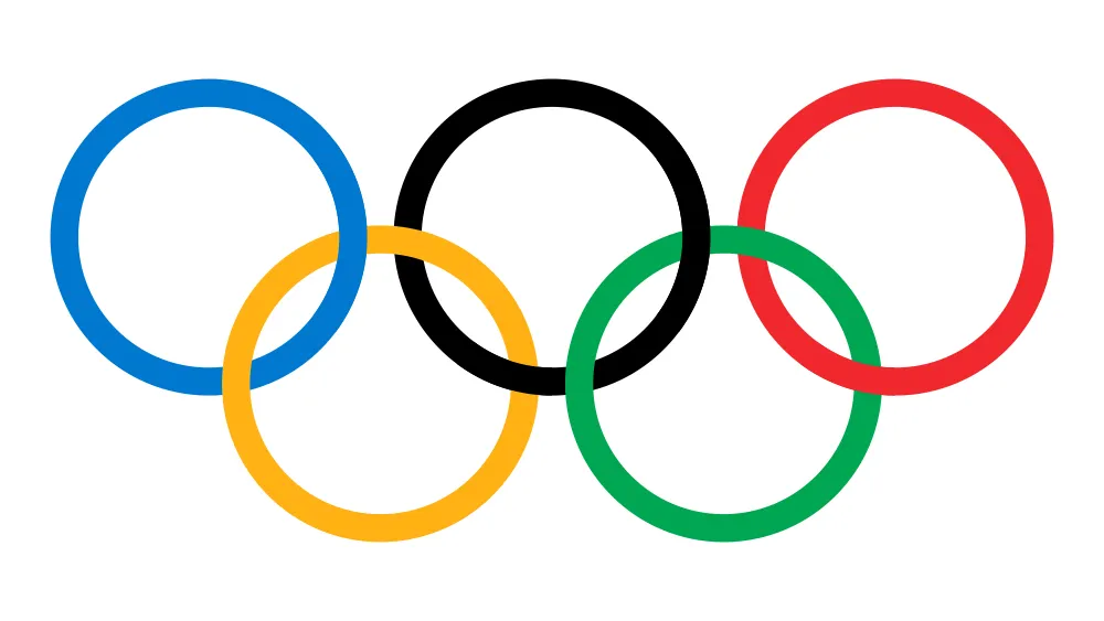
Pierre de Coubertin's 1913 Olympic rings design offer another masterclass in logo longevity, having remaining virtually unchanged for over a century. And Chris Perowne, head of design at Initials CX, believes that's worthy of attention.
"We live in an era where fleeting trends and dwindling attention spans have created an environment that dares us to sell radical change as a promise of commercial success," he points out. "Today's brands seem increasingly willing to shed their skin to 'evolve or die' in a crowded global market."
The Olympic rings, though, stand as counterpoint to all of that. "This simple and elegant logo has remained relatively untouched for over 100 years," notes Chris. "The five interlocking rings—blue, yellow, black, green, and red—represent the union of the five inhabited continents and the meeting of athletes from around the world in fair competition. It's a piece of truly classic identity design that stands as a symbol of stability and durability in our turbulent world."
Open University

The Open University logo demonstrates how simple geometric forms can communicate complex ideas about accessibility and learning. The circular cutout serves multiple symbolic functions while maintaining visual clarity.
"It’s not flashy, but it nails the brief," says Emma Grant, co-director at Figment. "The circular cut-out suggests openness and accessibility, while also hinting at an ‘O’ for ‘Open’ and a shield shape for learning.
“It’s adaptable across platforms, confident in a single colour, and still feels fresh decades after it was introduced,” she adds. “What I respect most is that it hasn’t been redesigned just for the sake of it; because it didn’t need to be.”
Penguin
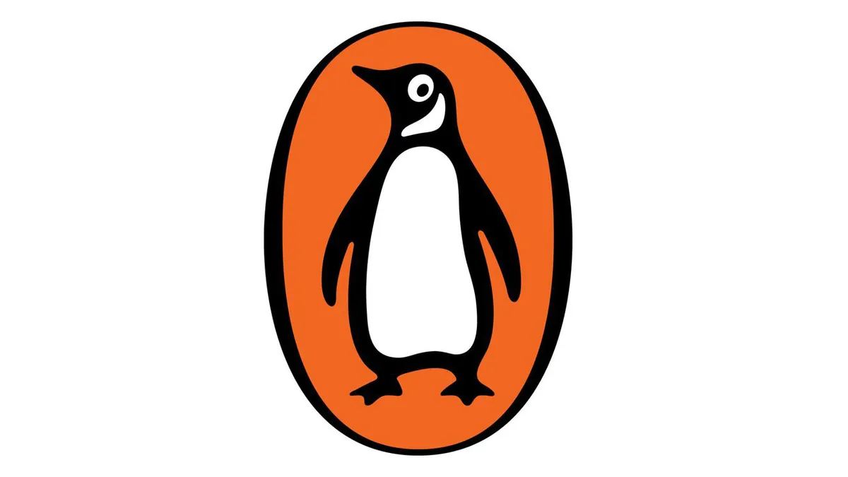
The Penguin logo is character-based branding at its most successful. Allen Lane’s 1935 creation proved that distinctive illustration could work as effectively as an abstract mark.
“Great logos are stories you read in a heartbeat,” says Fraser Donaldson, design director at Re, part of M+C Saatchi Consulting. “A penguin is a bird, yes, but the most famous one lives on book covers. Characterful yet quietly confident, it hops across stories without losing its waddle, assuring you it’s worth reading. Its world-famous silhouette, simple enough to sketch from memory, proves that clarity—not just simplicity—makes a mark stick.”
Andrew Mellor, design director at Chilli (part of IMA), coudn't agree more. "Famously created after a visit to London Zoo, it reminds us as designers that inspiration can betaken from anywhere," he notes. "I love the simple black and white nature of the character; the inquisitive eye that harks back to the intrigue that will come from reading the books; the solid bold colour that looks like it could have been designed to fit with the current minimalist trends."
Playboy

The Playboy bunny logo, created in 1953 by Art Paul, demonstrates how visual cleverness can create lasting recognition. "It was born from a clever bit of visual wordplay," explains Ryan Spence, senior creative at Born Ugly. "The rabbit has long symbolised playfulness and fertility, and paired with a tuxedo bow tie, hinted at a certain urbane and luxurious mischief. Simple, witty and instantly recognisable, it could be sketched from memory, and it was, by giggling schoolkids everywhere."
From the viewpoint of 2025, however, it's a complicated legacy. "Behind that elegance was a business built on objectifying women, presented through a narrow, idealised lens for a largely male gaze," notes Ryan. "Today, in a post-Hefner era, and as conversations around gender and power have evolved, it's an interesting exercise to detach the mark from the brand."
Qantas

The Qantas kangaroo is a great example of a logo that's both distinctly national and internationally sophisticated. “A true icon of the Australian skies, this logo subtly moves through its angles, the gradient that mirrors sunlight gliding over a plane’s tail, and of course, the proud kangaroo leaping across, guiding you home.”
The animal in question serves multiple functions. It identifies the airline’s national origin, suggests movement and progress, and creates emotional connection with Australian travellers. The sophisticated geometric treatment elevates it beyond mere pictorial representation. “Add a beautifully crafted custom typeface, and you’ve got a masterclass in communication design,” Georgia adds. “It’s elegance with altitude.”
The Red Cross

The Red Cross emblem is one of the most recognised symbols in the world. Its design couldn't be more economical, allowing it to deliver its meaning – of neutrality and protection – in the most effective of ways.
It was introduced in 1876, along with the red crescent (first used by soldiers from the Ottoman Empire, because the cross reminded them of the crusaders of the Middle Ages). Ever since, these symbols have been recognised the world over. Since 2005, a third emblem has been added, the Red Crystal. All three emblems have the same meaning and status.
"The Red Cross logo is so effective because it perfectly depicts the brand name," says David Airey, the author of one of the seminal books on logos, Logo Design Love: A Guide to Creating Iconic Brand Identities. "There are very few symbols that can do that in such a simple, distinctive way."
Santa Cruz

The Santa Cruz skateboard logo perhaps captures rebellious youth culture better than any other. “This logo is loud, bold, unapologetic,” says Alex. “Designed in 1985, it nailed the rebellious, gritty energy of skate culture. No redesigns, no ‘modern refinements,’ it was bang-on from the start.
“In fact, you can see modern branding creeping back towards this kind of expressive, attitude-driven style,” Alex adds. “It’s not just a logo, it’s a cultural flag, instantly recognisable and dripping with heritage. In the skate world, it’s every bit as powerful as Apple is in tech.”
The Santa Cruz Screaming Hand logo, designed by Jim Phillips, adds another dimension: “This is one from my childhood and is still going strong,” recalls Iain. “The Santa Cruz Screaming Hand is pure rebellious energy in graphic form. Bold, bright, and instantly recognisable, its attitude perfectly captures skate culture’s raw, unfiltered spirit.”
Shell

Since first appearing in 1901, the Shell logo has moved from a realistic rendering of a pecten, or scallop shell, to today's bold, simplified shape. The red and yellow colours were added in 1915, first appearing at California service stations. Not only did these striking hues help the logo stand out, but they're also the colours of Spain, where many early Californian settlers were born.
It was French-born designer Raymond Loewy who, in 1971, drew the design we know today, which has only received minor tweaks since. He simplified the logo to make it more recognisable and bold at a distance; essential when your logo is primarily placed on the side of a road, with traffic going past at speed.
Sony VAIO

The Sony VAIO logo represents conceptual cleverness at its best—a wordmark that literally illustrates the brand’s technological proposition through letterform design. The acronym VAIO stood for Video Audio Integrated Operation, and Teiyu’s design made this transition from analogue to digital visually explicit through the letterforms themselves.
“The logo came about in 1996 and was designed by Teiyu Goto,” explains Brian “What’s so nice is that the wordmark itself tells the story of the transition from analog to digital that was taking place at that time. The VA is stylised to represent a sine wave, contrasted with the IO, which represents binary code.”
Syncopy

Christopher Nolan’s company logo embodies the feted directors approach to cinema—sophisticated, mysterious, and rewards close attention to detail. “Being a film nerd, I’m always looking for the story in every little detail,” says Iain. “This logo's maze-like design is minimalist and understated, but with the detail that Syncopy productions thrive on. This quiet elegance perfectly mirrors the company’s focus on complex, mind-bending films like Inception and Tenet.”
Tate

No, there isn't something wrong with your screen. The Tate wordmark famously uses distortion as a metaphor. As Claire puts it: “It plays with blur and density in a way that visually captures the idea of shifting perspectives, which ties in beautifully with how people experience art. It’s one of the few museum logos that doesn’t rely on serif fonts or formal motifs but it still manages to feel authoritative.
“The subtle movement in the lettering gives it a living quality,” she adds. “And that flexibility has allowed it to work effortlessly across campaigns, signage and digital platforms without ever becoming stale.”
Toblerone

The Toblerone logo is another logo that makes clever use of negative space. "Born in Switzerland, the home of chocolate, it proudly features a mountain in its logo, a clear nod to the Matterhorn and its Alpine roots," explains Rich Denney, chief creative officer at St Luke's. But look closer and you'll find that hidden within the mountain is a white bear."
This clever reference pays homage to Bern, Switzerland's capital aka the city of bears. "It's a detail many might not know or see," notes Rich. "But once seen, it's never forgotten, and a delicious detail worth sharing."

