
The best audio logos are typically so integrated into a brand that you might not even notice them – it's not until you recognise them out of context that you realise what a powerful branding tool they can be. When we think of logos, often we imagine a static image, but when paired with sonic design, these identities can take on a whole new dimension.
Audio logos make for a rich sensory experience that can strengthen an identity in ways that static design can't, and while more brands are embracing sonic logo design, they're not just a fancy flourish. Not only are they perfect for reinforcing brand recognition, but they also transcend the confines of visual design, giving brands an identity in audio-only spaces such as radio or apps like Spotify.
While they might seem different to their visual counterparts, audio logos need to follow the same basic principles to be successful, balancing precision with emotionally resonant design. While there are no strict rules on how to develop a sonic identity, the best audio logo examples are a great place to start if you're looking for inspiration.
Feb 2026 - We have checked all the information is still correct at the time of writing and added in two new audio logos.
The best audio logos
05. McDonald's sonic logo

Love it or loathe it, McDonald's certainly knows branding. So it's perhaps surprising that the corporation, first launched as a franchise operation in 1955, waited almost half a century before it launched its first global marketing campaign in 2003.
The wait, though, was worth it. The slogan 'I'm lovin' it', accompanied by a super-catchy “ba da ba ba ba” vocal hook, was universally popular and instantly recognisable. So much so that there's been a great deal of controversy within the pop and hip-hop communities about who actually wrote it.
The truth is confusingly complex, but essentially a succession of creatives contributed to the final jingle, including the German ad agency Heye & Partner, Justin Timberlake, Pharrell Williams, Pusha T, and others. (There's a full blow-by-blow account on Pitchfork plus an excellent video explanation from Hodges U.)
Composition claims aside, the secret to this audio logo is that it's ultra-flexible and easily adapted to local markets, languages and cultures everywhere, as well as specific campaigns and different musical styles.
Partly because of this, it still seems fresh and relevant today as it did on first release. Even if the mangled grammar of 'I'm lovin' it' makes professional writers like ourselves recoil in horror.
02. Cadbury audio logo
Launched in 2022, the Cadbury sonic logo was an immediate new entry into our list of the best audio logos. Produced by specialist sonic logo branding agency DLMDD, the short sound ident accompanies the well-known visual logo to create a multi-sensory experience.
The sound was composed by Guy Farley on a 1895 Steinway piano. That might sound like an extreme length to go to, but you really do get a history and gravitas in the ident, which comprises just three notes. It's simple but perfectly fits a brand with a long legacy, evoking a sense of nostalgia and tradition.
03. Intel audio logo

Created by Austrian musician Walter Werzowa in the 1980s, Intel's three-second audio logo has become one of the most well-known in history. A simple five-note mnemonic, it's estimated to be played somewhere in the world every five minutes.
Werzowa was originally hired by Kyle Cooper, a friend employed at R/GA LA, and was told that the sound needed to convey reliability, innovation and trust. He spent 10 days composing the jingle, and finally had a breakthrough when he started singing the words 'Intel Inside'.
It works partly because it's a very catchy sequence of notes, but also because of the sound of those notes. The original recording used a combination of different synthesisers, xylophones and marimbas. And while it may sound simple, it's actually made up of 20 different audio layers.
Nailing the sweet spot between computerised and physical sounds, Werzowa's composition is unique, relatable to a broader audience, and timeless. And although it's been gently updated over the decades since, it still shows no sign of needing to be retired.
04. THX sonic logo

When your business is based on providing high-quality sound, a distinctive audio logo is the perfect place to showcase that quality.
Founded in 1983 by George Lucas, THX is best known for developing its high-fidelity audio/visual reproduction standards for cinemas. And it's in a huge auditorium, surrounded by huge speakers, that this thunderous blast of audio makes the most impact.
Here is the sheet music in case you fancy recreating it at home:
In 35 yrs we have NEVER shown this! View the never-before-seen score of #DeepNote THX's audio trademark 🔊 created by Dr. James A. Moorer a former employee of #Lucasfilm. #DeepNote debuted at the premiere of #ReturnOfTheJedi on May 25th 1983 // 35yrs ago #THXLtdEntertainsAt35 #RT pic.twitter.com/9LLF6Ul17mMay 25, 2018
Based around a distinctive glissando – a glide from one pitch to another – THX's audio logo is an epic wall of sound based around a rumbling low pitch, created by James A. Moorer, and known as the 'Deep Note'.
Climaxing in joyous synthesised triumph, this heady blast of sonic branding leaves you in no doubt that THX is a confident, industry-leading company.
05. RNIB sonic branding
RNIB is the UK's leading national sight loss charity. Its sonic identity was created by London-based music and sound design studio Molecular, and involves a sonic logo, a brand track with the same key notes and a set of 18 radio jingles, rolled out across RNIB's helpline, videos, advertising and more.
Molecular's founder, Dave Connolly and Head of Production Jamie Logan told us that they believe a successful sonic identity needs to have authenticity and a story behind it for the audience to create an emotional connection with the brand. To achieve that, they dig into the brand story and values to identify what their brand sound is or could be. In this case, the work involved blind and partially sighted musicians and voice actors, whose collaborative work echoed the brand's community focus.
06. Apple sound logo
Audio logos don't just appear in advertising, of course. For generations of Apple users, the sound that accompanies the switching on of their desktop computers is one that strikes an emotional chord to this day.
Just listen to the series of beeps and chimes in the video above, from the first 1984 Mac onwards, and you might just feel a shiver down your spine the moment you hear 'your' sound.
As you'll notice, many different sonic approaches have been taken over the years, but the most well-known sound is the chime used first in the iMac G3, and subsequently for all Macs from 1998-2016. In case you were wondering, the chord is a F-sharp major and was produced by pitch-shifting the 840AV's sound.
Mac models from late 2016-2010 didn't have a startup sound, with the single exception of the 13-inch, 2017 MacBook Air. But this was added in with the upgrade to Big Sur in 2020, the sound can now be toggled on or off.
07. Windows 95 startup sound
While historically Apple has been the hipper choice for creatives, Windows scored quite a coup with its Windows 95 release, by getting art pop icon Brian Eno to compose its startup sound.
While Eno played in Roxy Music and has worked with everyone from Bowie and David Byrne to Coldplay and Damon Albarn, his Windows chime is almost certainly the most widely listened-to piece of music in his entire career. And a quick re-listen now instantly reminds you what a powerful, otherworldly piece of audio it is.
It was Microsoft designers Mark Malamud and Erik Gavriluk who originally got Eno involved. As the musician recalled in an interview in the San Francisco Chronicle, they wanted "a piece of music that is inspiring, universal, blah-blah, da-da-da, optimistic, futuristic, sentimental, emotional, this whole list of adjectives, and then at the bottom it said: 'and it must be 3 1⁄4 seconds long.' I thought this was so funny and an amazing thought to actually try to make a little piece of music. It's like making a tiny little jewel."
The resulting composition, which he ironically wrote on a Mac, was certainly that. Although at six seconds, it was almost twice the requested length. Proof that a successful audio logo doesn't have to be super-short. Well, as long as you're a musical genius, that is.
08. Netflix sonic logo

Audio logos become most effective through repetition. And Netflix's distinctive intro, which plays before you start watching any show on its platform, is certainly getting a huge amount of that right now.
The audio logo for the streaming service, which is now available in over 190 countries, is comprised of "two 16th note timpani strikes on D2 and D3, simultaneously, which are played three dotted half notes on D2, D4, and D5", according to its official trademark document. Or, in layman's terms: it kind of goes 'Ta-dum'.
It's super-short, because anything longer would make time-pressed viewers tetchy. It's distinctive, making it easy to imitate yourself. It evokes a simple but powerful emotional connection: every time you hear it, your brain thinks: 'Yay! Binge-watching!'
And finally, the sound itself is deeply rooted in the DNA of Netflix. As @TelTalksGames kindly pointed out to us. it comes from the sound of Frank Underwood knocking in House of Cards – the platform's first original series, as shown in this video.
09. XBox audio logo
The growing importance of audio logos can be seen in the rise of specialist 'sonic branding' agencies, and the New York-based Audiobrain is a great example. It's best known for developing the audio logo for Microsoft's Xbox 360, which is used on the console's startup, as well as in advertising. And it's a real aural beauty.
In the company's words: "The sonic signature is a reflection of the Xbox 360 – you can hear the human energy, duality, cultural diversity and excitement."
That might sound like marketing-speak overreach. But listen carefully, and you have to agree there's a beautiful diversity and complexity to the sound; one that nicely matches the epic and far-reaching visions behind the best Xbox games.
10. T-Mobile sound logo

When you're choosing a mobile carrier, you're looking for someone you trust, and a good audio logo can be an important part of conveying that brand message.
It certainly has in the case of T Mobile, whose audio logo was composed by Lance Massey. This super-catchy series of notes could almost serve as the dictionary definition of an 'earworm'. It's upbeat. It's bright. It's simple. It's catchy. In short, what more could a brand want from an audio logo?
11. MGM Lion sonic logo
Audio logos aren't, of course, a totally new phenomenon. The classic MGM film intro, featuring a lion's roar, has spent more than a century getting audiences in the mood for epic flicks like Gone with the Wind, Ben-Hur, and 2001: A Space Odyssey.
The intro was originally created in 1916, as a piece of silent film, by ad executive Howard Dietz. The lion gave its first audible roar on July 31 1928, for the debut of the movie White Shadows in the South Seas.
There have been seven different lions in total, with the current lion, Leo, in place since 1957, while those of a certain age will fondly remember the Tom and Jerry variant.
The MGM logo is also a reminder that an audio logo doesn't necessarily need to be a piece of music. More modern examples of non-musical audio logos include J J Abrams' Bad Robot and Mutant Enemy Productions' Grr Arg.
See our full MGM logo history for more about the overall design of the logo.
12. Infiniti sonic logo
Wondering how to go about creating a sonic logo? The rather elaborate launch video for Infiniti's audio logo reveals how Nissan's luxury car brand identified three sounds that it wanted to include to communicate power, tranquillity and a human touc,h drawing on the Japanese philosophy of Ma.
It used Japanese taiko drums, furin wind chimes and a woman humming condensed to a signature sound that lasts a split second. The Infiniti rebrand may have been one of the strangest car rebrands of 2023, with some dealers complaining that it was spending more time developing signature scents than new cars, but the audio logo hits the right note.
13. 20th Century Fox fanfare ident
You'll have noticed by now that movie studios are well represented among the best sound idents and audio logos. That's perhaps not a surprise given the importance of sound in the experience of watching a movie at the cinema ever since the dawn of talkies. We've already mentioned the MGM Lion and the THX Deep Note. The 20th Century Fox logo and sound ident will be just as immediately recognisable among film fans.
The bombastic drum roll and fanfare were composed way back in 1933 by Alfred Newman. It perfectly encapsulates the excitement of a movie about to begin, firmly associating the brand with the magic of watching a film on the big screen.
14. Envato sonic branding

The Envato sonic branding was revealed in August 2024. The basis for this rebrand for the creative assets marketplace is a visual logo redesign. The wordmark itself feels confident and contemporary, and it's complemented by an exclamation mark-inspired symbol that the brand refers to as a representation of the 'Creative Spark’. But the visual design is backed up with a sonic identity.
Created by NYC-based composer K. Sparks, the sonic logo seems perfectly matched to the dynamism of the visual design and the idea of trying to represent a creative spark. The rising notes also create anticipation, suggesting the new creative possibilities to come from the brand's customers.
15. The Clios sonic branding
While more brands are embracing sonic branding, not every identity can be as suave as The Clio Award's audio logo. Shaped by the story of Clio, the muse of history and creativity, the new identity represents the enduring legacy of bold ideas, reflecting how creativity shapes our culture.
Created in collaboration with MassiveMusic, The Clios' sonic identity aims to encapsulate the awards' heritage in a timeless yet contemporary sound signature, mixing classic orchestration with modern sound production. The result is a harmonious brand identity that oozes class and sophistication.
16. Arby's sonic logo
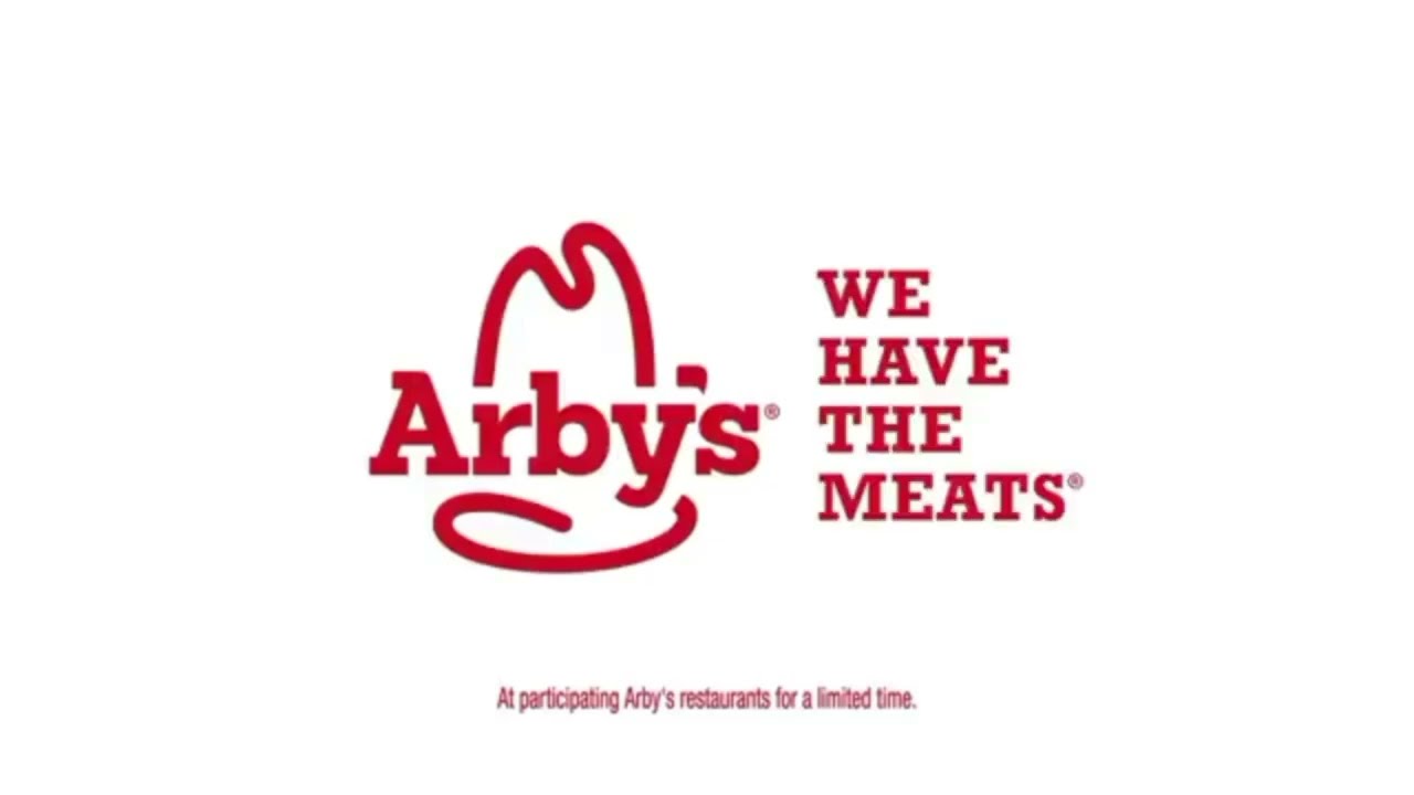
According to a blind recognition test with over 70,000 respondents, the Arby's audio logo is the most well known.
The 'We have the meat' jingle beat McDonald's, Netflix and the TikTok logo and was recognised by 86 per cent of people. Could that be because it actually says the word 'Arby's' in it? Quite probably. But it's still a great and very recognisable audio logo, even though it's quite simple.
17. Apple TV mnemonic
Apple TV got a new audio logo in 2025, or as the company calls it, a new mnemonic. It was created by Finneas and has three different versions, a five second ident, a one-second sting and a version that's over 10 seconds logo that is suited to playing at the start of films.
It's a thing of beauty, too. With electronic sounds followed by three gentle piano notes, it's a calming way to start a TV show. It reminds me, though Apple won't be pleased to hear this, of Microsoft's famous 1995 ident (above).
"Finneas delivered a completely original sound that feels cinematic and magical, serving as a welcoming invitation for viewers to enter the world of Apple Originals," said David Tayor, head of music at Apple.

