
Balance and symmetry are powerful elements in logo design, so it's not surprising that best ambigram logos make an impact. In fact, some ambigram logos could be considered among the best logos of all time.
An ambigram is a visual design that may be read in at least two directions, whether by rotation or by flipping. As a resource in logo design, the concept can creates a symmetry that enhances visual appeal and creates a sense of harmony while allowing an identity to be read correctly in different orientations – great for a brand whose mark appears on physical objects that might not always be seen straight on.
The best ambigram logo designs
Of course, not every brand can have an ambigram logo. It's a lot easier to create one if the name is a palindrome or contains letters than can made to mirror each other without losing clarity. Below, I look back at nine of the best ambigram logos and why they work – plus two that didn't. For more inspiration, see our pro tips for logo design.
01. The Abba logo
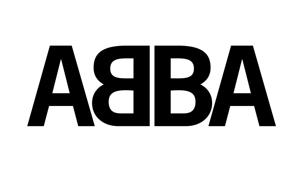
The name of the Swedish pop group Abba is an acronym of the initials of the singers’ first names, which happen to form a palindrome (a word that reads the same backwards). It wouldn't naturally be an ambigram since the letter 'B' isn't symmetrical, but a happy accident inspired an ingenious tweak to make the famous mirrored design.
As we saw in our Abba logo history, the idea came from a magazine photoshoot in which each band member held up a card with the first letter of their name. Benny Andersson held up his 'B' the wrong way around, but the photographer recommended using the image anyway.
Rune Söderqvist, who designed most of the band's record sleeves, incorporated the idea into a logo design that's still used today. The mirrored symmetry makes the simplicity of the minimalist design much more memorable and gives it more personality. To me, it feels like it also emphasises the fact that each of the letters represents a band member, making this a logo design that's on the Money, Money, Money.
02. The New Man logo

Turning the word Abba into an ambigram wasn't a huge leap of imagination, but New Man? A longer brand name comprising two words wouldn't normally lend itself to rotational symmetry, but Raymond Loewy achieved it in his famous 1968 logo for the French fashion brand.
Loewy's design takes advantage of the similarities between the letters 'W' and 'M' on one hand, and 'a' and 'e' on other. It amplifies the former with sharp diagonals that give balance to a design that still feels modern today, perfectly fitting the brand name. The logo's still in use, with the text now placed diagonally.
03. The Sun Microsystems logo

The Sun Microsystems logo is perhaps the best ambigram logo of all for its geometric perfection. The clever rotational symmetrical chain looks like it could be a tech component chip, and it was engineered with similarly mathematical precision.
The logo was created in 1981 or 1982 by Stanford University professor Vaughan Pratt. It was initially used horizontally on the company’s workstations and was later used tilted. At first glance, each segment resembles an S, but they also contain a 'u' and an 'n', meaning that the brand name can be read four times, reading correctly on each 90° rotation of the square lockup.
Communicating the idea of technological innovation, it was ideal design for a company that built workstations and developed the Java programming language.
04. The old Oysho logo

Oysho is a Spanish clothing brand from Inditex, the same stable that owns Zara. Its name wouldn't naturally form an ambigram, but a clever decision to make the 'y' rotationally reflect the 'h' gave the design sharp, symmetrical minimalism that well represented its clothing, while the rounded letters also made it visually distinct on the high street.
I'd say that the 2011 rebrand was a downgrade, opting for a much more generic-looking all caps serif font.
05. The OXO logo

There are at least two brands with the name OXO – the stock cube maker and the utensils maker (pictured). As a palindrome of just three letters, each one symmetrical, the name perfectly lends itself to a natural ambigram logo design.
In the case of the utensils company, the design is symmetrical when rotated and when flipped vertically or horizontally. And apparently that's why father and son ream Sam and John Farber chose the name. They wanted it to read correctly on utensils both horizontally or vertically whenever they were in use.
06. The SONOS logo

The audio system brand SONOS is another name that's a palindrome. The logo, revised by Bruce Mau in 2015, can’t be flipped because of the 'N', but it is an ambigram by rotation. And the brand makes full use of the flexibility that brings.
The brand's guidelines now allow the logo to be used both horizontally and vertically, providing a flexibility that opens up more layout options for designers. Art director Julia Jeanguenat, said at the time of the refresh that the brand was embracing the wordmark's "modular and flexible qualities", influenced by the freedom and versatility of its system of products. The design is particularly powerful in the optical illusion graphic above, providing a visual identity you can almost hear.
07. The DeLorean Motor Company logo

The DeLorean Motor Company brand will forever be associated with 1980s visions of the future thanks to the association of its one car, the DMC-12, with Back to the Future. The company had actually folded before the film's release, but the logotype's chunky rounded letterforms seem to capture the era perfectly.
Designed by Phil Gibbon, the logo makes effective use of the mirror-ablity of the letters 'D' an 'C' from the company's initials in an ambigram logo with maximum impact.
An honorary mention in the automobile category goes to Ford. Its logo isn't intentionally an ambigram, but Charlie XCX fans have discovered an amusing accidental semordnilap when you flip the design.
08. The Maoam logo

The shape of candy brand Maoam's logo has remained unchanged since it was designed by founder Edmund Münster way back in 1931. Even after Haribo bought the brand in 1986, the logo was only tweaked to switch the serif face for a friendlier and more modern rounded sans, more in line with Haribo's own identity. It's fun, grabs attention and has a nostalgic retro charm, which is everything candy branding needs.
09. The DXC Technology ambigram logo

We've already seen in the DeLorean logo that a D and a C can mirror each other well to create an ambigram logo. DXC Technology is another brand that's uses this to great effect. The white line centres the design on the X, making the design work as an almost abstract shape without losing the clarity of the letters. The X becomes a linking device, connecting two devices – perfect for a brand that provides IT solutions.
Ambigram logos that didn't quite work
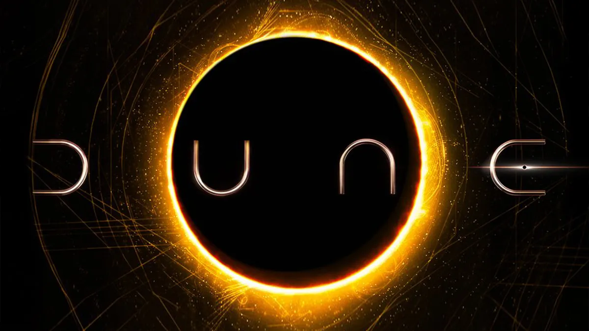
As DeLorean and DXC show, a reflected D becomes a C... not an E. Still to this day, there are people who insist on calling the Dune movies Dunc because of the attempt to create an ambigram logo that didn't quite work.
The design fail was most obvious in initial versions of the logo. By the time the first movie came to release, the problem had fortunately been solved to an extent by the addition of a well-placed solar eclipse to create the crossbar of the E – only now it's not an ambigram anymore. Our favourite building brick brand had to lend a hand to make sense of it with the Lego Dune logo.

Ambigram logos work well when they're easy to read, not when the design looks like some kind of cipher. Even people who don't know Abba wouldn't have much problem in working out what the logo is supposed to say, but the Odido logo is just confusing.
If you missed it, Odido is the new name for T-Mobile in the Netherlands. With such a radical rebrand, you want customers to at least know how they're supposed to pronounce the new name, but the enigmatic ambigram logo left people unsure if it was supposed to be Odido, Odico, Obido or Odeco. The brand even admitted that the name was meaningless. "Our name stays the same no matter how you read it," the guidelines proudly boasted. Great... but why?
Want to make your own? See are piece on how to make an ambigram logo in Illustrator. We also have an article on the exercises to do before you design a logo.
What is an ambigram?
The word ambigram combines the Latin 'ambi, meaning 'both' and the Greek suffix 'gram', meaning written. It describes visual designs that can be read in more than one direction, working as puns. They can work in different ways, either through horizontal or vertical symmetry or through rotational symmetry.
Some words are natural ambigrams, for example 'nu' and 'SOS' have rotational symmetry, while the word BOOK (in all caps) has horizontal symmetry, making it a natural lake reflection ambigram. But other words can be turned into ambigrams through clever use of typography or calligraphy.

