How we made made Castlevania: Nocturne a rare video game adaptation with a touch of elegance
The creators behind Netflix's dark anime reveal how they captured the characters and creatures in the series.
Sign up to Creative Bloq's daily newsletter, which brings you the latest news and inspiration from the worlds of art, design and technology.
You are now subscribed
Your newsletter sign-up was successful
Want to add more newsletters?
The Castlevania franchise is breaking the curse of video game adaptations, with the second season of Castlevania: Nocturne winning a positive reception on Netflix. Animated by Powerhouse Animation Studios, the series passes the Belmont family demon-killing business on to the next generation, set during the time of the French Revolution where vampires attempt to lead a revolt of their own.
Making a return on the second outing are directorial siblings Adam and Sam Deats, as well as character design supervisor Katie Silva, who pushed the show’s designs to reflect the emotional journey of Richter Belmont and the other cast members throughout the eight episodes. We caught up with them to learn how they went about bringing the characters to life in this dark anime.
If you're starting out in animation yourself, see our guides to the best animation software and the best laptops for animation.
Article continues below 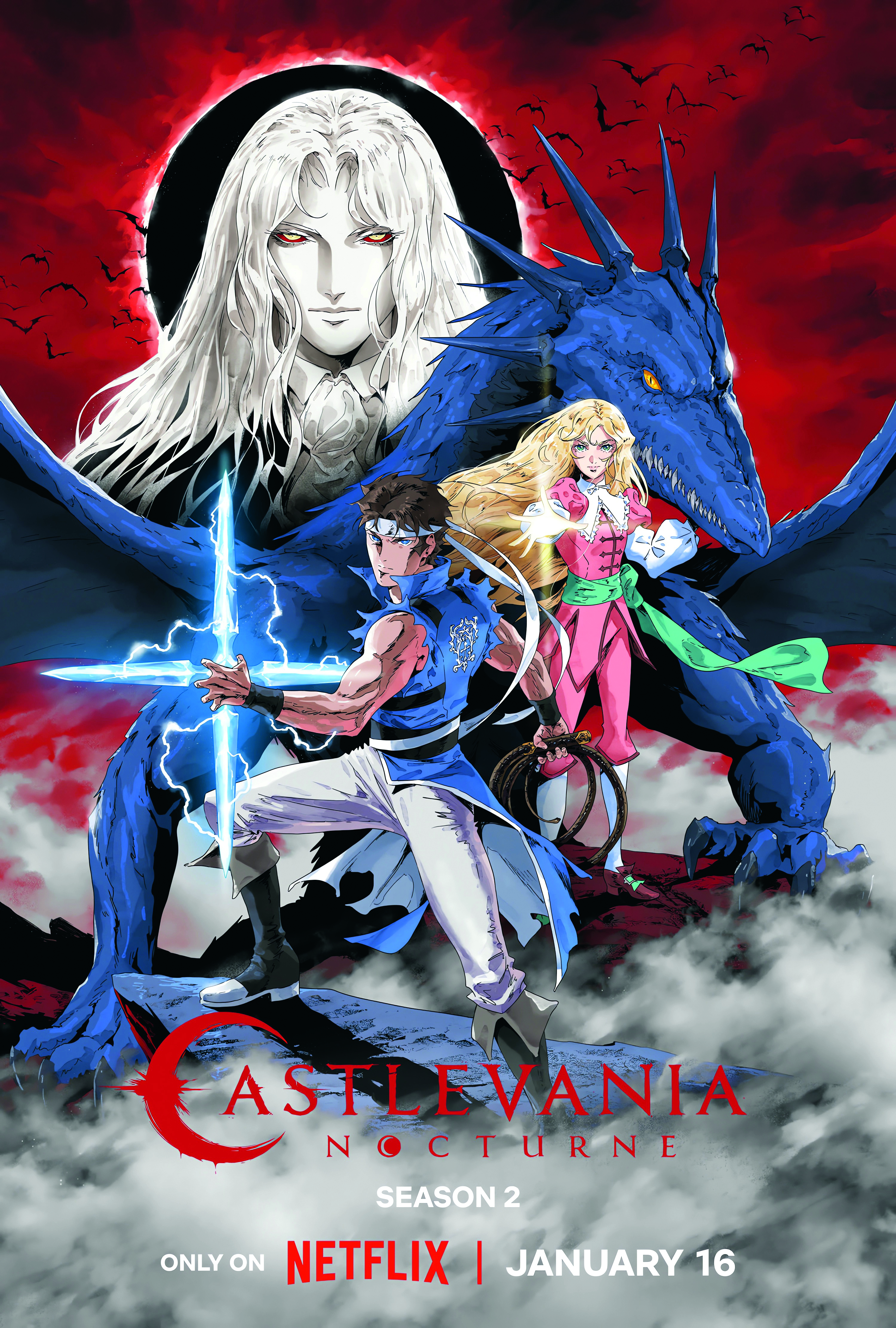
“When we started working on Nocturne, we wanted to bring it a touch of elegance to tie it into some of the French backdrop, but at the same time refine certain things,” states Sam. “Occasionally in the original series, there were some struggles with how certain shape languages were working and certain shading styles that gave us some trouble.
"It takes hundreds of different animators working on the show to make it happen. Different people would translate that style in different ways and we found that we needed to make a few adjustments to try to refine our approach, as we went into the new series on top of trying to improve upon the aesthetic.”
A particular show has remained an influential touchstone in moving from the original Castlevania anime and into Nocturne. “Obviously, we love Berserk and there are some dark moments in this show,” notes Katie. “But it’s less starting with a grizzled protagonist [Trevor Belmont] and more beginning with a younger protagonist [Richter]. Nocturne is more colourful and has curvy lines.”
An effort was made to simplify the animation process used during the series’ creation. “It’s funny, we went into Nocturne wanting to make it more animation friendly,” remarks Sam. “We tried to adjust the shading style in the show to have fewer levels of shading, to have more nuanced shape language in the shading and more delicate line work and things like highlights in the hair.
Sign up to Creative Bloq's daily newsletter, which brings you the latest news and inspiration from the worlds of art, design and technology.
"The result was that the nuances, shape language and more elegant line treatment basically made it a straight-up even split with the complexity of the original series. We ended up at the exact same place but with a slightly different look.”
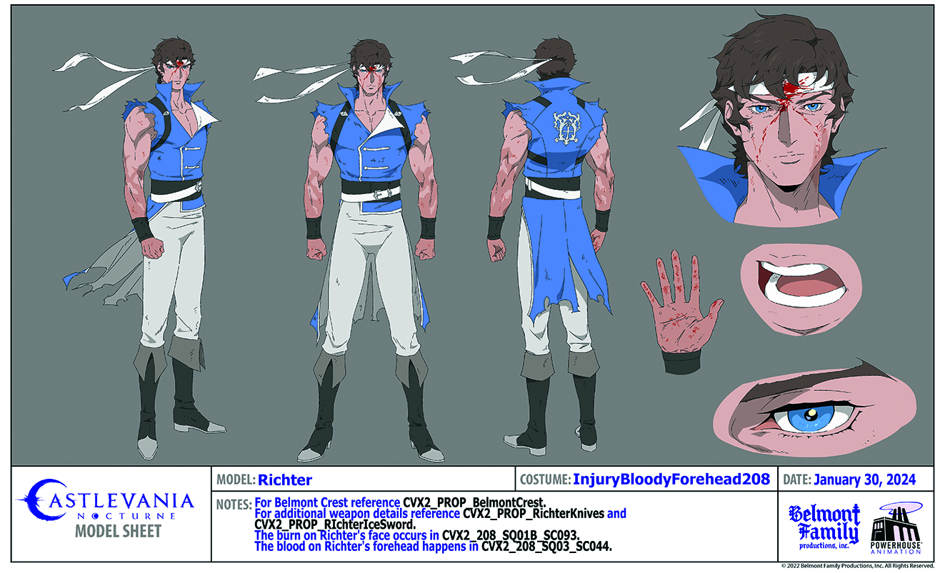
His brother is in agreement. “Not even just that,” notes Adam. “Like most of 2D animation, we’re still outsourcing to animators here in the US and studios in Korea. We tried to simplify the shadows. They are less dense and yet we’d still get shots back with a third and fourth tone.”
That simplification could only go so far, as Katie explains: “All of those buttons on this outfit are going to be difficult to track, but sometimes a character needs a lot of those details and animators have to put up with that. It’s a give and take.”
The wicked wardrobe
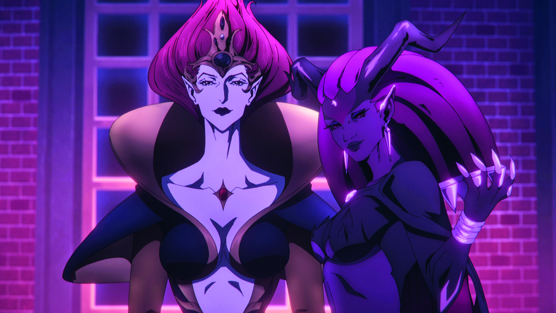
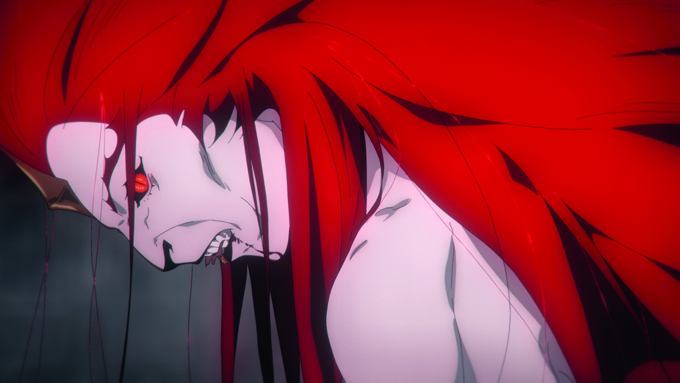
The character design that went through the most iterations was that of ancient vampire antagonist Drolta Tzuentes, who gets transformed into a Night Creature. “When she was first designed in Season 1, I showed a bunch of designs to the producers and writers, and the writers went, ‘This is so wonderful. Let’s do all of them',” Katie recalls.
“That ended up happening but it was a running thing that I was trying to make happen where she had a different outfit every time she showed up. All of the team got to design her.
“This season she’s a Night Creature, so it’s hard for us to do that. But we had flashback sequences where she also got to have a bunch of different outfits! My thought is that Drolta has a different outfit for everything she’s doing. When Drolta is talking to Olrox in Season 1, she’s wearing what we called her negotiator outfit. It’s part of her character and also makes her fun.”
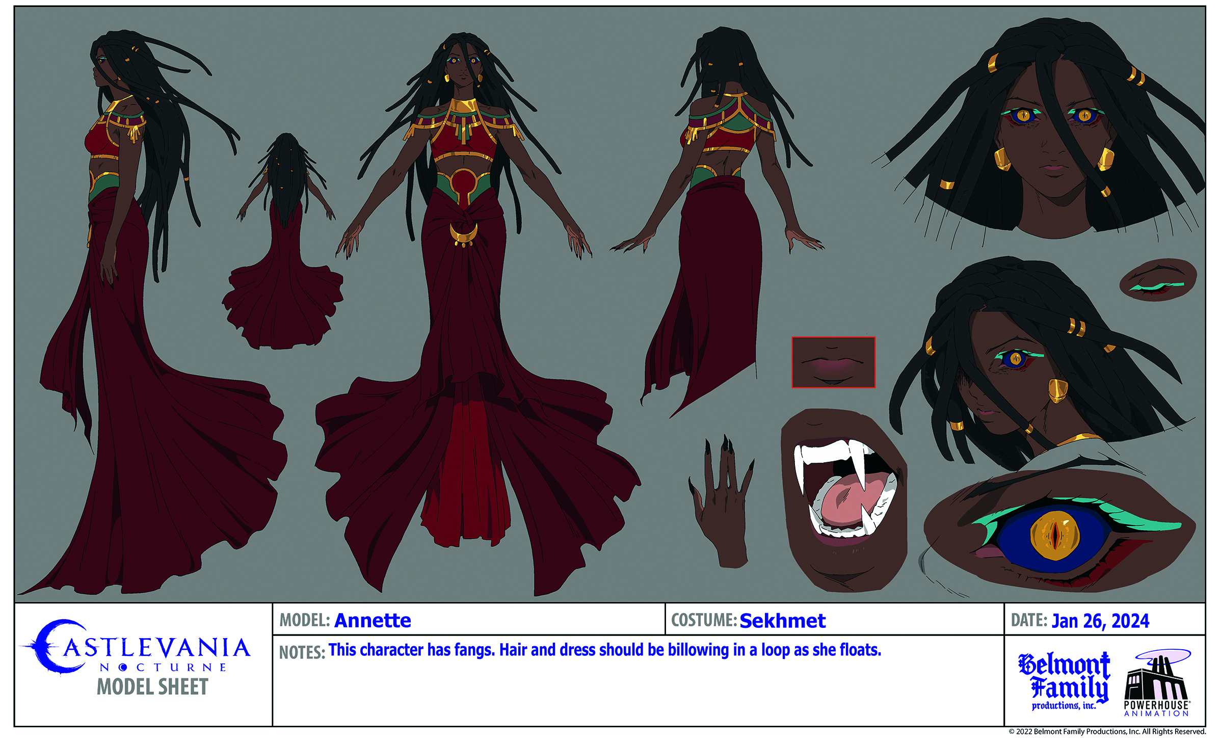
Character transformations are treated as special moments. “Instead of doing a bunch of model sheets for each stage of the transformation, we have a specialist animator on our staff and they’re figuring it out from the beginning to end stage,” explains Sam.
“There are some cases in Season 2 where a character will hit a midpoint in their transformation. We have a lot of scenes as they’re developing that transformation. In those cases, we had to do multiple model sheets for several different stages of that.
“It depends on the circumstances. If it’s going to be one sequence of shots where we see someone turning into something, I prefer to give it to a specialist animator. But if it’s going to be a long stretch event that changes throughout a larger number of shots and a lot of different animators have to be involved with that, it’s better to design those things in sheets.”
Making Richter Belmont
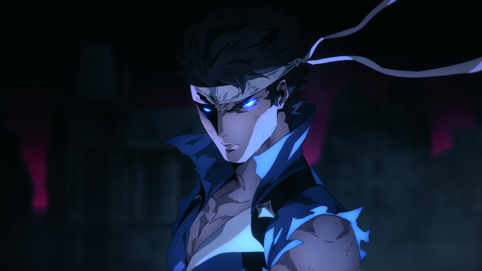
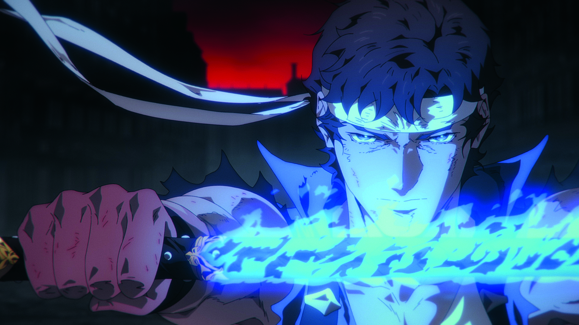
Richter Belmont is in full control of his magical powers, which influenced his character design.
“Sam went in with the goal of making sure Richter gets elements of his old outfit from the original Castlevania: Rondo of Blood game,” states Adam. “He managed to use that as the means of showing that growth, which is the fun part.” The video game homage was a nice visual and narrative touch.
Sam adds: “Slowly throughout the series and between the two seasons, part of the goal was to reflect Richter’s character growth and confidence by building him from one of his character designs from the games into the classic one that everyone remembers from the original Rondo of Blood game.
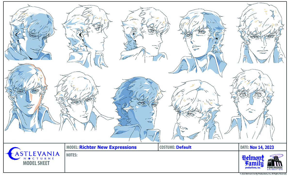
“This was actually intended to be reflected in Season 1, starting with Episode 106 through to the end, and Richter’s design was actually updated, particularly his expression sheet and hairstyle. Those were updated to reflect the change in his attitude and character growth. Everything did change little by little throughout the series, all the way down to how we were styling his hair. It’s all subtle but is there.”
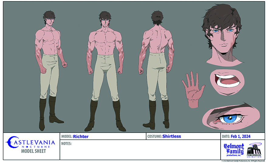
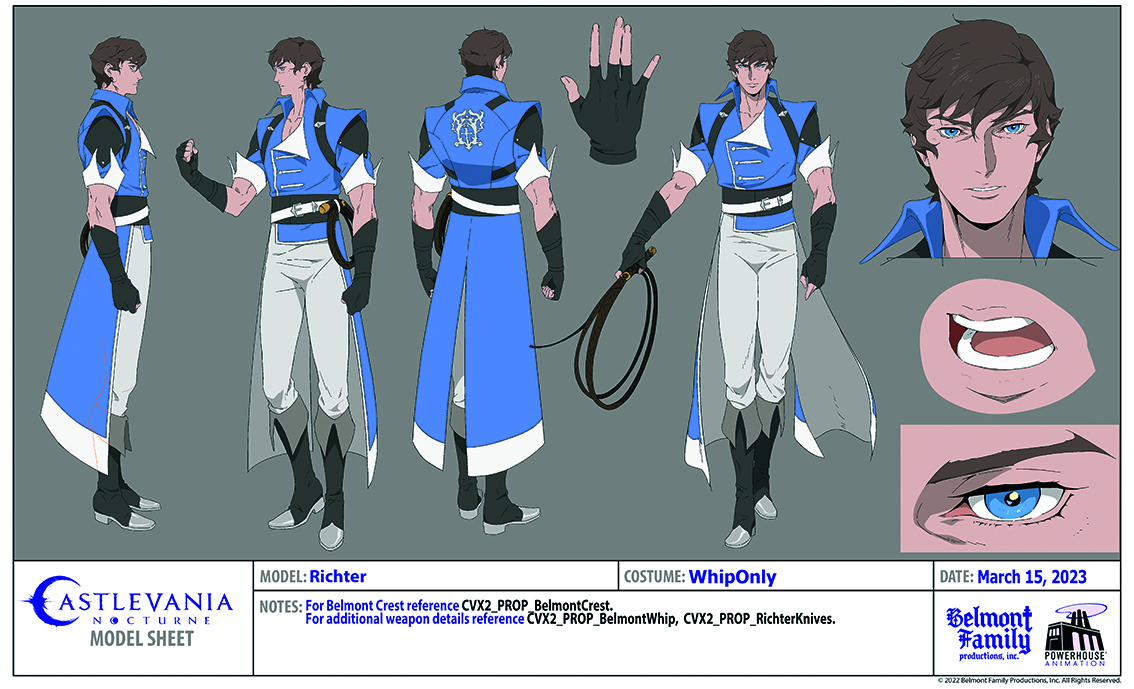
Katie follows up with a laugh: “It’s definitely Sam’s baby! Through the season we had to redo his main sheets, which is difficult because the main characters need to have a lot of expressions and several angles. We definitely did redo Richter and gave him funkier hair and various expressions.
"We called it ‘Chad Richter’ versus ‘Baby Richter’. He evolved into Chad Richter. Sam has a shot where he’s taking an energy blast and protecting Annette, and his sleeves burst off. It’s like, ‘There’s Chad Richter.’ We definitely had to do a number of sheets for that.”
A challenging character
Interestingly, the pure white face of the dhampir Alucard posed more technical than emotive problems. “Adam had to deal with how much Alucard can get blown out if he’s not being carefully colour adjusted,” says Sam. “But when it comes to the facial expressions, Alucard has always been a difficult character to draw right; that has been a constant even with the original series when he had a little more colour in the face.
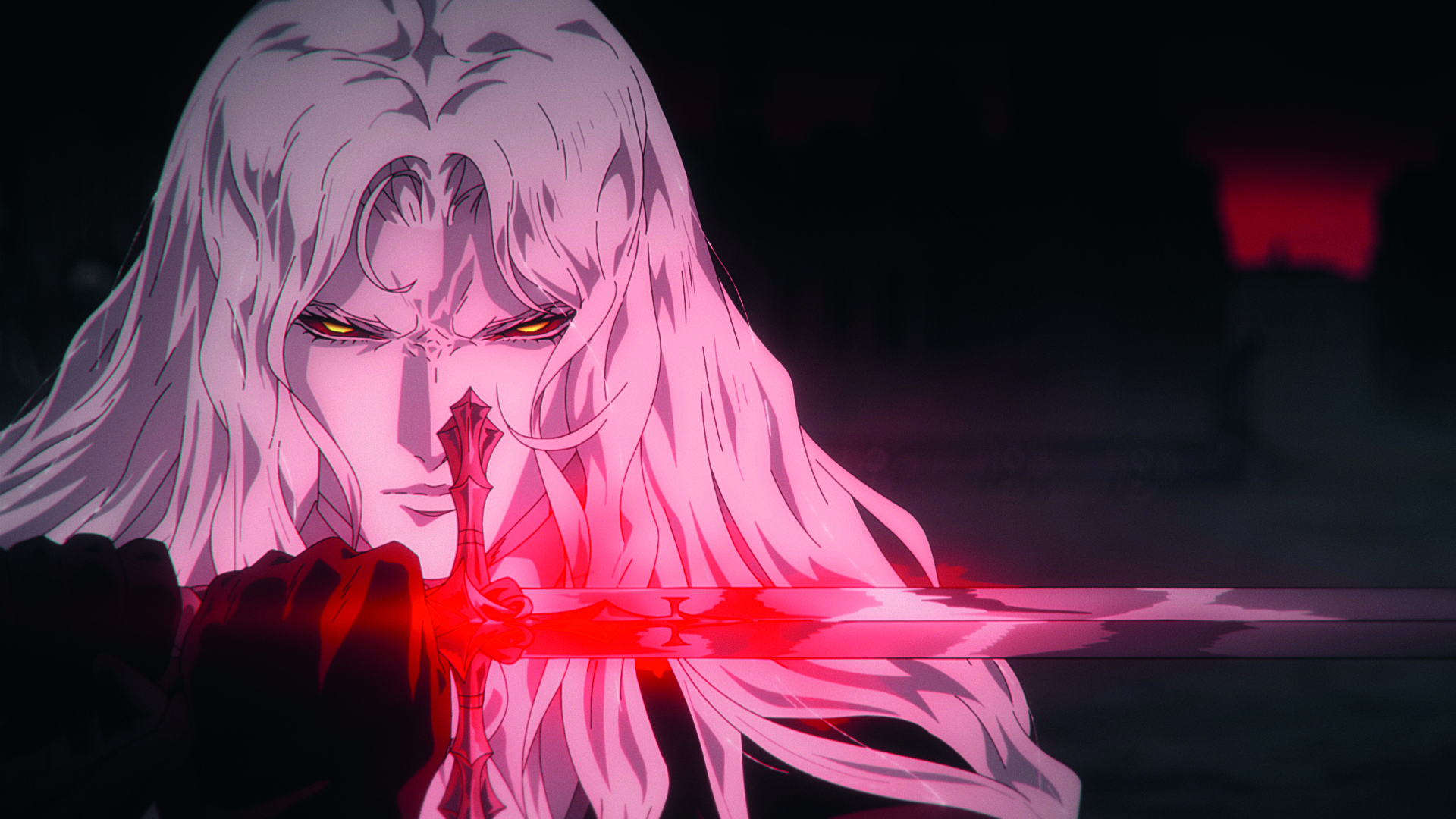
It’s part of the same struggle that we have with the nuances of the show; the line style and subtleties of certain expressions that we try to push for. It’s a challenge we’ve grown used to over the years that we’ve been drawing him.”
But lessons have been learned by the team, as Adam observes: “One thing that you should never do is have hair colour almost identical to the skin colour. It’s really bad! That colour gets wrong all of the time. There were paint issues.
Effects designs, meanwhile, are tricky because of outsourcing. “If you have a unique effect design, then it sometimes gets burnt out by the outsourced animation crew, so tends to look similar to other stuff,” observes Adam. “What worked nicely is that we’d have some of our in-house animators like Josh Aguilar, who’s a great effects animator and did, for example, Erzsebet Báthory’s dark orb.
I gave him a short description, and he did a still frame of it and said, ‘I’m going to animate this because we can send it to the outsource studio and they’ll know how it moves.’ “I wanted it to feel violent-looking despite the fact it was a singular orb that crackles and flashes a lot. What Josh did with it was great.
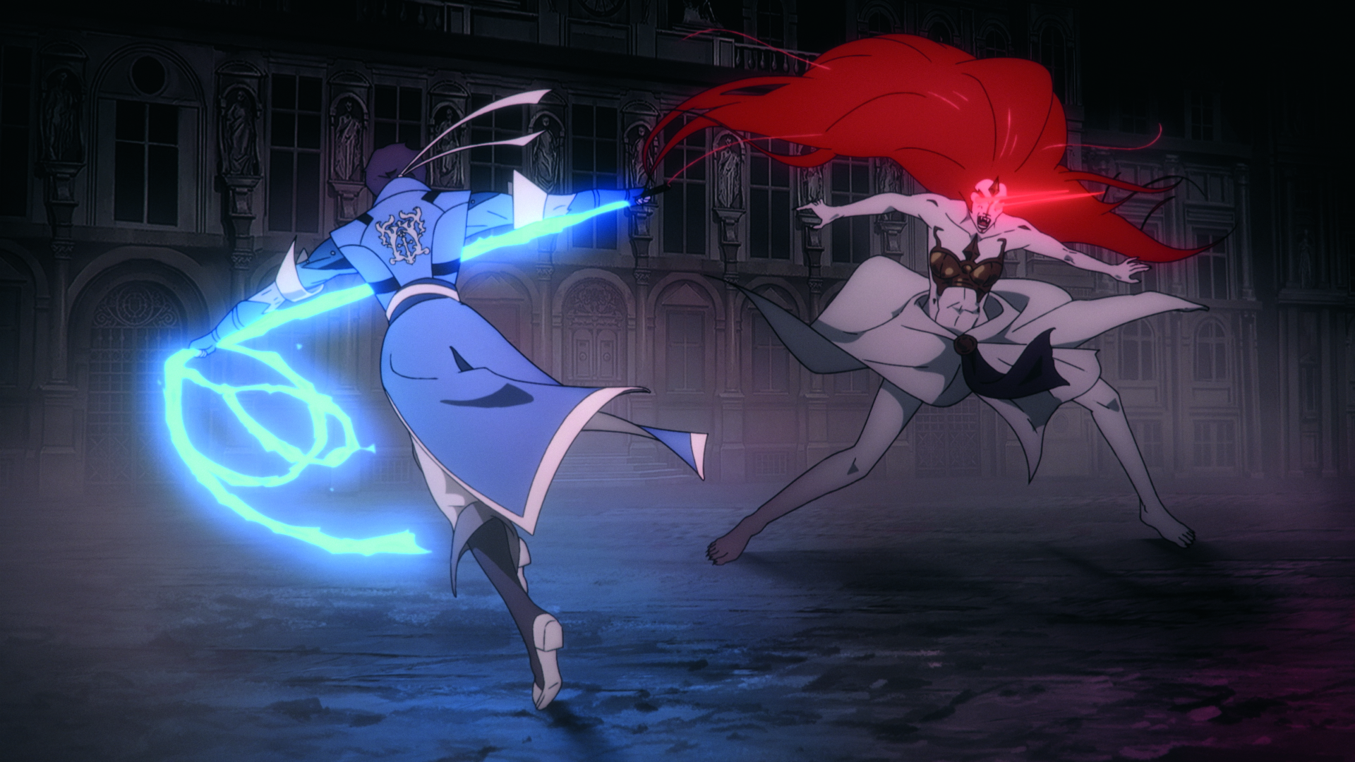
It had a black lightning bolt and white core that looked like the eclipse and the animation moves a lot. That single bit of animation appears in almost every shot when she’s holding the orb. It was useful and efficient to do it that way. “That goes for everything. We have fire effects model sheets that we’ve actually used for a long time. They don’t get duplicated as closely as I would like, but we’ve still been using them for a long time now.”
Details at a distance
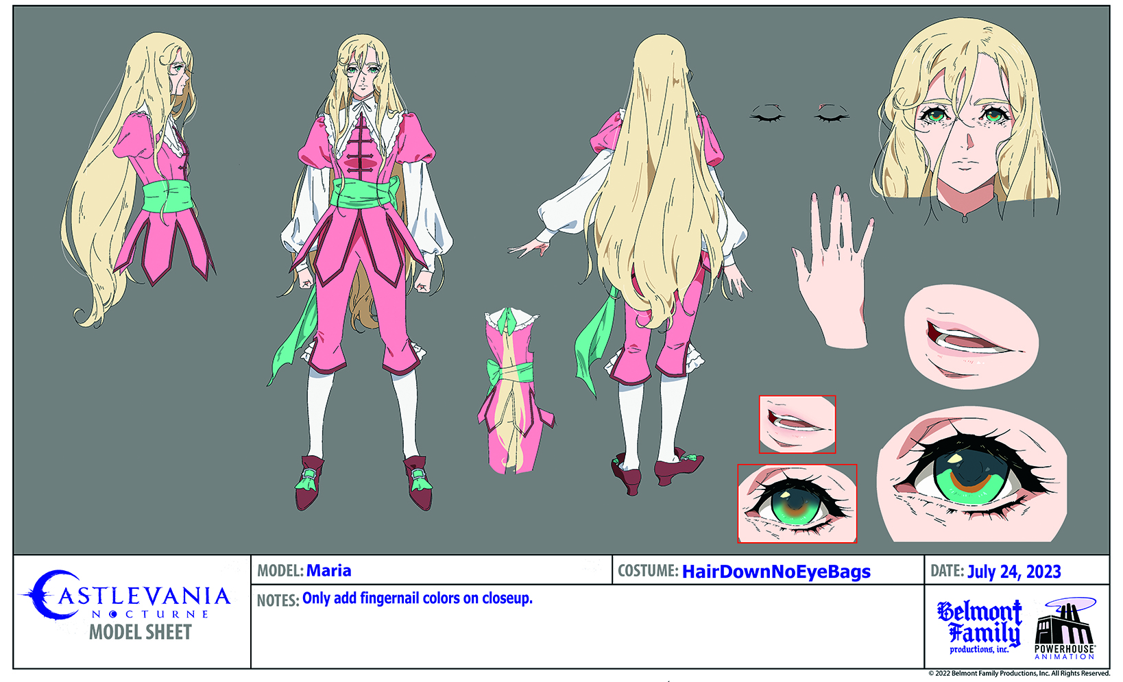
Some modifications were made to the character design methodology for Season 2, taking a lead from other anime series. “We had distance models so that the closer you zoom in on a camera, the more detailed the character will get,” explains Katie.
“We actually have ways that explain how to increase or decrease detail for these characters; that was a new thing we started doing. A lot of anime does it, but we leaned into it this time.”
Generally, Nocturne’s character designs tend to be line dense. “It’s our cross to bear when you work on a show that you want to be as elegant and detailed as this,” admits Adam. “That becomes a problem of being hell to animate, so we find ways to cut corners like the characters not needing a lot of detail for a crowd.”
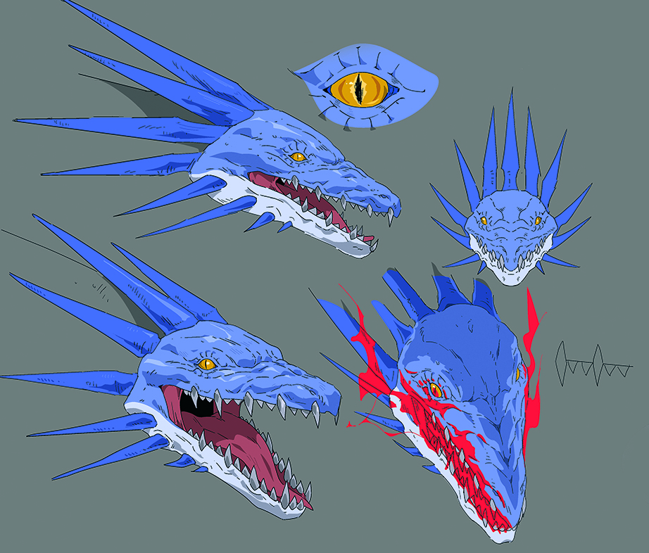
Making night creatures
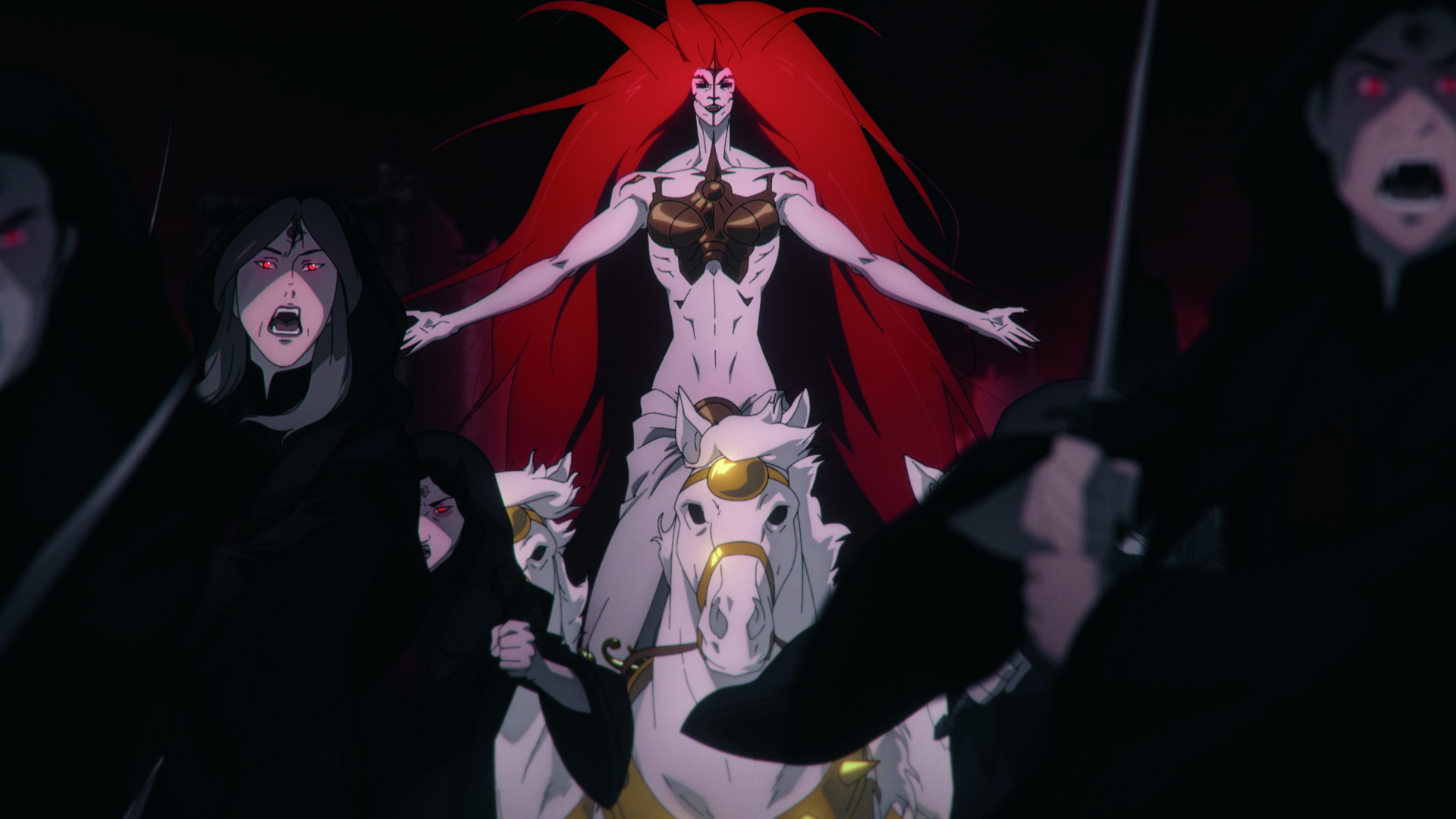
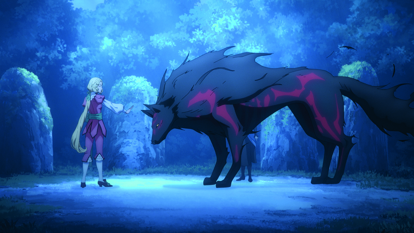
“As a team, we’d talked about the Night Creatures having more human elements because the story is directly related to their evolution after a certain point,” Adam recalls.
“This time around we had to think about what’s going to bring out those human elements in a subtle way, and they were there in the first four seasons too [including three seasons of the previous Castlevania anime series].” The manufacturing process for Night Creatures is different than in the original series.
Katie explains: “In the [Nocturne] story it’s a machine. It’s implied that the machine is bringing each individual’s soul back into the same body.” Sam adds: “From a storytelling perspective we have the Abbot using a machine to produce Night Creatures now, so the goal was to reflect that sometimes.
On occasion, it was that we wanted to make sure there was a little bit of that humanity showing. But on other occasions we had to also have hordes that are going to be fighting in this army. We built certain creatures to not have their original soul attached and that reflects their design as well, to be more creature-like. It depended on the circumstances on how they came to be and how they served the story.”
However, the approach wasn’t entirely straightforward with so many animators working on the show. Sam admits: “One of the trickier things when it comes to distance models is that there’s a way that looks better. You can only draw so small but we’d find sometimes that when a character got smaller or their face was turning, the face would turn into mud depending on how it was being cleaned up.
"We had to do our best to communicate, ‘Here is the shape language that’s easy to animate and looks good from this distance.’ We tried our best to get that across with all the different animators. It’s a constant struggle.”
Complete effect
Animation tests assist in creating unique visual effects styles that can be replicated.
“We tend to find that if we do an animation test for unique effects styles, that has a positive influence any time a similar effect comes around again,” Sam says. “But if it isn’t a unique effect, for example fire or dust, typically what happens is that the animator will lean into their own individual habits, so those effects tend to end up being more varied and up to how the animator decides their approach to those kinds of things. We make all of those effects feel cohesive by adjusting how we composite them in the final show.”
Digital augmentation is an important tool, and the team did a lot of visual effects entirely digitally, which had to be contemplated in the pipeline.
"A long time ago, because the show is based on a game, we decided that we were going to have a distinct visual effects pipeline here and there because it meshes with the overall look of the game," Adam says. "If we run out of time to do a 2D cell effect, then we figure out something in post that’s purely digital. Usually that ends up falling on me!”
For more inspiration, see our guide to animation styles and the Disney principles of animation.
This content originally appeared in ImagineFX magazine, the world's leading digital art and fantasy art magazine. ImagineFX is on sale in the UK, Europe, United States, Canada, Australia and more. ImagineFX print is available for delivery from our online store (the shipping costs are included in all prices).

Trevor Hogg is a freelance video editor and journalist, who has written for a number of titles including 3D World, VFX Voice, Animation Magazine and British Cinematographer. An expert in visual effects, he regularly goes behind the scenes of the latest Hollywood blockbusters to reveal how they are put together.
You must confirm your public display name before commenting
Please logout and then login again, you will then be prompted to enter your display name.
