Behind the scenes on bizarre anime adaptation DAN DA DAN
How the colour palette sets the tone of the series everyone's talking about.
Sign up to Creative Bloq's daily newsletter, which brings you the latest news and inspiration from the worlds of art, design and technology.
You are now subscribed
Your newsletter sign-up was successful
Want to add more newsletters?
One of the essential elements of visual storytelling is the colour palette, which plays a role in setting the tone, establishing or supporting themes, and directing the viewer’s attention by highlighting and de-emphasising objects depending on their importance within the frame.
Going into vibrancy overdrive is the anime adaptation of Yukinobu Tatsu’s manga DAN DA DAN, now streaming on Crunchyroll and Netflix, distributed by GKIDS, directed by Fuga Yamashiro, and animated by Science SARU.
The story centres around a dare that sees a young extraterrestrial enthusiast get possessed by a yokai and lose his testicles, while his spirit-believing classmate gets abducted by sexual reproduction-obsessed aliens that inadvertently awaken her psychic abilities – and live to regret doing so.
Article continues belowIf you're interested in the world of manga and want try if out yourself, see our piece on how to publish your first manga.
And in the middle of all this craziness is a budding romance that holds everything together. The character colour concepts were shared between Yamashiro and Science SARU colour designer Satoshi Hashimoto. “There was a mutual understanding so we didn’t have a lot of issues with the base colours,” recalls Hashimoto.
“What we ended up dealing with more was figuring out the colours for each cut and scene, especially because this was director Yamashiro’s first time working as a full director of a series or film.
“There were a lot of times when he would get back a composited movie version of the cut, or we would look at the work in progress and he would say, ‘Oh, no, I want to do retakes’ on this and that, because maybe it wasn’t what he was expecting. Especially the action scenes in Episode 101; we were doing retakes and multiple versions for a long time to get them right.”
Sign up to Creative Bloq's daily newsletter, which brings you the latest news and inspiration from the worlds of art, design and technology.
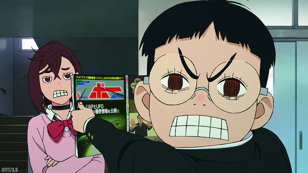
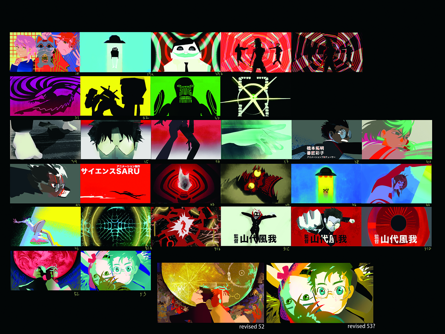
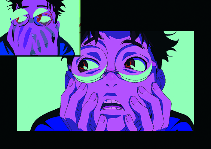
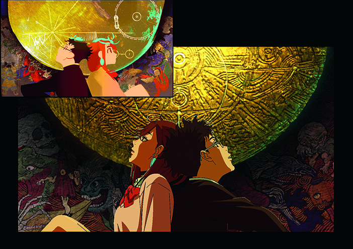
The source material was influential. “What I noticed about the manga is that it has everyday and occult themes, action, and the romance between Momo and Okarun,” says Hashimoto.
“I feel with a lot of other animated projects, you have one theme or genre that’s strong. If it’s a romance project it’s just romance. If it’s an action project it’s just action. But this time there were all these different kinds of genres mixed together, so we pushed things in different directions based on the context and content of a scene.
“As for the general colour direction, maybe this is hard to understand if you’re not familiar with the original manga if you aren’t Japanese; there are lot of references to Japanese retro pop culture in the manga, both in props and items, but people will also mention old songs or commercials.
“I was also inspired by that to create something more nostalgic and retro-feeling, especially in the normal everyday scenes in terms of how the backgrounds are drawn and coloured. But then with the action scenes I wanted to contrast that and go with a much more vivid look.”
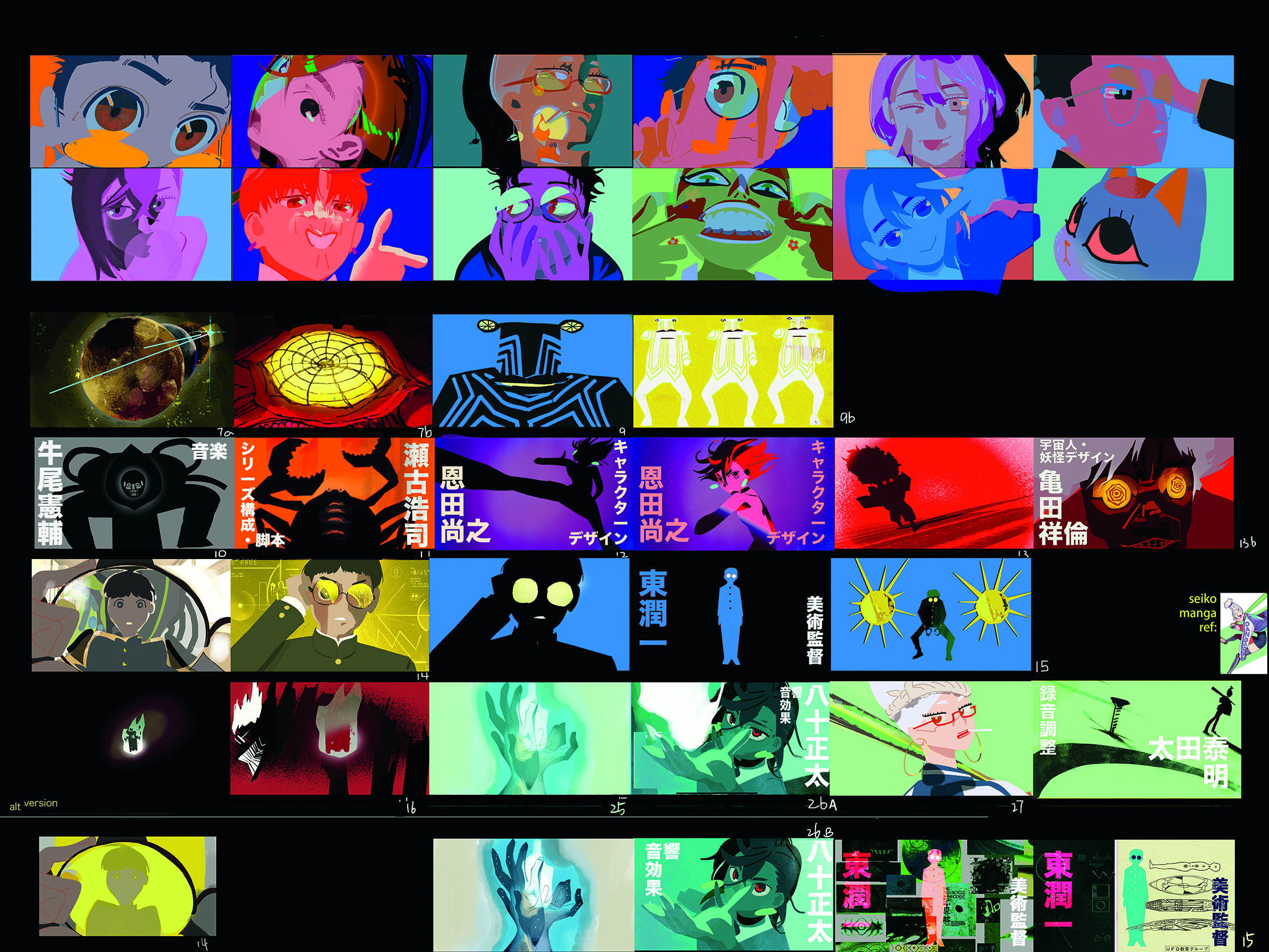
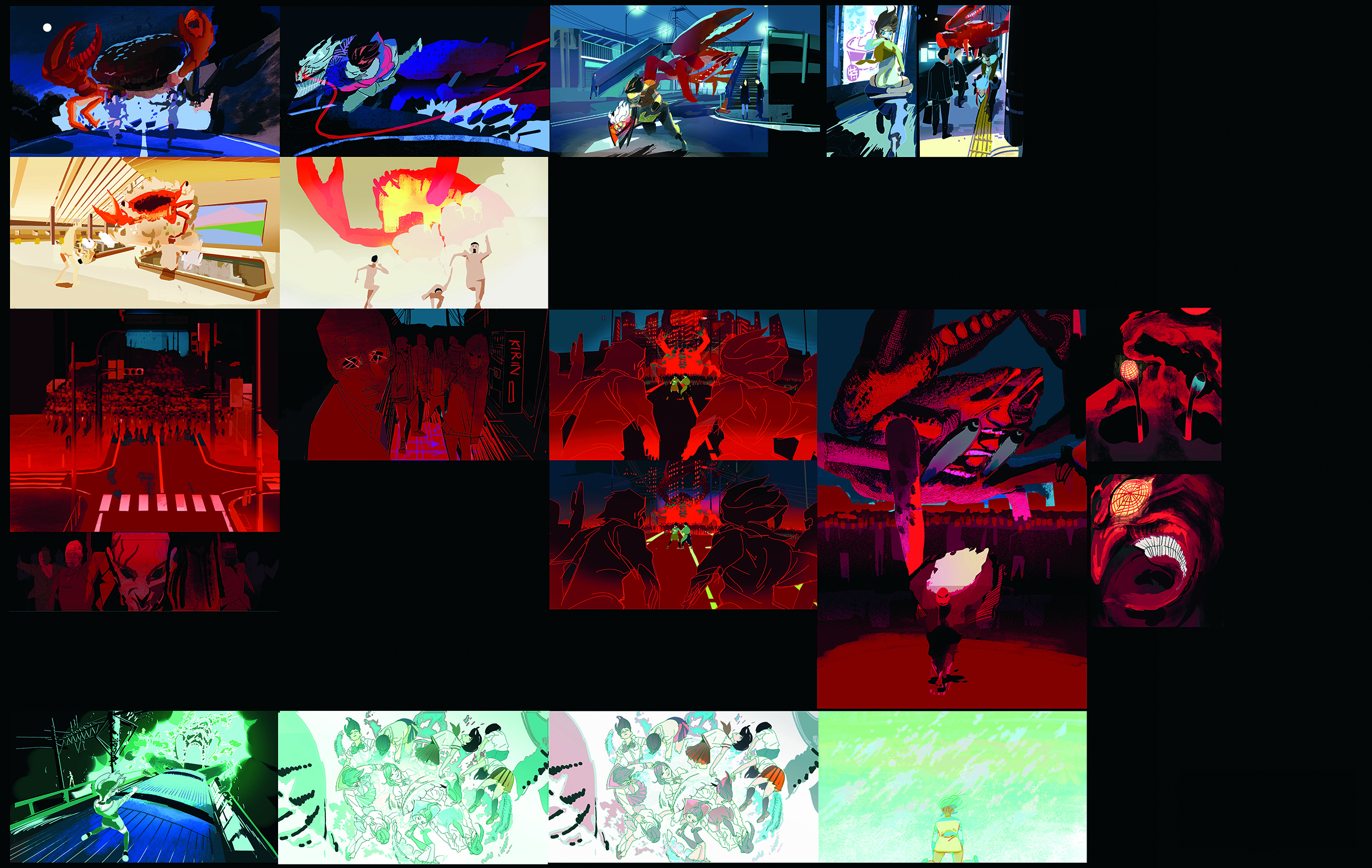
Distinctive logic Director Yamashiro brought a unique take on the use of colour throughout the series. “When a director says you have one theme colour as a colour person, you always think that the complementary colour also has to be there,” says Sophie Li, a colour script artist at Science SARU.
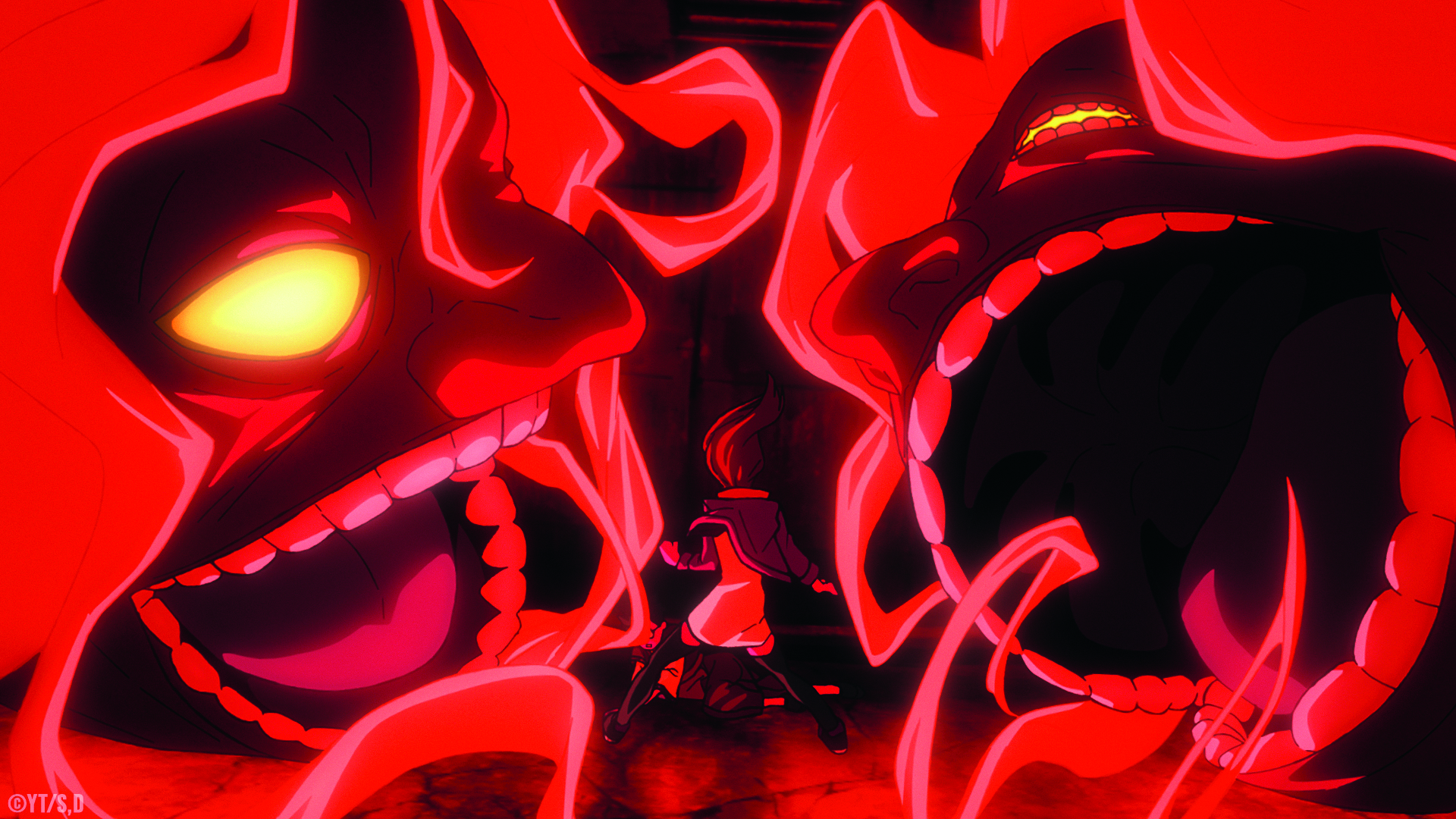
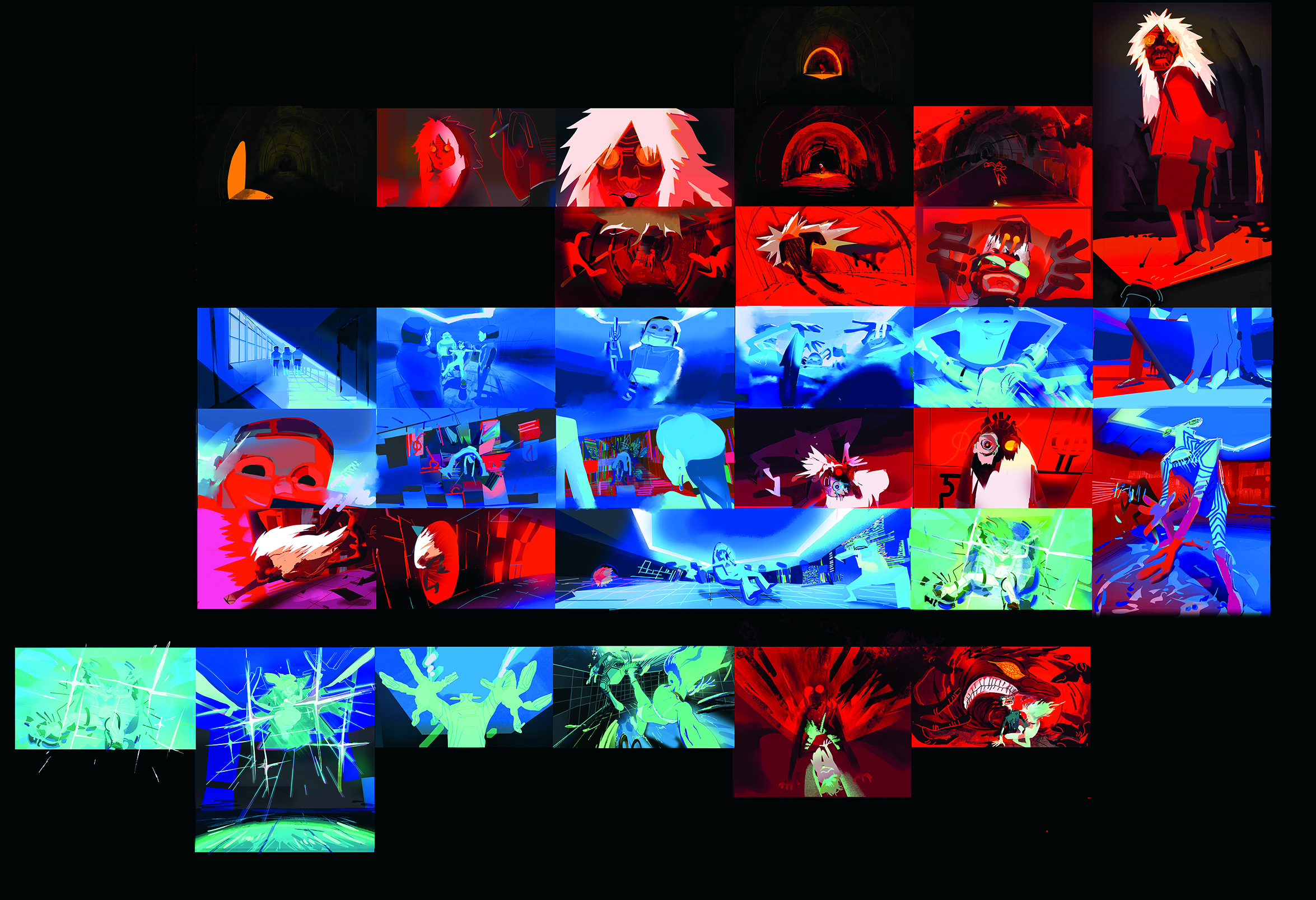
“However, for DAN DA DAN it has to be monochrome, as per the director’s vision, and that part was tricky to get to. We had a lot of iterations where we did different blues for the Serpo [a race of aliens], found the right one and said, ‘We don’t want any other colour. How do we make it work in the scene?’
“We slowly build up to the point where the whole image is dyed in the same colour for the fight sequences. DAN DA DAN was interesting and challenging because it’s not like those colours don’t appear when it’s daily life. Those colours still appear, but they follow a different colour logic.”
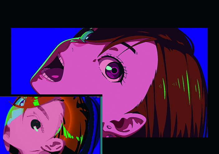
The series’ character and story arcs are reflected through the colours. Li adds: “Because we already know what the story is with the manga, Yamashiro-san had clear directions on everything, so I’m iterating what he said to me in the meetings. But the colour has to show who has the upper hand in the battle and that’s what makes it easier to think about. So when Okarun and Momo are losing a fight their colour dies down a bit, while the colour of the monster becomes stronger.”
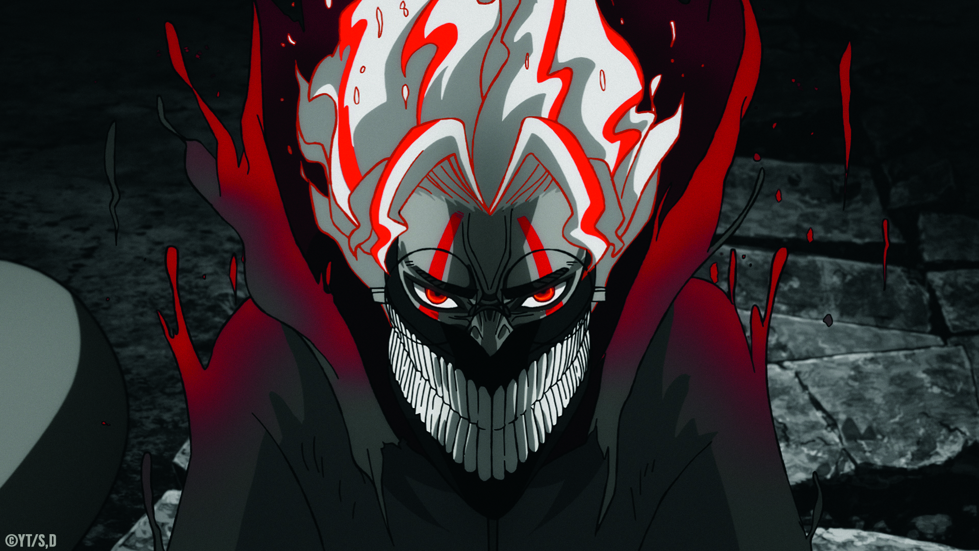
At times an absence of colour dominates the screen. “For the Flatwoods Monster, I watched black and white films, such as Sin City or the works of Akira Kurosawa, to figure out the vibe,” reveals Li. “It needed to be a stern but strong character and had to read well in the space. I don’t think about it in colour at all.
“And vice versa when I did the Acrobatic Silky sequences; I started with the pink and tried to balance out the other colours. For Silky, it was tricky because it’s pinkish, but is also red and rusty because of the rusted, decayed background.”
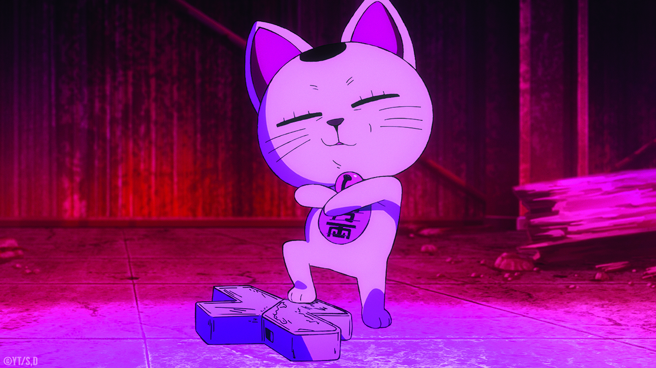
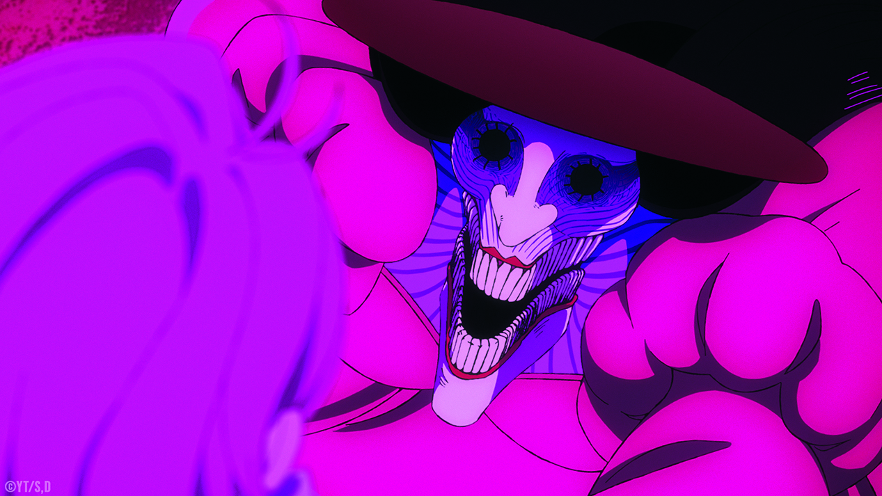
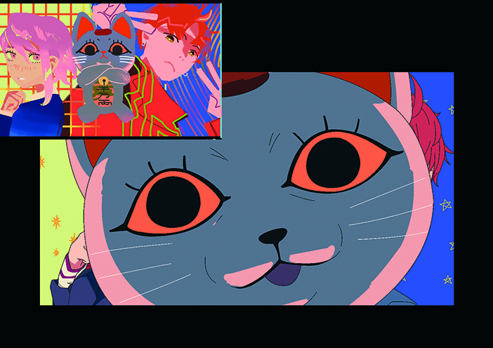
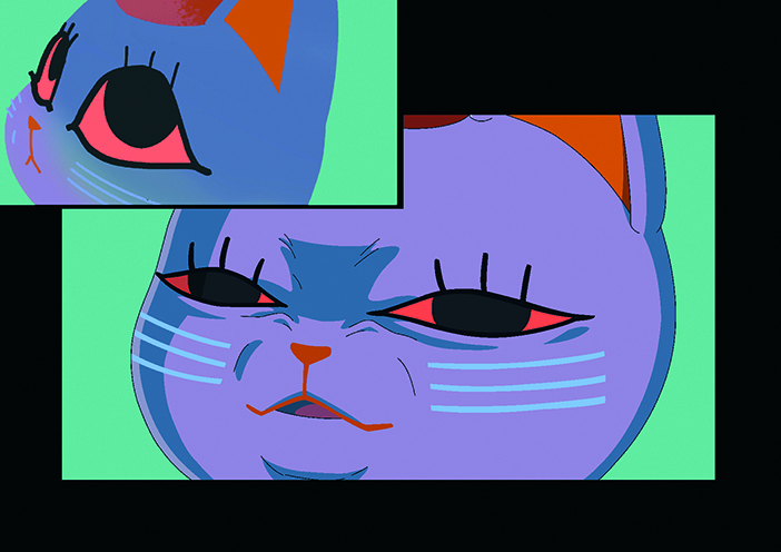
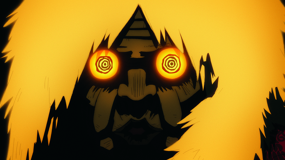
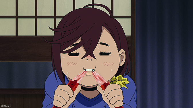
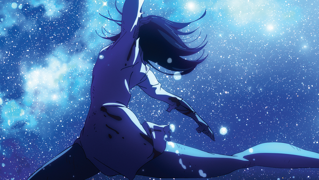
The colour script that went through the most iterations was the Acrobatic Silky fight, which intercuts with her backstory. “There are so many things going on,” says Li. “I worked on it for a long time. I think about the two different parts separately. From my point of view, Silky’s story is so sad and impactful but grounded in reality. I wanted it to look realistic. The sequence where Silky is dancing on the rooftop, she’s in the dark but illuminated by a sea of light. It’s like the most beautiful dance you’ve ever seen on a beautiful stage.”
Then there are moments where the characters go in and out of the daily life and action colour schemes, such as when Okarun and Momo encounter the crab as they attempt to lift Turbo Granny’s curse on Okarun. “It was difficult,” admits Science SARU colour designer Makiho Kondo.
“We had an idea of how far the crab’s influence extends. We would say that within a few metres, maybe it would make all that kind of stuff red. But it was deciding how far that goes. We had to figure that out on a cut-by-cut, scene-by-scene basis. If they’re in the sky then they go back to normal colours. It was difficult to figure out whether they were normal or red.”
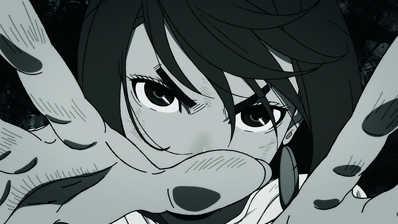
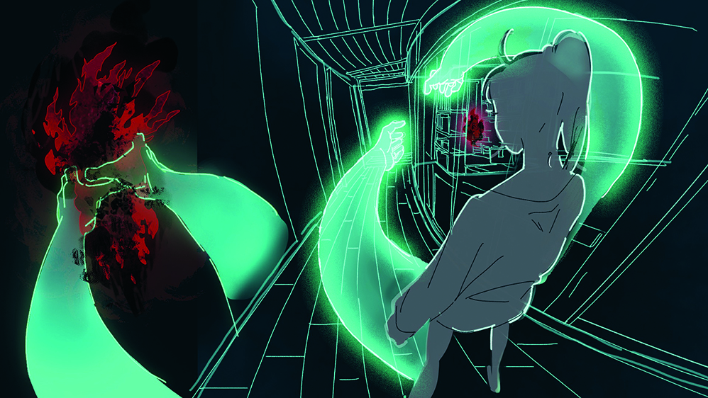
A dramatic scene for both the viewer and Momo is when she unlocks her psychic abilities. “You can see that there’s a lot of surprise when Momo first activates her powers,” notes Hashimoto. “That’s shared by the people who are watching as well, because it happens so suddenly. She turns this emerald green colour, which we continued to use later on. For example, during the later episodes you’ll see Momo take this pair of hands out of her back.
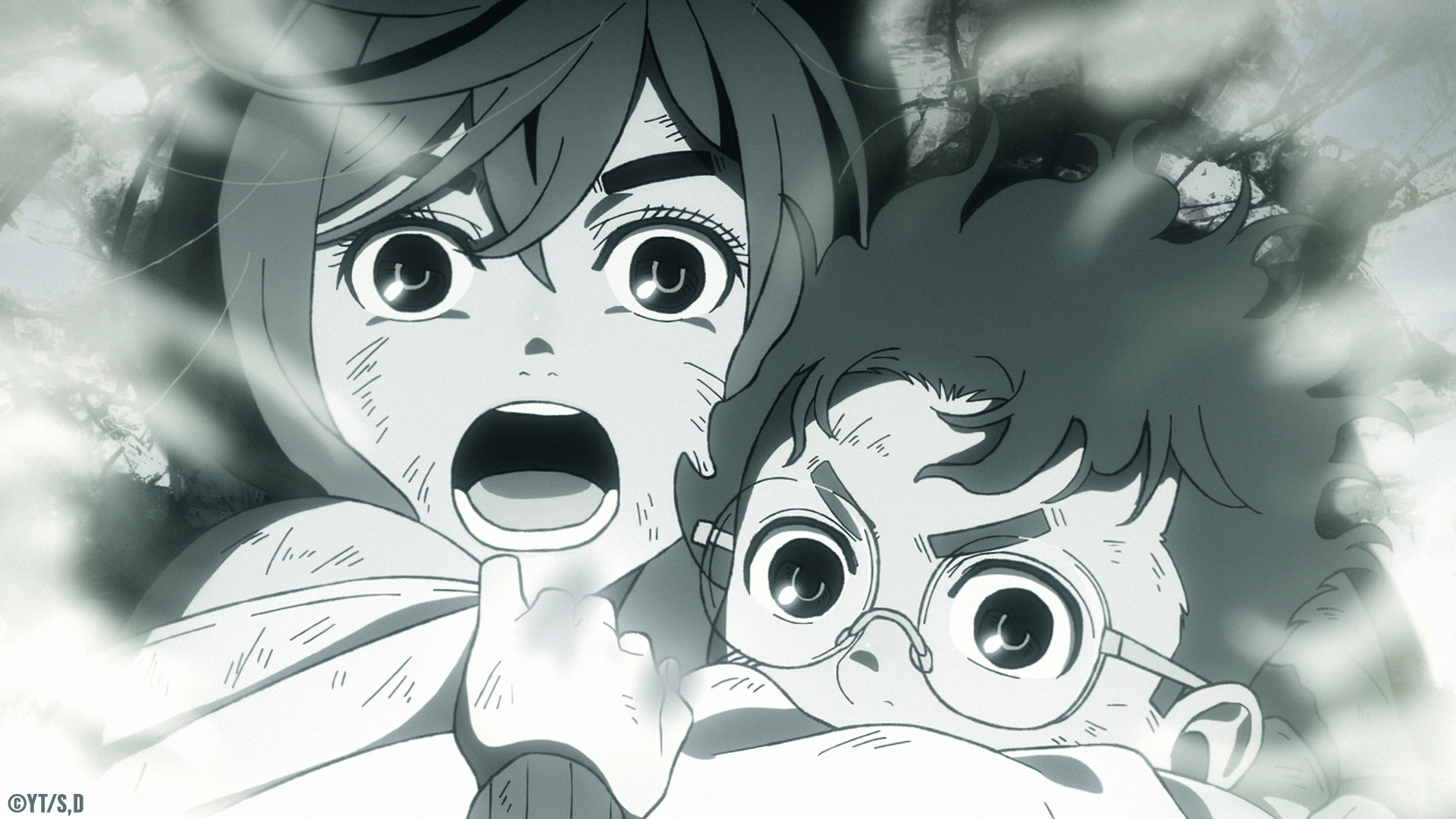
“But there was one point we did well in terms of depicting the growth of her powers. That was in the episode where she uses her psychic powers to grab Turbo Granny’s red soul, which looks like a flame. We go to Momo’s point of view and everything turns black and white. We did a good job of showing her growth and making that easy to understand for the audience.”
This content originally appeared in ImagineFX magazine, the world's leading digital art and fantasy art magazine. ImagineFX is on sale in the UK, Europe, United States, Canada, Australia and more. ImagineFX print is available for delivery from our online store (the shipping costs are included in all prices).

Trevor Hogg is a freelance video editor and journalist, who has written for a number of titles including 3D World, VFX Voice, Animation Magazine and British Cinematographer. An expert in visual effects, he regularly goes behind the scenes of the latest Hollywood blockbusters to reveal how they are put together.
You must confirm your public display name before commenting
Please logout and then login again, you will then be prompted to enter your display name.
