The Handmaid’s Tale’s secret weapon is colour
It's more important than you think.

Margaret Atwood's novel The Handmaid's Tale has grown a cult following that has only grown since its 2017 TV adaptation. Bringing the dystopian world of Gilead to life, each meticulous visual detail carries a disturbing symbolism that has set fan theories ablaze, but while there are countless elements to dissect, I'm here to dive into just one subtle yet ingenious feature – its expert use of colour theory.
Looking at costume design alone, the show's palette of rich jewel tones and muted earthy hues is a manifestation of its core theme, power. While colour plays such a large role in the show's visuals, its considered application is organically threaded throughout the series, demonstrating how something as simple as a red garment can represent an entire system of oppression.

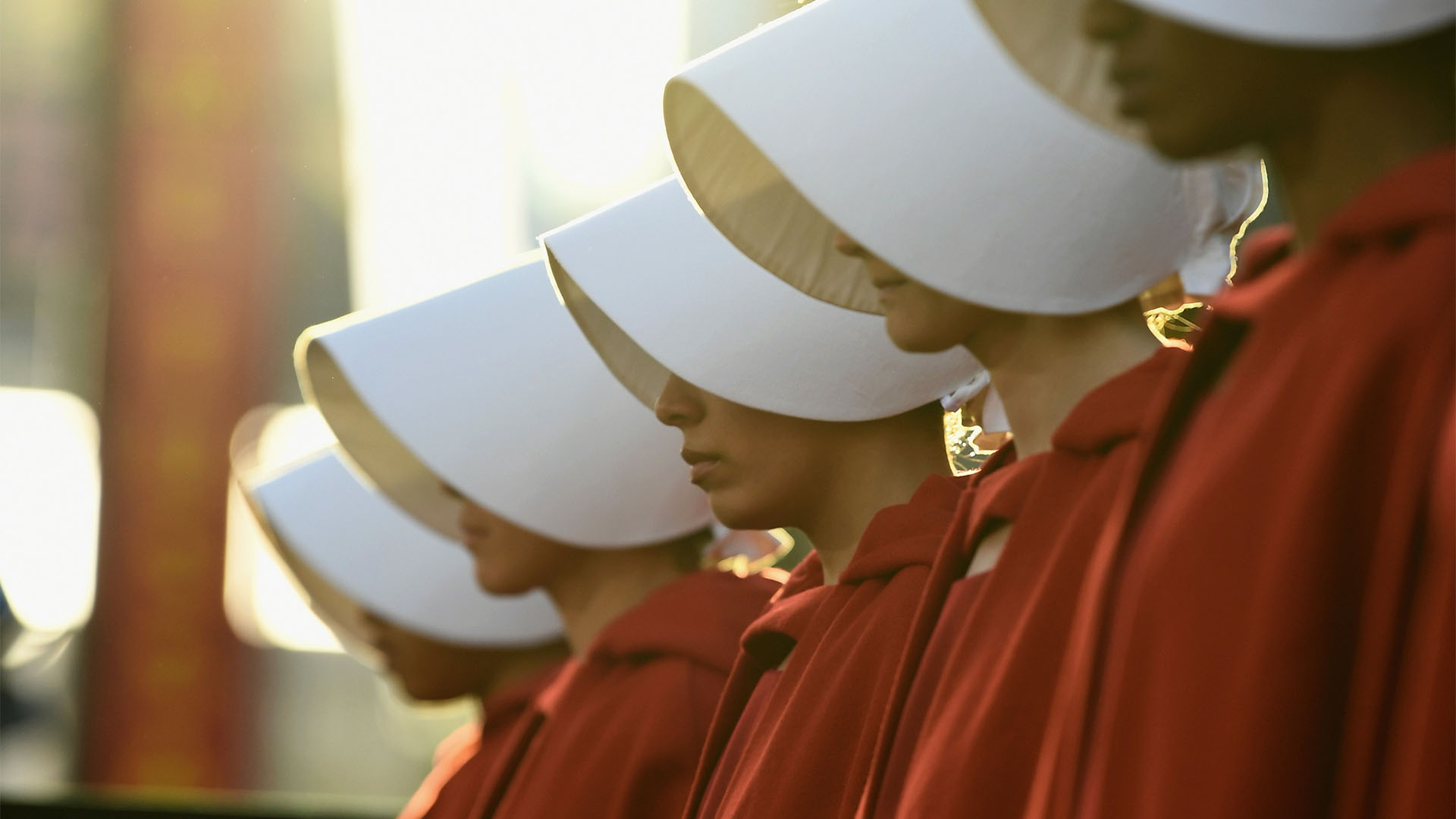
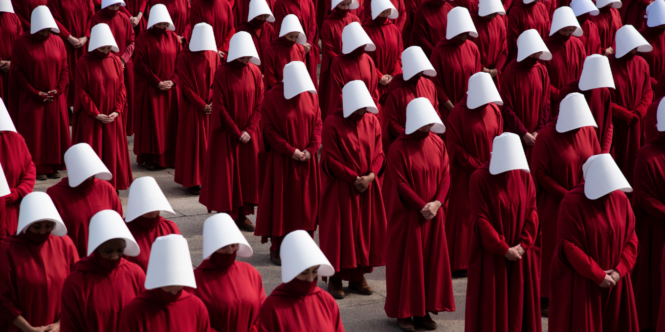
At its core, The Handmaid's Tale's costume design is a matter of status. Each handmaid is given a red 'uniform' – a scarlet letter that distinguishes them as "other" while making them easily identifiable should they attempt a futile escape. Red has numerous connotations – danger, anger, passion – associations that mark the women as untouchables.
Article continues belowSimultaneously, objects of value for their fertility, the red of their garments marks the blood of their bodily sacrifice as a surrogate, but with this sexual sacrifice comes an innate shame. While the red is a symbol of fertile power, it's juxtaposed with a lustful desire imposed by the Commanders, ultimately rendering the woman powerless under the male gaze.

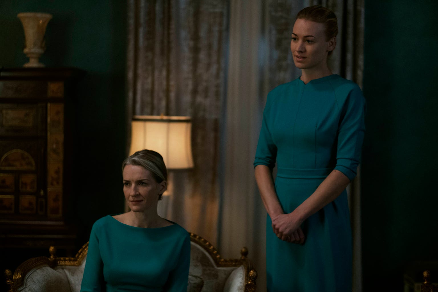
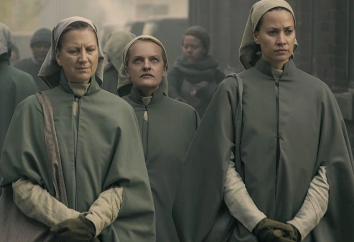
On the other side of the colour spectrum, the cool teal uniform of the commander's wives carries a serenity and purity. Akin to the Virgin Mary, there's an unspoken respect in the formal, sexless, almost corporate appeal of the blue shade. In contrast, the earth tones of the Martha's uniforms act as a veil of anonymity. Dull and accessible, the plain garments are devoid of any status, value or identity.
The Handmaid's Tale is a prime example of the power of colour theory in enhancing a story. While we might not process the symbolism of the costumes at first, the subtle yet striking power of considered design proves that colour theory is an invaluable world-building tool that can bring a story to life.

For more creative insight, check out how Met Gala 2025’s most striking looks can inspire your next character design. If you're after more creative tips, check out how to design characters for animation that fit a story.
Sign up to Creative Bloq's daily newsletter, which brings you the latest news and inspiration from the worlds of art, design and technology.

Natalie Fear is Creative Bloq's staff writer. With an eye for trending topics and a passion for internet culture, she brings you the latest in art and design news. Natalie also runs Creative Bloq’s 5 Questions series, spotlighting diverse talent across the creative industries. Outside of work, she loves all things literature and music (although she’s partial to a spot of TikTok brain rot).
You must confirm your public display name before commenting
Please logout and then login again, you will then be prompted to enter your display name.
