Goodreads finally has a new logo (and it actually looks... good?)
The social reading platform's new look is only twenty years too late.
Sign up to Creative Bloq's daily newsletter, which brings you the latest news and inspiration from the worlds of art, design and technology.
You are now subscribed
Your newsletter sign-up was successful
Want to add more newsletters?
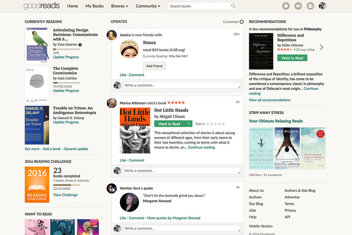
Goodreads has always seemed like it might be in on the joke. The Amazon-owned social reading platform has for a long time looked so clunky and dated that it sometimes felt as though it might be a wilful choice on the part of the designers. Not so, it seems – Goodreads has just launched new branding, and it actually looks kind of... good? While hardly one of the best rebrands of the year, if this one signals that more visual improvements are coming to the whole platform, it might just be the most welcome.
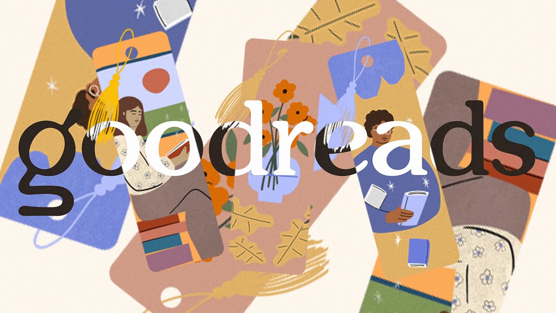
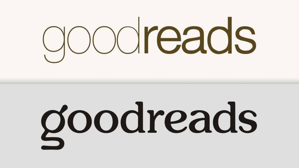
The new logo and wordmark still feature a lowercase 'g', but one that's much softer and more stylised than the previous bland sans serif offering. Typography across the platform now looks both more friendly and more literary, and the whole thing looks a lot less like a Wordpress blog from 2011.


"Our new logo is designed to better represent Goodreads and is optimized for accessibility so it looks clear and sharp no matter where you see it—from your phone to a billboard," Goodreads announced on its website. "The lowercase "g" incorporates a magnifying glass over an open book, symbolizing the book discovery and sharing of perspectives that are at the heart of the Goodreads experience. It’s fun, friendly, and focused on books—just like Goodreads."
Article continues belowAnd for once, it seems the response to a new app logo is landing pretty well among users. "The previous logo was the saddest on my Home Screen, I like the new one. I hope it translates in the rest of the app," one Redditor comments.

But mostly, it seems users are hoping the new logo might herald more significant updates across the entire platform UI. As another Redditor puts it, "I guess it’s a good sign that they’re trying to implement some changes that I hope to be for the better,” one Reddit user wrote. “The site (and app) were practically frozen in time!”
Time will tell whether Goodreads is planning to overhaul the entire software experience. We can but hope.
Sign up to Creative Bloq's daily newsletter, which brings you the latest news and inspiration from the worlds of art, design and technology.

Daniel John is Design Editor at Creative Bloq. He reports on the worlds of design, branding and lifestyle tech, and has covered several industry events including Milan Design Week, OFFF Barcelona and Adobe Max in Los Angeles. He has interviewed leaders and designers at brands including Apple, Microsoft and Adobe. Daniel's debut book of short stories and poems was published in 2018, and his comedy newsletter is a Substack Bestseller.
You must confirm your public display name before commenting
Please logout and then login again, you will then be prompted to enter your display name.
