People will hate me... but our banknotes don't need a redesign
Sign up to Creative Bloq's daily newsletter, which brings you the latest news and inspiration from the worlds of art, design and technology.
You are now subscribed
Your newsletter sign-up was successful
Want to add more newsletters?
So let me get this straight. The UK in a cost-of-living crisis, the NHS is creaking at the seams, and the Bank of England has decided that what Britain really needs is a public consultation on whether our banknotes should feature "nature" or "innovation" themes.
Because clearly, when you're choosing between heating and eating, your primary concern is whether there's a nice picture of a daffodil on your fiver.
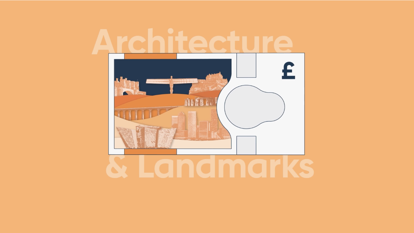
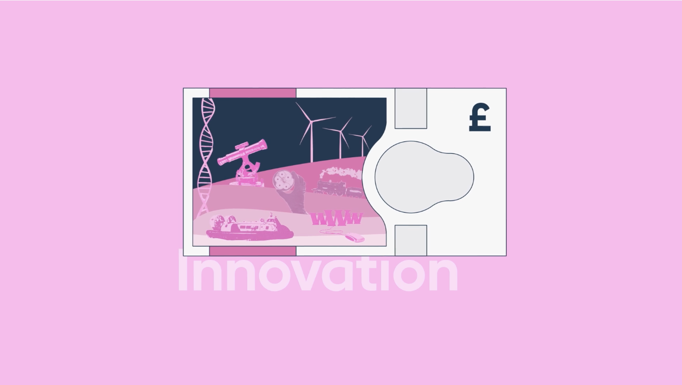
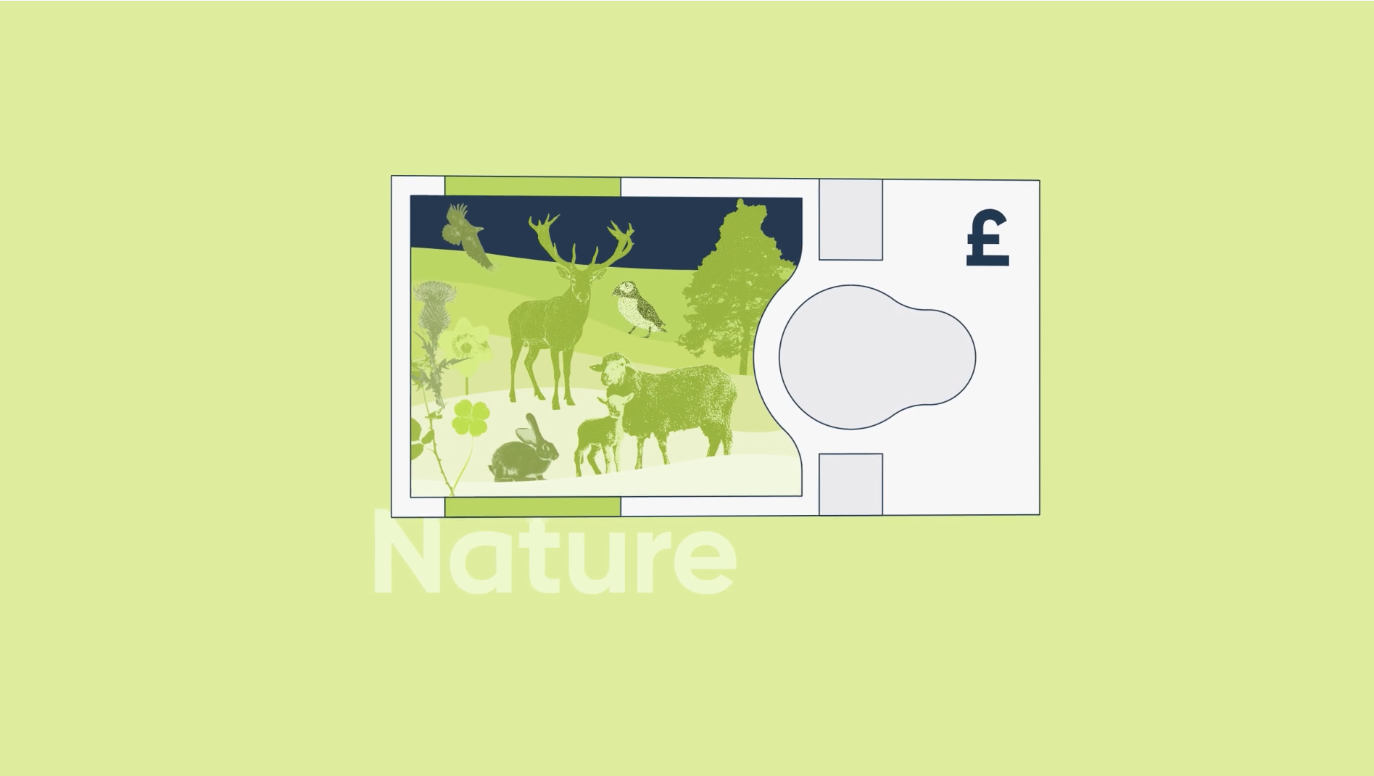
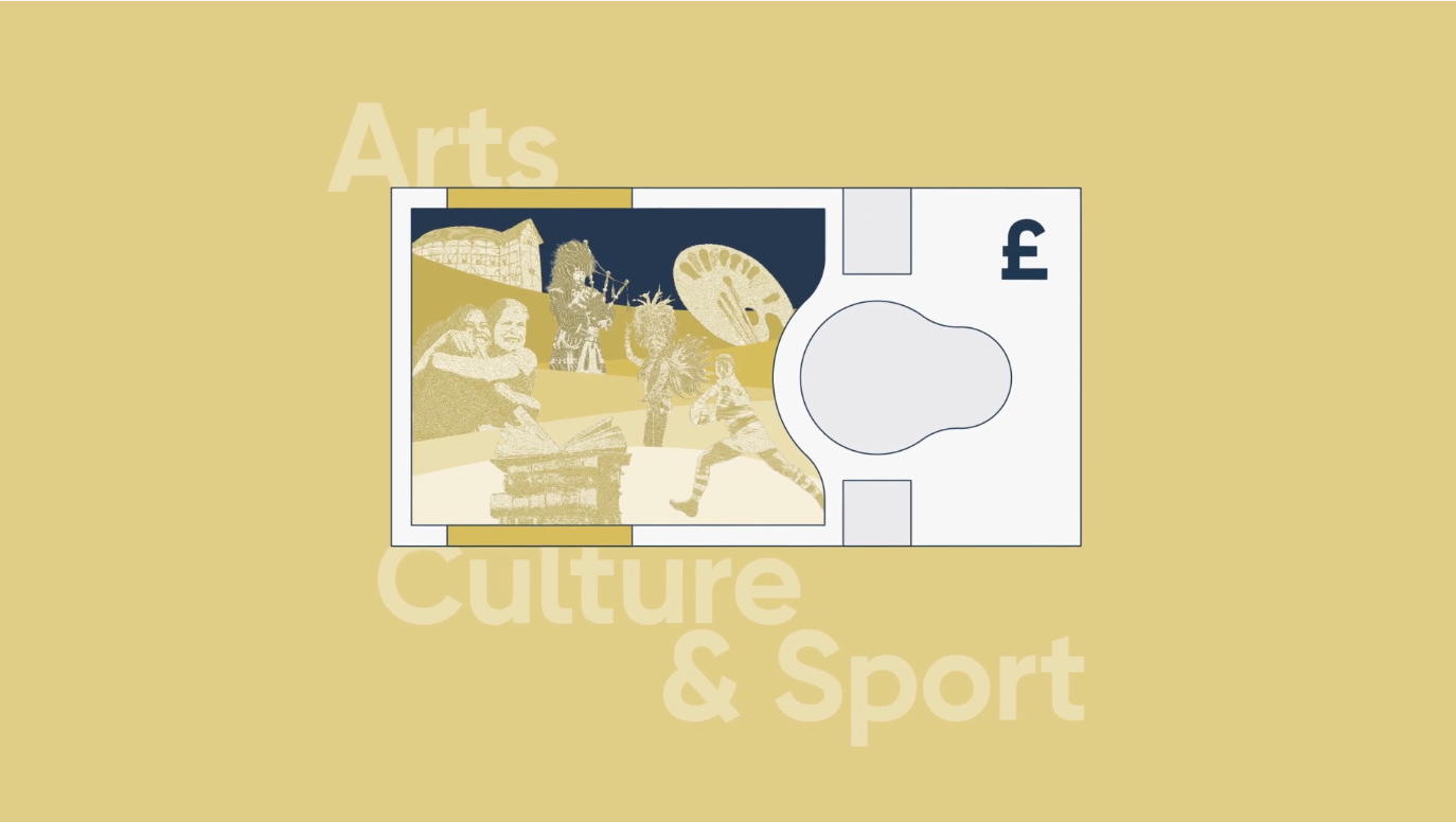
What am I talking about? Well, the Bank of England has launched a public consultation on the next series of banknotes, inviting us all to help choose between six themes: notable historical figures; nature; architecture and landmarks; arts, culture and sport; noteworthy milestones; or innovation. Though we know the best rebrands can be invigorating, this is not one of them.
Article continues below 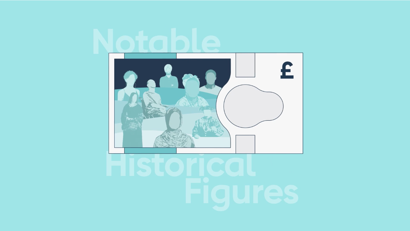
They want us to believe this is democracy in action, that our voices matter in shaping the future of British currency. But to my mind, it feels more like they're asking us to rubber-stamp an expensive vanity project, whilst pretending we have a say in the matter.
This is not, I should add, part of the process of replacing the late Queen's head with that of the King; that already happened a year ago. This is a further redesign that doesn't seem to have any obvious reason driving it.
Nor has the Bank of England put it out to tender to design agencies, to get the freshest ideas and the best all-round value. Instead, it all seems to be happening, again for no obvious reason, in-house.
Security theatre
The Bank's professed justification for this latest redesign is security, claiming they need to "incorporate the latest anti-counterfeiting technology." This sounds terribly important until you realise that the humble American one-dollar bill hasn't been redesigned since 1963.
Sign up to Creative Bloq's daily newsletter, which brings you the latest news and inspiration from the worlds of art, design and technology.
That's right: for over 60 years, the world's most widely used currency has stayed fundamentally unchanged. And somehow the US economy hasn't collapsed under the weight of sophisticated counterfeiters armed with photocopiers.
If the Americans can manage perfectly well with George Washington's decades-old portrait staring back at them, why do we need to spend millions redesigning notes that, by the Bank's own admission, aren't being counterfeited in significant numbers? It all feels like "security theatre" of the highest order.
Human cost
While the Bank pays lip service to accessibility, talking about the "large font and tactile features" of the new notes, they're ignoring the real impact of on the people who rely on cash most – and all the accessible fonts in the world won't help.
Let's be honest: every time banknotes change, elderly people who've spent decades recognising currency by feel and familiarity are forced to relearn everything. The same goes for people with visual impairments, who develop sophisticated techniques for identifying notes that become worthless overnight when designs change.
And the timing couldn't be worse. Just as we're asking families to tighten their belts, the "complex and detailed multi-year process" the Bank describes doesn't come cheap. Design fees, printing costs, public consultation expenses, marketing campaigns – it all adds up. And for what? So we can have a nice picture of Stonehenge instead of Jane Austen?
Meanwhile, the Bank's own research shows that cash usage has declined dramatically over the past decade. If fewer people are using banknotes, why are we spending more money making them prettier? It's like investing in a new sound system for your local Blockbuster.
Democratic fig leaf
Call me a cynic, but the consultation itself feels like a masterclass in managed democracy. The Bank has graciously allowed us to choose between six pre-approved themes, all of which sound like they were focus-grouped to death. "Notable historical figures" – groundbreaking. "Nature" – revolutionary. "Innovation" – how very 2025 of them.
What they won't let us choose is a seventh option: keep the bloody things as they are. That's not on the form, because it would be the overwhelmingly popular choice and would rather defeat the point of the exercise.
None of this feels natural to me. As a regular contributor to Creative Bloq, I'm generally the one sticking up for the government's right to spend a bit of cash redesigning stuff (see, for example, my article Everyone calm down, designers didn't get paid half a million to move a dot). But in this case, I find myself uncomfortably on the side of the naysayers.
Because as far as I see it, the current notes work perfectly well. They're secure, recognisable, and people know how to use them. In a world full of genuine problems requiring urgent attention and scarce resources, redesigning functional currency is the definition of a luxury we can't afford.
And yes, I know it's too late to stop any of this. But next time they get the urge, I'd love the Bank to consider the possibility that the notes are fine as they are. Sometimes, the best innovation is knowing when to leave well enough alone.
To do better, see these tips on brand strategy.

Tom May is an award-winning journalist specialising in art, design, photography and technology. His latest book, The 50 Greatest Designers (Arcturus Publishing), was published this June. He's also author of Great TED Talks: Creativity (Pavilion Books). Tom was previously editor of Professional Photography magazine, associate editor at Creative Bloq, and deputy editor at net magazine.
You must confirm your public display name before commenting
Please logout and then login again, you will then be prompted to enter your display name.
