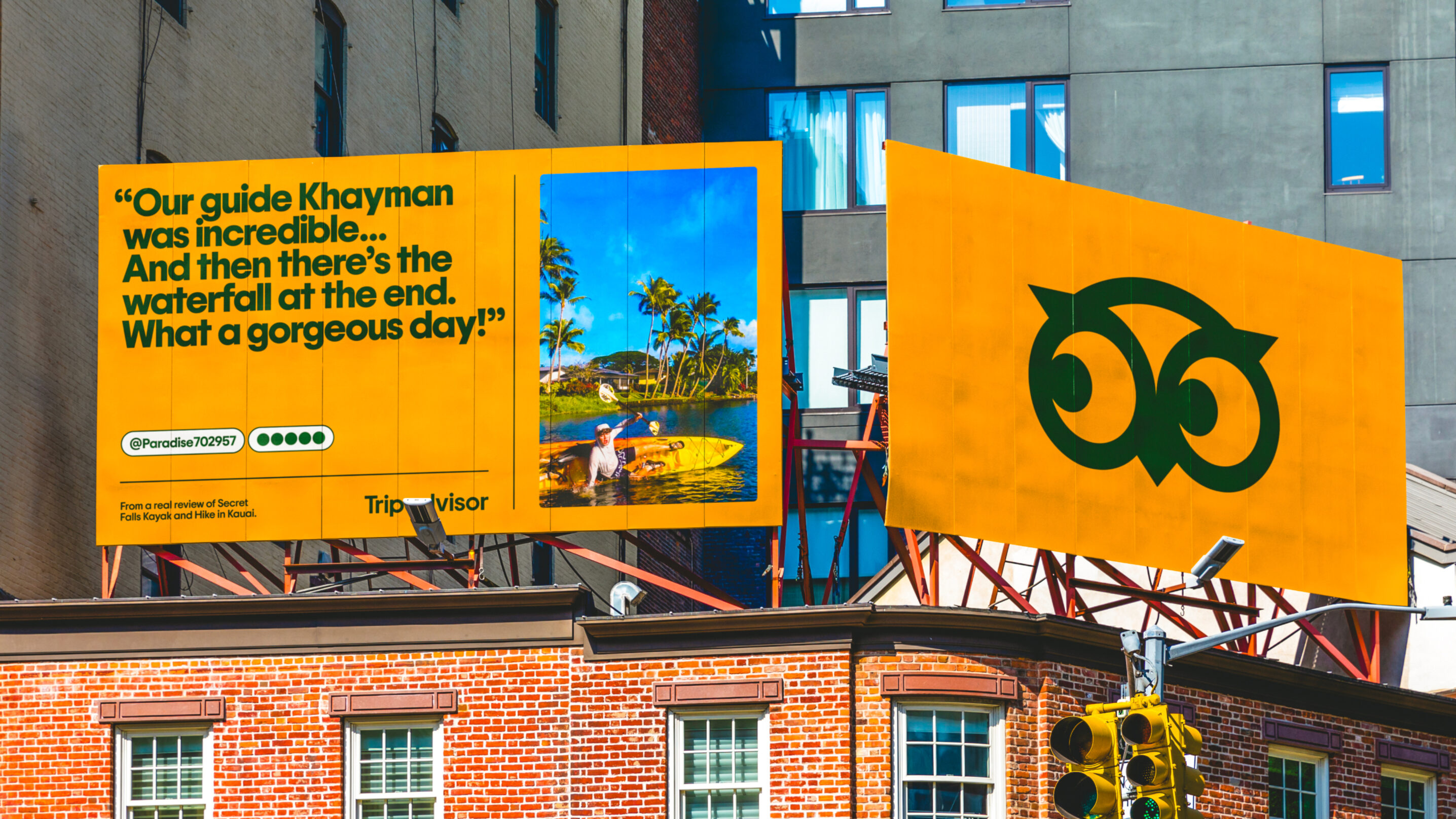
TripAdvisor's new logo reveal just made me spit out my coffee
Perhaps the most 'chronically online' rebrand reveal ever.

Sign up to Creative Bloq's daily newsletter, which brings you the latest news and inspiration from the worlds of art, design and technology.
You are now subscribed
Your newsletter sign-up was successful
Want to add more newsletters?
We've been covering rebrands long enough to know the formula for their announcement. A quote-filled press release is accompanied by some splashy before-and-after animations posted to social media, along with a detailed case study on the creative agency's website for the design nerds (guilty).
The announcement of TripAdvisor's new rebrand, designed by Koto, features most of the above. But the brand has also found a pretty hilarious way to announce the redesign of its owl logo.

"Tripadvisor’s new identity is built to showcase travel as it really is: personal, textured, emotional," Koto announces in said press release. "The logo brings new life to Tripadvisor’s iconic owl mascot, Ollie. Once static and ornamental, Ollie now feels alert and expressive, his gaze always oriented toward traveler content, a quiet cue that Tripadvisor values their perspective."
Article continues belowThe rebrand also features a refined shade of 'TripAdvisor green', which has been "refined to feel warmer and more vibrant. Trip Pine replaces black to add depth and reassurance, while Trip White enhances clarity. The secondary palette is drawn directly from traveler photos to make every layout feel grounded, personal, and real."

So how did TripAdvisor itself announce the new owl? Why, by tapping into the Kardashians' sudden penchant for revealing exactly what surgery they've had undertaken on their faces. Just like the models themselves, TripAdvisor has taken to Instagram to list a series of 'treatments' including rhinoplasty, lip filler and buccal fat removal to explain Ollie the owl's new, fuller face.
A post shared by Tripadvisor (@tripadvisor)
A photo posted by on
While it might fly close to the 'obnoxious brand voice' sun, TripAdvisor's 'chronically online' joke just about gets it right. And hey, as Koto says in its case study, "When was the last time travel looked this fun, this relatable, this real? Lots of brands claim to be “authentic,” but more often than not, it’s just empty talk. With Tripadvisor, authenticity is a promise." Because there's nothing more authentic than buccal fat removal.
Sign up to Creative Bloq's daily newsletter, which brings you the latest news and inspiration from the worlds of art, design and technology.

Daniel John is Design Editor at Creative Bloq. He reports on the worlds of design, branding and lifestyle tech, and has covered several industry events including Milan Design Week, OFFF Barcelona and Adobe Max in Los Angeles. He has interviewed leaders and designers at brands including Apple, Microsoft and Adobe. Daniel's debut book of short stories and poems was published in 2018, and his comedy newsletter is a Substack Bestseller.
You must confirm your public display name before commenting
Please logout and then login again, you will then be prompted to enter your display name.
