
This year has seen a growing trend for subtle rebrands vs big, flashy ones we've seen in years gone by. This has been demonstrated by the new looks for the likes of Amazon, Adobe and Walmart, which have embraced incremental changes and either left the logo alone or tweaked it slightly.
Recently at D&AD Festival, JKR's Lisa Smith and Tosh Hall debated just this subject in a fun, high-energy talk entitled Change Everything, Change Nothing.
I caught up with Lisa after the talk to discuss the trend in more detail as well as talk about some of the most influential rebrands she's worked on, including Walmart, Mozilla and Uber.

Lisa has a career spanning over two decades, where she has become renowned for her transformative work with some of the world's most cherished brands. As executive creative director, global at JKR, her strategic vision has played a pivotal role in the global rebrand efforts for clients such as The Coca-Cola Company, Burger King, Impossible Foods, Nordstrom Rack, Mozilla, and Manischewitz.
Why do you think we are seeing more subtle rebrands now?
There's a lot going on in branding. We were at par with last year with the quantity of rebrands that are being entered into D&AD. And I think with the really big brands, like the Amazons, the Walmarts, the Adobes, their businesses are adapting and changing right now. A lot of them are growing beyond what their core offering is.
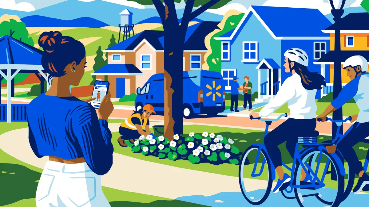
So, take Walmart, which is all about retail, and traditionally you go to the physical store, it’s got the rise of direct to consumer, then you're selling advertising, so there's Walmart Connect. And then you've got all the B2Bs – the fulfilment, the delivery, the logistics. When it rebranded many years ago it was just the core identity. And this is very similar for Amazon, mirrored in slightly different ways.
One's always been core digital, the other has physical retail, but both of them have expanded beyond what their core offering is into other areas, and with that, the brands have sort of fractured. The identity was very limited, I presume, for both in terms of what they were. I would argue that Amazon had even lost its way in colour. It was originally an orange and black brand, but now some of the deliveries are in blue.
So both of them have huge architecture challenges. It was getting them back to what they're great at doing, and then being able to look at the architecture and how they behave across everything they do – whether it's direct, whether it’s B2C or B2B.
Adobe was more surprising to me. I felt its identity was very expressive and represented creativity at the heart of it. And I felt like the [latest Adobe rebrand] was a very corporate, grown up rebrand, and it's very systemised. I didn't see the flex and the expression that I would have expected potentially, but there's probably a very real business challenge that they're probably going through, and that is why the outcome of the work is the way it is.
I'm always like, ‘oh, something's going on here. They're growing. They're expanding into something, and this is the reason that they're reevaluating.’ Because I don't think any of those big brands will go, ‘oh, let's take on refreshing our identity as a novelty’. It is so much investment of time, money, and scale. It's not small even if you're just going through some of the things that feel evolutionary.
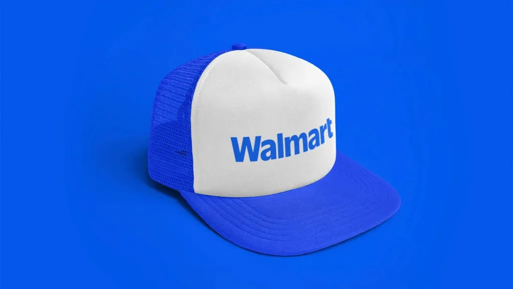
Obviously, Walmart was a blue brand. We've changed that blue. We've grown a huge spectrum of blues. We've grown into a wider palette in order to have more illustration and warmth, because they really started to modernise the stores, which were really exciting, but they felt very almost cold and sterile, missing the kind of warmth and humanity – like they [help people] save money, live better, they care about people, so we had to bring more personality to it as well.

Is it the same amount of work to do a brand refresh versus a big rebrand?
Yeah, they're both the same. Again, from judging and looking at other projects that I've seen here this week, like the Olympics or something like that, these are all humongous undertakings, and they take a big in-house team and collaboration with many other partners, whether it's their advertising agencies or their experiential agencies.
It's a big thing to undergo any kind of change within something like a Walmart. Equally, I work on all spectrums, and so when I think about maybe more mid-sized ones like Mozilla, for example… what's interesting about Mozilla's culture is that they're from the grassroots, they're not top down. So there's a lot of opinions. There's a lot of people that you take on the journey. There's a lot of people that are like, ‘this is the way we have always done it’. And you're like, ‘Oh, this might be getting in our way’....
Obviously doing the creative work is just one part of the job. It's actually how you get it through, in partnership with whoever's leading within the brand. [Some rebrands] can still take a while, but you can also do some really fast. Years ago, Chobani we did in eight months. I think I did Zocdoc in 12 weeks. What I've done so far depends on what the structure of the organisation is, and who's endorsing it, who's leading it, who's championing it, essentially.

What about when you can’t change a logo?
When we embark on a rebrand, we look at what their equities and assets are at that point and sometimes we do testing, sometimes you just know. Take Budweiser, yes we did modernise that when we did that many years ago, but you're not going to get rid of something that's so deeply rooted in the heritage that represents the essence of what that brand stands for.
I think when we did Uber, Uber had had one sort of misfire rebrand that had not gone so well. Wolf Ollins were amazing, and got it back on track… But I think the design system had run its course.
[We have to say], okay, what is working and what isn't and what's not helping you communicate what you need to do? And with Uber, the brand had completely changed in the pandemic. They went from being a rides brand… and they've become a delivery company during a pandemic, where you could deliver anything – that was the idea underneath.
And the rise of Uber Eats almost started to equal what was traditionally their rides side of the business. And then it was like, actually, you can get anything. I can have stuff delivered from the pharmacy. I can have food delivered. I can get stuff from anywhere. And so we needed to also re-look at the architecture and sort of disseminate what their colour palette is.
For the first time ever, we gave them a core master brand. When they sign up drivers and partners, it is white with black type, but then when it switches to rides, it's black, and then on white, because that is famously what everyone knows. So we kept that, and then we started to introduce the green for Eat.
We've given them a portfolio if they start to go into freight and beyond, which they're going to go into as their business continues to grow. So it's creating architectures and systems. That was the brief, really, around the architecture and the system, and how does the identity fix and flex? And there was no issue with the logo.

When we got underneath of the design system, where they were originally using the ‘U’ from Uber, we were like, ‘what’? There was just such a nugget. And it was one of our designers who just had one of those ‘aha’ moments: ‘they've always been about the circle, line and the square’, and then we lifted that out.
And I think what's been amazing – seeing it across all the airports, everywhere I've been traveling – these big campaigns with the circle lines and squares filled with photography. Very much how we intended.
But then I've been loving seeing how Mother Design picked that up and took it from there into finding the circle line and square in all kinds of delightful moments, the spill on a shirt, the sculpture butt line, and all of those different things.
But isn't that the beauty? When you see the distinctive assets and the idea and the system that you set out start to translate into all the communications, and seeing it work for all the agency partners is just amazing. It's really satisfying.
We didn't touch the logo and really the colours, we just reprioritised them. So every job is slightly different, but if the logo communicates what they do, and it's not going to get in the way of the vision of where they want to go – whether that's reappraisal or relevancy – then I don't see a reason to change it.
I love change. I'm very good with ambiguity and change, but I would not do anything reckless. To do a logo change is not only a big investment, but it's more investment in terms of telling the story.
You would never get rid of The Spark. We actually asked consumers, what do they think of when they think of Walmart and they drew the spark. Now they might not have the right number of sparklets... but in digital times, having a shorthand that people remember… to then go and create a new one and then to see a backlash on, ‘maybe you didn't change it enough’.
What would you have done? I mean, people say, Oh, you made the type bolder, and it's a completely different typeface. Probably my mum couldn't spot that either. So we'll just move on.

Congratulations on winning the Best of Show at the Brand Impact Awards for your RSPCA project. What do you think makes that project stand out?
Obviously it's a beloved British icon brand, but I think it was done really respectfully. That is a great example of where everything pretty much changed. I know it's a dotted line to blue, but it's a very different pigment of blue. So you could call that the evolution. But everything else. I mean, all the character illustrations of the animals, how we partnered and collaborated with the whole of the organisation through that change… It's very special.

Why do you think design awards are important in general?
Hopefully this doesn't come across as, like my ego, but I think it is nice to see teams’ work get validated by other peers. Every award has their own take on different criteria. But I think we're filling judges rooms with all age groups, people from everywhere, getting to hear different kinds of points of view around work is really great. And so I know we've been trying to capture loads of insights out of D&AD. It's so inspiring.
Every year my colleague says to me, ‘you don't need to judge as many awards. You should give them to the younger ones.’ And I always do. But I always want to do at least one if someone asks me, because when I get to see that year's work, I just feel so inspired, and it raises the bar for the work that I want to do.
Find out more about JKR and D&AD Festival.

Have you created some standout branding? Enter the Brand Impact Awards today.

