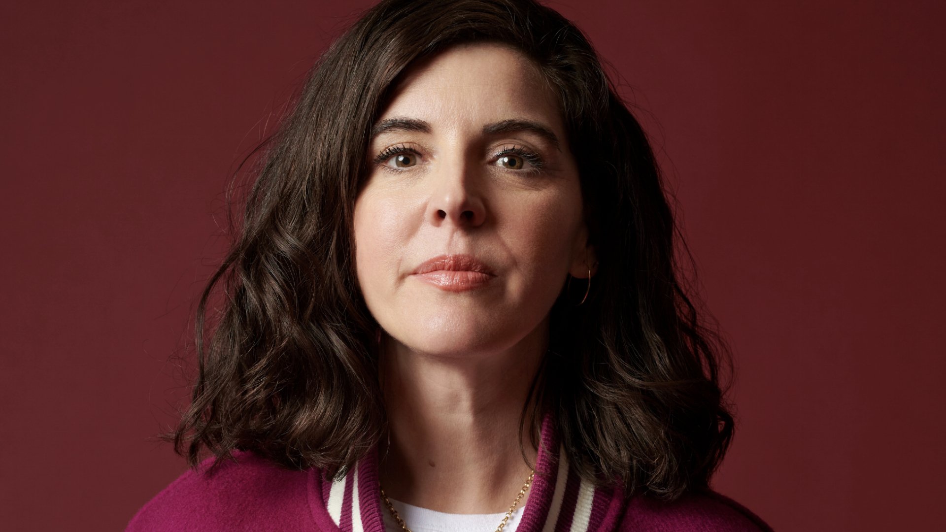
"I see a lot of imitators out there," JKR's Lisa Smith on today's brand challenges
We chat about award-winning rebrands for The Met, USA Today and Burger King.

Sign up to Creative Bloq's daily newsletter, which brings you the latest news and inspiration from the worlds of art, design and technology.
You are now subscribed
Your newsletter sign-up was successful
Want to add more newsletters?
I recently met JKR's executive creative director Lisa Smith at D&AD Festival and enjoyed a fascinating chat with her about all things brand. You can read the first parts of our chat about the D&AD branding as well as when you should or shouldn't change a logo.
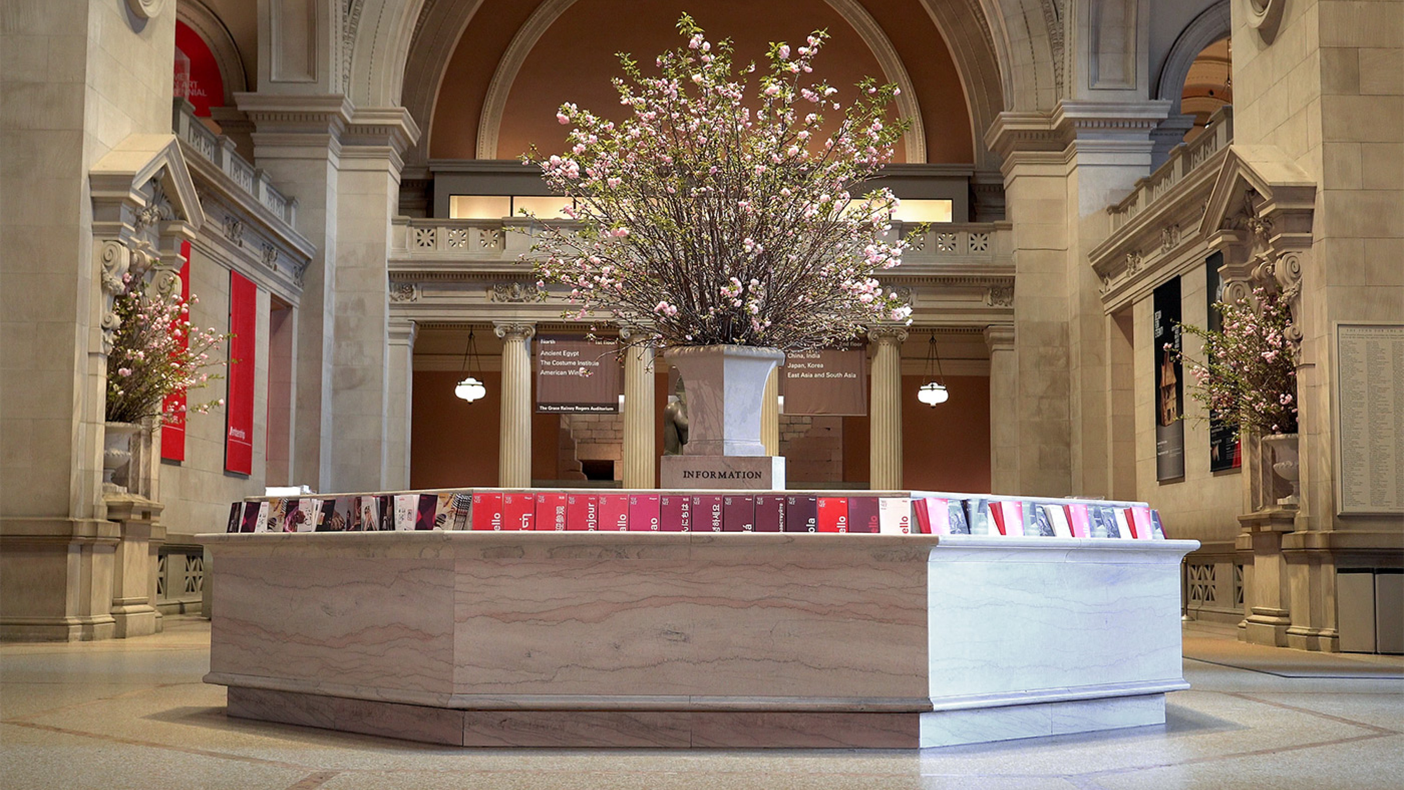
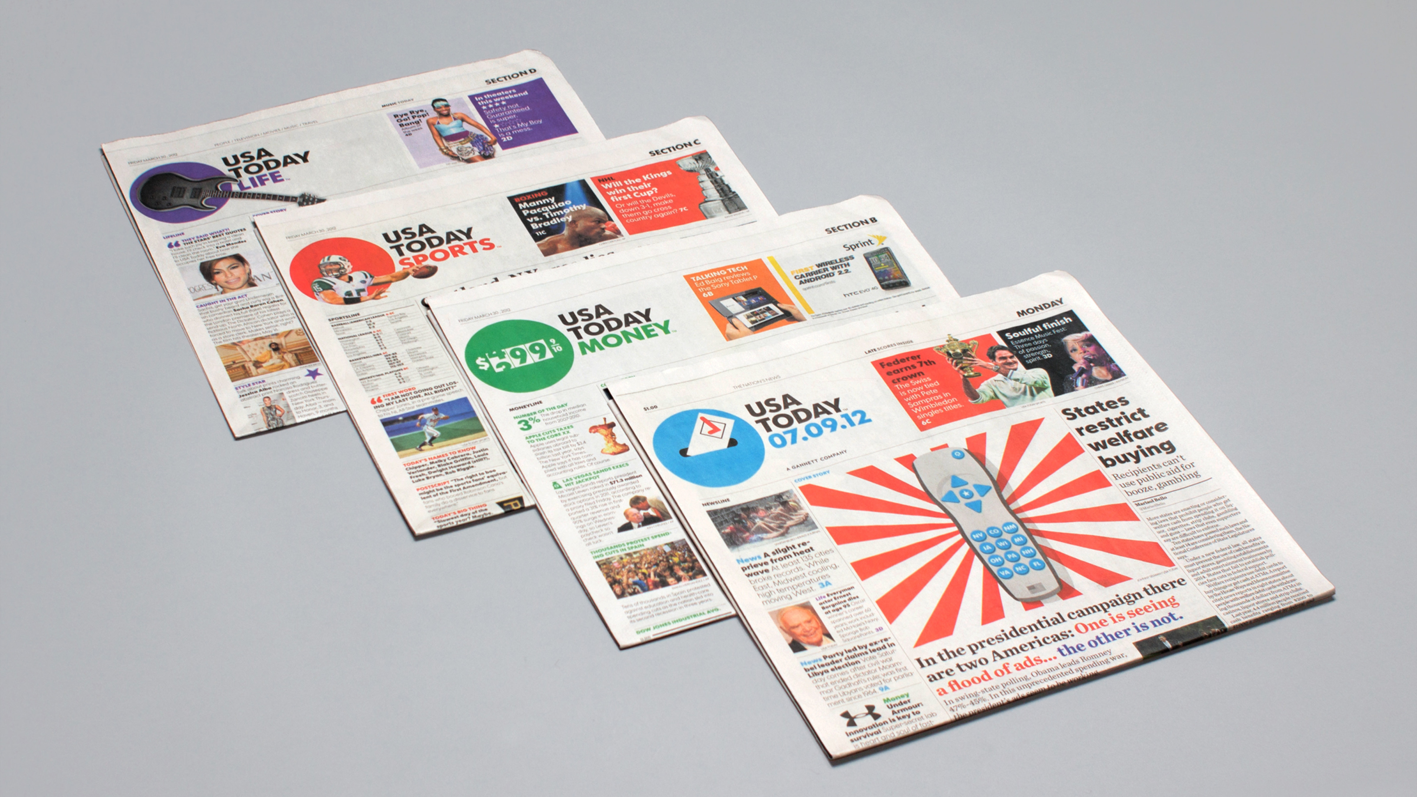
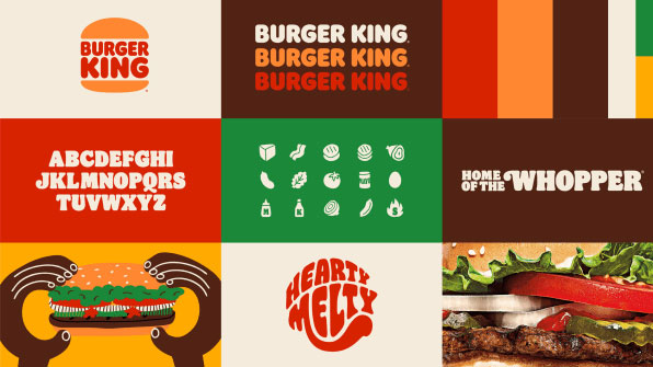
Below, we discuss the branding challenges brands are facing in 2025 as well as some of Lisa's most celebrated work, including award-winning rebrands for The Met, USA Today and Burger King.

Lisa has a career spanning over two decades, where she has become renowned for her transformative work with some of the world's most cherished brands. As executive creative director, global at JKR, her strategic vision has played a pivotal role in the global rebrand efforts for clients such as The Coca-Cola Company, Burger King, Impossible Foods, Nordstrom Rack, Mozilla, and Manischewitz.

What challenges do you think branding is facing today?
A lot of people are embarking on brand identities without really just getting to the true essence of what the brand is. I see a lot of imitators out there. I think blanding is one issue which was born more of tech… kind of like the difference of going from Flash to HTML and everything suddenly got very stripped away in digital design. And that's changing.
I think Brian from Airbnb was famously quoted recently saying that flat design is over, and I feel like we are getting back to much more expressive brand identities. I saw that also during the pandemic, everybody stripping all the character. It started in tech, then went to fashion, then went to products, and even to physical coffee shops, all looking the same. Every design area got affected by literally mimicking stuff.
Post pandemic, brands have got much more expressive, which is very exciting, but that doesn't mean they all got expressive, and should all use bright colours and quirky typefaces and all look the same. But still, 85% of the work I would say I saw this week at D&AD was people following very similar design codes and trends; obviously looking at the same references and doing exactly that.
So whilst all these clients are being really brave on embarking on rebrands, they need to take stock. Is this truly representing who we are and what we stand for? We often talk about the analogy of a mirror at JKR and that we are the mirror holding it up to the brand to reflect back who they are on their best day, at the core essence of them. That should be following no design trend whatsoever. It should be what's right and fit for them.
I think Chobani was a great example, because I'd never seen a brand mimicked as fast. And it made the founder really nervous. They were like, ‘do we need to change because everyone's starting to look like us’? I was like, ‘hold your horses. This is the right expression of who you are and what you stand for.’ All those imitators, they don't even exist anymore.

And what tips would you give to people who want to stand out?
They gotta have, in truth, an idea at the core of who they are. Let’s take The Met: life to art, art to life. That's about the connections of art history over time, over 10,000 years. It wasn't about one moment in time. Hence, we changed the logo, which had a Leonardo man symbol that was only about one point in time, versus all of those.
USA Today was pulse of the nation. Mozilla: reclaim the internet. Burger King: be as crave-able as the food. People didn't feel good about eating Burger King. They started to remove all the artificial ingredients from the food. They started with the Whopper. They wanted to then put just claims on it. We're like, ‘I don't think claims are going to cut it’.

And then you've got like, actually, it's your brand that feels really artificial and bad. First, it's inconsistent, it's broken. The physical experience doesn't feel like the digital, doesn't feel like the packaging. And then you have this shiny, glossy, flashy logo that feels about the most artificial it could do.
Article continues belowWe need to get it back to being as crave-able. Once we had that idea of crave-ability, it ran through every single thing: juicy, delicious type, photography that literally makes your mouth water, colours that make you want to celebrate. It's having an idea at the heart of what you stand for. It isn't as easy as it sounds.
Find out more about JKR and D&AD.
Have you created some standout branding like JKR? Enter the Brand Impact Awards.
Sign up to Creative Bloq's daily newsletter, which brings you the latest news and inspiration from the worlds of art, design and technology.

Rosie Hilder is Creative Bloq's Deputy Editor. After beginning her career in journalism in Argentina – where she worked as Deputy Editor of Time Out Buenos Aires – she moved back to the UK and joined Future Plc in 2016. Since then, she's worked as Operations Editor on magazines including Computer Arts, 3D World and Paint & Draw and Mac|Life. In 2018, she joined Creative Bloq, where she now assists with the daily management of the site, including growing the site's reach, getting involved in events, such as judging the Brand Impact Awards, and helping make sure our content serves the reader as best it can.
You must confirm your public display name before commenting
Please logout and then login again, you will then be prompted to enter your display name.
