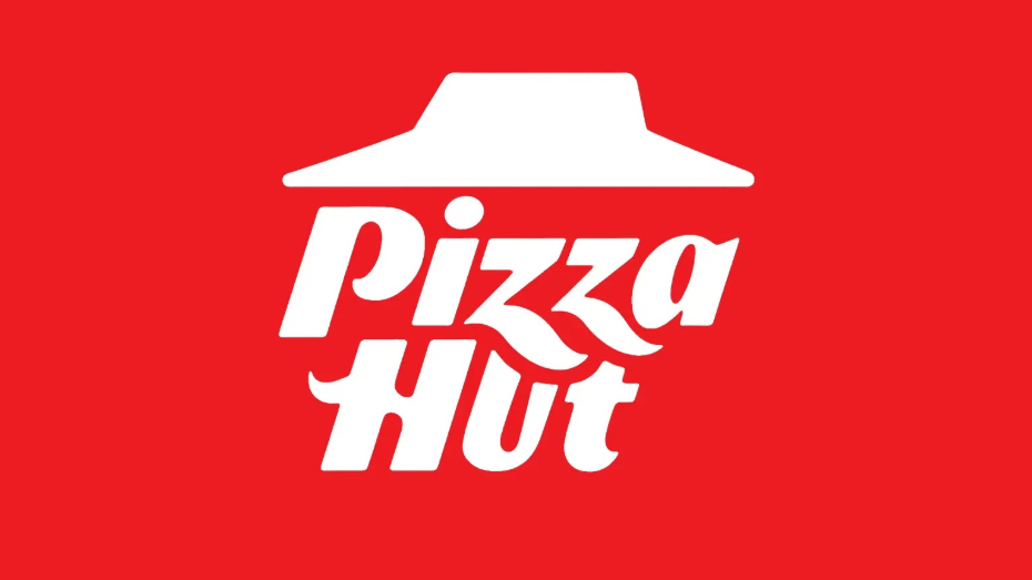
Pizza Hut's new logo is baked to perfection
It's got just the right amount of nostalgia.

Sign up to Creative Bloq's daily newsletter, which brings you the latest news and inspiration from the worlds of art, design and technology.
You are now subscribed
Your newsletter sign-up was successful
Want to add more newsletters?
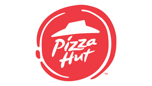
Restaurant chain Pizza Hut has announced a new logo design for its branches in the UK, Canada and some other markets. The new look moves away from the round background (below) – presumably meant to evoke a pizza – and has echoes of an older design originally introduced in the 1970s, which is still used in the US today.
The refreshed brand retains the iconic 'hut' element of the design, and, like some previous versions, uses an italicised fonts. It also has jaunty flourishes on the 'z' and the 'h'. With the nod to older logos, it seems the designers have read our why brands need to respect their heritage piece.

The Pizza Hut logo has had various iterations throughout the years, which have contained some version of the red roof since the 1970s.
Article continues belowAs mentioned, the new logo is similar to the current US version (below), which has been in use since 2019 and was also in use previously in the 70s-90s. Some might wonder why Pizza Hut chose not to bring all territories' logos in line with each other and switch everyone to the US logo, but I for one am glad they didn't.
While some might say the 'z' now obscures the view of the 'u', making it look like an 'o', I think that brand recognition is strong enough here for this not to matter.

The new logo stands out amongst a sea of similar-looking logos thanks to the use of italics and the fun lettering. It also feels contemporary, and will work well online and at small sizes.
By making the logo reminiscent of the 90s logo, Pizza Hut is tapping into nostalgia, and let's not forget that for many this will be a nostalgic brand anyway.
Sign up to Creative Bloq's daily newsletter, which brings you the latest news and inspiration from the worlds of art, design and technology.
Whether or not that will be enough to bring people flocking back to a brand many associate with the 90s remains to be seen. I hear they still offer unlimited ice cream though.
What do you think of the new look? Let us know with the poll below/in the comments.

Rosie Hilder is Creative Bloq's Deputy Editor. After beginning her career in journalism in Argentina – where she worked as Deputy Editor of Time Out Buenos Aires – she moved back to the UK and joined Future Plc in 2016. Since then, she's worked as Operations Editor on magazines including Computer Arts, 3D World and Paint & Draw and Mac|Life. In 2018, she joined Creative Bloq, where she now assists with the daily management of the site, including growing the site's reach, getting involved in events, such as judging the Brand Impact Awards, and helping make sure our content serves the reader as best it can.
You must confirm your public display name before commenting
Please logout and then login again, you will then be prompted to enter your display name.
