The most controversial rebrands and logo redesigns of 2025
Sign up to Creative Bloq's daily newsletter, which brings you the latest news and inspiration from the worlds of art, design and technology.
You are now subscribed
Your newsletter sign-up was successful
Want to add more newsletters?
As noted in Tom May's recent recap of the year in branding, 2025 was a dangerous time to refresh an identity or roll out a logo redesign. Everyone has an opinion on design these days, and social media amplifies the loudest of these.
The result is that even the most routine rebrand can become a controversy. If it's a subtle refresh, people will say it wasn't bold enough and was a waste of money. Go too bold, and you'll be accused of ruining the brand or of being 'woke' simply for opting for a minimalist wordmark.
Most brands try to ignore the initial backlash, trusting that if the design decisions were right, the target audience will come to accept the change. But there were signs this year that some were starting to doubt their own judgment and to listen to the crowd. Cracker Barrel backtracked on its controversial logo redesign, and McDonald's pulled its heavily criticised AI-generated Christmas ad.
Article continues belowWith that in mind, here are the rebrands and logo redesigns of 2025 that generated even more controversy than most.
The most controversial rebrands of 2025
01. Cracker Barrel
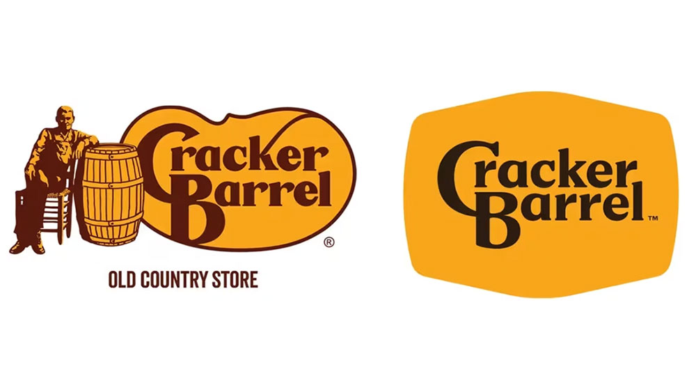
The Cracker Barrel logo controversy was easily the most controversial rebrand of 2025 in terms of the sheer volume of media stories and social media comments generated, and it barely lasted more than a week. The brand was taken aback by the storm, having never imagined that removing an image of an old man from its logo design would cause such a scandal.
Who could blame it? On the face of it, the move was a modern brand update no different from hundreds of others. The new logotype remained recognisable but was simpler and less fussy.
But the internet is a strange place these days. Even president Donald Trump joined the pile-on demanding to know “WTF is wrong with Cracker Barrel”. Within days, the rebrand was scrapped. Perhaps if today's climate had existed in 1976, even the Apple logo would also still look like something that was carved in wood in the 19th century.
Sign up to Creative Bloq's daily newsletter, which brings you the latest news and inspiration from the worlds of art, design and technology.
02. MSNBC and CNBC
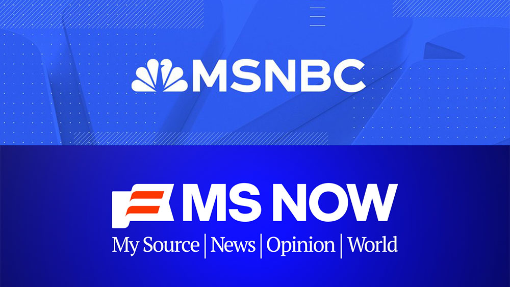
While Cracker Barrel's new logo was divisive, some controversial 2025 rebrands were almost unanimously roasted. NBCUniversal's upcoming spin off of its traditional cable networks into a new company called Versant claimed two major branding victims.
First, MSNBC became MS NOW. The new name supposedly stands for My Source News Opinion World but reeks of a being a backronym. People quickly came up with other interpretations – “Most Surely No One Watching,” one person suggested, while others weren't sure how to pronounce the name. Even more strangely, why does the logo feature the Austrian flag?
Then there was the new CNBC logo. This network gets to keep its name but can no longer use the famous NBC peacock logo. The solution was to look back to the past. The new design features a fused N and B as a reference to the original CNBC logo from 1989.
The blue upward arrow between the letters is intended to reflect the 'square motion theory' of the network’s on-air design language and to represent expertise in financial news, but, again, some viewers had other interpretations.
“Looks like a sinking ship with a blue sail, and the little cleft between the N and B provides extra emphasis of the ship sinking,” a designer wrote on Reddit.
03. HBO MAX
Sticking with TV networks, the saga of the HBO rebrand was one of the most chaotic of the past couple of years. First, the name changed to Max. Then it was Max with an HBO-inspired logo, and then Max with an even more HBO-inspired logo.
Finally, the brand went full-circle and became HBO Max again. It tried to brush the emotional whiplash under the carpet pretending it was all a joke – something like when Duo the Duolingo Owl faked his own death. But, despite the attempts at humorous deflection, augmented by X's refusal to give the brand its username back, the shambles suggested a brand with an identity crisis.
04. PepsiCo
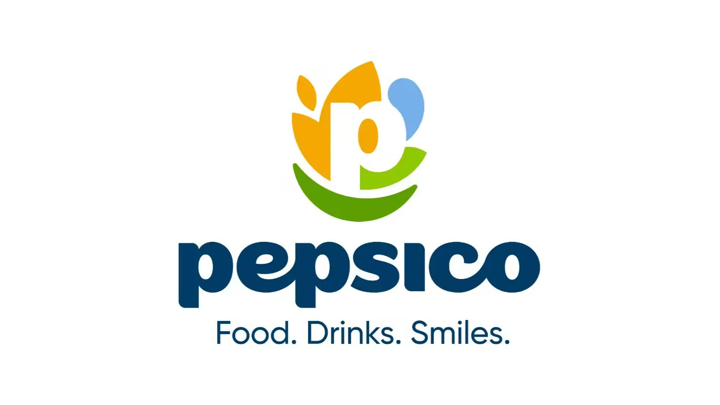
The new PepsiCo logo was one of those branding exercises that made perfect corporate sense but which confused people on the street. PepsiCo is home to over 500 brands, including Gatorade, Quaker and Siete, but most people associate it with cola.
The new design includes a yellow shape representing food and grains, showing the group's connection to agriculture, a blue shape for drinks or water and a green leaflike form that is supposed to represent “winning with pep+”, whatever that means (we know from that infamous Pepsi design document that the group likes to imbue its branding with profound meaning).
The intention was to differentiate the group identity from the cola, which is just a part of its business, but it's 2025, so some accused Pepsi of dropping the colours of the US flag for a more global identity. Others suggested the new logo had a generic feel and a “startup aesthetic” unfitting for a global consumer powerhouse.
05. Texas Tech
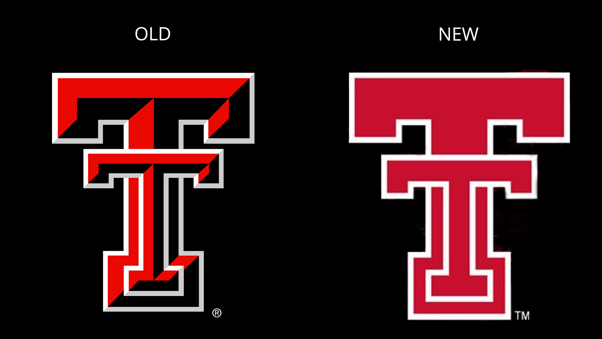
It would be impossible to make a roundup of controversial logo redesigns and not mention a sports logo. Even the best sports logos are divisive, and Texas Tech's new logo sparked a particularly heated response.
While the university described the new identity as a modernisation, some saw the stripped-back flat design as a disappointing and overly simplistic downgrade. “That logo is like buying a base model Sedan with no window tint and no power windows,” one person reckoned.
06. Range Rover
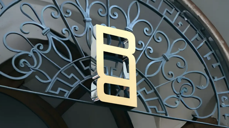
Range Rover's new logo, the first in the brand's 55 year history, formed part of the most controversial rebrand in motoring since Jaguar's a year earlier. Part of JLR, the brand intended to retain a connection to its heritage, but some thought the monogram logo of toe-to-toe Rs more fitting for a fashion or jewellery brand than a carmarker.
Brand design chief Will Verity told Design Week that the new look was designed to highlight that Range Rover, which launched in 1970, was the "first automotive brand to combine utility and luxury". The logo does look like a belt buckle, though.
07. Great British Railways
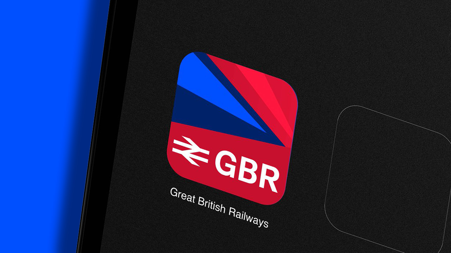
This wasn't so much a rebrand as a brand launch. British Rail ceased to exist when it was privatised in 1997. Great British Railways represents the hope of a milestone transition back towards a nationalised rail system, but the response to the launch of the visual identity was curiously hostile.
While Pepsi was accused of being un-American by not using the colours of the US flag, Great British Railway was accused of being 'un-British' because of its overuse of the union flag, which some deemed to be “brash” and “inelegant”.
“Loud, in your face, distracting; this isn't a British design language but American – doesn't belong anywhere near our timeless classic double arrow logo,” one person argued.
“Leaning in on the flag this heavily comes across as weak to me, as if the designers couldn’t come up with a design strong enough to stand on its own. People still talk about the boldness of the British Rail redesign decades later – I doubt this design will last nearly as long,” someone else wrote.
For the record, Great British Railways will use the iconic British Rail logo, the controversy concerns the broader brand system, which makes heavy use of the red and blue for livery and digital brand assets.
08. The Trump Kennedy Center for Performing Arts
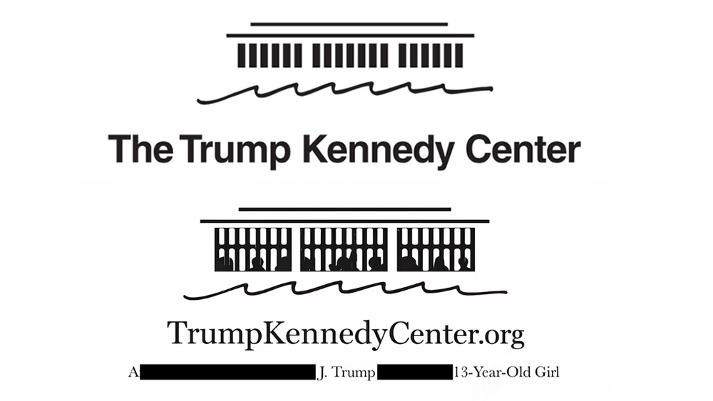
Finally, a late contender for the most controversial rebrand of 2025 was the renaming of the Kennedy Center as the Trump and Kennedy Center. The institution was founded in 1964 as a memorial to JFK after his assassination, but the new board, which Donald Trump chairs, voted to add the current POTUS's name.
It's unusual, ominous even, for a sitting president to have a memorial, and yet a day after the name change was announced, the signage on the building's facade in Washington DC was changed to read 'The Donald J Trump and the John F Kennedy Memorial Center for Performing Arts'.
Some artists have already cancelled concerts at the venue following the narcissistic rebrand. Doug Varone and Dancers pulled two shows scheduled for April stating, "we can no longer permit ourselves nor ask our audiences to step inside this once great institution."
To add to the troubles, a satirist predicted the name change months in advance and snapped up the web domain trumpkennedycenter.org before the institution could. He's launched a parody site, complete with a caustic redesign of the official logo.
These were the rebrands of 2025 that generated the most controversy and debate, but the year saw plenty of great branding and logo designs that generated fewer headlines. See our roundup of the biggest logo moments of the year, where we recap some of the design wins.
You might also want to check out the winners of our own Brand Impact Awards 2025, our annual celebration of the best branding in the world.

Joe is a regular freelance journalist and editor at Creative Bloq. He writes news, features and buying guides and keeps track of the best equipment and software for creatives, from video editing programs to monitors and accessories. A veteran news writer and photographer, he now works as a project manager at the London and Buenos Aires-based design, production and branding agency Hermana Creatives. There he manages a team of designers, photographers and video editors who specialise in producing visual content and design assets for the hospitality sector. He also dances Argentine tango.
You must confirm your public display name before commenting
Please logout and then login again, you will then be prompted to enter your display name.
