
We are delighted to reveal the full winners of the Brand Impact Awards 2025, after the celebration event where the Best of Show and Social Impact awards were presented. This year we had a record number of entries – over 220 – and our esteemed judging panel whittled it down to just 67 projects. Of those 67 projects, several received multiple awards.
We're proud to announce a total of nine Gold Awards, 37 Silver Awards and 37 Bronze Awards as well as Best of Show and the Social Impact Award. Our global judging panel rated the entries independently across three weeks before coming together to debate the projects in small specialist panels across a further two weeks.
Thanks once more to our sponsors, Frontify (Craft categories) and ASUS ProArt (Illustration category).
All our winners have received (or will receive) one of our striking 2025 edition Mallet trophies.
Best of Show
Out of the 83 winning projects, only the nine Gold entries were shortlisted for Best of Show. Our judges deliberated to name the project that stood above the rest.
Centersquare by Jones Knowles Ritchie


Following the merger of Evoque and Cyxtera, Centersquare rebranded to redefine what a data brand could be. Moving away from cold, corporate visuals, the new identity centres on “Infinite Flexibility. Absolute Certainty.” to express both stability and adaptability. A dynamic logo, architectural typography, warm colour palette, and custom iconography transform technical infrastructure into an elegant, artistic system.
Who knew data solutions could look so epic?
Jessica Bong-Woon, Ragged Edge
This distinctive visual language set Centersquare apart in a conservative industry, earning critical recognition and reshaping engagement. The design not only unified internal teams under a shared vision but also built trust with customers, humanising a traditionally technical field.
Social Impact
The Social Impact Award has been running since the beginning of the Brand Impact Awards, and recognises the meaningful difference a campaign can make.
We are Warriors: Take the Crown by R/GA


Following the defeat of the 2023 Voice referendum, which aimed to give Indigenous Australians a stronger political voice, many Indigenous communities were left disheartened. In response, R/GA launched Take the Crown, a bold initiative designed to reignite national dialogue around colonial power, counter public disengagement, and amplify Indigenous rights in a way that resonated widely.
The rage was palpable
Cat How, How & How
A graffiti artist created a striking crown emblem, while music, dance, art, storytelling, panel discussions, and the premiere of a new We Are Warriors film celebrated Blak excellence. A throne crafted from gilded colonial-style frames symbolically reversed history. The campaign drew over 14,000 attendees and gained backing from Adobe, JD Sports, and TikTok.
Gold Awards
In alphabetical order, the following projects received at least one Gold trophy at the Brand Impact Awards 2025.
Alta / A Human Atlas of a City of Angels by Studio Sutherl& LYON


- Gold Award: Publishing
Alta: A Human Atlas of a City of Angels is a multidisciplinary exploration of social change in 21st-century Los Angeles by Studio Sutherl& LYON , combining art, science and storytelling across book, exhibition, podcast and digital platforms.
Brilliantly executed all the way through: the infographics, the elegant type setting, the smart logo and even the name of the event/book
Muriel Schildknecht, Lonsdale Design
Created in collaboration with the Getty Conservation Institute for Pacific Standard Time, Alta profiles 100 individuals through portraits, oral histories, and ancestral DNA. The design system embraced duality, using colour and form to connect personal identity with collective humanity. Infographics visualised over 2,000 datapoints with sensitivity and clarity. The adaptable visual identity reflected LA’s geography, avoiding regional clichés. Broad media coverage amplified its cultural and social impact citywide.
Centersquare by Jones Knowles Ritchie
- Gold Award: Technology & Telecoms
Following the merger of Evoque and Cyxtera, the newly formed Centersquare redefined what a data centre brand could be. Rather than competing on commoditised features, the new positioning focused on long-term partnership built on the promise of 'Infinite Flexibility. Absolute Certainty'.
Such a simple logo and idea that was expanded in a really interesting way (taking the square spinning it, using the different angles to build off for iconography and visuals)
Jess Marie, Bulletproof
This duality shaped the brand identity crafted by Jones Knowles Ritchie – from the name itself to a visual system that transforms technical infrastructure into dynamic, architectural design. Typography, warm colour palettes and isometric illustrations replaced cold, corporate norms, bringing sophistication and humanity to the category. The result: industry acclaim, internal unity, and a brand that customers see not just as a service, but as a safeguard for the future.
Endura by Reed Words and Pentland Brands


- Gold Award: Copywriting
Endura, the irreverent Scottish cycling brand, needed a verbal identity to match its bold new look, and Reed Words and Pentland Brands delivered.
The way they've captured Scottish colloquialisms and turned that into a replicable tone of voice is genius – and takes a lot of care and work to get right
Eva Munday, The Clearing
Ditching the macho clichés and fashion-parade posturing, the new tone of voice channels pure, muddy joy – speaking with blunt honesty, maverick spirit and a playful Scottish edge.
Drawing from local dialect and a unique 'McLexicon', the voice celebrates grit, humour, and the thrill of the ride without slipping into caricature. The impact? A clear brand distinction in a crowded market, with over 58 per cent revenue growth, a 26 per cent lift in average selling price, and a 31 per cent higher checkout completion rate – proving that personality drives both loyalty and conversion.
Forest Carbon: In Tune with Nature by Design Bridge and Partners


- Gold Award: Experiential, Professional Services
Forest Carbon’s rebrand by Design Bridge and Partners transforms it from a carbon credit issuer into a science-led steward of ecosystem restoration.
The consideration given to different applications, including textiles, paper and digital surfaces, made the design system feel thoughtful and comprehensive
Jacquelyn Iyamah, Making the Body a Home
At its core is a powerful idea: sound reflects forest health. Using real wildlife recordings from Indonesian wetlands, the team created generative visual assets – Chladni-inspired pattern – making biodiversity literally visible.
A flowing logotype, musical typography, and vibrant, regionally inspired palette connect science with emotion. The system scales from field kits to investor decks, building credibility and resonance. In a saturated sector, the identity stands apart – grounded in data, but designed to inspire. Already, it’s helped secure investment and strengthened Forest Carbon’s mission to restore one million hectares.
Heinz: Love Letters by Jones Knowles Ritchie and Studio DRAMA


- Gold Award: Typography
For the first time in its 150-year history, Heinz introduced a custom global typeface system to unify its brand across over 200 markets – created by Jones Knowles Ritchie and Studio DRAMA.
This type system truly honours and celebrates Heinz’s rich heritage, turning the brand’s iconic character into a unified and authentic typographic voice
Pete Gaskell, Dalziel and Pow
Previously fragmented by over 30 legacy fonts, the brand needed a typographic identity that honoured its iconic heritage while enabling global consistency. Drawing from archival assets and the geometry of the Heinz wordmark, the team created Heinz Label for headlines and Heinz Sans for functional use.
The result is a timeless, adaptable system that reinforces brand recognition across packaging, communications, and merchandise. It has improved legibility, reduced complexity, and eliminated licensing costs – making every word unmistakably Heinz.
Lloyds: A Next Step Forward by Wolff Olins
- Gold Award: Financial Services
Lloyds faced a pivotal moment in a shifting UK banking landscape, where trust had eroded and digital challengers were rising. To stay relevant, it launched a brand-led digital transformation rooted in its long-standing purpose: helping Britain prosper.
The Lloyds work did a great job of feeling contemporary, but not losing who they are as a brand. It also felt very personal and full of character
Martin Homent, Citi
The new positioning created by Wolff Ollins – Lloyds moves everyone forward – addressed both technical and emotional needs, offering pragmatic support for real-life financial progress.
A new design system, CancaraOS, inspired by the iconic black horse, unified every touchpoint with clarity and optimism. Through modern visuals, authentic tone, and integrated services, Lloyds became a brand for all of Britain. The result: a bank reinvented for the digital era.
Mozilla: Reclaim the Internet by Jones Knowles Ritchie and Studio DRAMA


- Gold Award: Typography
Jones Knowles Ritchie ensured accessibility and inclusivity were made foundational to Mozilla’s updated design, in partnership with Purple Tuesday and Studio DRAMA.
I appreciate the project’s clear and smart logic, the added value from its alignment with the brand’s strategy, and the rigour in defining a timeless and high-quality craft
Tom Foley, Monotype
Every element – colour, typography, iconography, and illustration – was rigorously tested to ensure legibility across diverse audiences, from coders to policymakers. The identity exceeds global accessibility standards, future-proofing the brand while maintaining expressive character.
Custom typography improved clarity and reading speed, with design features like uniwidth spacing and enhanced character distinction. Brand colours surpassed AA and APCA contrast benchmarks. The result is a bold, inclusive identity that supports Mozilla’s mission to reclaim the internet for all – proving accessibility can drive both innovation and impact.
Solflare by Ragged Edge
- Gold Award: Financial Services
Solflare, a secure Solana wallet, partnered with Ragged Edge to rebrand for mass adoption while retaining credibility with crypto-savvy users. Rejecting crypto’s clichéd aesthetic, they created a bold new identity: the 'Stronghold of the Free'.
I liked how Solflare approached the need for trust and security in what is quite a saturated crypto space
Helen Fuchs, ustwo
This concept bridged technical depth with emotional reassurance, drawing on historical visual codes like blackletter typography and engraved-style illustrations to evoke trust and sovereignty.
The rebrand balanced grit with wisdom, resulting in 1.5 million new users (a 75 per cent increase), over 3,200 launch memes, and $20 billion in assets held. Solflare now stands as a credible, long-term force in crypto – revolutionary yet deeply reliable by design.
Silver awards
In alphabetical order, the following projects received at least one Silver Award in the Brand Impact Awards 2025.
Aagrah Foods by Red Dot Studio


- Silver Award: FMCG
Aagrah's founder went from selling kebabs from a cart in Bradford to owning seven restaurants. When it was time to take Aagrah to the next level with a major supermarket launch, feedback from major supermarket Tesco made it clear its dated packaging was holding the brand back. The Red Dot Studio team introduced Lulu the elephant, who bursts off the shelf and stands proud against generic curry sauce brands.
How the elephant delivers character and personality is lovely, coupled with simple, modern styling
James Ramsden, Coley Porter Bell
Impactful colour-blocking and beautiful simplicity, drawn from traditional Indian stamps, give this brand an edge, while a playful tone of voice bounces seamlessly between its Kashmiri roots and Bradford heritage.
The redesign helped secure listings in 364 Tesco stores, and the range is now stocked in other major supermarkets, independent stores and delis across the UK.
AB InBev: TaDa Abandoned Nights by R/GA


- Silver Award: Emerging Tech, Retail
TaDa identified a problem it was facing: abandoned carts, and R/GA turned it into an experience. Using the products left behind in people's carts, generative AI imagined the epic night they might have had if only they'd checked out, and served customers personalised, humorous video featuring TaDa's brand characters.
The use of AI is clever, and how I'd want to see AI being used in industry
Jessica Bong-Woon, Ragged Edge
Users received the story 24 hours after abandoning their cart, and if they completed the purchase within the next 24 hours, they had a chance to make that predicted night a reality. This resulted in an over 400 per cent increase in click-through rates, a 23 per cent increase in new users and every video shared drove two or more extra visitors to TaDa.
AME Coffee by Sons & Daughters ID


- Silver Award: Bars & Restaurants
AME is a boutique coffee shop in Marbella that draws inspiration from the rare beauty of rain in a city known for endless sunshine.
Love the storytelling, the poetry, the sensorial execution that connects all the elements together, the craft in the typography and the beautiful illustrations
Muriel Schildknecht, Lonsdale Design
Sons & Daughters ID build the brand around this central theme, expressed through its name, fluid typography, and intricate raindrop-based illustrations. Every detail – from elegant layouts to sophisticated packaging – evokes the refreshing essence of rain, balanced by a vibrant vermilion drawn from Marbella’s tropical landscape.
The result is a cohesive and visually striking identity that stands out in a crowded market. Early-stage, customer feedback has been overwhelmingly positive, affirming AME’s distinctive, emotionally resonant brand experience.
ATP Tour by NOT Wieden+Kennedy


- Silver Award: Sport & Leisure
The ATP Tour is essential to tennis, but as many as 80 per cent of fans didn't follow it. NOT Widen+Kennedy stepped in to change that, creating the brand proposition of 'It All Adds Up' to shine a light on what makes the ATP Tour so vital to tennis.
The way it was visualised really captured the gritty energy and determination of what it takes to be a champion
Jess Marie, Bulletproof
The design lens of 'Grit+Glamour' shows the raw, high-impact energy, as well as more refined moments of poise. Frame-by-frame hand-rendered animations, created by Mana, added to the feeling that every point, match and frame counts.
The result was a more engaged and active casual audience with an improved perception of the ATP Tour and what it means to tennis.
BBC Studios: Made to Make You Think by R/GA


- Silver Award: Brand Strategy
To boost the BBC's relevance in the U.S. market, R/GA created the Made to Make You Think campaign – positioning itself as a refreshing, impartial alternative in a partisan media landscape.
It's strong, impactful and smart
Meilyn Weege, forceMajeure
The identity centred on the BBC’s founding principles: providing unbiased news, global storytelling, and thoughtful content that connects across borders. Spanning film, digital, social, audio, and OOH, including Times Square takeovers, the campaign used real journalist footage and a Hans Zimmer-composed score to convey authenticity and integrity.
The results were powerful: an over 13 per cent CTR above benchmark, 90th percentile attention scores, over 31 per cent lift in ad recall, and a significant rise in US audience consideration and engagement.
Cambridge Innovation: Where Innovation Makes History by Johnson Banks


- Silver Award: Copywriting
Johnson Banks' Cambridge Innovation campaign is a unified brand identity for a region with many voices, aligning stakeholders from universities to local councils.
I thought it made an interesting use of the visual language of mathematics and combined it well with the written language it used
Allie Oliver, DixonBaxi
Centred on the idea 'Where innovation makes history', it draws from Cambridge’s scientific legacy – specifically John Venn’s diagram – to build a flexible, visually striking system of equations and diagrams.
This toolkit celebrates the region’s deep roots in discovery while positioning it as Europe’s leading knowledge ecosystem. Applied across presentations, workshops, and digital media, the campaign has seen widespread adoption, with hundreds of asset requests from institutions including universities, councils, NHS trusts, and investors – marking a significant shift toward cohesive regional storytelling.
China Now Music Festival 2024 by Saboteur


- Silver Award: Culture
Every year the US-China Music Institute at Bard College host an experimental performance, and in 2024, the theme was Composing the Future. Composers used AI to write music, which was then performed live on classical instruments. You might assume the LED billboards were created by AI, with some help from Saboteur, too, but were they?
The animations paint a beautiful landscape that instantly evokes sound and music
Justin Hallström, NOT Wieden+Kennedy
The machines were asked to work like people, and the people were asked to think like machines, resulting in an exciting melange that explored the boundary between the past and future.
The performance enhanced the institute's reputation as a thoughtful and intelligent participant in the global conversation and resulted in reviews and discussions in a range of major publications and channels.
Dark Arts by NOT Wieden+Kennedy


- Silver Award: Artisan
Wieden+Kennedy London aimed to create an identity reflecting London's eclectic and diverse culture, emphasising the power of bringing different people together. The team's solution involved commissioning nine diverse London-based makers, from jewellers to barbers and primary school children, to each create a piece incorporating 'W+K London'.
It’s a really creative hook
Matt Tyas, Co-op
This resulted in a dynamic identity rich in contradictory styles, embodying London's cultural melting pot. The project yielded physical items displayed in the office and an ever-evolving identity. This initiative successfully distilled the agency's essence and fostered new collaborations, reflecting a truly inclusive culture.
Drawn to D&AD by Jones Knowles Ritchie
- Silver Award: Copywriting, Experiential
The D&AD Awards reward true excellence in design and advertising but ahead of 2025, entries were trending downwards. Jones Knowles Ritchie set out to change that with one rallying cry in mind: creatives are drawn to create. The resulting campaign centred around 'drawn to', with messages fitting into this system: 'drawn to reworking', 'drawn to making peers jealous', 'drawn to the next wellness trend' to name but a few.
It embodies D&AD perfectly, was playful and creative and had some incredible lines
Allie Oliver, DixonBaxi
The brand experience around the Awards was extensive, starting on socials with a Pencil-inspired typeface that became weightier as the event drew nearer. At the event itself, Drawn to D&AD was everywhere from coffee cups to the DJ stand, creating a bespoke branded landscape for creatives to flourish in. The impact was unprecedented, resulting in the highest number of entries in the awards' 60+ year history.
Forest Carbon: In Tune with Nature by Design Bridge and Partners

- Silver Award: Sonic
Forest Carbon is an ecosystem restoration company that revives degraded wetland forests across Southeast Asia. The company was looking to reposition itself as a science-led steward of regeneration rather than simply a carbon offset provider, and Design Bridge and Partners stepped in to help.
I love how tied the sonic branding is to the visuals
Sue Lee, Antfood
The identity centres around the idea that a noisy forest is a sign of biodiversity while a quiet one does not. The team translated bioacoustics (forest soundscapes) into dynamic visual assets. The headline font is influenced by musical notation while a flowing logotype echoes rainforest root systems. A generative tool transforms audio into animated assets so that as new sound data arrives, the identity evolves.
In the weeks following the rebrand, Forest Carbon secured two important grants, secured the CEO speaking opportunities and led to strong engagement across digital channels, including a 189 per cent increase in website visitors.
Hyph by Reed Words


- Silver Award: Copywriting
Hyph is an app where anyone can mix and make songs, offering a fun alternative to the likes of Spotify and Apple Music. Reed Words helped Hyph imagine what it means to 'play' – making it all about adding your own flair – and crafted a tone of voice to match, riffing on the idea of 'Powered by Play'.
This hit the right balance between personality and functionality
Eva Munday, The Clearing
With enough wit to continually delight users and the flex to speak to all different types of Hypher – from creators, to listeners to investors – the system was rolled out across the web and UX. Clear voice guidelines advise on the right way to be vocal, and when to dial it up or adapt the messaging to different types of user.
Island by Common Curiosity
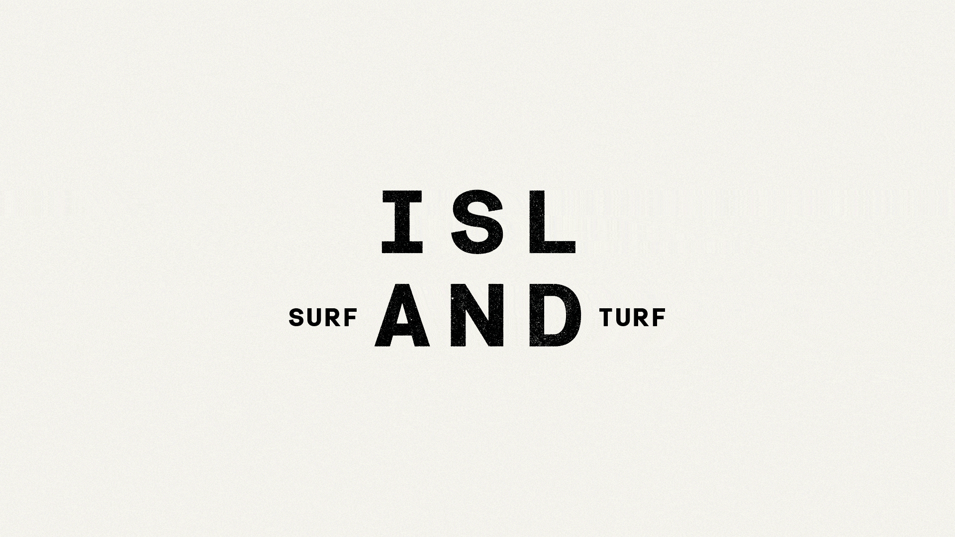
- Silver Award: Bars & Restaurants
Island is a bold reimagining of the surf and turf restaurant, led by Michelin-starred chefs Tom Brown and Brad Carter, with a design identity by Common Curiosity.
It's very consistent, memorable, and feels Michelin-level, yet approachable
Muriel Schildknecht, Lonsdale Design
Combining seafood expertise with nose-to-tail meat cooking, the concept brings land and sea together in inventive, ingredient-led dishes inspired by the chefs’ travels.
To express this fusion, a distinctive identity was created around the split-stacked logo highlighting the 'AND' in ISLAND – symbolising limitless pairings. Playful branding features hybrid animal mascots, flexible messaging, and bespoke touches like menus on eco-conscious paper and bills in custom bottles. Though newly launched, Island has been fully booked since opening and gained early media attention.
Lipting by Design Bridge and Partners


- Silver Award: Brand Strategy
Lipton Ice Tea’s new Ritual Identity created by Design Bridge and Partners centres around the “Lipting” – a distinctive gesture combining a raised pinkie and a teacup ting sound.
I think it's a strong strategy, rooted in culture, that creates a unique and ownable hook simply by reimagining traditions
Meilyn Weege, forceMajeure
Created to cut through a market saturated with hyperactive energy drinks, the Lipting reclaims tea’s natural, mood-lifting benefits through a playful, repeatable brand asset.
Rooted in Lipton’s heritage, the gesture symbolises both uplift and positive change, aligning with the science behind tea’s calming ingredients. Applied across global communications, the Lipting unites three billion tea drinkers under a single, ownable ritual. It has been fully adopted across markets, revitalising Lipton’s identity with a fresh, participatory brand experience.
Lloyds: A Next Step Forward by Wolff Olins


- Silver Award: Brand Strategy
Amid shifting trust in UK banking and rising digital competition, Wolff Ollins gave Lloyds a bold brand-led transformation to stay relevant. Rooted in its 260-year heritage, the bank redefined its purpose with a new positioning: 'Lloyds moves everyone forward'. This strategy bridged emotional and technical change – uniting personal, business, and commercial services around real customer needs.
Solid and refreshing
Meilyn Weege, forceMajeure
Central to this was the Cancara Philosophy and CancaraOS, a design system ensuring consistency and relatability across all touchpoints. Through modern branding, inclusive storytelling, and a large-scale campaign, Lloyds reestablished itself as a trusted yet agile force, combining scale with emotional resonance to drive meaningful progress for all.
LSO 25/26: Waves of Emotion by Design Bridge and Partners
- Silver Award: Motion
Design Bridge and Partners had previously revamped London Symphony Orchestra (LSO)'s brand to celebrate its chief conductor, Sir Simon Rattle. With the arrival of a new chief conductor, Sir Antonio Pappano, it was time to evolve the brand story: shifting the focus away from a single figure of the conductor to the collective mastery of the musicians and the power they have to move the audience.
Displays motion design's capabilities to reveal something that's hidden from sight
Alex Rodrigo, Human After All
Partnering with UCL's Ear Institute, Design Bridge and Partners recorded the brain activity of two audience members as they listened to different sections of Tchaikovsky's Symphony No 4. The team then transformed this biometric data into two animated sequences: The Calm and The Storm, which informed the rest of the 'Waves of Emotion' campaign.
Early sales for the season exceeded recent seasons.
Masshole Light Lager by Copper Giants


- Silver Award: Wine, Beer & Spirits
Masshole Light Lager is a locally brewed beer with a big personality, just like the people of Massachusetts. Copper Giants aimed to capture the spirit of the Masshole: proud, scrappy and unapologetically authentic.
Bursting with confidence, personality and fun
Jamie Watson, Taxi Studio
The seagull, or rat of the sky, anchors the identity: a stolen slice of pizza clenched triumphantly in its beak. Elsewhere, with its bold logo, witty packaging and no-nonsense tagline, 'The Light Beer from Here', every element has been designed to represent the Bay State. "We didn't just design a can," says Copper Giants. "We canned an identity."
Following its launch, Masshole Light Lager is now in dozens of bars and liquor stores and is growing fast. Swag and merch have also been flying off the shelves.
Mo Museum by Sons & Daughters ID


- Silver Award: Motion
The Mo Museum of Modern Art has a diverse offering of events, programs, discussions and more, and as a result, its brand had become complex and inconsistent. Sons & Daughters ID was tasked with refreshing the brand while preserving the logo and ensuring that artwork could be integrated without distortion.
A cohesive and consistent design that works across motion and still graphics
Matt Smith, Future
The new identity was built around the idea of shifts, using angled planes that echo that logo's 'M' and the museum's striking angular architecture. But the 'M' is not alone, it was built to seamlessly combine with an evolving roster of partner logos, meaning the identity is forever flexing, empowering the team while also maintaining coherence.
Following the launch of the identity, visitor numbers increased by 168 per cent from one month to the next, and were up 31 per cent in the month of November, compared to the previous year.
Moncler: City of Genius by R/GA


- Silver Award: Fashion, Interactive
A standard fashion show and ecommerce experience wasn't enough to celebrate Genius, Moncler's flagship collection for creativity and experimentation. R/GA used technology to help blend the physical and the digital, with a custom WeChat mini-programme guiding users through 10 visionary designers interpretations of what it means to 'live their Genius'.
This really immersed me in a completely different world
Jacquelyn Iyamah, Making the Body a Home
The City of Genius film set the tone for an imaginative journey into creativity and innovation, and from there, users entered a virtual cityscape mirroring their actual surroundings in Shanghai, where they could explore product insights, behind the scenes stories and narratives about each collection.
The event had 57 million viewers, and in the first week, achieved a reach of 8.9bn and 825 million global engagement. Since launch, moncler.com has seen traffic to the experience increase by 17 per cent and engagement with its content increase by nearly 20 per cent.
MTTR by Studio Sutherl&


- Silver Award: Fashion
The idea behind MTTR, a zero-waste denim brand, is if you're making something the world doesn't need, you'd better be sure you're making a difference. The core design principle is 'doing more with less', which extends to the brand's visual identity, created by Studio Sutherl&. The logo consists of a pared back stencil, the letterforms echo pieces of cut denim and the 'offcut' shape features subtly throughout.
I love the bigger story all the way down to the small thoughtful details
Jess Marie, Bulletproof
The jean itself is used as 'packaging', holding the CTLG – a printed catalogue – soap nuts and product/recycling information on the 'pocket passport'.
MTTR launched at Birmingham Design Festival and completely sold out its first production within days.
Raise the Roof by Kit Studio


- Silver Award: Not-For-Profit
Raise the Roof is a music event series created in partnership with Centrepoint UK, designed to celebrate emerging musical talent while raising funds and awareness to help end youth homelessness. Kit Studio was tasked with crafting a brand that would stand up in the music world yet also showcase the series' real-world impact.
I just loved the simplicity of the house symbol
Pali Palavathanan, TEMPLO
The identity centres around raised hands, a gesture seen at music events, with the added Easter egg of a house hiding in the negative space between both. Typography and layout takes inspiration from grassroots music culture, giving the work an analogue feel that works as well digitally as it does in physical iterations.
The initiative received press coverage from major media outlets, helping position Raise the Roof as a meaningful cultural platform.
Robinhood: Future Trading by ManvsMachine


- Silver Award: Financial Services
Robinhood is a trading platform for serious traders. Its rebrand needed to showcase them not just as innovators but as fearless, unapologetic leaders. The resulting campaign by ManvsMachine sidesteps stock market clichés and over-complicated visuals, instead focusing on a distinctive and ownable visual language that sets the platform apart.
It will make its users feel like absolute heroes in their trading journey
Jessica Bong-Woon, Ragged Edge
A set of films showcase the brand's different offerings, from Crypto and Futures to Legend and Asset Classes, and kinetic animation boldly shows the energetic nature of the different market sectors. At the heart of the identity is a series of minimalist nature environments, each representing a unique 'trading floor' within Robinhood's ecosystem. These captured attention with their sheer scale, vision and cinematic prowess.
Royal Botanic Garden Edinburgh by Johnson Banks


- Silver Award: Typography
It had been well over a decade since the Royal Botanic Garden had examined its identity, which had led to inconsistency across the brand.
The typographic system feels cohesive and harmonious, from the logotype through to the broader typeface
Chris Nott, Studio DRAMA
Johnson Banks celebrated the garden's heritage by redrawing its symbol – an iconic arctic-alpine plant species, first named in the 1750s – simplifying it in the process, and including versions that can 'hug' other plants and people. The new custom typeface included special ligatures and is accompanied by new images and a new tone of voice.
Traffic to the new website has improved and early stats suggest that awareness of the garden's conservation work has shot up from 34 per cent to 72 per cent.
Sonocea by Manifest


- Silver Award: Professional Services
Sonocea represents a way to scientifically enhances our home lives through sonic augmentation technology but its previous brand was one-note and uninspiring. 'Sonocea' is a portmanteau of 'sonic' and 'panacea' – evoking both the healing power of sound and the technological innovation behind it.
Its ambition is on point
Muriel Schildknecht, Lonsdale Asia
Manifest came up with an anchoring statement 'Life. Amplified', which sits at the heart of the brand, forming a dynamic messaging mechanic. An 'S' monogram captures the resonance and amplification Sonocea tech has on its users while a neutral colour palette keeps things bold and simple yet precise.
Tanqueray 10 x Alessi by Design Bridge and Partners


- Silver Award: Wine, Beer & Spirits
Tanqueray No. Ten is synonymous with cocktail artistry while Alessi is an iconic Italian design house. What do you get when you mix the two? A limited-edition luxury gifting set that elevates the cocktail experience to an art form.
Classic but unexpected at the same time
Jenifer Lehker, Lippincott
Design Bridge and Partners was inspired by the Tanqueray 10 bottle while creating the form of Alessi's bespoke cocktail shaker and accessories, celebrating the commitment to craftsmanship of both brands and coming up with something truly unique.
The collaboration was a hit on social media, with the Alessi-themed post on Tanqueray's socials achieving a 25 per cent increase in reach and a 300 per cent increase in engagement.
The Dinner Ladies by Universal Favourite


- Silver Award: Copywriting, Retail
The Dinner Ladies is a Sydney-based frozen meal delivery service. With its previous identity feeling a little stale, Universal Favourite stepped in to revolutionise the brand. The aim? To distil the authentic Dinner Ladies attitude and deliver it to a category craving distinction.
Completely stands out in the frozen meal category – it's filled with personality
Johanna Roca, Koto
Irreverent humour, punkish design elements and a no nonsense voice based on the founders ensured the brand felt both heartfelt and rebellious. The packaging was designed for standout on the shelf/freezer and uses illustration and a redesigned logo to great effect.
The results were impressive, with sales up 46% on the previous quarter post redesign.
The Southbank Centre by NB Studio


- Silver Award: Brand Strategy
NB Studio built the new visual identity and messaging for Southbank Centre Membership around the idea: 'so full, one membership feels like many', reflecting the organisation’s uniquely diverse artistic offering.
Differentiating in the crowded space of London cultural memberships isn't a simple task, and they absolutely cracked it
Uri Baruchin, Independent
Rooted in consumer research and Southbank Centre’s core USP, the concept positions the membership as higher value than competitors – offering multiple experiences in one.
Bold, dominating typography expresses the richness of the offer, while a vibrant multi-colour palette cuts through the site’s iconic yellow to ensure standout. From dynamic digital motion to messaging timed along the user journey, the identity translates cohesively across touchpoints – bringing emotional resonance grounded in real, tangible benefits.
TrueTribe: Better Work Wellbeing by GoodLove


- Silver Award: Professional Services
TrueTribe is a Dutch digital wellness platform and services provider, whose mission is to transform work wellbeing from the ground up. It has a holistic philosophy, believing that everyone's wellbeing is formed from a host of interconnected factors.
I felt it had lots of character and felt personal over many things in this space
Martin Homent, Citi
GoodLove's mission was to design a brand to reflect this philosophy. The new identity is centred on overlapping pebble faces, with simple expressions that interact with each other. Illustrations bring to life the spectrum of feelings and topics covered and a striking palette brings warmth.
TrueTribe puts employees first and it shows: one early pilot study showed 32 per cent of users completed a wellbeing scan (far more than the average of 20 per cent) and dozens of users then booked onto a session with an expert.
Ultraderp by Mucho


- Silver Award: Sport & Leisure
Ultraderp is a product designed for active, outdoorsy dog owners who don't take themselves too seriously.
Great logo and love the way it’s used across applications. So many clever details.
Jess Marie, Bulletproof
Mucho provided an identity to match: 'Ultra' for serious functionality and 'Derp' for the playful chaos dogs bring to all outings.
A bold punch workmark sports a literally tongue-in-cheek logo, bold colours make a splash outdoors and the brand voice is full of personality. In a space marked by overly cute or overly sterile branding, Ultraderp carves out a new space: performance with personality.
USwitch: We Put U First by ManvsMachine
- Silver Award: Motion
ManvsMachine teamed up with Lucky Generals to design and direct four commercials to launch Uswitch's new brand platform.
This is strong in execution, level of detail in the animations and its simple brand message
Alex Rodrigo, Human After All
Each film revolves around the letter 'U', rendered in different guises to represent energy, broadband, mobile and switching.
The spots were all created in 3D and animated in a 'claymation' style to give them a friendly and approachable feel.
We Are Warriors: Take the Crown by R/GA
- Silver Award: Culture, Not-For-Profit
After the 2023 loss of The Voice referendum (a plan to give Indigenous people a greater political representation in parliament), Indigenous communities across Australia were left reeling. But ‘Take the Crown’ by R/GA emerged as a powerful way to reignite the conversation on colonial power, combat the public’s fatigue and speak to Indigenous rights in a way that would resonate with all Australians.
Overall, I loved the grit
Cat How, How & How
A graffiti artist was commissioned to paint a bespoke crown logo and music, dance, art, storytelling and panel discussions, plus the premiere of a new We Are Warriors film put Blak excellence front and centre. Pair that with a throne hand-crafted from gilded frames so closely tied to colonisation, and the ways of the past were firmly turned on their head. This approach attracted over 14,000 attendees and has been supported by brands including Adobe, JD Sports and TikTok.
Wesmo! by Seitaro Design


- Silver Award: Brand Strategy
Wesmo! is a new payment service by JR West, designed to bridge Japan’s growing digital divide across regions and generations. Rooted in Seitaro Design's brand concept 'Moving is Value', Wesmo! reimagines payments as joyful, human-centred experiences that foster connection, stimulate local economies and support inclusive mobility.
I really like the strategic shift of taking it from a payment app to a means of movement, joy and discovery
Jamie Watson,Taxi Studio
The name and logo reflect movement and discovery, while the custom typeface 'WESTERX Sans' and tactile UI/UX design enhance accessibility, especially for older users. Features like tap-based payments inspired by train gates blend innovation with familiarity. Wesmo! has reshaped JR West’s image, with its vibrant identity and intuitive design receiving strong user praise and guiding project decisions.
Yahoo! The YEP by Jones Knowles Ritchie


- Silver Award: Illustration
Original '90s internet company Yahoo! was once known for its eccentric and anti-corporate personality, but its brand had become tired, lacking energy and character. Jones Knowles Ritchie used illustration to revamp the brand, chopping off the wordmark to leave the Yahoo Exclamation Point, named the YEP.
Accessible in its simplicity but versatile enough to work for different themes without feeling repetitive
Avinash Weerasekera, Independent
The YEP is flexible enough to fit an ever-changing internet landscape and along with the work of various illustrators, it acts as a canvas to tell a range of diverse stories. This shows the breadth of Yahoo!'s offerings.
The new brand coincided with a revamped Yahoo Mail, which saw a 125 per cent increase in new users connecting their Gmail accounts to Yahoo Mail on desktop. Mobile traffic on Yahoo News is also up 10 per cent year on year, with engagement rates up over 50 per cent.
Bronze Awards
The following projects received at least one Bronze Award in the Brand Impact Awards 2025.
A Collaboration of Ampersands by Studio Sutherl&


- Bronze Award: Self-Branding
This book is a collection of ampersands, which celebrates partnership and collaboration, marking the Studio Sutherl&’s 10th anniversary. It features a miscellany of ampersands created for clients, studio projects, and workshops over ten years, interspersed with naturally occurring ampersands.
Beautiful, thoughtful and playful work
Jess Marie, Bulletproof
The second chapter showcases characters created by studio collaborators. Published for clients and friends, and sold online, the project strengthened relationships with clients and collaborators. This initiative resulted in increased visibility and positive engagement across social channels and industry networks, showcasing the studio’s collaborative ethos and long-standing client relationships.
Accumulate by Design Bridge and Partners


- Bronze Award: Not-For-Profit
Accumulate is a charity that has been transforming the lives of people on the margins of society through creativity for 10 years. It wanted a brand refresh to position itself as a game-changing institution.
The idea’s strong, especially for the client/budget
Atsaya Gabiryalpillai, For The People
Design Bridge and Partners focused Accumulate's new identity around the iconic red dot – traditionally used in galleries to show an item has sold – reimagining it as a symbol of visibility, inclusion and value. This shift reframes the red dot as a symbol of exclusivity into one of empowerment – representing that everyone should have the opportunity to fulfil their talent, whatever their journey.
AME Coffee by Sons & Daughters ID
- Bronze Award: Illustration
AME is a specialty coffee shop in Marbella built around the refreshing essence of rain. Sons & Daughters ID created a brand that embodies this idea across every detail, from the name and raindrop logo to intricate illustrations formed from thousands of droplets.
It was the subtle details that made it stand out for me
Simon Buijs, BUCK Netherlands
Elegant typography with flowing ligatures mirrors rainfall, while frames and icons echo its movement. Coffee packaging links the richness of rain with the boldness of the roast, energised by a vibrant vermilion drawn from Marbella’s tropical landscape. With concept, craft and consistency across print and digital, the identity feels distinctive, sophisticated and true to AME’s core vision.
Artea by andstudio


- Bronze Award: Financial Services
Artea means 'it is coming closer', signalling both human connection and strategic progress. This was a much-needed name change for a brand that was aiming to modernise infrastructure, reach a younger demographic and move beyond its legacy perception, as well as stand out as a local bank in a sea of foreign-owned brands.
The illustration idea is strong and the work is well presented
Paulo Assunção, R/GA
andstudio built a new identity based on abstracted Lithuanian patterns, and used these across the logo, layouts and all other touchpoints. To reinforce the human element of the brand, andstudio collaborated with Lithuanian illustrators to create a set of expressive and warm images.
The rebrand resulted in strong market confidence and has supported major technological partnerships.
Audible 1984 by Alphabetical


- Bronze Award: Entertainment
Audible wanted a campaign for George Orwell's 1984 that would engage faithful Orwellian fans but also appeal to new audiences. Alphabetical created an immersive visual world that works from the mobile screen to the big screen, from a memorable audiobook cover to a cinematic trailer and range of OOH advertising.
Well-executed
Amy Globus, TEAM
The wide-reaching campaign focused on the character's inescapable connection to telescreens, which reflects our own screen-obsessed society. Together with tech artist Josh Ellingson, Alphabetical explored the narrative's themes of privacy and surveillance. Dystopian visuals on authentic '80s screens disoriented viewers, all in the campaign's signature visual style.
Audible's 1984 reached number one in the audiobook download charts in the US and UK and was the biggest selling title of the year.
Bicester Motion by Conran Design Group


- Bronze Award: Property & Construction
Based in Oxfordshire’s Motorsport Valley, Bicester Motion is a 444-acre former RAF Bomber Station, and a unique business community shaping mobility's future. Aiming to be the world's leading mobility technology community by 2035, it needed a world-class, timeless identity reflecting its rich history and innovative future.
I felt the 'M' symbol was beautifully crafted
Muriel Schildknecht, Lonsdale Asia
The new brand by Conran Design Group balances heritage with dynamic ambition, accommodating multiple subsidiaries. The logo symbolises converging horizons and includes a roundel for sub-brands . The colour palette draws from century old colours used when Bicester Motion was an operational WW2 RAF Bomber Training Station, and the typeface, RT Rondelle was inspired by public transport signage.
The rebrand has been well received on social media, with engagement up over 2,000 per cent, and has attracted a high-caliber of brands wanting to work with Bicester Motion.
Cambridge Innovation: Where Innovation Makes History by Johnson Banks
- Bronze Award: Professional Services
Cambridgeshire, with its diverse voices from investors to local councils, needed a unified narrative. Johnson Banks' solution: 'Where innovation makes history', drew inspiration from John Venn's diagrams and the region's scientific heritage.
Something different
Helen Fuchs, ustwo
Johnson Banks developed a radical approach for place-making using a toolkit of diagrams and equations. This scheme, inspired by the region's strength in science and discovery, addressed the challenge of diverse stakeholder perspectives. Combining these ideas with visuals of Cambridge's skies, Johnson Banks created a design toolkit and campaign deployed across various media.
The resources have been used across webinars, presentations and workshops, and there have been hundreds of requests to use and share the assets.
Cancer Research: More Research Less Cancer by Johnson Banks


- Bronze Award: Brand Strategy
Post-pandemic, all major charities have experienced a drop-off in public donations. Johnson Banks' task was to explore how Cancer Research UK (CRUK) could reach a new, philanthropic audience. The answer was (eventually) very simple: 'More Research, Less Cancer'.
It's a simple idea with good cut-through for the category... excellent thinking
Uri Baruchin, Independent
It cuts through the noise of the sector, allows CRUK to be quite disruptive and transactional, and crucially contains 'Cancer' and 'Research' in the headline. This chimed perfectly with CRUK's core offer – the more research it can do, the better its chances of fighting the disease that touches 1 in 2 of us in our lives. And it felt authentic. The more/less construct has helped raised £230 million in just 12 months.
Carlsberg Elephant by Taxi Studio


- Bronze Award: Wine, Beer & Spirits
Carlsberg Elephant, already a beloved brew in India, needed a bold new identity to overcome visibility issues in dimly lit retail spaces. Taxi Studio's solution was a striking redesign that amplified the elephant – an iconic cultural and brand symbol, making it the hero of the pack.
The updates to scale and colour were very intentional, and the elephant is now so much more iconic
Jenifer Lehker, Lippincott
A refined gold, black, and white palette enhanced shelf impact and premium appeal, while a dramatically enlarged elephant graphic ensured visibility from over 10 feet away. The result was both culturally resonant and commercially transformative: brand preference rose by up to 9 per cent, segment share jumped 220bps in 10 months, and Elephant drove 85 per cent of Carlsberg’s India volume.
Coffee Counter Culture by Turner Duckworth


- Bronze Award: FMCG
Blue Diamond’s Barista Almond Milk was crafted for quality coffee but its branding felt more suited to the supermarket than the café. Turner Duckworth created a new identity designed with baristas in mind, bringing the grower-owned story to the front of pack.
They nailed the brief, in elevating what is typically a commodity product
Jenifer Lehker, Lippincott
The stripped-back aesthetic mirrors the small-scale co-operative of farmers and aligns with independent coffee culture. At its centre sits a new emblem symbolising the partnership between growers and baristas, supported by hand-drawn illustrations inspired by coffee shop life. A blue and white palette, lo-fi textures and café-ready applications ensure the brand now feels at home behind the counter.
Curu: Nature Loving Coffee by Magpie Studio


- Bronze Award: Illustration
Curu is a nature-positive coffee brand on a mission to restore Brazil’s Atlantic Forest through agroforestry and sustainable farming. To cut through an industry rife with greenwashing, Magpie Studio created an identity that puts environmental impact at its heart.
The illustrations are beautifully hand crafted with real personality in the characters
Georgia Coggan, Creative Bloq
Inspired by Curupira, the mythical guardian of the rainforest, the name and logo symbolise farming in harmony with nature. Hand-crafted woodcut-style illustration, a protective wordmark, and vibrant colours drawn from native flora bring authenticity and accessibility. From packaging to recycled coffee sack posters, every asset communicates regeneration and positions Curu as a coffee that empowers consumers to create real, lasting change.
Drawn to D&AD by Jones Knowles Ritchie and Studio DRAMA
- Bronze Award: Culture, Motion, Typography
D&AD has been rewarding excellence in design and advertising for over 60 years, but entries to its famous Awards were trending downwards. Jones Knowles Ritchie focused a campaign for D&AD's 2025 Awards around the idea that creatives aren't drawn to win awards, they're drawn to create.
A singular concept, rooted in the D&AD brand, stretched into something expansive, beautiful and functional
Justin Hallström, NOT Wieden+Kennedy
Design elements were 'drawn to' the award or D&AD logo, as if it were a magnet, simple kinetic type was drawn to the logo while words were turned into buildings, horses and pencils, all also drawn to D&AD. The typeface, created by Studio DRAMA, was inspired by the Pencil, with heavier weights representing a heavier pull as the event drew nearer.
The result was record-high satisfaction with the festival, consistently positive feedback and a record number of entries.
Fortnum's Famous Animal Crackers by Design Bridge and Partners


- Bronze Award: Copywriting
Fortnum & Mason's nuts were "boring" and "not nutty enough". The old ‘Deli Style’ labels were forgettable, offering no wit or distinction. Design Bridge and Partners' idea was to draw on Victoriana – eccentric, charming, a touch bonkers. Inspired by brass nutcrackers shaped as beasts, the team created seven ‘Animal Crackers’: Bruno the Grizzly to piggy Thérèse, each cracking shells with paw, jaw, beak or snout.
Very well executed Victorian-era fun
Eva Munday, The Clearing
Illustrated in linocut, they brim with storybook charm and limerick-like verse. Steeped in British heritage, Edward Lear’s playful nonsense meets Fortnum’s wit – elevating simple snacking into something utterly delightful.
Jane Grey by WMH&I


- Bronze Award: Typography
WMH&I crafted a striking, type-led identity for professional dominatrix Jane Grey, rejecting industry clichés in favour of psychological power and precision. At its core were custom 'binds', tight, commanding typographic phrases like 'Surrender to Me' – designed to disarm and dominate.
I found the typographic approach interesting, derived from the idea of the 'dominatrix' and from the connection between typography and visual language
Gianluca Ciancaglini, Landor
Using Migra’s sharp serifs and elegant curves, the studio created custom ligatures and tracking to evoke compression and control. A brutal yet beautiful monogram and wordmark reinforced Jane’s authority, appearing on tools, textiles, and skin. Every touchpoint, from packaging to stationery, deepened the brand’s influence. The identity not only set Jane apart visually, but also safeguarded her practice by attracting only aligned clients.
Kino Pavasaris by andstudio


- Bronze Award: Culture
For its 30th anniversary, Kino Pavasaris, Vilnius’ international film festival, sought to evolve from an annual event into a year-round cultural platform. andstudio created a flexible identity system built around the concept of 'Eye-Opening Cinema'.
It features some beautiful motion and sound design and evokes the feeling of cinema
Stuart Radford, JKR
At its heart sits an eye-shaped logo on spring green, animated to mirror discovery and sharpened perception. Colours sampled from film stills categorise screenings by emotional tone, while typography balances sophistication with clarity. Unlike many festivals, Kino Pavasaris now has a permanent, evolving design language. The result positions it not just as a yearly celebration, but as a dynamic, lasting presence in Lithuania’s cultural landscape.
Laphroaig: Unphorgettable by Design Bridge and Partners


- Bronze Award: Copywriting
Laphroaig is divisive. “An acquired taste”. Design Bridge and Partners leveraged one of the brand’s greatest assets, The Friends of Laphroaig, to create its ‘UNPHORGETTABLE’ campaign – taking their real ‘words of appreciation’ and creating visual representations that are as unique as the descriptions themselves.
It’s a great campaign idea: turning a perceived weakness of the product (its harsh taste) into a strength
Jamie Thorp, Reed Words
Championing Laphroaig’s boldness of character, each illustration characterises the quotes collected; for example, flaming tornado – flaming illustrative style. Ocean-based quote – water-based illustration, angels fresh from a bonfire – smoky illustration. Each expresses the notion that each drinker’s experiences are different. The ways they describe Laphroaig could be mistaken for the words of people who dislike the whisky. Hate it even. But they can’t get enough...
London Soundtrack Festival by Baxter & Bailey


- Bronze Award: Typography
The London Soundtrack Festival launched in 2025 with a bold, motion-led identity celebrating the power of sound across film, TV, and games – created by Baxter & Bailey. Inspired by screen formats, the design featured a dynamic, shape-shifting grid system – flexible enough to house typography, imagery, and video across all brand touchpoints.
The typeface choices, the simple (but effective) motion design, and the application of these across the brand all hold up well
Tom Foley, Monotype
The visual identity placed movement at its core, echoing the rhythm and emotion of soundtracks. This distinctive branding played a key role in securing major partners like the BFI, Southbank Centre, and Roundhouse. Combined with an intuitive, visually rich website, the identity helped drive over 10,500 ticket sales and 132,000+ visits in a single month.
Mo Museum by Sons & Daughters ID


- Bronze Award: Culture
The Mo Museum of Modern Art aims to redefine what an art museum can be. But over time its brand became complex and inconsistent. Sons & Daughters ID helped refocus the brand with a refresh that kept the existing logo and ensured artworks could be integrated without distortion.
A really smart solution to a challenge for every gallery, which is to allow the artworks to work within the brand, without affecting the integrity of the art
Karen Hughes, EDIT
The new brand, centred around shifts, needed to stay consistent across a growing team so Sons & Daughters ID created a generative design tool that allows anyone to creative distinctive patterns, layouts and motion assets, all within a cohesive system. This means that institutional clarity of the system is balanced seamlessly with creativity.
As a result of the rebrand, visitor numbers were up and the museum's in-house team saved considerable time and money in their communication work.
Mozilla: Reclaim the Internet by Jones Knowles Ritchie


- Bronze Award: Brand Strategy
Mozilla needed a way to better represent the brand and its mission. While it's been at the forefront of issues like privacy and open-source for years, it hasn't received enough recognition for its work. It needed a brand identity that was rooted in the Mozilla manifesto and connected to activists, government and regular internet users alike.
Somehow connects the past with the future, stays rooted and lands well
Uri Baruchin, Independent
Jones Knowles Ritchie focused on galvanising people to Reclaim the Internet, creating a design system that worked whether you were a grassroots activist or a government official. The team created a design system, aptly named ‘Grassroots to Government’. Modern, digital-first and expansive, it speaks to grassroots coders developing tools to empower users, government officials advocating for better internet safety laws, and everyday consumers seeking to reclaim control over their digital lives.
reMarkable Paper Pro by ManvsMachine


- Bronze Award: Technology & Telecoms
reMarkable enlisted ManvsMachine to launch its groundbreaking new product, the Paper Pro, its first major campaign in over four years. The goal: create a bold, emotionally resonant return to educate new audiences, thrill loyal users and reinforce the brand’s leadership in the paper tablet space.
The use of film stock and analogue rendering techniques to mirror the tactile paper experience of the product hit the nail on the head
Jessica Bong-Woon, Ragged Edge
The campaign highlighted key innovations (an immersive colour display and built-in backlight) introduced with a refined, understated confidence. ManvsMachine led the creative from concept to execution, blending live action, photography, and 3D motion to reflect the product’s tactile, paper-like experience. The launch generated over 28,000 likes and 160+ comments on Instagram, sparking praise and boosting brand visibility.
Saudia Airlines by amp Sound Branding
- Bronze Award: Sonic
Saudia Airlines, a key figure in Saudi Arabia's Vision 2030, required a sonic identity to represent its national heritage with global appeal. amp Sound Branding delivered just that, composing with traditional Arabic scales and instruments, blended with innovative timbres, resulting in the adaptable Saudia Sonic DNA.
A solid and robust piece of work which is well considered and crafted throughout the system
Paul Silcox, FutureBrand
This initiative yielded over 40 distinct sonic assets, earning client trust. Its release on streaming platforms garnered millions of impressions, sparking cultural embrace by Gen Z on social media. Saudia’s sonic brand now thrives as an authentic soundtrack of the brand, Saudi culture and Vision 2030, enhancing brand identity and guest experience.
SCADstory Atlanta by BRC Imagination Arts


- Bronze Award: Experiential
SCADstory Atlanta is the world’s only fully immersive, multi-sensory brand storytelling experience created for a university. Conceived by BRC Imagination Arts, it reinvents how SCAD communicates its values, inspires future students and lives its mission of creativity and innovation.
It’s clear that a lot of thought went into creating a truly experiential design
Jacquelyn Iyamah, Making the Body a Home
Guests journey through projection-mapped galleries, a cinematic Dreambox environment, curated retail, and an alumni art gallery, all shaped by the outputs of 24 SCAD programmes. Over 70 students, alumni, and faculty helped bring the project to life. More than a tour or exhibit, SCADstory Atlanta transforms recruitment into storytelling, ensuring young people see themselves in a creative future.
Screened by The Chase


- Bronze Award: Self-Branding
Screened by The Chase celebrates storytelling, craft, and cinema by reimagining iconic Christmas film quotes through original illustrations and traditional screen printing. Each of the 10 posters features a different illustrator, creating a diverse collection.
Beautifully clever and beautifully executed
Jess Marie, Bulletproof
The campaign came to life with shimmering silver ink on black stock, popcorn-scented packaging, and daily social media reveals with short films and custom soundtracks. This multi-sensory approach boosted Instagram impressions by 105 per cent, total interactions by 156 per cent, and profile activity by 71.7 per cent. On LinkedIn, reach grew by 72.7 per cent, reposts by 320 per cent, and impressions by 47.9 per cent, showcasing the studio's values and strengthening its reputation.
Soho School by Wonderhood Design


- Bronze Award: Education
Soho Parish CofE Primary, the last remaining school in Soho, faced closure after years of declining enrolment. To safeguard its future, Wonderhood Design created a bold, community-driven rebrand under the banner 'There’s Only One Soho School', part of their Neighbourly Fund initiative.
The generator meant that the kids could be a part of the brand and have that sense of pride attending
Atsaya Gabiryalpillai, For The People
The new logo, a silhouette of the school filled with pupil-designed icons, visualises Soho as their classroom, from Ronnie Scott’s to Regent’s Park. An interactive logo generator, vibrant identity system, and city-wide campaign made the school unmissable. The result: applications rose nearly 60 per cent, proving the campaign not only safeguarded the school but also united the community.
Squarespace: Jeff Koons by ManvsMachine
- Bronze Award: Motion
ManvsMachine's long-time collaborators, Squarespace, wanted a film that imagines a collection of work by legendary artist Jeff Koons, living all together in the same gallery.
A simple and elegant use of motion to deliver on a high-level brand message
Alex Rodrigo, Human After All
Breathing new life into some of his iconic art pieces, the film goes deep into Jeff's mind, taking the audience on an exciting and mesmerising journey.
The film has been featured in a number of articles across the press and was received extremely well on social media with the stills post quoted as "some of our best work".
Streamtime by NB Studio


- Bronze Award: Brand Strategy
Streamtime isn't your typical project management software. Since 2002, it's reimagined timesheets as intuitive to-do lists, designing tools that suit how creative businesses really work. NB Studio rebranded Streamtime's identity and website to reflect a move into the wellbeing space, making the tension between productivity and wellbeing the core idea in 'Business balance for creative chaos'.
The 'Productive Wellbeing' angle is highly differentiated for this space... the creative strategy brings that to life in a strong way
Meilyn Weege, forceMajeure
A series of seven shapes grounds the visual identity based on the product's current interface. Elements like hover buttons, emo-shapes, and cards tilt and wobble with layered stacking effects. Embracing imperfection, the identity repurposes everyday office tropes, file drawers, notebooks, and trophies with bold, colourful overlays and new meaning.
The Dinner Ladies by Universal Favourite


- Bronze Award: Illustration
The Dinner Ladies is a frozen meal delivery service based in Sydney. Its old identity was feeling tired so Universal Favourite stepped in to recapture the charm and rebellion of the original brand.
It evokes a very retro, nostalgic vibe, yet in a contemporary and fresh way
Simon Buijs, BUCK Netherlands
Illustration had always been a major part of The Dinner Ladies identity and Universal Favourite sought to bring back the original punk style via a collaboration with Jake Foreman, whose hand-drawn style brought something extra to the original look. The hero illustration expresses the shared joy of eating together around the dinner table while small spots focus on specific offerings and product attributes. The illustrations appear across the whole brand system, from packaging to delivery trucks.
The result of the rebrand was the best month of sales in the history of the brand, and a 46 per cent increase in sales following the first launch campaign, compared to the previous quarter.
The Foxes Club by Thisaway


- Bronze Award: Brand Strategy
The Foxes Club began in 2007 with simple games and activities in a London park. Today, it’s a market leader in community-based children’s play programmes, holiday camps, and football academies. The Foxes Club needed to sharpen its proposition and build a brand that stood for more than just its practical services.
The thinking is very clearly articulated and then seen through
Emily Penny, BeColourful
From a customer perspective, the brand felt fragmented. Two different websites and visual identities spoke to different age groups and audiences, creating confusion about the relationship between The Foxes Club and Foxes FC.
Thisaway's task was to unite the brand under a single, clear proposition that appealed across age groups. The unifying brand idea, ‘Well Played’, stems from a simple truth: play is not just enjoyable, it’s essential to a child’s development. To reflect its evolution and reduce confusion, Thisaway simplified the name to The Foxes Club, creating a more cohesive and age-inclusive identity. Through tone, imagery, and design assets, the team created a brand system that speaks to every audience: fun for kids, trustworthy for parents and credible for partners.
The New Forest by Studio Glass


- Bronze Award: Not-For-Profit
Go New Forest needed help with its confusing dual brand identities (Go The New Forest and The New Forest). Studio Glass' approach balanced locals and visitor needs with a solution 'Old, Yet Ever New' – a tagline discovered in the local archives.
The illustrations are timeless
Jason Little, Independent
This approach encapsulates what makes The New Forest special, with its magical blend of old and new. Through extensive collaboration and research, including insights from local voices and folklore, a cohesive communication strategy was crafted. The initiative transformed tourism from extraction to stewardship, supporting sustainable growth rooted in authentic connection and historical narratives.
The New York Historical by Lippincott


- Bronze Award: Culture
The New York Historical Society Museum & Library needed a brand to honour its legacy as New York's first museum while acknowledging its expanded focus. Lippincott came up with the idea 'Our nation in conversation' and built a refocused identity around that.
The brand feels clean while maintaining institutional weight
Amy Globus, TEAM
The new name, The New York Historical, drops 'Society' to emphasise inclusion and openness. The hyphen in New-York acts as a centrepiece in the identity, resulting in a bold 'H' symbol, which is paired with a classical name style and historical colours (the orange is a nod to the state's origins as a Dutch colony while the blue references the union of the American flag).
The new identity was met with excitement and praise and drew attention from major outlets such as The New York Times.
The Quietus by 11:11 Studio


- Bronze Award: Publishing
The Quietus worked with 11:11 Studio on a rebrand to address dwindling ad revenue and a dated user experience, aiming to rebuild as a reader-first platform.
The statistics on reader engagement etc improving were really impressive. There are many elements that work well, particularly the navigation and use of illustration
Rosie Hilder, Creative Bloq
The core idea, 'Culture Countered', positioned The Quietus as a challenger to mainstream narratives. The new branding blended classical elegance with punkish irreverence, improving editorial layouts and introducing surreal illustrated characters.
The site was restructured for better readability and discoverability, with a new feature called The Portal curating archive material. This rebrand significantly boosted engagement: mobile traffic increased by 58 per cent, social referrals by over 150 per cent, engaged sessions by 130 per cent, and views per user by 64 per cent. It also led to new partnerships, including a merchandise collaboration.
Throwaway by Studio Sutherl&


- Bronze Award: Culture
Throwaway explores the disposable nature of modern society through the lens of street photography. Captured from inside street bins using a phone, the images expose consumer waste and the fleeting nature of digital culture.
The logo concept is unexpected and supports the story of the artwork with wit
Stuart Radford, JKR
To support this vision, Studio Sutherl& created iconography that captured the artist's vision while embodying the 'throwaway' concept. The Keep Britain Tidy logo was reimagined with the artist's head in the bin, typography continued the theme, with characters appearing to be discarded like rubbish, and a crumpled newspaper-style catalogue was left on the gallery floor.
The project attracted over 200 attendees on launch night and received significant media attention, enhancing the profile of the artist, Tony Davidson.
Tripadvisor: Made Possible in Massachusetts by Wanderlab


- Bronze Award: Transport & Travel
Visit MA partnered with Wanderlab to create an authentic, multi-channel campaign that showcased Massachusetts through its greatest strength: its people. Titled Blazing the Trail, the campaign featured a six-part video series, Massachusetts Makers, spotlighting local innovators, from Duck Boat guides to brewers, who bring the state’s spirit to life.
The storytelling, the quality of execution ranks high. Emotionally [it] moved me
Jessica Bong-Woon, Ragged Edge
Guided by Tripadvisor insights, the campaign aligned content with travellers’ interests, from food to family fun, using high-impact video to engage audiences. With over 55.5 million impressions and a 0.24 per cent CTR, the campaign drove 272,000 bookings and over $324M in economic impact, proving that real stories, told well, deliver powerful tourism results.
W+K London by NOT Wieden+Kennedy


- Bronze Award: Self-Branding
NOT Wieden+Kennedy created an identity reflecting London's eclectic and diverse culture, emphasising the power of bringing different people together. The team's solution involved commissioning nine diverse London-based makers, from jewellers to barbers and primary school children, to each create a piece incorporating W+K London.
It’s a really creative hook
Matt Tyas, Co-op
This resulted in a dynamic identity rich in contradictory styles, embodying London's cultural melting pot. The project yielded physical items displayed in the office and an ever-evolving identity. This initiative successfully distilled the agency's essence and fostered new collaborations, reflecting a truly inclusive culture.
Yoloh by Taxi Studio
- Bronze Award: Copywriting
Most insurance brands trade on fear and jargon. Yoloh set out to flip that script and needed more than a visual identity – it needed a brand that made insurance make sense.
The anagram mechanic reflects the strategic thinking behind the project really nicely
Eva Munday, The Clearing
Taxi Studio delivered Insurance Dejumbled: a cohesive platform untangling complexity at every touchpoint. In partnership with writer Nick Carson, they gave Yoloh a witty, reassuring voice, transformed policy jargon into playful anagrams, and created Andi, a four-fingered digital assistant who literally ‘dejumbles’ confusion into clarity. From ambigram logo to investor decks, Taxi’s work proved that words and design together could make insurance human, approachable – and commercially powerful.
Credits
Click to read full production credits for all the winning projects at the Brand Impact Awards 2025, as supplied by the entrants.
If we're missing anything, or you need to make a correction, please get in touch at bia@futurenet.com
Congratulations to all the winning agencies
Thank you to everyone who submitted entries, and congratulations again to all our worthy winners – you smashed it.
See you in 2026!

