The biggest logo moments of the year weren't always in the headlines

Sign up to Creative Bloq's daily newsletter, which brings you the latest news and inspiration from the worlds of art, design and technology.
You are now subscribed
Your newsletter sign-up was successful
Want to add more newsletters?
Looking back at 2025's logo landscape reveals a fascinating split. While a handful of rebrands sparked culture war hysteria and social media pile-ons, the design community was quietly celebrating an entirely different set of projects.
If you spent your time scrolling certain accounts on X, you'd think 2025 was the year corporate America lost its mind, systematically erasing heritage and tradition in pursuit of soulless minimalism.
But if you were reading the design press, attending industry events or actually working in branding, you saw something completely different: a masterclass year in evolutionary design. Thoughtful refinements that solved genuine business challenges. Elegant systems that unified fragmented identities.
Article continues belowIn short, what constitutes a "big logo moment" now depends entirely on your perspective. Are you measuring impact by outrage metrics and stock price wobbles? Or by how elegantly a brand solved complex architectural challenges whilst maintaining equity?
Noise versus signal
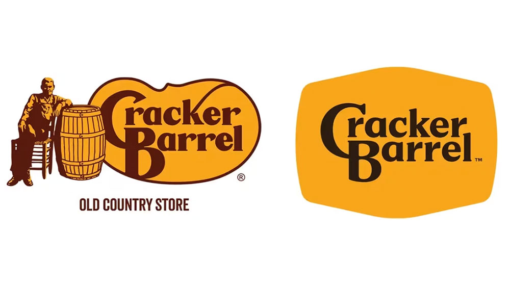
When it comes to popular outrage over logo updates, Cracker Barrel's August rebrand was the big story of the year. On the face of it, the restaurant chain simplified its logo, dropped an illustrative "old-timer" character, and modernised the typography; textbook stuff that's been industry standard for a decade.
Yet removing an anonymous figure in overalls triggered accusations of anti-American sentiment, with Donald Trump Jr demanding to know "WTF is wrong with Cracker Barrel?" The design community's response? As my fellow writer Joe Foley put it: "It's called graphic design, Don. Read Creative Bloq, and you'll learn all about it."
But while MAGA commentators raged about "sterile, soulless branding", designers were more interested in whether the simplified mark would actually improve highway visibility; which, as the CEO later revealed, was the entire point.
Sign up to Creative Bloq's daily newsletter, which brings you the latest news and inspiration from the worlds of art, design and technology.
The backlash was severe enough, however, that Cracker Barrel issued an apology and shelved the redesign, setting a worrying precedent. But 2025 wasn't all bad news for logo design. Most of the time, the design press was celebrating genuinely thoughtful work that barely registered beyond industry circles.
What designers actually loved

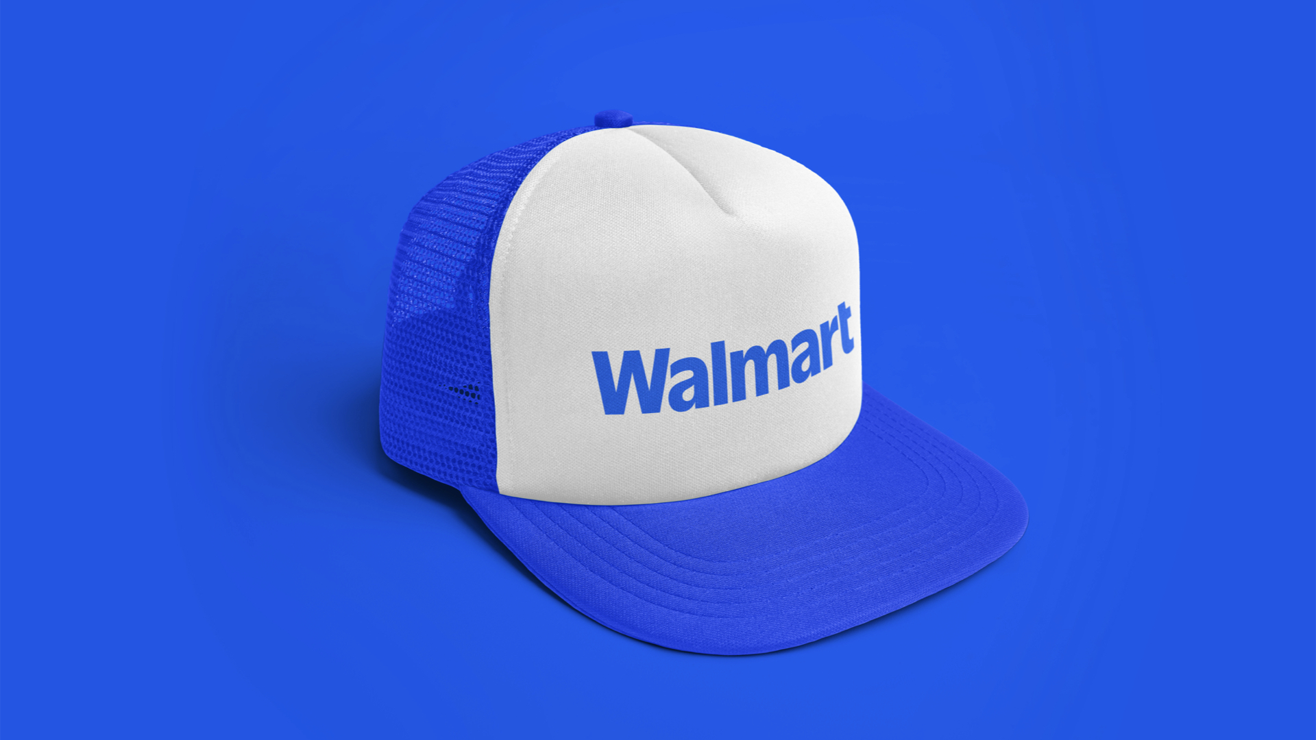
Walmart's refresh initially attracted some social media snark, but the design community recognised it as exemplary evolutionary branding. Jones Knowles Ritchie's work featured bolder shapes, a brighter yellow, and a deeper 'True Blue', plus typography inspired by founder Sam Walton's 1980 baseball cap.
As our review noted: "When paired with the new iteration, the old version looks faded and a bit dingy." Polly Hopkins of FutureBrand London also praised Walmart's approach, arguing: "changes in brand identity don't need to be seismic when the business itself is not shifting its strategy". The project became a case study in confident refinement over reckless revolution.

Elsewhere, Adobe's refresh, inspired by Marva Warnock's 1982 design, created what Mother Design called a "positive space expression" that genuinely looked like it had always existed. Bentley's fifth logo evolution in 106 years exemplified luxury branding done right; wings became "sharper and more dramatic, more reminiscent of a Peregrine Falcon." And even Google's gradient 'G' earned praise for making the previous version "instantly feel dated".
Amazon's unification of 50+ sub-brands similarly flew under the mainstream radar whilst earning design press plaudits. The work addressed genuine architectural challenges as the company expanded beyond retail into advertising, logistics, and B2B services. The result: a "deeper and more emphatic smile" and cohesive visual ecosystem that worked across countless applications.
A further highlight was Eventbrite's vibrant overhaul by BUCK. This introduced 'The Path': an adaptable mark symbolising "the event journey from discovery to memory-making." The work demonstrated how thoughtful systems thinking creates flexible, future-proof identities.
All great stuff. No political drama.

Not everyone avoided logo missteps in 2025, though. HBO Max's year-long identity crisis, for example, illustrated what happens when brands lack conviction. The platform changed from HBO Max to Max (confusing everyone), adopted blue branding (still confusing), switched to monochrome resembling HBO's logo (extremely confusing), then reverted to HBO Max… only to find X wouldn't let them reclaim the @hbomax handle.
This shambles proved one thing: when brands show they lack faith in their decisions, audiences lose trust entirely. Compare that to the quiet assurance of brands like Bentley or Adobe, who understood their heritage and evolved it purposefully.
A mixed bag
This year has been, in short, a bit of a mixed bag for logo design. On one side: politicised controversies over changes that amount to basic modernisation. On the other: the design community celebrating strategic thinking, elegant systems, and thoughtful evolution that serve genuine business needs.
As JKR's Lisa Smith explained about Walmart: "You would never get rid of The Spark. We actually asked consumers what they think of when they think of Walmart and they drew the spark." That's the mindset behind 2025's best work; respecting equity whilst enabling growth.
For designers, the lesson is clear: the work that genuinely moves the industry forward often happens under the radar, celebrated by those who understand it whilst the world argues about something else entirely. In 2025, the biggest logo moments depended entirely on where you were standing, and whether you were actually looking at the design or thinking about other things entirely.

Tom May is an award-winning journalist specialising in art, design, photography and technology. His latest book, The 50 Greatest Designers (Arcturus Publishing), was published this June. He's also author of Great TED Talks: Creativity (Pavilion Books). Tom was previously editor of Professional Photography magazine, associate editor at Creative Bloq, and deputy editor at net magazine.
You must confirm your public display name before commenting
Please logout and then login again, you will then be prompted to enter your display name.
