The TikTok logo: history and inspiration
Sign up to Creative Bloq's daily newsletter, which brings you the latest news and inspiration from the worlds of art, design and technology.
You are now subscribed
Your newsletter sign-up was successful
Want to add more newsletters?
The TikTok logo may seem pretty straightforward, but it's cleverer than you might think. The mark is simple and immediately recognisable but also stands out from other social media logos thanks to a punchy design that's only undergone minor tweaks. The platform has also used the power of sonic branding with the audio TikTok logo.
What does the TikTok logo mean, and why does it work so well? Below we take a closer look at the TikTok logo history since its creation back in 2016 and look at what we can learn from the design today.
For more logo inspiration, don't miss our piece the YouTube logo history. If you're looking to make your own designs, see our tips on how to design a logo.
Article continues belowThe TikTok logo history
TikTok was quite a unique social media platform when it burst onto the scene in 2017. The micro-video format clicked with a younger generation who wanted to do more than just share images of their dinner on social media – a generation that wanted to perform.
The app rapidly gained a following. But the TikTok logo actually predates the existence of TikTok as a brand. It all started in 2016, when China's ByteDance launched an app called A.me.
The app was soon renamed Douyin, which means something like 'shaking sound'. The TikTok logo was actually created for the Chinese app, which is still called Doyin. That's why it looks like a letter 'D' and why it was designed to look like it was shaking.
Pre-TikTok logos
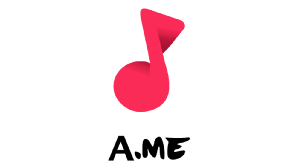
In China, Douyin began life as A.me on September 20, 2016. This name only lasted three months, but already the logo design incorporated a musical note to show the importance of music on the platform.
Sign up to Creative Bloq's daily newsletter, which brings you the latest news and inspiration from the worlds of art, design and technology.
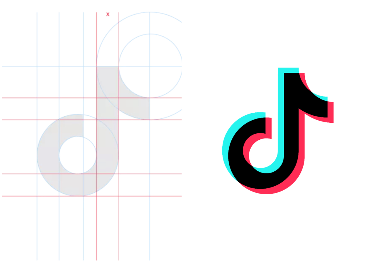
This motif would be refined and stylised after the platform changed its name to Douyin in December 2016. The musical note was made to look more like a letter 'D' for Douyin, and fuchsia and cyan shadows were added to make it look like it was shaking, also reflecting the app's new name.
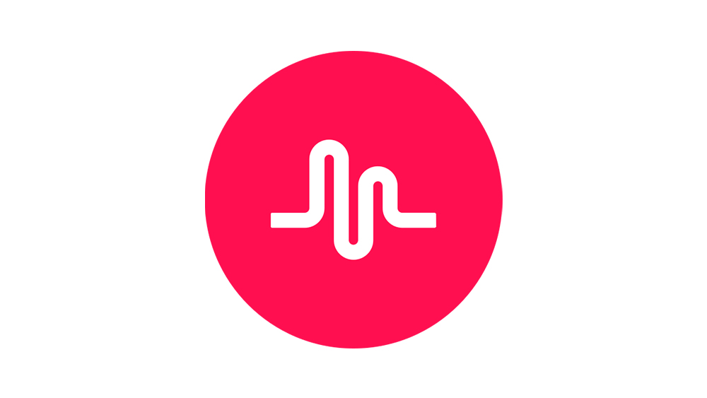
Musical.ly (pronounced "Musically") was a fairly popular social media platform based in Shanghai but with a presence in the US, including an office in Santa Monica. Like Douyin, it allowed users to create and share short lip-sync videos.
Seeing the opportunity to go global, ByteDance bought the company in 2017 and merged its app with TikTok.
The Musical.ly logo featured a letter 'M' designed in a way to make it look like sound waves. But ByteDance didn't retain any of the Musical.ly branding. In August 2018, Musical.ly users found that the TikTok logo had taken the place of the app on their phones.
The similarity between the colour of the Musical.ly logo and the pink in the TikTok logo appears to be pure coincidence.
The TikTok logo inspiration
Today, a musical note might seem a little misleading since TikTok is a video-based social media app rather than a music streaming service. But the symbol fits Douyin's name and made a lot of sense initially when the app's specialty was lipsynch videos. It was the ability to add music and reuse the sound from other videos on the platform, that helped the app to take off.
The company itself says that it wanted a logo that "spoke to the stage that TikTok had created for so many talented people." The result was "designed to inspire creativity and brings joy to fans and creators across the globe". Aww.
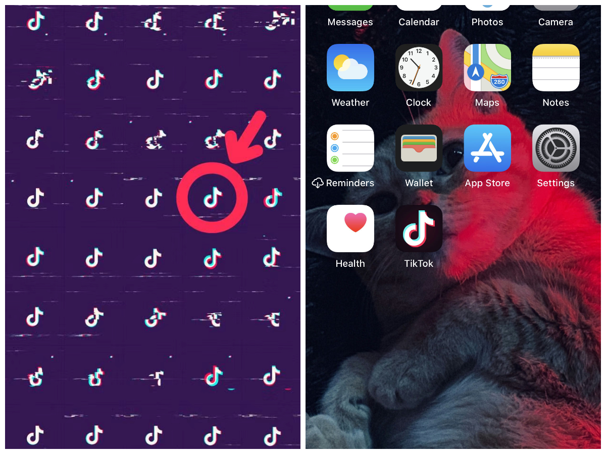
The designer of the TikTok logo, who the brand doesn't name in its own recap of the history, apparently "chose the colour black as the background of the logo to excite users for the performances behind the app." Fair enough.
Black also has the benefit of being different from the colours of any of the main established social media platforms, and perhaps even felt a bit rebellious.
The cyan and fuchsia shadows were apparently inspired by the designer's observation of the contrast between the dark backdrop and lighting effects at live music concerts. They were added to make it look like the logo is shaking.
The first TikTok logo
ByteDance launched TikTok outside of China as a separate app from Douyin, but it kept the same logo that it was using for its Chinese product.
It was a smart move. The mark is distinctive and dynamic, and a musical note serves as a relatively universal symbol that isn't limited to a particular culture or language, so there was no issue with the logo not working in the west.
The TikTok name was incorporated under the logo, initially spelled as two words in a basic sans serif font with squared-off corners.
The TikTok logo today
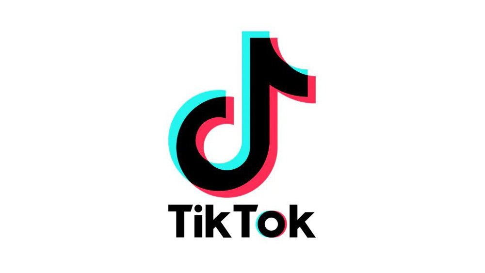
By the end of 2018, TikTok had grown to have 271 million users (it's since surpassed the two billion mark). At this point, the brand decided to dedicate a bit more time to finding the right font for the logo, and created the TikTok wordmark that's still in use today.
In the original logo, the text felt like a bit of an afterthought, flung on haphazardly below the mark, which it probably was. In the redesign, the text was made to look lot more connected to the glyph aesthetically, with heavier type, and the space between 'Tik' and 'Tok' removed.
A cyan and fuchsia shadow effect was added to the 'O' to mirror to enhance the connection between the wordmark and symbol, creating a more coherent whole.
The TikTok sonic logo
A brand that was all about music and people's responses to it was a prime candidate for an audio logo, and the TikTok sonic logo is a bit of a masterpiece.
Massive Music and sonic branding specialist VMC Sound put community-driven entertainment at the core of the identity by incorporating user-generated sounds into the distinctive sound identity.
It's a little raw and unpolished, hinting at spontaneous creativity, while the two onomatopoeic beats reflect the brand's name. The sub-bass sound is intended as a reference to music on the platform but one that transcends genres and regions, while the ascending melody communicates optimism and anticipation.
The team also created sonic sticker assets for community interaction, encouraging creators to integrate brand sounds directly into their own content. The identity won a host of awards, including at the Red Dot Awards 2023 and Clio Music Awards 2024. A survey found that 84% of users associated the sound logo with positive attributes.
Why the TikTok logo works
For most TikTok users, the TikTok logo's resemblance to a 'D' and its representation of the meaning of 'Douyin' is irrelevant since they're unaware of the TikTok logo's history and the existence of a Chinese app with a different name. And yet the logo seems to work perfectly despite being created in-house and before TikTok even existed.
It works because, perhaps even without knowing it, the uncredited designer used classic rules of logo design and colour theory. The design is simple, clean and easy to interpret and remember.
Black and white are bold, clear contrasting colours, while cyan and fuchsia, close to magenta, are complementary colours that create dynamic accents around the edge of the logo, adding depth and making the 2D design look more 3D through the evocation of anaglyph 3D images. The result is a design that captures the platform's slightly rebellious energy while looking different from other, more staid social media apps.
For more logo deep dives, see our features on the Google logo history, the Instagram logo history and the X logo history.
Looking to improve your TikTok videos? One of the best ring lights can make a big difference.

Joe is a regular freelance journalist and editor at Creative Bloq. He writes news, features and buying guides and keeps track of the best equipment and software for creatives, from video editing programs to monitors and accessories. A veteran news writer and photographer, he now works as a project manager at the London and Buenos Aires-based design, production and branding agency Hermana Creatives. There he manages a team of designers, photographers and video editors who specialise in producing visual content and design assets for the hospitality sector. He also dances Argentine tango.
You must confirm your public display name before commenting
Please logout and then login again, you will then be prompted to enter your display name.
