Poor old Lyle's. The golden syrup company probably wasn't expecting such a furore when it unveiled a new logo this week – its first new design in more than 140 years. But the rebrand seems to have infuriated several corners of the internet, and even the Church of England is upset.
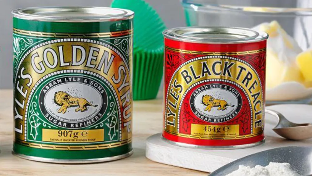
The previous logo, featuring a dead lion complete with swarming flies, was a tad more macabre the most (read: all) of the best logos of all time. But it did have some religious connotations – which might explain why the Church has decided to weigh in on the rebranding of a confectionary brand.

"There is nothing modern about ditching tradition or sidelining Christian messaging," Sam Margrave, a member of the General Synod, the Church of England's legislative body, told the Telegraph. "I am sure the Lyle business doesn't mind benefiting from sales and Christian branding every Easter, so why do they feel the need to eradicate their connection with their Christian founder's iconic logo which tells a story that works for every generation?"
Lyle's responded with its own statement to the Telegraph. "Religion played absolutely no part in our decision to try something different on our syrup bottles - a product format where we regularly use different approaches to our brands," Gerald Mason, Senior Vice President of Tate & Lyle Sugars, told the newspaper. "It makes me sad that we might have unwittingly upset people today, and I want to apologise for that."
As for the Christian connection of the old logo, the key is the product's tagline: "Out of the eater, something to eat; out of the strong, something sweet." The phrase comes from the Biblical tale of Samson. The story goes that Samson killed a young lion with his bare hands. When he goes back a few days later, he finds bees have made a hive in the carcass, so he helps himself to some honey. Asked by his parents where the bounty came from, he utters this line.
From Amazon's Hitler-esque icon to the world's rudest 'M', we've seen plenty of unsavoury logo designs over the years – but this is the first time we've seen everyone from Reddit users to the Church beg for one's return. If you're looking for more logo inspiration, check out our guide on how to design a logo.

