New LA Clippers logo is an instant classic
NBA team gets a stylish glow-up.
Sign up to Creative Bloq's daily newsletter, which brings you the latest news and inspiration from the worlds of art, design and technology.
You are now subscribed
Your newsletter sign-up was successful
Want to add more newsletters?
For sports fans, their team's logo is more than just a design, it’s a badge of identity. So when basketball team the LA Clippers decided they were due a new look, the result had to honour its legacy while still feeling fresh. With a bold new logo and refined wordmark, the Clippers’ new look is a slamdunk with fans, bringing the team into a stylish new sporting era.
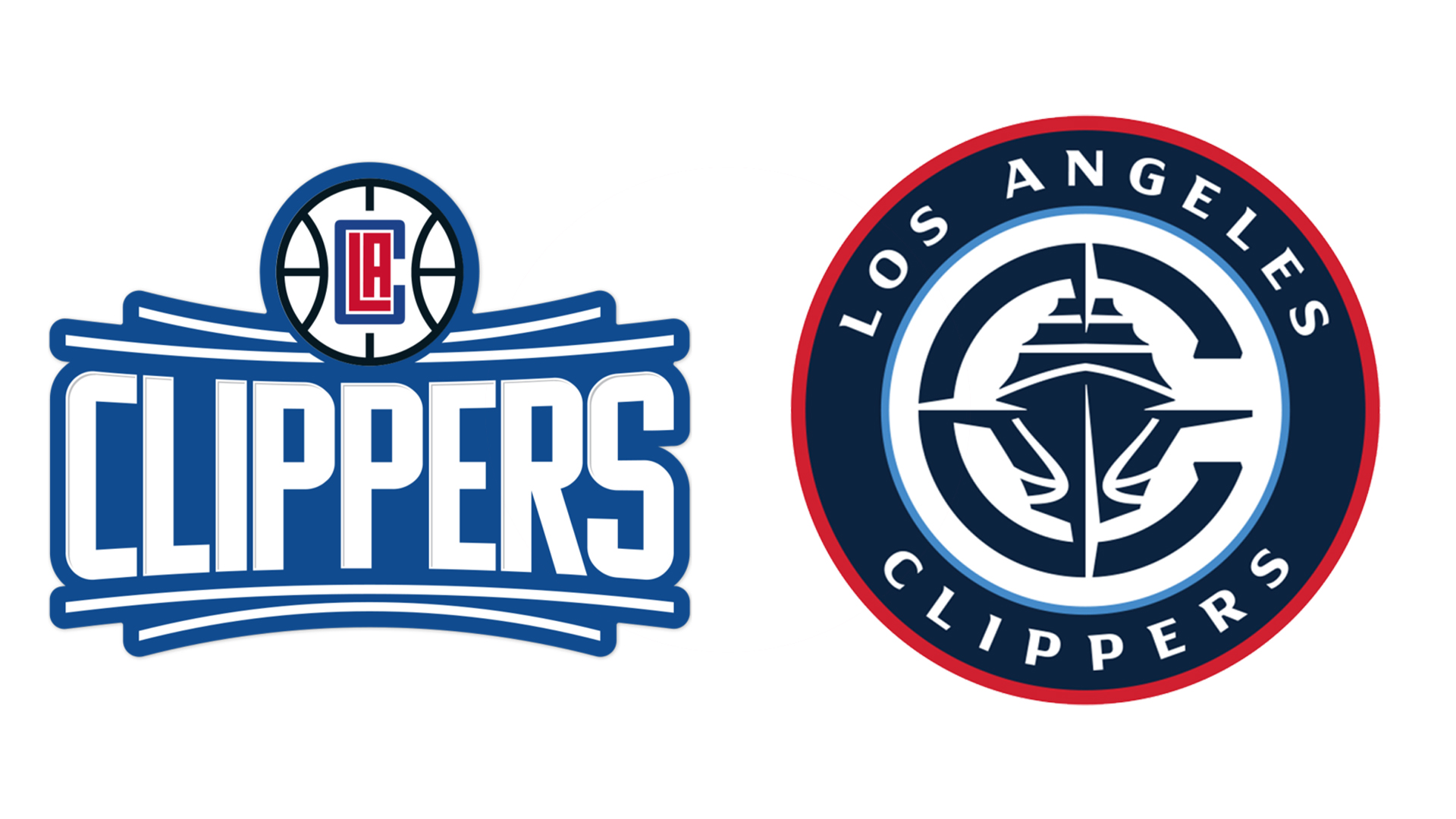
The best sports logos have fans at the heart of design, and the Clippers logo is no different, being shaped by the voices of supporters. Compared to the old logo, the new look is a major glow-up – simultaneously modern and timeless with its striking symbolism.
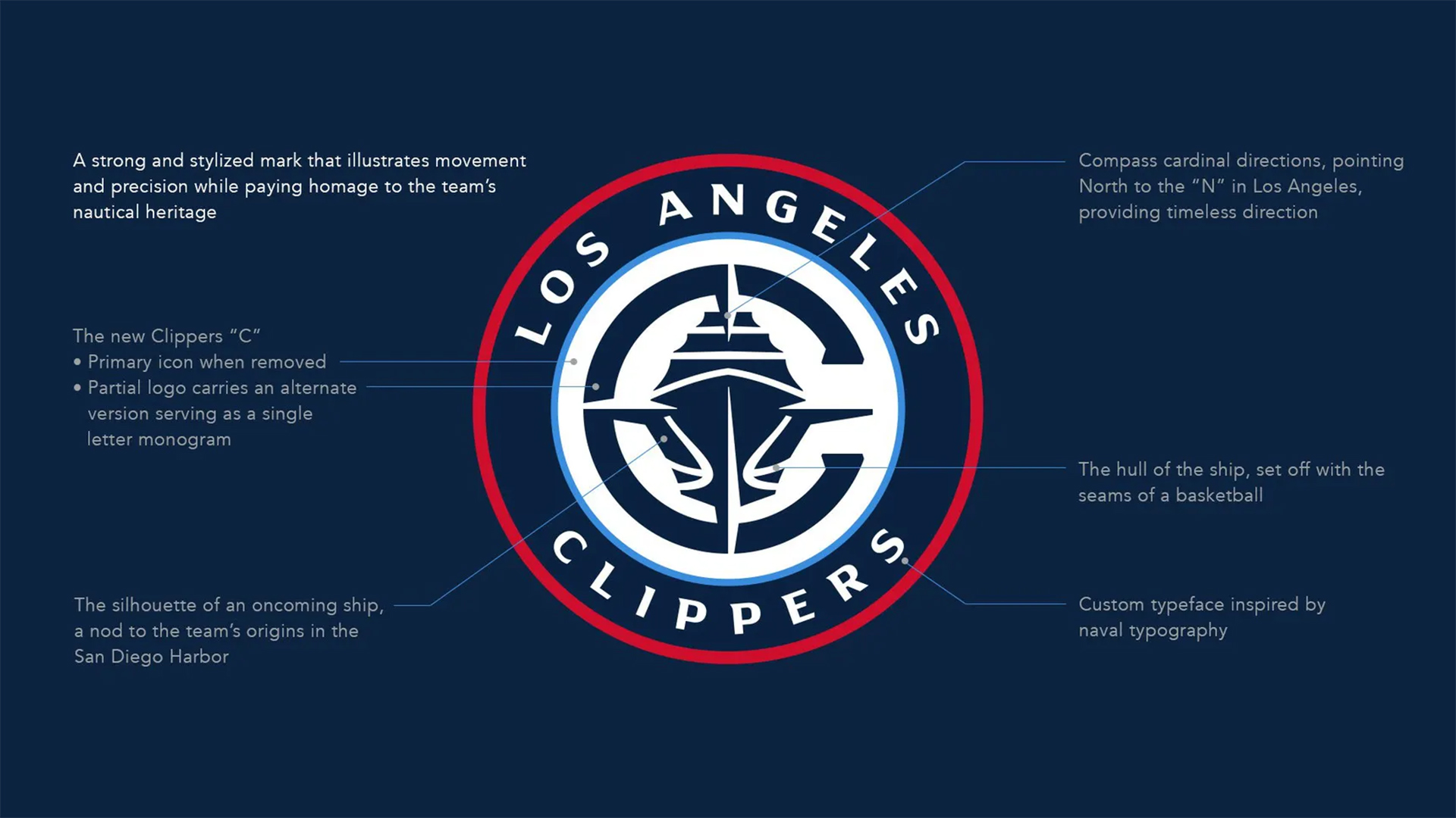
The new Clippers logo features a front-facing clipper ship in reference to its nautical identity, focusing on the concept of forward momentum. The face-on shilouttete of the vessel creates a confrontational fighting attitude while the wider compass-inspired design references the team's revitalised focus and direction. The clunky squared-off “C” of the previous logo has been scrapped for a curved design that compliments the circular badge emblem seen on the new kit.
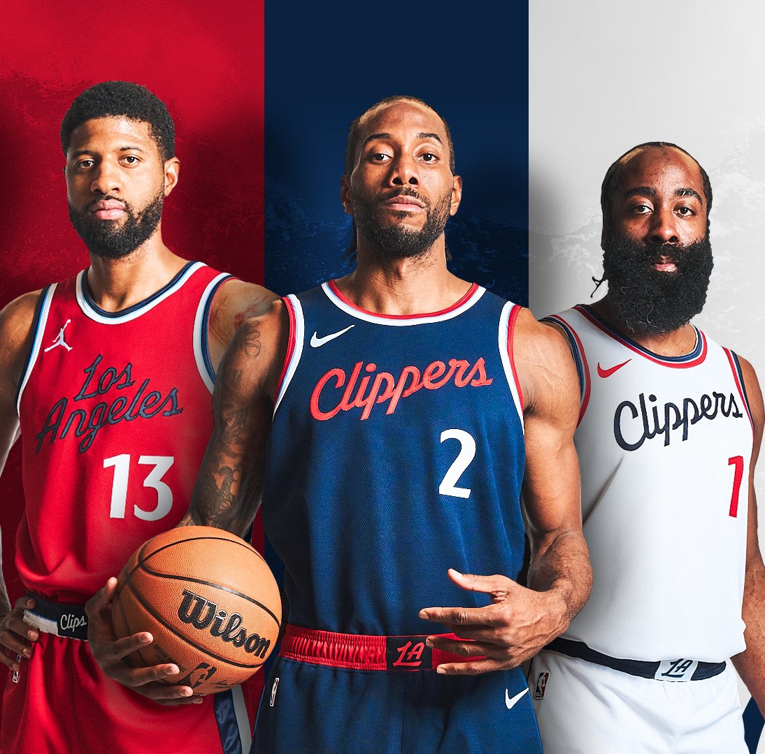
Article continues below"Embracing our maritime roots in a modern design, we take inspiration from past and future," says the team in the official new look announcement. In keeping with their traditional colours, the updated design features the same blue and red theme with a new navy blue motif that feels classy and elevated. The new look also features a revision to the team’s wordmark, which has been sharpened and refined for a cleaner, less cartoony look.
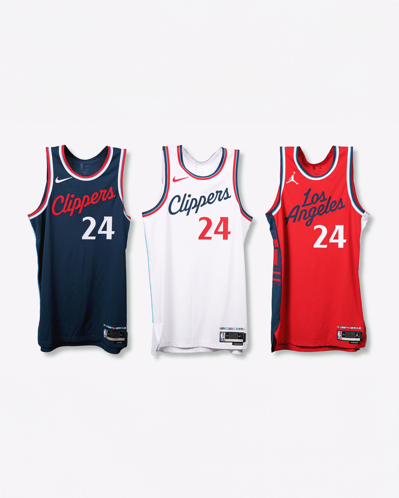
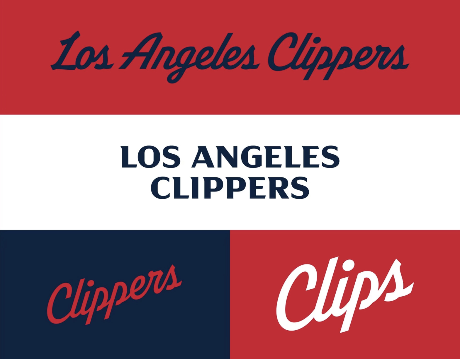
For more iconic sports rebrands, check out Tiger Woods’ new logo which has an ingenious hidden design. If you’re after more stylish design, take a look at the NBA’s new LED court that has to be seen to be believed.
Sign up to Creative Bloq's daily newsletter, which brings you the latest news and inspiration from the worlds of art, design and technology.

Natalie Fear is Creative Bloq's staff writer. With an eye for trending topics and a passion for internet culture, she brings you the latest in art and design news. Natalie also runs Creative Bloq’s 5 Questions series, spotlighting diverse talent across the creative industries. Outside of work, she loves all things literature and music (although she’s partial to a spot of TikTok brain rot).
