
The best sports logos often have to walk a very tight balancing act. They have to be dynamic and striking, ideally instantly recognisable. In many cases, they have to pay heritage to a great deal of history, while also being forward-facing and future-looking, reflecting a team or organisation's ambition to progress.
Many of famous sports logos have become cultural icons in their own right – but many many more have been consigned to the dustbin of history. So, here we've assembled a list of the most iconic, effective and downright spectacular sports logos ever designed, many of which have decades or even more than a century of history behind them.
If this has got you inspired to design a logo for your own local team, take a look at our rundown of the best logo design tools to help you do it, as well as our list of the best rebrands for some more inspo. For now though, let's dive into the most iconic sports logos from across the decades, and take a deep dive into what makes a timeless, fan-favourite design.
The best sports logos
01. Nike logo

The best sports logos also include the logos of sports brands, which are now inextricably linked to a wide range of sporting disciplines. Probably the most immediately recognisable around the world is the Nike Swoosh, which was created by Portland student Carolyn Davidson in 1971. Paid $35 for her work at the time, a decade later she was given a gold and diamond swoosh ring and Nike stock by founder Phillip Knight.
Effortlessly conveying the key elements of speed, agility and positive thinking, this logo has been the perfect representation of the brand for almost half a century, and it shows no signs of needing to be retired any time soon. That's not to say that the design is universally loved - there was a big backlash when Nike put the Jordan Jumpman logo on Utah Jazz shirts.
02. Olympic rings

The phrase "design classic" is thrown around a lot. But the Olympic Rings - five interlocking circles, coloured blue, yellow, black, green, and red - surely deserve the title. Instantly recognisable by people across the entire world, this iconic emblem is one of the most famous sports logos that exist.
Created in 1913 by Pierre de Coubertin, the design is richly symbolic. As de Coubertin wrote at the time: "It represents the five continents of the world, united by Olympism, while the six colours are those that appear on all the national flags of the world at the present time".
More than a century later, so much emotion has been invested by so many, in this beautifully simple yet powerfully unique design, making it one of those logos we never want to see changed. That said, it has been tweaked a couple of times over the years (see our piece on the Olympics rings history). Also see the first Olympics logo.
03. Paris Saint Germain logo

There are a lot of roundel logo designs in sports, and the style seems to be proliferating since a circle serves well for a range of applications. But few are so clear, clean and relevant as the Paris Saint Germain logo. The club's original logo featured a red ship, a symbol of Paris, but that was soon changed to a much more widely known symbol of the French capital, at least internationally: the Eiffel Tower.
The team has retained the same motif and colour palette since 1972, except for a brief departure in the mid-nineties. The design has been progressively simplified over the years to reach the super clean current incarnation introduced in 2013. A heraldic fleur-de-lis under the arch of the famous Parisian landmark adds a touch of class to the design.
04. Detroit Red Wings logo

The Detroit Red Wings logo communicates its team's origin in a different way. Rather than use a physical landmark, it uses a wheel to represent Detroit's history as US Motor City. It's an unusual motif for an ice hockey team, which makes the logo stand out from others in the NHL, while the colour and the wings are clear, literal references to the team's name that also give the logo a lot of energy. The design has changed little since the team's beginnings as one of the league's Original Six, with only the shading and dimensions being tweaked.
05. NBA logo
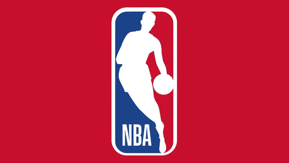
The instantly recognisable silhouette of 'Logoman', never formally acknowledged as but widely known to be 1960s Lakers player Jerry West, has been associated with the NBA for half a century. Designed by branding guru Alan Siegel in 1969, the NBA logo became so utterly iconic that it has barely changed in the intervening years. A tweak to the font here, a minor hue adjustment there – that's basically it.
The motif of a white silhouette on a red-and-blue background was originally pinched from a logo for Major League Baseball, designed by Jerry Dior the previous year. Then-NBA commissioner J. Walter Kennedy took one look at it, then called up Alan Siegel and instructed him to produce something similar. The rest, as they say, is history – and you can read our history of the NBA logo for a deep dive into how it all unfolded.
06. Nike Air Jordan logo

As a bonus, Nike actually owns another of the most famous sports logos. The Nike Air Jordan logo, known as the 'jumpman logo' dates back to the early years of the brand's collaboration with basketball legend Michael Jordan in the 1980s. It was designed by Peter Moore, who designed the Air Jordan I, based on a stage photograph, though didn't feature on the shoes themselves until Air Jordan III in 1988. It quickly became an iconic design associated with both Nike and the sportsman himself. And while we've seen plenty of athlete-brand collaborations and endorsements since, none has managed to achieve the same status.
07. NFL logo

The origins of the distinctive NFL logo are shrouded in mystery – sources think that the icon of the shield emblazoned with the football, stars and stripes probably originated in the 1940s, but could have appeared as early as the 1930s. The identity of the designer has been lost to history, but whoever they were, they nailed it, as the motif has represented the NFL right the way to present day.
There are currently eight stars on the logo, representing the eight divisions of the NFL. This came about as a simplifying revamp in 2008, after previous versions of the logo had sported 25 stars for (as far as anyone could tell) no reason at all. A beautifully clean revision of a classic logo that has stood the test of time – see our full history of the NFL logo for more.
08. Adidas logo

Occupying the same kind of iconic territory as the Nike Swoosh, the Adidas trefoil was also created in 1971. Incorporating the three stripes that Adolf 'Adi' Dassler had been using to identify its footwear since 1967, the three-leaf shape represents the main landmasses of the world: the Americas, Europe and Africa, and Asia.
Actually, though, no-one at Adidas designed it. The original owner of the logo was a Finnish company, Karhu Sports, who made sports shoes and spikes. But the company was hit hard by the Second World War and agreed to sell the design to Adidas for the equivalent of €1,600 and two bottles of whiskey. (It didn't do them any harm though; they're still a successful company today.)
09. The Manchester United logo

Manchester United may nowadays be a multinational business and media entity worth somewhere close to five billion pounds. But its still an organisation that's richly steeped in heritage, and that's clear from its logo.
The current version, which was crafted in 1998, represents a gradual evolution over the decades from the original 1963 design, which was based on the coat of arms of Manchester City Council. The red devil, based on the club's nickname, was added in the 1970s, and the word 'Football Club' were removed in the 1990s.
Overall, though, a time traveller from half a century ago would not find difficulty in recognising the current logo. And as such it remains a beacon of steadfastness, linking today's global, big-money operation back to a more communal and local past.
10. The Dallas Cowboys logo

Known as “America’s Team”, The Dallas Cowboys have been named by Forbes as the most valuable sports franchise in the world. And at the centre of this powerful brand lies a sports logo that is all-encompassing in its simplicity.
The original Dallas Cowboys logo, used from 1960 to 1963, was an identical blue star, but without the border. It was an obvious tribute to Texas, known as the 'Lone Star' state. The logo was redesigned by Jack Eskridge after he joined the team in 1959, who added the border and made the logo look more 3D.
Still used today on everything from team helmets to supporter merchandise, the Dallas Cowboys logo has proved to be as versatile as it is iconic. Also see our pick of the best NFL logos.
11. The New York Yankees logo

The famous baseball team's interlocking 'NY' logo actually predates the Yankees themselves. One of the team’s co-owners was former police chief 'Big' Bill Devery, and in 1877 he commissioned Tiffany & Co to design a police medal to honour a fallen officer, John McDowell, who'd been shot in the line of duty .
A few years later, Devery realised that this design could be used as a way of conveying team unity. And so in 1905, the players, then known as the New York Highlanders, adopted a version of the medal design as their official logo.
Over the years, it came and went from season to season, but has since become established as one of baseball's (and New York's) most enduring symbols, not to mention a global fashion statement in its own right. It's certainly one of the best MLB logos.
That said, it's worth noting that their most famous player, Babe Ruth, never actually wore it on his jersey. Future biopic makers, take note!
12. The Chicago Bulls logo

Although US basketball is not widely followed outside of North America, there are two things people all around the world will recognise: the name Michael Jordan and the striking Chicago Bulls logo, easily one of the best NBA logos.
This design featuring an angry red bull has been in place since the team began in 1966, and seems unlikely ever to be altered (although some have tried proposing new Chicago Bulls logos). It was designed by the late cartoonist and graphic artist Dean Wessel, although he unfortunately never received any payment for his effort beyond a few free tickets.
13. The Premier League logo

Although the sports logos on our list so far have all been around for decades, that doesn't mean a new logo can't quickly become a classic. And here's a great example.
The lion had been a part of the Premier League identity for decades. But in 2016, this vibrant new version of its logo was created by DesignStudio and Robin Brand Consultants. And, somewhat unusually for a new logo launch, especially in the impassioned world of sport, it met with near-universal praise.
A defiantly modern design, stripping back the previous design to its bare essentials, and much more flexible when used across digital media, this was a redesign that ticked all the boxes.
Most importantly, it gave the lie to the idea that sports fans are super-traditional and don't like anything that's new. Apparently they do, as long as it's good.
14. Arsenal FC logo

A nice, literal logo for one of the Premier League's most famous teams – the Arsenal cannon has existed in some form or another since 1905, originally forming part of a coat of arms. The modern distinctive crest, however, debuted more than a century later in 2002.
Keeping things simple, it pairs the profile silhouette of the cannon with the team's name in bold, striking letters, and incorporates all of the team's associated colours – not just the obligatory red, but also blue, gold and white. The shield motif, meanwhile, is a tip of a hat to the crest's coat-of-arms origins.
15. The Invictus Games logo

Found in 2014, the Invictus Games is a sporting event for disabled, wounded and sick servicemen and women initiated by Prince Harry. When Lambie-Nairn (now part of Superunion) was asked to create its identity, they discovered that 'Invictus' is also a famous poem, with the final lines: ‘I am the master of my fate: I am the captain of my soul.'
Following this thread, the team hit on the device of highlighting ‘I Am’ within the logo. And this became not just the founding idea of the Games’ visual identity, but a truly global cultural phenomenon.
Nowadays, if you do Google Image search for ‘I Am Invictus tattoo’, you’ll find that sentiment tattoed on the arms of people from all across the world. Like most great ideas, it's simple, but powerfully and beautifully realised in an elegant logo design.
16. The Tour de France logo

The Tour de France logo we've all come to know and love (above) was created by designer Joel Guenounback in 2002. Its playful brush script and splash of vibrant colour is unmistakably French, and filled with that sense of 'joie de vivre' (enjoyment of life) for which the Gallic nation is known. The yellow background symbolises the yellow jersey given to the winner of each stage. And did you spot the clever little sketch of a cyclist that's formed within the word 'Tour'?

In 2019, the longstanding logo got an eye-popping refresh (see above), with some tweaks to the typography, the disappearance of the word 'Le' and a much brighter yellow to match the jersey colour better. Read more about the latest refresh here.
17. Italy 1990 World Cup logo

One of the best World Cup logos, Italia 1990's minimalistic ball design was clear and precise. It featured with offset shadows to incorporate the colours of the Italian flag and it was the perfect complement to the star of the visual identity: the mascot ciao.

The mascot, the result of a competition, was the work of self-taught graphic designer Lucio Boscardin. The stylised character composed of blocks in the Italian colours, was a breath of fresh air in World Cup branding. It broke away from the tendency for World Cup mascots to be animated characters with cheesy smiles, avoiding stereotypes by presenting an anonymous, gender-neutral footballer that still had a lot of character. It was clearly Italian and versatile enough to be used almost as a logo itself.
18. Boston Red Sox

Founded in 1901, Boston's finest were initially known as the Boston Americans. The Red Sox name was chosen by the team owner, John I. Taylor, after choosing a white uniform with bright red stockings for home games. He also designed the original logo, featuring a single red sock with a white trim.
The Red Sox logo used from 1950 to 1960 was frankly terrifying, but in 2009, the team switched back to the classic 1924 logo, with a few modernising tweaks to a clean and modern design that clearly depicts those famous red socks themselves.
19. Miami Heat logo

The Miami Heat logo is one of the NBA's most recognisable icons, and not just because of its legendary team. Representing the fiery passion of its players, the Miami Heat logo is a prime example of timeless design, remaining mostly unchanged since its 1988 debut.
Created by Mark Henderson and Richard Lyons, the iconic design was voted for by fans, receiving 34% of the vote out of 13,000 submissions. The graphic appeal of the design, with its bold imagery and dynamic flame motif, has become an iconic design, proving that a simple concept can have a big visual impact.
Of course, we couldn't fit all the best sports logos in our list (sorry if your team didn't make the list). For more sporting design, take a look at the best NBA logos and the best UK football logos.

