The best World Cup logos ever
Find winning inspiration in the best World Cup logos, from 1930 to the present day.
Sign up to Creative Bloq's daily newsletter, which brings you the latest news and inspiration from the worlds of art, design and technology.
You are now subscribed
Your newsletter sign-up was successful
Want to add more newsletters?
The best World Cup logos are often remembered long after the specific competition they were designed for. The FIFA World Cup and FIFI Women's World Cup are among the biggest global sporting events, and their branding needs to represent the passion of millions of football fans, and of the host nation.
Getting that right is no mean feat for the branding agency that wins the account, but there are several World Cup logo designs that have gone down as classics, from the first World Cup in Uruguay back in 1930 right up to the 2023 Women's World Cup in Australia and New Zealand. Below, we recall ten of our favourites (and yes, we're controversially including the 2026 World Cup logo!)
For more inspiration, see our picks of the best sports logos and the best logos overall.
Article continues belowThe best World Cup logos to date
01. Uruguay 1930 World Cup poster
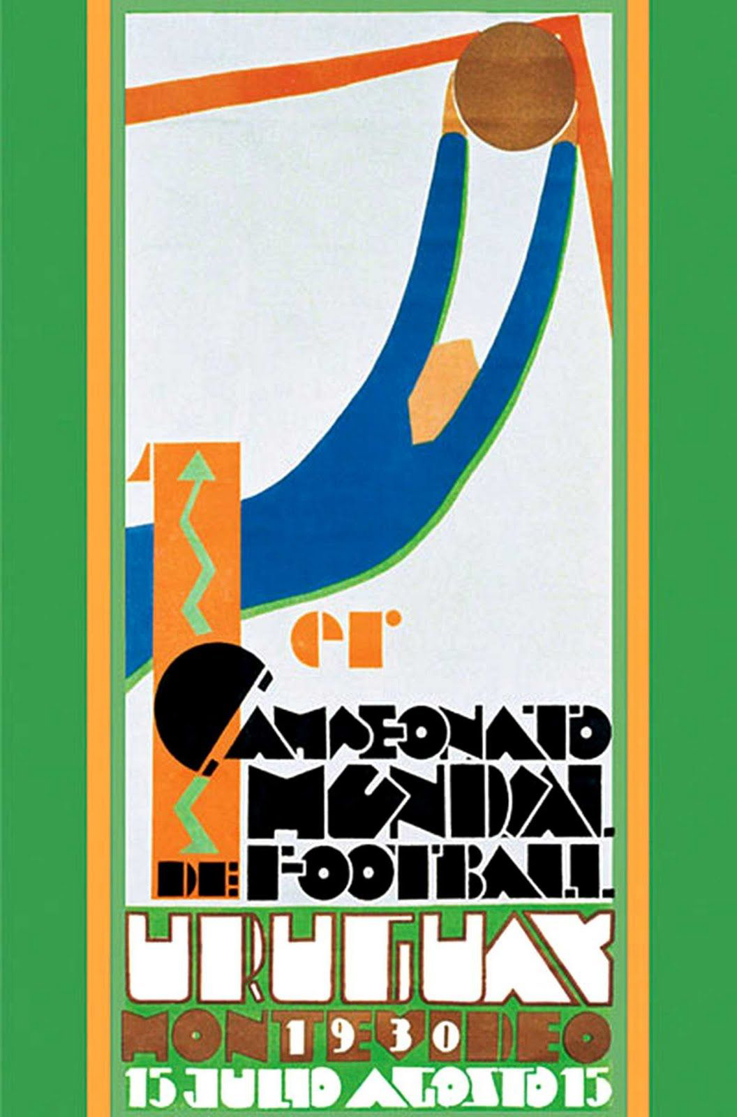
We're starting at the very beginning, with the first-ever World Cup – held in Uruguay in 1930, when there were only 13 teams participating. Although there wasn't a World Cup logo exactly at this stage, the beautiful Art Deco-style poster created a wonderful look for the inaugural event in what would go on to become one of the world's greatest sporting competitions.
Featuring an absract, stylised image of a goalkeeper making a save, clad in the Uruguay national colours, the poster captures the spirit of the game as well as the aesthetic of the time.
02. France 1938 World Cup poster
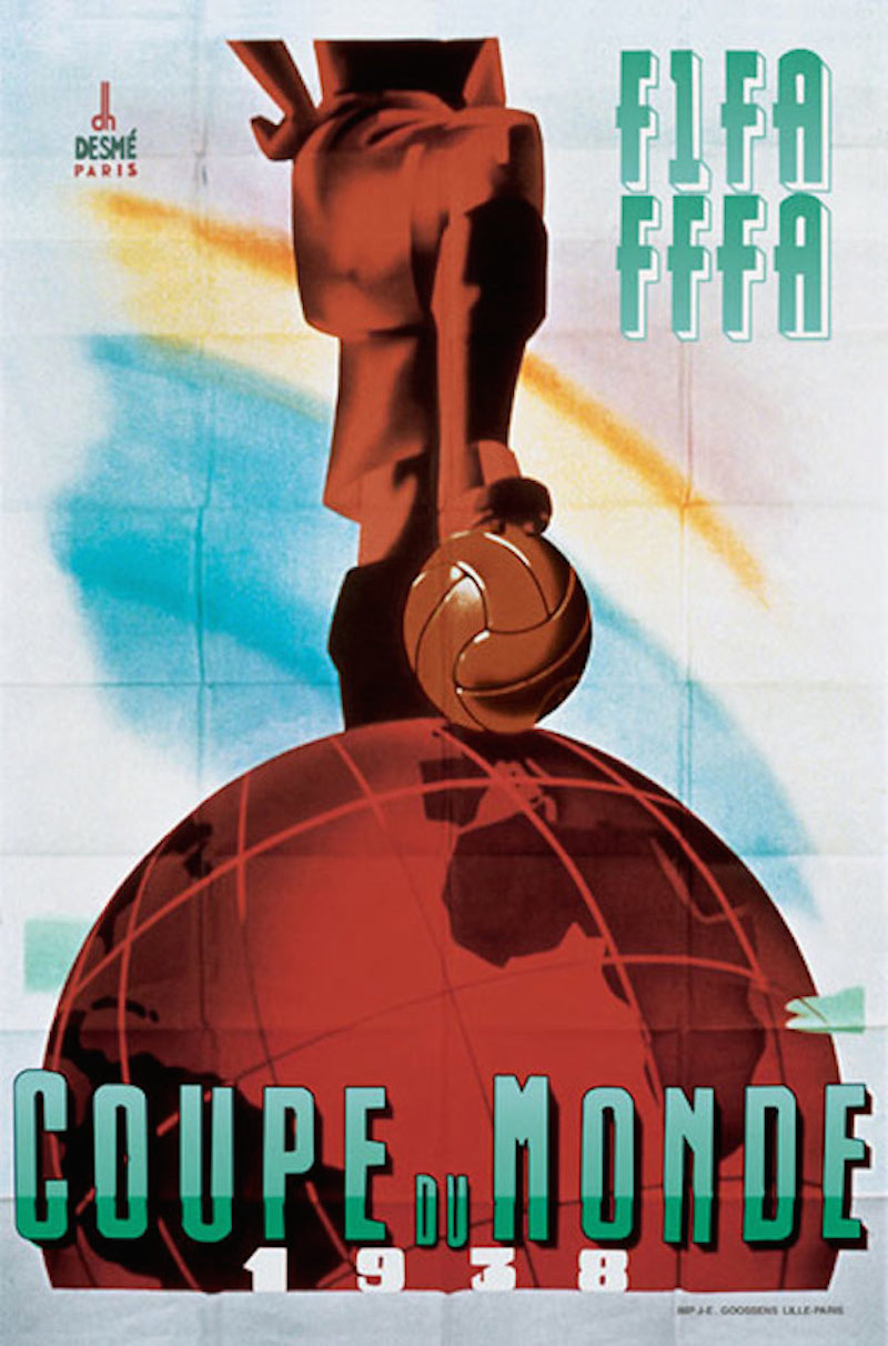
Two tournaments later, the World Cup made it to France – with another beautifully stylised poster replacing the action shot of Uruguay's offer with a dominant, imposing stance of a footballer conquering the globe.
Little did the world know of the devastating conflict that would be sweeping through France in the following few years, but here in 1938, notions of victory and world domination were confined to the beautiful game. This was the third and final time that a poster represented the tournament rather than a logo. Compared to some of the more overt 'national flag' palettes that followed, the use of red, white and blue is much more conceptual and abstract.
Sign up to Creative Bloq's daily newsletter, which brings you the latest news and inspiration from the worlds of art, design and technology.
03. England 1966 World Cup logo
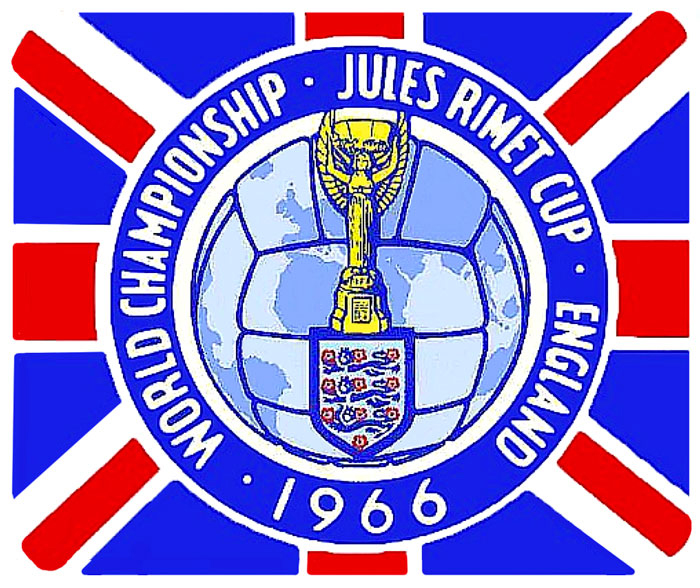
In stark contrast, England's 1966 World Cup logo attempts to leave no doubt as to the identity of the host country (although Scottish, Welsh and Northern Irish fans may query the choice of the Union Flag rather than the English one). The logo for an event that was the first, and only time the country has triumphed at the tournament looks gaudy and amateur today with a hand-drawn look.
As well as the English team's Three Lions crest, another very overt link with the host country, this World Cup logo prominently features the Jules Rimet Cup itself – which was replaced by the current cup design in 1974. Rather than a footballer conquering the globe, with a ball on top of it, the strikingly symmetrical design instead integrates the globe with the football.
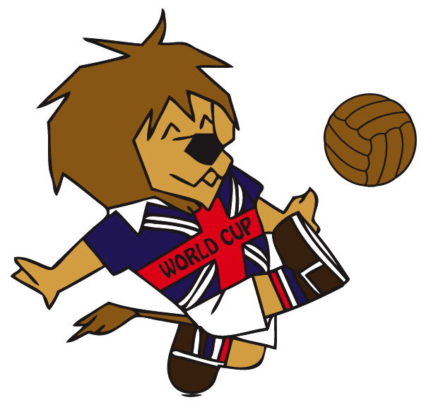
Another first at the England World Cup was the introduction of the first World Cup mascot in the form of a footballing lion. World Cup Willie kick-started a tradition that has become an integral part of World Cup culture.
04. Mexico 1970 World Cup logo

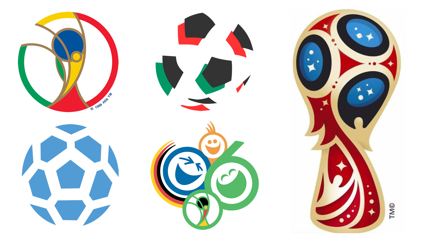
The following World Cup, held in Mexico in 1970, is widely considered one of the finest in history – seeing Pelé's Brazil team picking up their third trophy. The logo is beautifully simple, graphic and effortlessly iconic – and also the first to feature the Adidas Telstar ball, with its alternating pentagonal and hexagonal segments, now inextricably linked with the modern game.
05. Italy 1990 World Cup logo
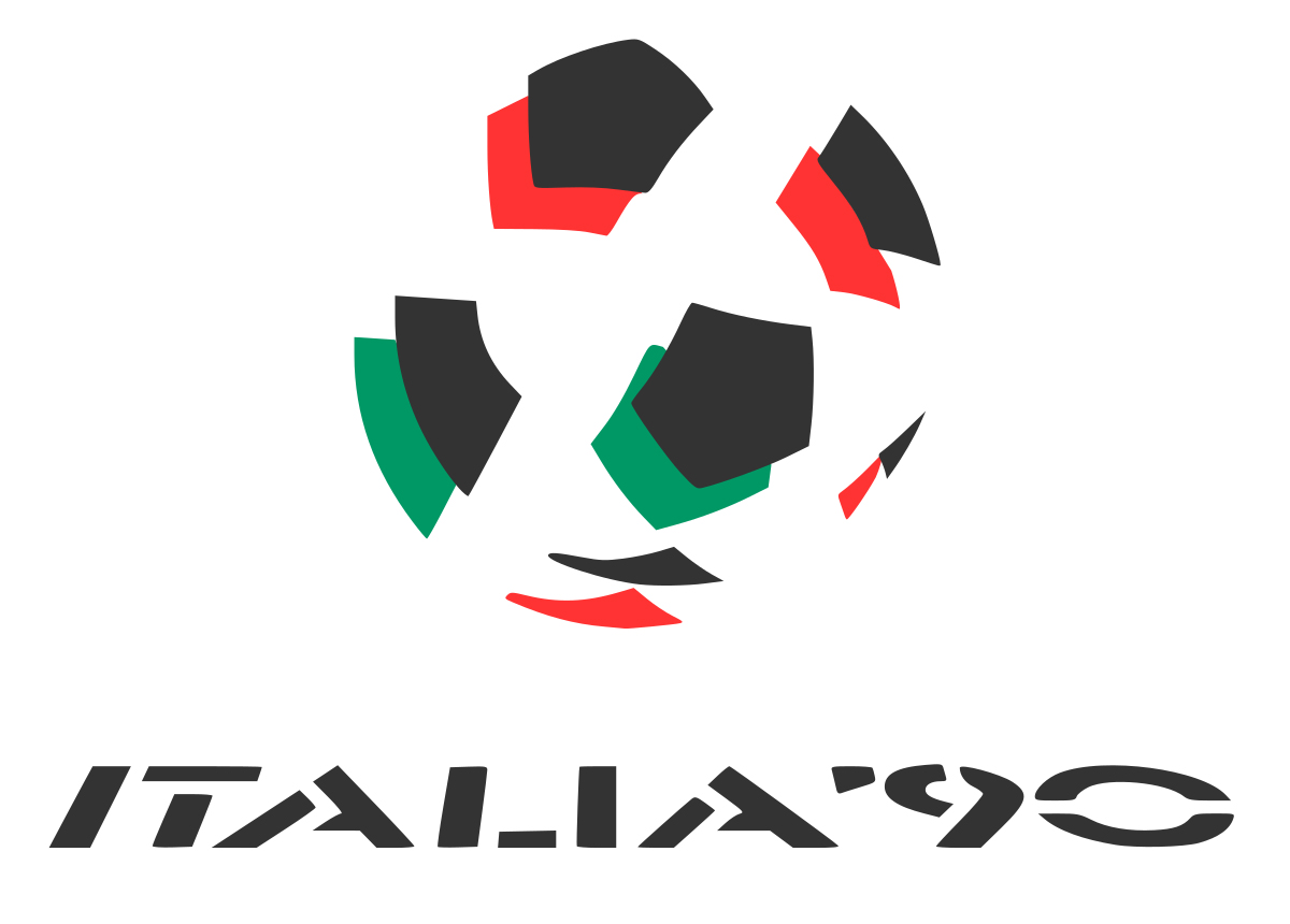
Two decades later, a similarly minimalistic depiction of the ball design featured in the Italia '90 World Cup logo, albeit offset in a more abstract way to incorporate the colours of the Italian flag.
Amid the flurry of anthropomorphic animals that followed England's World Cup Willie – and continues to this day – Italy really bucked the trend with its mascot, translating the stylised, graphic look and feel of the logo design into a character called Ciao.
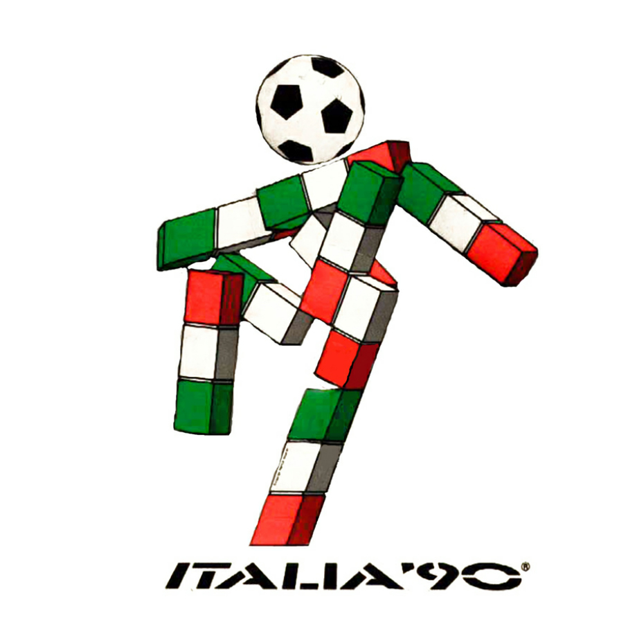
Other than his featureless football-shaped head, Ciao – which means both 'hello' and 'goodbye' in Italian – was composed entirely of simple blocks in the Italian colours. He certainly stands out in a line-up of World Cup mascots to this day.
06. Korea / Japan 2002 World Cup logo
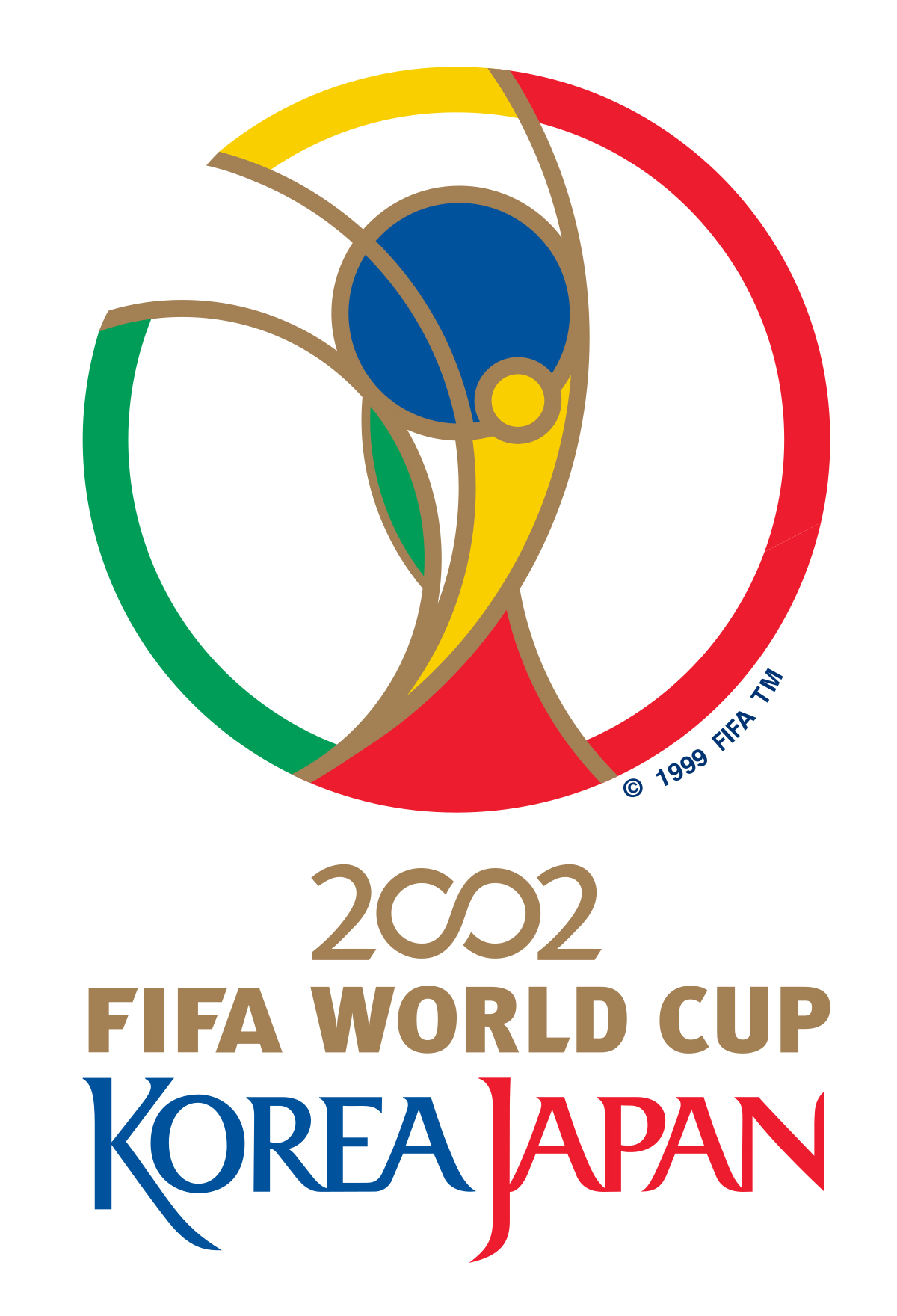
The first World Cup of the new millennium, Korea/Japan's joint hosting of the contest in 2002 kicked off a wave of modern, geometric logos that put the focus back on the trophy rather than the ball, and the global community of fans rather than the host country.
Formed from intersecting curves and circles, the logo – created by Interbrand London – is a clever combination of trophy outline and banner-waving fan, all contained within a satisfying perfect circle.
07. Germany 2006 World Cup logo
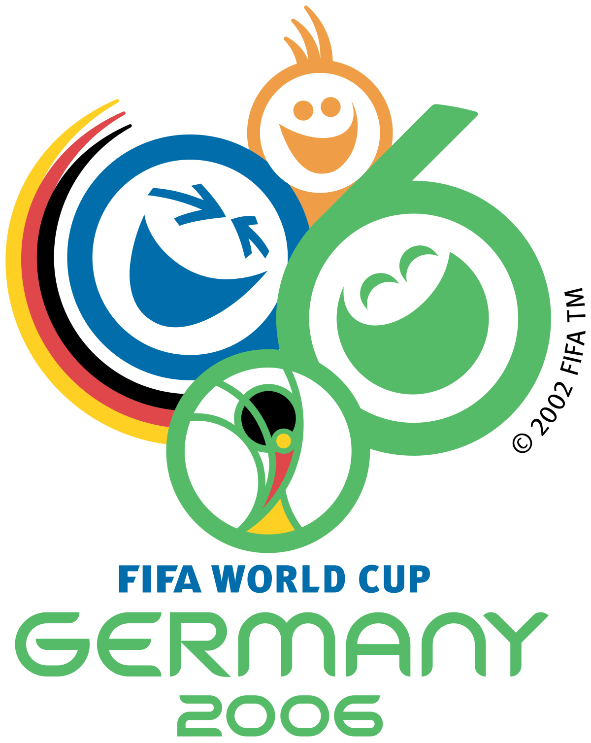
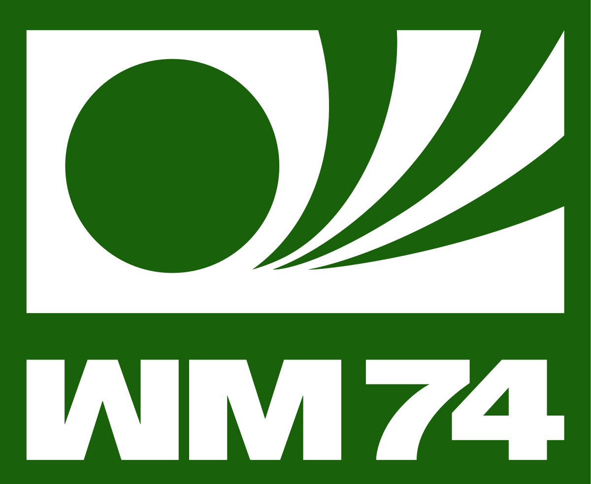
For the Germany 2006 World Cup, for the first time the World Cup logo integrated its predecessor. But it also gave full prominence to the fans this time. Having last hosted the Word Cup in 1974 (as West Germany, the eventual champions) with a minimalist two-colour logo that depicted a ball flying through the air, modern unified Germany opted for a much more colourful, cheerful design.
Dubbed 'Celebrating Faces of Football', the 2006 logo is all about the camaraderie of the game, with the '0' and '6' given stylised laughing faces. Germany's flag colours are subtly represented, as a sweeping banner around the side, as well as within the repurposed Korea/Japan 2002 logo at the bottom.
08. Russia 2018 World Cup logo
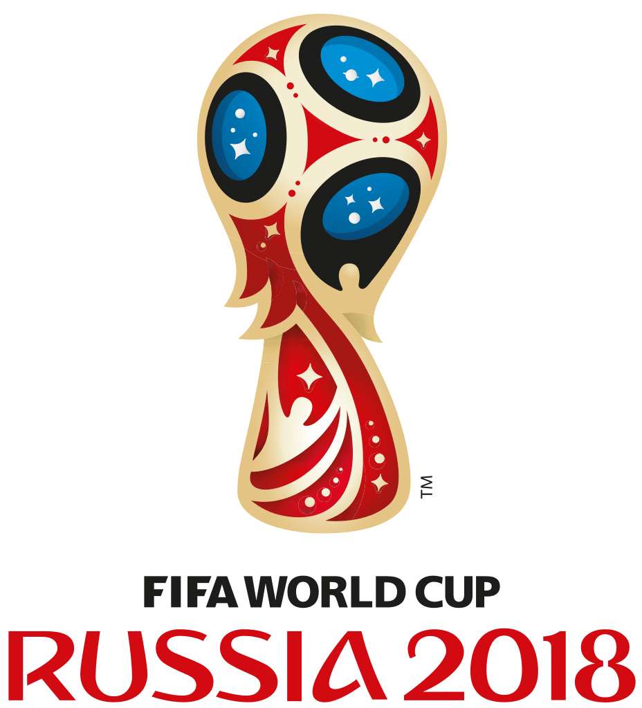
The last few World Cup logos, from Brazil 2014 to Qatar 2022, were a bit of an about-turn, placing all the emphasis on the trophy itself. It felt like FIFA was aiming to transition to a more consistent look in the logo, with each design featuring a stylised version of the World Cup with colours and motifs representing the host nation.
The first, the Brazil 2014 logo, was much mocked, and popularly dubbed a 'facepalm' for an unfortunate resemblance. The Qatar 2022 logo was also a bit of a strange one, turning the trophy into a figure 8 in an embroidered shawl because... well, there were eight stadiums. However, the Russia 2018 World Cup logo felt like it got things right. Lisbon-based Brandia Central integrated references to Fabergé eggs, Saint Basil’s Cathedral in the Red Square and the Sputnik space probe. The decorative, ornamental flair combined with a personality-laden typeface added a new twist on World Cup logo tradition.
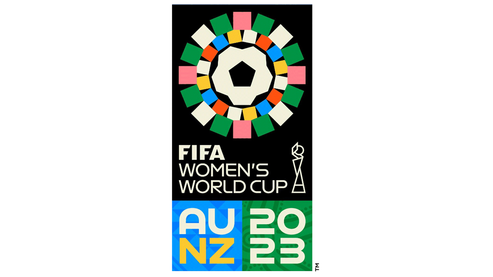
09. Australia and New Zealand 2023 Women's World Cup logo
The 2023 Women's World Cup has been one of the most high-profile women's football events yet, and thankfully the logo also got more love this time around. It's a design that proves that representing a host nation doesn't have to mean using the colours of the national flag. Instead, the colour palette is intended to represent Australia and New Zealand's forests, mountains, cities and water.
There's a lot going on in the full package. There are 32 squares, representing the number of teams competing, while their arrangement in a circle is intended not only to complement the shape of the football in the centre but also indigenous traditions. But as well as the main logo, there's also a simplified version of the silhouette of the Women's World Cup trophy plus two patterns, one created by Australian artist Chern'ee Sutton and one by New Zealand textile artist Fiona Collis.
It might feel like a bit too much, but together the pieces create a complete identity and a package of elements that can be used over different pieces. It's a vibrant and inclusive identity that helps put the event on the map.
10. The 2026 World Cup logo
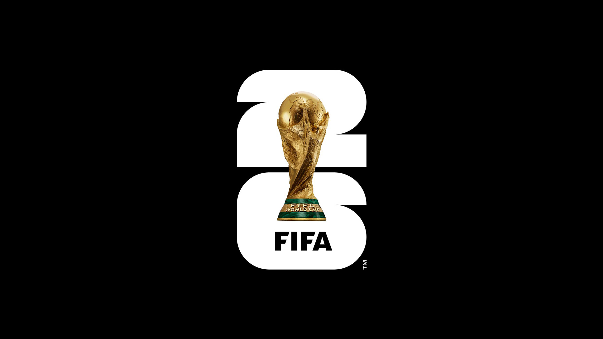
The FIFA World Cup 2026 logo took many people aback when it was revealed. It turns its back on World Cup logo traditions with an exceedingly simple design: a vertically aligned '26' with a photo of the World Cup itself slapped over it, along with the word 'FIFA'. And that's it. We often say that simplicity is a virtue in logo design, but for some this was taking it too far.
Even more controversially, FIFA has said that it plans to use the same style in future logos, effectively taking the same approach as the Super Bowl logos in recent years by adopting a fixed brand style that can be replicated at each event. "The image of the trophy and the year allow for customization to reflect the uniqueness of each host, while building an identifiable brand structure for years to come,” FIFA says.
That means more consistent but more boring branding. And since the World Cup only takes place every four years, it's possible that such an approach could grow tired even more quickly than with the Super Bowl. But, that all said, the logo design actually works well in some of the example branding we've seen so far.
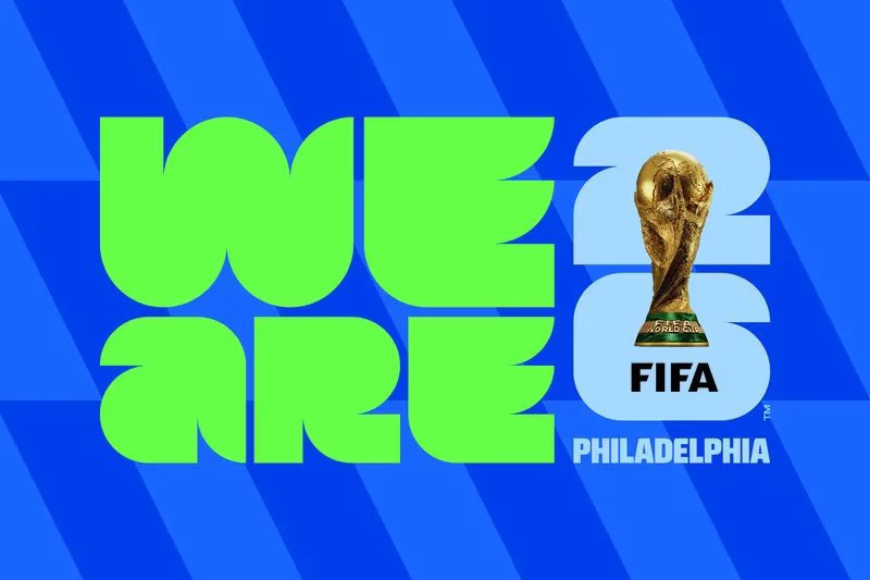
The brand package as a whole is lot more exciting than the logo in isolation – with the addition of bright colours and patterns, and the typeface really pops. The question is how the photo of the trophy is going to work in small applications (see our guide to how to design a logo for tips on implementing your own designs).

Nick has worked with world-class agencies including Wolff Olins, Taxi Studio and Vault49 on brand storytelling, tone of voice and verbal strategy for global brands such as Virgin, TikTok, and Bite Back 2030. Nick launched the Brand Impact Awards in 2013 while editor of Computer Arts, and remains chair of judges. He's written for Creative Bloq on design and branding matters since the site's launch.
- Joe FoleyFreelance journalist and editor
