The best NBA logos: 10 basketball teams that nailed branding
Sign up to Creative Bloq's daily newsletter, which brings you the latest news and inspiration from the worlds of art, design and technology.
You are now subscribed
Your newsletter sign-up was successful
Want to add more newsletters?
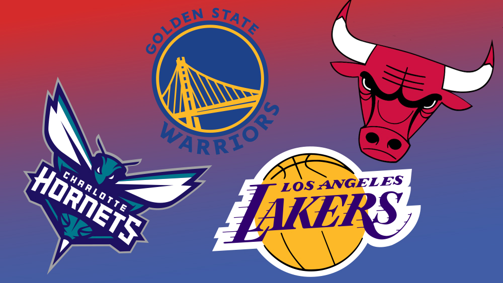
The best NBA logos are known around the world, even among people who don't follow US basketball. From the Chicago Bulls' angry bull to the Golden State Warriors' leaping bridge, these identities are successful in different ways but have all become iconic representations of each team's identity.
While some have evolved over time, many of them have stayed more or less unchanged for decades. It's testimony to the strength of these designs, which are among the best sports logos of all time. Below, we've gathered together a list of the eight we love the most. Please note, though, that's not the same thing as the teams we love the most. (We're a design website, not a sports website, so no hatin' on us!)
Anyhow, we hope our selection inspires you to create your own designs, perhaps using the best logo designer software to get you started. Also see our history of the NBA logo itself as well as the best sports fonts.
Article continues belowThe best NBA logos
01. Atlanta Hawks
No one in the NBA's travelled around the country quite like the Atlanta Hawks. The team's origins can be traced to the Buffalo Bisons, created in 1946 in Buffalo, New York as part of the National Basketball League (NBL). The team then moved to Moline, Illinois, where they were renamed the Tri-Cities Blackhawks. The new name was a tribute to the 1832 war in Illinois between the United States and Native Americans, led by the Sauk leader Black Hawk.
In 1949, the team joined the NBA and two years later moved to Milwaukee, where they because the Milwaukee Hawks. In 1955 they become the St. Louis Hawks, then finally moved to Atlanta in 1968. (Got all that?).
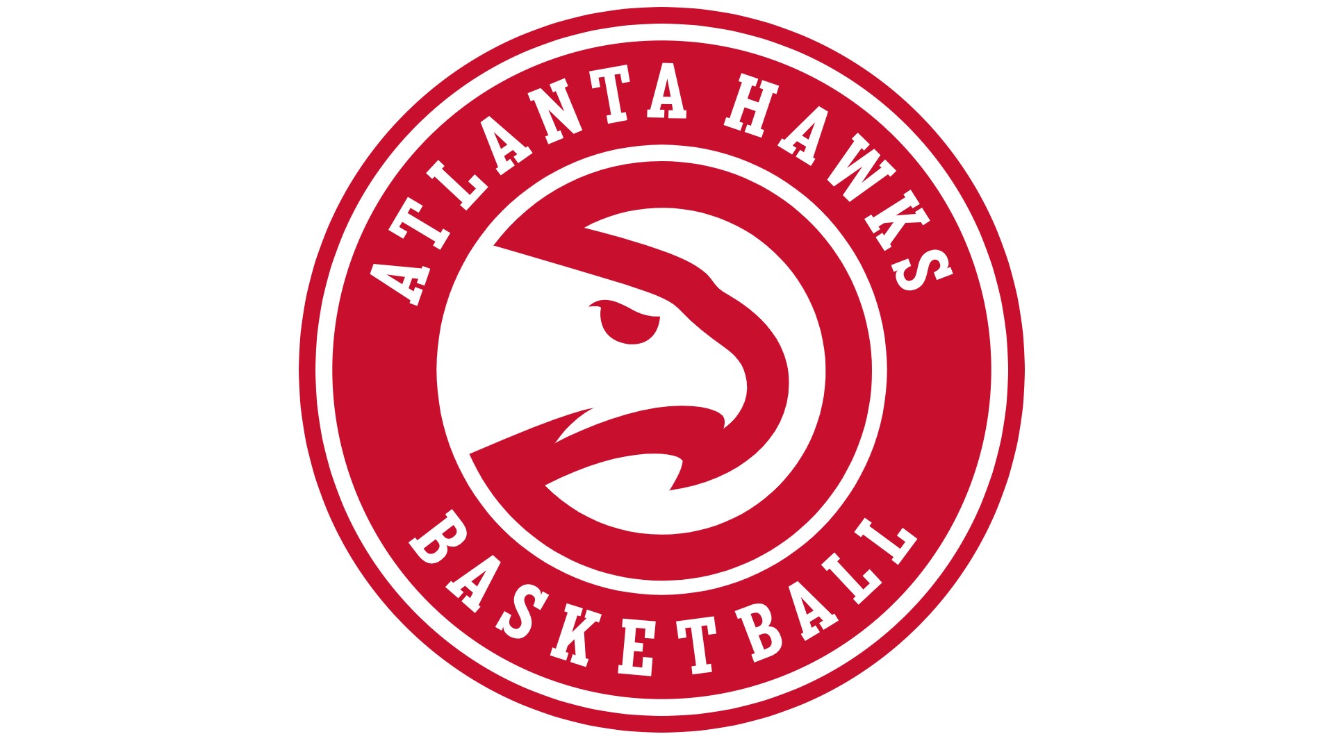
The genesis of their current logo came in 1972, when they debuted a simplified hawk head silhouette inside a circle, in red and white, which made masterful use of negative space and was ironically dubbed the 'Pac-Man logo' by fans.
This was replaced by a completely different design in 1995, based around a flying hawk. But the '72 logo came back around in 2015, now enveloped in a more formalised badge along with the name of the club. We particularly love the cleanness of the serifs and the blood-like hue of the primary colour, amplifying the palpable sense of menace and aggression.
Sign up to Creative Bloq's daily newsletter, which brings you the latest news and inspiration from the worlds of art, design and technology.
02. Boston Celtics
Founded in 1946 as one of the league's original eight, the Celtics play their home games at TD Garden. (Coincidentally, that's also the home of the National Hockey League's Boston Bruins, owners of one of the best NHL logos). The Celtics currently hold the record for the most recorded wins of any NBA team.
The name is an obvious nod to Boston's large Irish-American population, caused chiefly by a wave of immigration from Ireland in the 19th century. In fact, people of Irish descent today only constitute 15.8% of Boston's citizenry. But more broadly the city has long embraced the Emerald Isle as its cultural and spiritual home, and so it's not surprising that the Celtics logo leans so heavily into this connection.
The logo was originally designed by Zang Auerbach, the brother of Celtics head coach Red Auerbach, and an artist and cartoonist who also designed the logo for the Washington Senators baseball team.
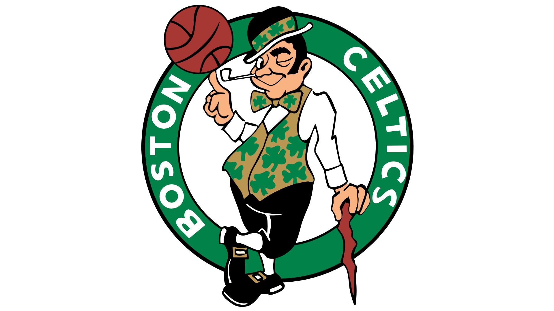
Unashamedly cheesy and revelling in Irish stereotypes with wild abandon, it features a leprechaun named Lucky spinning a basketball. Its predominant colour is green, a hue strongly associated with Irish nationalism since the Great Irish Rebellion of 1641. The team have also had various alternative logos over the years, with the most popular being a white shamrock with the word Celtics above it, wrapped in a green circle.
03. Charlotte Hornets
Based in Charlotte, North Carolina, the Charlotte Hornets were founded in 1988. The name was inspired by British General Cornwallis, who allegedly described the city as "a hornet's nest of rebellion" following the Battle of Charlotte in 1780.
In the 35 years since, the team has switched back and forth between Hornets and Bobcats, and their original hometown and New Orleans. They're currently based at the Spectrum Center in Uptown Charlotte. In 2014 the club returned to its original name, and devised their fourth and current logo. The entire brand identity was designed in collaboration with senior executives within the club, Jordan Brand, a division of Nike, and the NBA’s Global Merchandising Group.
Drawing on a distinctive bright blue and muted turquoise colour palette with white accents and lettering, it features a stylised hornet bisected by a bold white nameplate.
The creature design certainly leans into the aggressive and attack-ready characteristics of real-life hornets. And we also love the sleek and jagged lettering, replete with barb-like serifs, which puts us in mind of classic '90s cartoons and anime. But most cleverly of all, the hornet's body includes the markings of a basketball shape.
04. Chicago Bulls
Founded in 1966, The Chicago Bulls play their home games at the United Center, an arena on the west side of the Windy City. Best known for hosting Michael Jordan for 15 seasons, the Bulls are the only NBA franchise to win multiple championships while never losing an NBA Finals series.
The club’s first owner Richard Klein chose Bulls as the nickname for his team when it joined the NBA in 1966. Along with suggesting strength and power, it points to both the city’s meatpacking tradition and the proximity of the team's first home court to the Chicago Stockyards.
Based on an angry red bull, their logo emblem pulls no punches whatsoever. Bold, iconic and instantly intimidating, it's was created by American graphic designer Dean P. Wessel, and has been largely unchanged since the team's inception. Overall, it's one of most iconic and recognisable logos in all of sports to this day (although some have seen something else in it and some designers have even had the temerity to try a Chicago Bulls logo redesign).
05. Golden State Warriors
The Golden State Warriors are based in San Francisco, and compete in the NBA as a member of the Pacific Division of the Western Conference. They were founded in Philadelphia in 1946, then moved to the San Francisco Bay Area in 1962 and took the city's name. They switched to Golden State Warriors prior to the 1971–72 season, as a way of suggesting the team represented the entire state of California, not just 'Frisco. Fans have nicknamed them the 'Dubs', as a shortening of the letter W.
The team's had a number of different logos over the years, but their current one is a true classic. Released in 2020, it was essentially a refinement of the 2011 logo featuring a stylised Golden Gate Bridge, rising out of the centre of a basketball. As such, it perfectly represents both the sport and the team's home city, and its current incarnation is simplified enough to work at multiple sizes.
06. Miami Heat
Founded in 1988, Miami Heat is based at the Kaseya Center and was where three-times NBA champion Dwyane Wade spent most of his career. The team's name was selected by a contest, and winner Stephanie Freed's inspiration was pretty straightforward. The South Floridan metropolis sees summer temperatures range from the mid-'80s to low 90s°F (29–35°C), which are typically accompanied by high humidity.
Having picked a name, the team then ran a logo contest, which was won by Mark Henderson and Richard Lyons. Their design won 34% of the vote out of 13,000 submissions, and has been tweaked only a tiny amount since.
Yes, the essential concept (a basketball bursting into flames through a hoop) is pretty simple. But the execution is brilliantly unique. In particular, its asymmetric design stands out dramatically against other NBA logos, and the geometric, oblique sans-serif wordmark beautifully balances the dynamic with the quirky.
07. Memphis Grizzlies
The Memphis Grizzlies were originally established as the Vancouver Grizzlies in the 1995-1996 season. (The team's original plan was to be called the Vancouver Mounties, but objections from the Royal Canadian Mounted Police forced them to find a new name.) In 2001 they moved to Memphis, Tennessee and changed their name accordingly. Referred to locally as 'the Grizz', they're currently based at the FedExForum.
The Memphis Grizzlies logo features a stylised bear, and hits the perfect sweet spot between cuddly and scary. The intense gaze of the animal symbolises the grit, determination and fierceness needed to succeed in the NBA, while the flash of what the designers call 'Grizzlies Gold' makes a subtle reference to the colours of Egyptian royalty. (In case you didn't join the dots, the original Memphis was in ancient Egypt).
08. Toronto Raptors
The Toronto Raptors was founded in 1995 as part of the NBA's expansion into Canada, along with the Vancouver Grizzlies. The team plays its home games at Scotiabank Arena, which it shares with hockey superstars Toronto Maple Leafs. They've been the only Canada-based team in the league since the Grizzlies (see above) relocated from Vancouver to Memphis, Tennessee in 2001.
At their inception, a nationwide contest held to help name the team and develop their colours and logo. Over 2,000 entries were narrowed down to 11 prospects: Beavers, Bobcats, Dragons, Grizzlies, Hogs, Raptors, Scorpions, T-Rex, Tarantulas, Terriers and Towers. The winning name, Raptors, was inspired by the 1993 dinosaur movie Jurassic Park; it's a contraction of the Velociraptors, the most menacing creatures in the film.
The original logo was pretty literal, based around an aggressive-looking Velociraptor wearing sneakers and dribbling a basketball. In 2014, however, the team switched to the current design, which they've described as "a circular shield with a ball torn by the unmistakable attack of a Raptor". Developed in partnership with the Sid Lee branding agency, the new Raptors logo is both fun and intimidating in equal measure.
09. Portland Trail Blazers
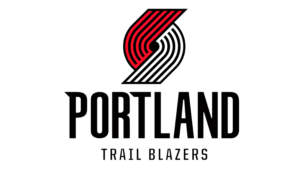
OK, hear us out on this one. The Portland Trail Blazers logo is famous for being weird – and for Jimmy Fallon mocking the design in a rap. Sure, unlike most NBA logos, doesn't look much like a basketball. Indeed, it's not initially clear if it's supposed to represent anything at all. "A real bad drawing of a candy cane" and "Picasso's version of a hurricane" were a couple of Jimmy Fallon's suggestions.
According to Oregon Public Broadcasting, the logo does actually feature a basketball, just an abstract representation. Originally designed by Frank Glickman, it was inspired by the shape of a pinwheel and is packed with symbolism.
The five lines on each side represent five offensive and five defensive players, while the curved lines represent the players' movement and speed on the court. The hole in the centre is actually supposed to represent a basketball. The original 1970 design was tilted at an angle in 1990 to put the lines at 45 degrees, representing the 45th Parallel North that leads to Portland.
So what makes it one of the best NBA logos if it's so hard to interpret? Distinction. In a league full of animal logos and more figurative basketballs, the Portland Trailer Blazers logo is totally unique and instantly recognisable.
10. Los Angeles Lakers
This is another NBA logo that I realise will divide opinion. On the one hand, the Los Angeles Lakers logo looks dated. But when it comes to sports teams, a retro design can actually be very powerful because it represents legacy and heritage.
The design is simply a basketball and the name of the team, and that serif font with speed lines would surely never be used today. But the Lakers are such giants that the logo became iconic. The colours were tweaked in 2001 to add contrast and make the logo more vibrant, and that was really the only update the logo needed.
For more on sports logos, see our best NHL logos, the history of the Miami Dolphins logo and the best Olympics logos.

Tom May is an award-winning journalist specialising in art, design, photography and technology. His latest book, The 50 Greatest Designers (Arcturus Publishing), was published this June. He's also author of Great TED Talks: Creativity (Pavilion Books). Tom was previously editor of Professional Photography magazine, associate editor at Creative Bloq, and deputy editor at net magazine.
- Joe FoleyFreelance journalist and editor
You must confirm your public display name before commenting
Please logout and then login again, you will then be prompted to enter your display name.
