Jimmy Fallon mocks unusual NBA logo design in hilarious rap
Sign up to Creative Bloq's daily newsletter, which brings you the latest news and inspiration from the worlds of art, design and technology.
You are now subscribed
Your newsletter sign-up was successful
Want to add more newsletters?
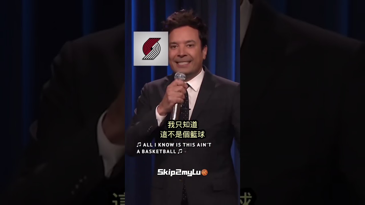
With the 2023 NBA season underway, The Tonight Show Starring Jimmy Fallon has paid an unusual musical tribute to the basketball league. Rather than offering sporting analysis, Fallon's lyrical play focused on teams' logo designs.
As we can see in our own pick of the best NBA logos, many of the league's 30 teams feature basketballs in their logos. Sometime the ball is included in inventive ways, such as in a musical note in the Utah Jazz or a hornet's body for the Charlotte Hornets. But Fallon set his sights on one unusual design that appear to break the mould. Where's the basketball in the Portland Trail Blazers logo?
"The New York Knicks have a basketball, the Toronto Raptors have a basketball, the Miami Heat have a basketball, and the Phoenix Suns have a basketball, and the Indiana Pacers..." You get the idea. However, Fallon's lyrical flow is ruined when he gets to Portland Trail Blazers' logo. He recommences his delivery, but again stalls when he gets to the Trail Blazers cryptic emblem.
Finally, he dedicates the last lines of the rap to trying to "figure out" what the Portland Trail Blazers logo shows: "It's a real bad drawing of a candy cane. It's a comma and apostrophe doin' a thing. It's Picasso's version of a hurricane / it's Ed Sheeran going down the drain. It's Donald Trump's hair with a chicken's wing / It's a 69 don't wanna be profane. Man, I don't know what it is at all / All I know is, it ain't a basketball."

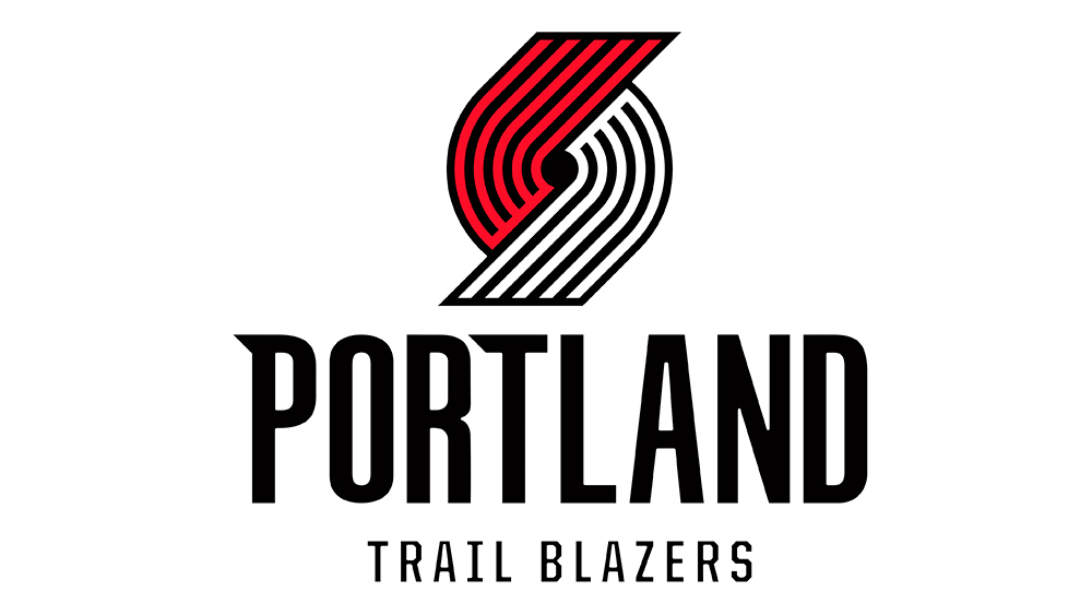
So what does the Portland Trail Blazers logo really show? Well, according to Oregon Public Broadcasting, it does actually feature a basketball. It's just that the ball is a little abstract. The design, the first version of which dates back more than five decades, is said to be based on the shape of a pinwheel, but each of the elements also has a hidden meaning.
The five lines on each side represent five offensive players and five defensive players, while the curved lines represent the players' movement and speed on the court. And the hole in the centre? That represents the basketball that Fallon was struggling to find.
The original logo was designed by Frank Glickman, a Boston-based graphic designer and cousin of Trail Blazers founder and first general manager, Harry Glickman. The original 1970 design was tilted at an angle in 1990 to put the lines at 45 degrees, representing the 45th Parallel North that leads to Portland. The latest tweak was made in 2017, when the ends of the lines were made flat instead of pointy.
Sign up to Creative Bloq's daily newsletter, which brings you the latest news and inspiration from the worlds of art, design and technology.
For more logo design amusement, don't miss the hilarious Lego Dune logo (it's handmade).

Joe is a regular freelance journalist and editor at Creative Bloq. He writes news, features and buying guides and keeps track of the best equipment and software for creatives, from video editing programs to monitors and accessories. A veteran news writer and photographer, he now works as a project manager at the London and Buenos Aires-based design, production and branding agency Hermana Creatives. There he manages a team of designers, photographers and video editors who specialise in producing visual content and design assets for the hospitality sector. He also dances Argentine tango.

