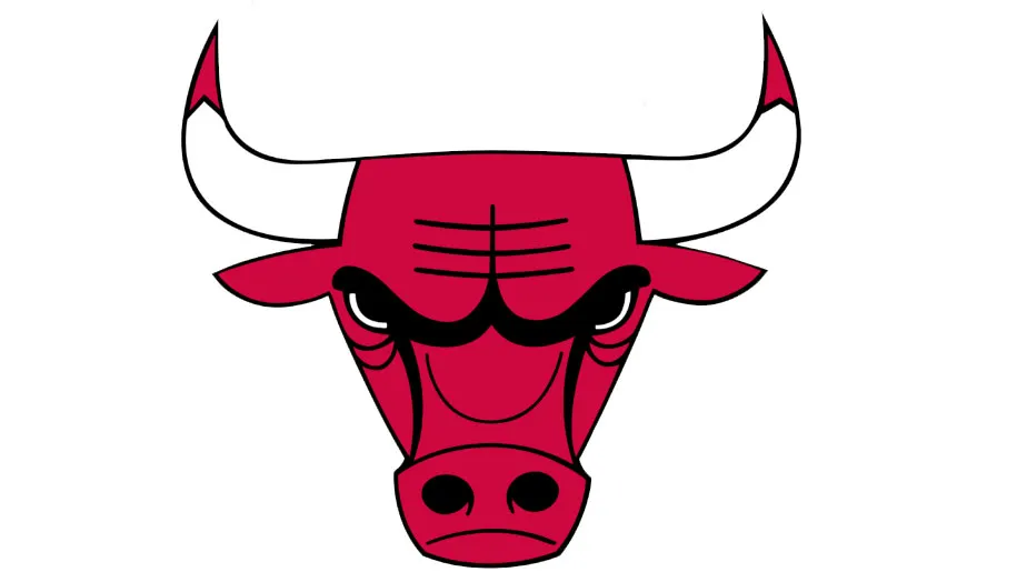
Social media users have discovered a bizarre and racy design detail in the logo for the American basketball team, the Chicago Bulls. When viewed normally, the logo looks like a bull scowling at you. But if you flip it upside down, it's not a huge stretch of the imagination to see, and there's no two ways of saying this, a robot mounting a crab. Or a robot reading a book, whichever your mind prefers.
We've already covered what creators should keep in mind in our how to design a logo guide, but there's a valuable lesson to be learnt from this alternative Chicago Bulls logo observation. Namely that designers might want to consider a design from all perspectives.
Don't believe us that an intimate relationship between a robot and a crab could find its way into the Chicago Bulls logo? Check out this eye-opening comparison recently shared on Twitter by writer Deniz Camp. We should warn you though, you won't be able to unsee it...
If you turn the Chicago bulls logo upside down it’s a robot having sex with a crab pic.twitter.com/KGfsqyr3MlSeptember 14, 2019
While people have pointed out in his replies that Camp wasn't the first person to notice the smutty detail, he managed to capture the attention of Twitter by sharing the regular Chicago Bulls logo next to the upside down one.
Considering that the Chicago Bulls logo has been in use since 1966, it's amazing that nobody has spotted this detail before. Although to be fair, the logo that's doing the rounds on social media is a single colour version. Usually the Chicago Bulls logo is white and red, which goes some way to disguising the unintentional X-rated design Easter egg.
And while we've had a good laugh at this unfortunate design coincidence, the Chicago Bulls isn't the first organisation to make a logo blunder. Our list of fantastic design fails reveals that anyone can slip up when it comes to creating a brand.
So the next time you think you've created the best logo ever, step back and take the time to view it from different angles just to make sure an unfortunate image hasn't snuck its way into the design. You'll thank yourself in the long run.
Related articles:

