Cracker Barrel should never have apologised for its controversial new logo
If the brand doesn't have faith in its rebrand, how can we?

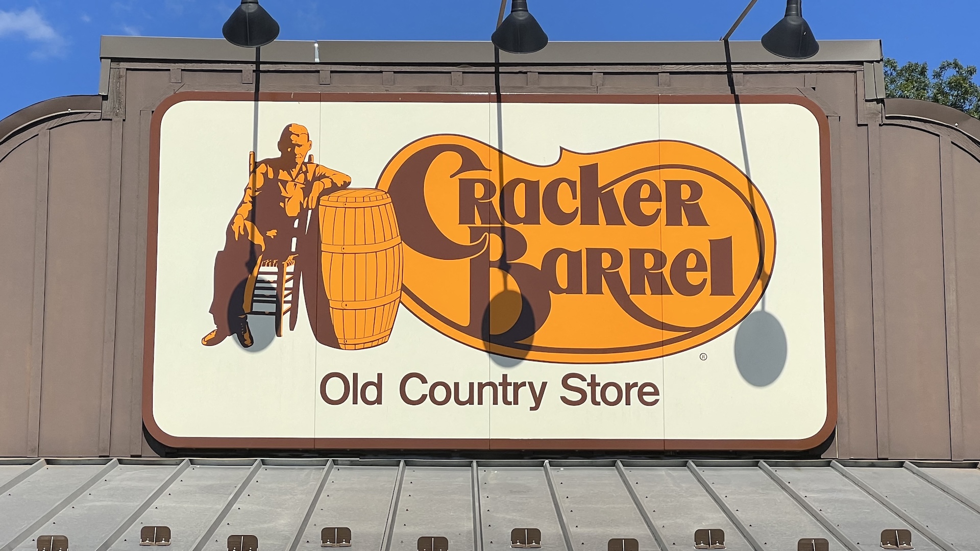
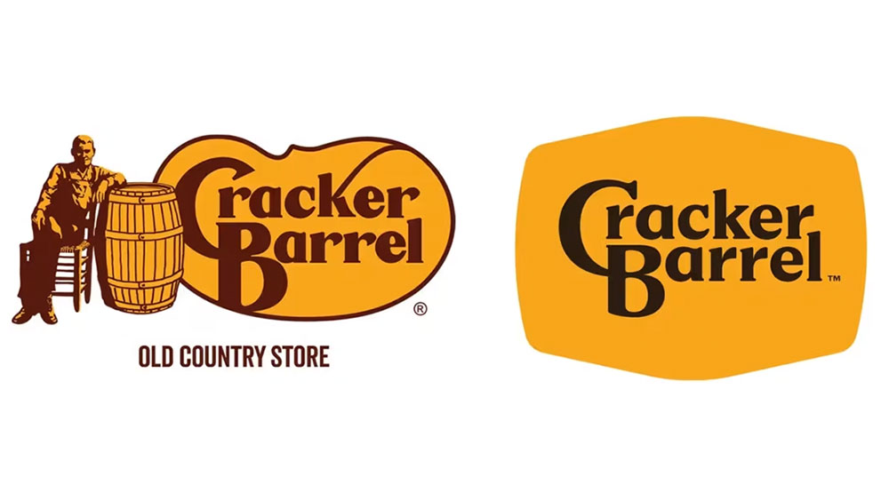
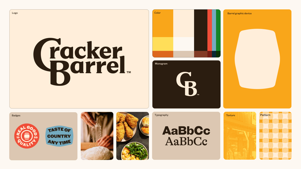
Hot off the heels of American Eagle seeing its stocks surge after that so-called anti-woke ad featuring Sydney Sweeney, we've seen another brand go completely the other way. US-themed restaurant Cracker Barrel recently debuted a simplified new logo, doing away with its mascot (a man leaning on a barrel) and the words "old country store". Cue outrage, and a tanking stock price.
The whole saga has more than a few echoes of Jaguar's recent rebrand, in which the brand was accused of abandoning its heritage in pursuit of a more contemporary aesthetic. But while Jaguar at least had the tenacity to stick by its new look, Cracker Barrel has done the opposite, offering a contrite statement about the rebrand.
A post shared by Cracker Barrel (@crackerbarrel)
A photo posted by on
“You’ve shown us that we could’ve done a better job sharing who we are and who we’ll always be,” the statement laments, before insisting that Cracker Barrel will remain “a place where everyone feels at home, no matter where you’re from or where you’re headed.”
Article continues belowCracker Barrel insists that keeping its brand fresh means "showing up on new platforms and in new ways, but always with our heritage at the heart. We know we won't always get everything right the first time, but we'll keep testing, learning, and listening to our guests and employees."

But if the response to the most controversial rebrands has shown anything time and time again, it's that the internet is a noisy place – and that noise will eventually die down. Remember the backlash to the Airbnb logo in 2014? Nobody's complaining about that one anymore.
I'm starting to think brands ought to adopt the famous Royal motto, "Never complain, never explain". By showing that the (often politicised) complaints have hurt it, and admitting it "could have done a better job", Cracker Barrel is suggesting that it doesn't have complete faith in its own new look. And if the brand itself doesn't, how are we supposed to?

Sure, it's probably a little oversimplified, but the rationale behind simplifying a logo to make it easier to apply in an array of different contexts, including digital use as an app icon and social media avatar, is a sound one – and not one you'd expect the Twitter hoards to take into consideration. Give it a few months, and Cracker Barrel might have had some decent metrics to show for the new look.
Sign up to Creative Bloq's daily newsletter, which brings you the latest news and inspiration from the worlds of art, design and technology.
It's no secret that any corporate rebrand goes through layer upon layer of iteration and sign-off. For brands to start apologising days after a rebrand sets a worrying precedent for the design industry, suggesting that in 2025, a few loud voices of online dissent are enough to shake their faith in their vision – and their designers.

Daniel John is Design Editor at Creative Bloq. He reports on the worlds of design, branding and lifestyle tech, and has covered several industry events including Milan Design Week, OFFF Barcelona and Adobe Max in Los Angeles. He has interviewed leaders and designers at brands including Apple, Microsoft and Adobe. Daniel's debut book of short stories and poems was published in 2018, and his comedy newsletter is a Substack Bestseller.
You must confirm your public display name before commenting
Please logout and then login again, you will then be prompted to enter your display name.
